“Don’t Judge a Book by Its Cover” is a proverb whose simple existence proves the fact impressionable souls will do so without fail. This monthly column focuses on the film industry’s willingness to capitalize on this truth, releasing one-sheets to serve as not representations of what audiences are to expect, but as propaganda to fill seats. Oftentimes they fail miserably.
It’s an interesting month for wide releases this June—a fact that results from big hitters like Avengers: Infinity War, Deadpool 2, and Solo all dropping April/May. The studios have decided audiences will be fatigued in that aftermath and are following them up with some smaller-scale sequels able to hopefully cajole families out of the house for dinosaurs (Jurassic World: Fallen Kingdom opens June 22), heists (Ocean’s 8 opens June 8), and cartels (Sicario: Day of the Soldado opens June 29). Consider these the “adult” version of the superhero fantasies parents have accompanied their kids to see.
Those titles won’t need quite the same number of screens that Disney and Marvel’s behemoths did. Being a five Friday month, that means more indies can flood the market for necessary counterprogramming. It’s therefore no surprise that these films are the ones providing the most evocative posters below. You have to turn those heads or suffer the fate of letting ticket buyers see their favorite blockbuster a third time instead.
How familiar


I hope the estate of Frank Lloyd Wright gets a cut of every film’s gross that has a poster design going full Art Deco window frame. Art Machine went there with a tint of futuristic vibranium on Black Panther and WORKS ADV took the idea and ran with it on The Great Gatsby. BLT Communications, LLC takes it further by turning the aesthetic from purely decorative to structurally relevant on Hotel Artemis (opens June 8). They’ve created a window like the one that might adorn the front of a fancy establishment such as the film’s namesake. And each piece of glass holds a character.


Had this been a tease with only the window, I’d probably champion it. As is, however, the whole is a busy mess. Sometimes the actor is out of proportion behind the bars of the window and other times he/she is super small in front of or spanning multiple dividers. Jodie Foster is top-billed and in the center, but she’s dwarfed by Sterling K. Brown and Sofia Boutella. And then we have an “engraved” monogram and neon-lit title competing for our attention rather than complementing each other (the font on the latter is quirky in the best way). Throw a room key in a random place and we understand just how failed a collage the whole proves.

Nancy (limited June 8) goes the opposite direction and shows itself to be too spare in comparison to its visual counterpart in Ignition and LA’s Ides of March. That poster was one of my favorites of that year because of its ingenuity to both seem unnatural in its perfect scale and natural in its plausible authenticity. It’s also spare, but there’s still a scene—a sense of place.
The sheet for Nancy lacks that reality. Here we have two pictures of the same person, so there should be no excuses as far as letting it line up and give our eyes a break. Instead we’re moving back and forth between color schemes, resolution, size, and angle. It could be a powerful image contrasting past innocence with present at-all-costs determination, not the goofy juxtaposition it actually delivers. Pushing the title to the left gives us the cause to find its balance on the right (a badly blurred hand we’re supposed to ignore) and the critics quotes are so staid that my view gets stuck as though I’ve hit a patch of quicksand.
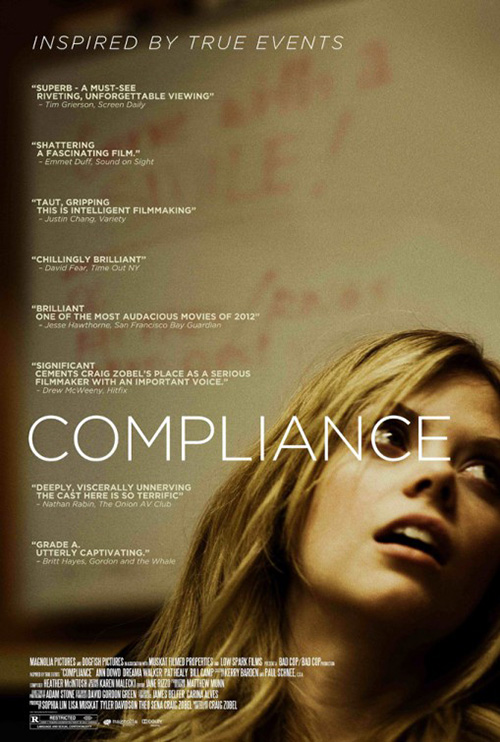
P+A enters the fray with Leave No Trace (limited June 29) less through mirroring previous artwork than utilizing a well-worn composition tactic. There are many examples of posters pushing the subject to the bottom of the frame so the white space above can add drama and room for text, but the one I thought of first was Compliance.
Both adverts contain a lot of critics’ blurbs as a means of drumming up interest. It’s a good tactic when your marketing budget isn’t huge and your stars aren’t bona fide A-listers because it adds legitimacy. The hope is that you’ll find a writer’s name you know or a publication you respect and take their word for it, keeping the title in mind the next time you’re at the theater.
I like both for different reasons: Compliance‘s title placement inside the list of quotes to line up with Dreama Walker’s eye is great while the size of Ben Foster and Thomasin McKenzie in Leave No Trace lets the gravity of nature and the futility of their place within take hold. The latter is great in its separation of text between the top left and bottom right, the biggish buzzwords against the biggest title. And it may be subtle, but the way that “No” is a hair smaller than “Leave” and “Trace” is just off-putting enough to steal an extra couple seconds of attention.

The most interesting entry in this section, however, is LA’s Upgrade (opens June 1) because putting it next to the firm’s own Get Out makes you wonder if Blumhouse has crafted a template for their high concept fare. There’s the tiny window of imagery with eyes ever prominent, the (identical) thick sans font for the title, and the solid black/white background to ensure nothing distracts from the meticulously curated information supplied atop it.
I really hope Blumhouse and LA team up for a trilogy capper next year. If it ain’t broke …
All alone


I can’t look at LA’s poster for Gotti (limited June 15) without thinking of the John Travolta from Pulp Fiction meme because his arms are in static robot position. The assumption is that he’s about to button his coat, but the stance is too awkward to blindly accept it. For a guy who once commanded big bucks and marquee space, this glimpse of him teetering over a puddle of water could be a metaphor.
And what is that water anyway? Is he in an alley? Is it the blood of a victim? Urine? I haven’t the faintest clue of its make-up or presence. Why not just put Travolta’s face big and center? You could even keep the weird red tint if you wanted.
Just look at Superfly (opens June 13). If Trevor Jackson is filling this poster and his name isn’t even deemed important enough for an appearance. He stands with a whole city propped up on his gold lion head cane anyway.
This one is weird too because it says so little. We can infer the details with it, though. Jackson’s character is the “hustler” of the tag and whatever game he’s playing now holds control of his home in the balance. LA brings the high contrast darkness of the subject matter to the sparkling gold of the spoils, our eyes moving from title to lion to chain to earring as a means of quantifying this guy’s worth.
What I can’t stop looking at, though, are the credits. “From the producers of The Matrix Trilogy” with “Original Soundtrack Produced by Future.” Those are very specific details that have less to do with the actual product than selling an unproven bill of goods. Perhaps that’s enough to earn money on opening night.
For Won’t You Be My Neighbor (limited June 8), ARSONAL makes Fred Rogers a bit smaller and a whole lot less imposing. They have the icon in familiar pose, pulling on his sweater for a new day teaching children the world over. It’s very bland, though, with a graduation photo gradient blue back. Some would say this tone fits the man perfectly, but it doesn’t necessarily help turn heads at the movies.


Luckily Rogers has a face everyone knows. Seeing his smile and catchphrase should bring a feeling of warmth and excitement to any fan. It simply lacks the energy of director Morgan Neville’s 20 Feet from Stardom and the character of his Best of Enemies (both by Gravillis Inc.). A little excitement makes a world of difference too.
Take Territory Studio’s Westwood: Punk. Icon. Activist. (limited June 8) for an example. Here’s one person against a solid background and yet it screams at us in comparison to Roger’s silence. The giant ink-stroked title, white wardrobe on white wall, and bright hair/banana become an assault together despite their otherwise mundaneness apart. You want to know what this woman is about. You want to know why this is the image chosen to describe her to unversed audiences. There’s mystery in its multiple juxtapositions and a promise of answers from the film.
Having fun


The Refinery’s poster for Hearts Beat Loud (limited June 8) is on that line between cute and tacky. I’m going to swing it to the former because of the “fun” aspect that permeates through. Had it just been Kiersey Clemons and Nick Offerman against a color, I would have done the opposite. But the rainbow of vinyl spines adds some nice flair. They aren’t real records with such titles as “Hip Hop,” “The Best of Jazz,” and “Classical Easy Listening,” but the idea transcends the generic presentation.
Those records give the whole a hipster vibe—as does her “lo-fi” equipment and his plaid—that’s contrasted against the more modern grunge font of the title and quote. I’m not one for drop shadows, but the text does get lost at times. Sometimes the feel is more important than legibility, though.


BLT brings the fun for Action Point (opens June 1) too, their homage to Rick Meyerowitz’s Animal House obvious and tonally relevant even if the content is so stylistically different. It’s smart because of the film’s period setting, similar to New Wave Creative’s Wet Hot America Summer. It evokes an era of nostalgia.
This one has an effective design beyond the illustration itself. There’s no need for an excess of text when Johnny Knoxville and the “Jackass” name explains all you need to know. This means the image can sprawl out from the center with fireworks and people flying through the air. The title receives a nice old school vibe and roller coaster slope to tie everything together. If I didn’t already know the result was a series of stupid stunts, this poster might have earned itself a ticket sale.
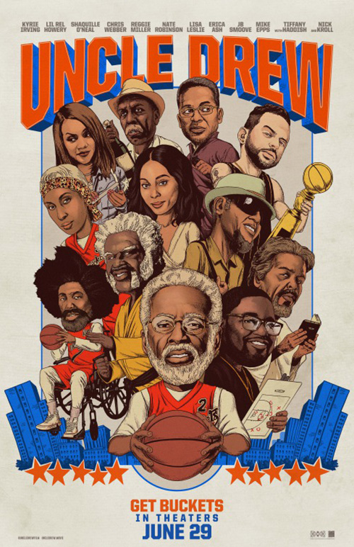
LA then channels a specific feel for Uncle Drew (opens June 29) in the form of bobble-head character sheets. I’ve seen these things for months and still have no clue what the film is about despite proving a showcase of former NBA players’ acting talent. So why not just turn the cast into giveaway collectible statuettes? There’s no better embodiment of merging sports and commerce this century.
The full sheet has its own charm, but its collage of faces lacks the bobble-heads’ high concept humor. It still oozes NBA, though, with its Knicks colors and stars. You may not get a glimpse of the plot, but you definitely know whether the comedy it’s sure to supply will be something you’re willing to spend money on.
Bring that athlete avatar concept to the world of superheroes and you get BOND’s great display of secret identities with The Incredibles 2 (open June 15). The cowl tan-line gag has been around for a while, but it’s no less hilarious in this context since the first film was about family above heroics. It’s easy to forget this when you see the full sheet with everyone in costume ready to fight evil. Being able to show the heart and humanity behind the action is the better avenue to travel.


The entire campaign has been taking pains to showcase this duality whether it’s BOND’s “Almost Ready” washing machine or LA’s Mr. Incredible ironing his suit. The blurring between domestic and super lives is what makes the franchise so charming. We want to know how this number of powers can co-exist under one roof more than how they’ll thwart the latest threat to world peace.
Visually arresting


Everyone seems to be talking about the creepy family portrait, but I’m all about the original puzzle box teaser that Gravillis Inc. gave Hereditary (opens June 8). More than just a Rubik’s Cube a la The Cabin in the Woods, however, this one holds an infinite wealth of detail inside the windows’ yellow glow. It could be actors, animals, floating chairs, or impossible doors. You don’t know what’s happening, who’s in control, or just how crazy things will get. All you know is that you want to enter each room and find out.


The portrait is atmospheric and jarring, but it doesn’t really get into the potential of what we should expect. None of them are looking at another to clue us in on who the predator of the group is or who holds the tagline’s “secret.” We get a sense of the tone, are introduced to an unknown trinket in the daughter’s hand, and wonder at the angelic glow of the tree above the title. I simply can’t get lost within it as long as the house.
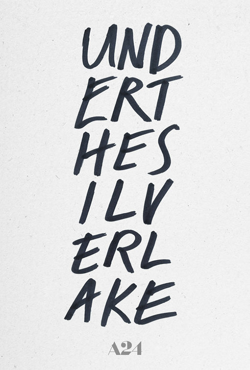
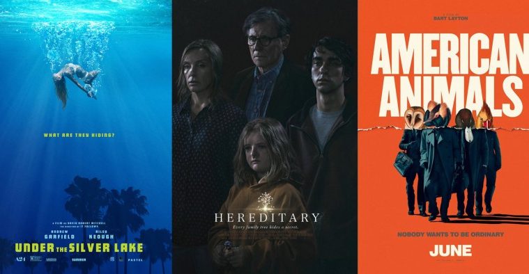
BOND was put in charge of A24’s other June offering, Under the Silver Lake (limited June 22). They seek to provide high production value intrigue as well, flipping sky and water to give us a woman falling/floating/suspended just north of center. The palm trees sit as silhouettes that could be pool liner pattern as easily as incongruous overlap of above and below surface. And if you look carefully at the center of the two tallest, you will see Andrew Garfield looking back.
It’s a captivating image that deals with the symbolism the title conjures. It creates a scene as though dream, a fantastical personification of an idea with a clean, stylish sans serif to give it concrete form. This last part is a huge change from P+A’s text-only teaser of hand-written caps breaking the title into six rows of three letters. You think cypher even though it’s very straightforward, each grouping bringing our eyes down to the bottom. Both sheets put us under.
Brandon Schaefer brings a high production lo-fi aesthetic to The King (limited June 22), one that contrasts Midnight Marauder’s low production lo-fi festival sheet. They each use a Xerox filter, but the former dials it back to move towards a glossier visage of Elvis inviting us into his life.
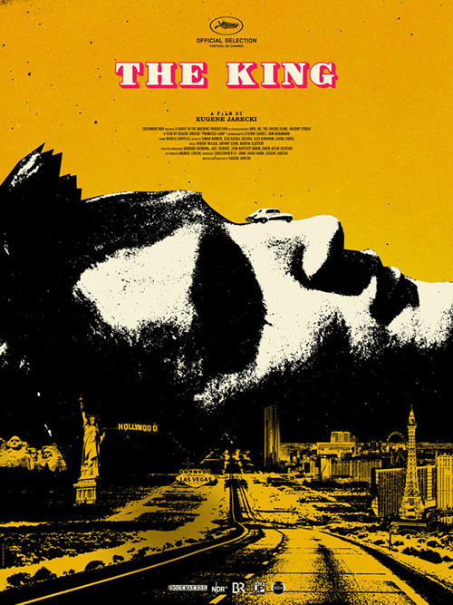
Schaefer’s is a memorable work showing the car this musical road-trip takes to the heart of both the artist at its center and America itself. The grain captures the grittiness of reality as the sunset reds and purples backlight Presley as though a God welcoming us into a dreamland of infinite possibilities. And this imagery never forces us to compete with the extensive amount of text because the font size minimizes every word to texture unless you’re close enough to read it. Ours eyes let those words fade into white noise, the totem of Elvis, car, and title all that remains.
Of all this month’s posters, though, Empire Design’s American Animals (limited June 1) takes the cake. It’s an unforgettable combo of actors and animals, the two merged together with a rip of paper removing the tops of one and bottoms of the other. You want to go up to it, grab hold of the duck’s bill, and lift the two halves apart to see what’s underneath.
That sense of tactility is rare in a two-dimensional piece and the firm doesn’t look to distract from it with unnecessary clutter. The title is large and in-your-face, the tagline a darker color to pop against the bright date while still being legible against the orange back.


P+A’s domestic posters don’t do it justice by comparison. I like the warped flamingo book page for its surrealism, but its inclusion in lieu of the animal heads loses humor and cohesiveness. At least this one keeps the actors faces out-of-frame to retain more mystery than darkened sunglasses in their other. That one uses the flamingo as shadow, its large size positioning it to eat them. Maybe these two make contextual sense to the film, but they don’t to someone like me who hasn’t seen it. They’re weird, but Empire’s is iconic.
What is your favorite June release poster? What could have used a rework?