I can’t say it was difficult finding nine posters to talk about this month––most new April releases were given the bad Photoshop treatment. Some, like Cash Out, scream DTV. Some, like Arcadian, try their best to at least make the lighting and coloring look real. Some go the collage route, e.g. The Long Game. And then there are those like Blood for Dust where the actors resemble flat cutouts and their heads bobbling balloons pasted on top.
I’ll never understand a studio’s desire to go that route when a simple film still with effective typography can garner attention for its beauty rather than its superficiality, but that mindset doesn’t seem to be changing anytime soon. Thankfully there are still those who get it––those who commission posters as an art form and a marketing tool. You can have both.
Shadows


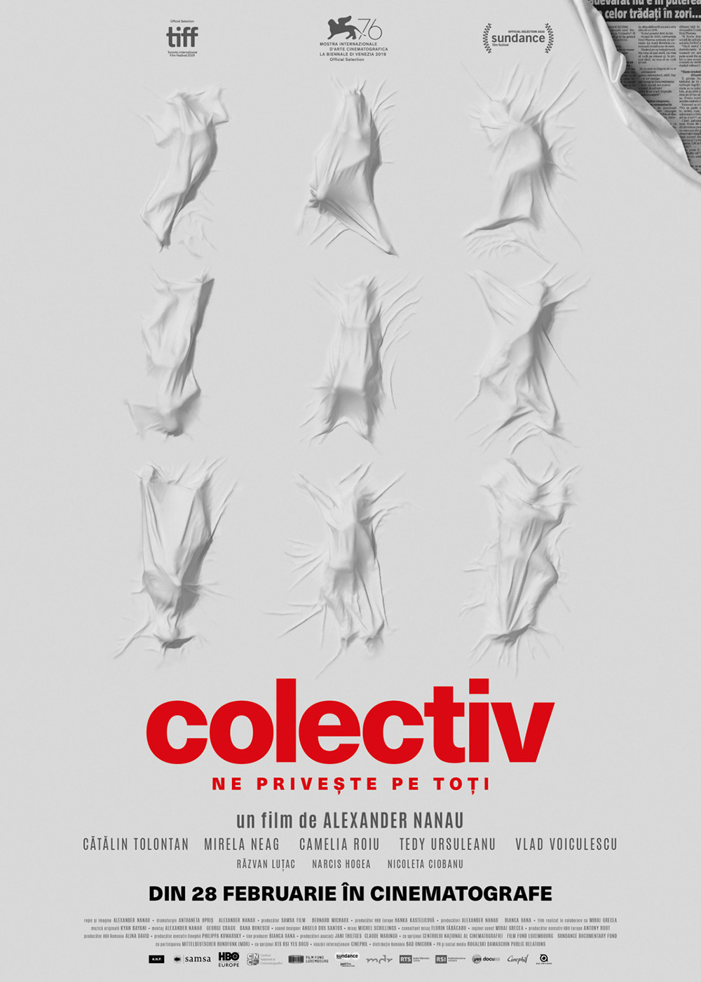
While not as provocative as the poster for Collective, MOCEAN’s sheet for Humane (limited, April 26) is just as foreboding in its depiction of the dead. Whether covered by a sheet in different states of distress or zipped up in body bags, the large numbers found within their careful grid patterns is the real gut punch. What killed them all? Did they all have to die?
What’s interesting about the image for photographer Caitlin Cronenberg’s debut film is the discovery that one of those bags isn’t quite closed all the way. See the middle of the second row from the top and the face peeking out from beneath the plastic. Suddenly our question is no longer about their deaths. Now it’s about whether they will stay dead.
The grid pattern creates some nice horizontal lines for the designer to place most of their text. The bright white helps the all-caps sans serif pop a bit, but I won’t deny it can be hard to read considering just how claustrophobic the whole proves. Although I do actually like how the title itself is lost amongst the bags with the branding cutting through the middle of the letters. It forces us to pay closer attention and pick out details like that solitary face.
“Shadow” is taken more literally with Maks Bereski’s Housekeeping for Beginners (limited, April 5). Whereas Humane deals in the metaphorical echo of human life, this film uses the word to place a character into the frame despite them not being visible. The uncertainty therefore lies in whether we’re seeing a woman standing on the opposite side of the room for the girl to look at or the memory of a woman who is no longer there.

Beyond the different stories that might be told through this visual, however, is also just a captivating composition. It’s meticulously constructed in a way that presents the sense of insecurity and conflict that comes from a narrative about a woman deciding to raise her partner’s two daughters. The crooked painting. The crayon scribbles on the wall. The toys on the bed. And the girl, at once defiant and scared.
My favorite part is the typography and how Bereski uses the white space between the picture frames to create a moving line of text from top-left to bottom=right. The tagline centers itself at the start with our eyes moving below it to the title as the letters snake around the gilted edges until the cast list acts as a final bookend. The “for” in the middle is a bit awkward––it’s a different typeface and multi-colored––but the effect works because of its relationship with the crayon drawings.
Its chaotic uniformity meeting intentional imperfection delivers a unique quality that cannot be matched with a film still––although ARSONAL’s provides a very attractive attempt to do so. The gorgeous over-exposure and red/pink hue provide a warmth to the embrace. This is the hopeful happy ending while Bereski depicts the rocky road that must be traveled to get there.
I guess Brandon Schaefer and Jump Cut’s Sasquatch Sunset (limited, April 12; wide, April 19) is less shadow than silhouette, but I include it here just the same. The imagery presents a heartwarming scene with a bigfoot family (shades of Harry and the Hendersons has my nostalgia in overdrive) standing against a giant sunset––you can’t get more literal that than as far as visualizing the title goes.

What I love about the whole is the way in which the scene is composed. The geometric shapes of the background provide a crisp circular frame to house the title as the characters and shadowy portions of the forest behind them enters with a heavy static grain. There’s a real printmaking vibe to it wherein I want to peel off the black plate to see the colors below––as though it was printed on a transparency overlaid above the rainbow of warm-to-cool banding.
I also enjoy the symmetry (intentional or not) with Sam Smith’s poster for the Zellner Brothers’ Kumiko, The Treasure Hunter. His also possesses that same circular frame and color fields––it just doesn’t add that extra layer of texture. Even the title treatments are in-concert with each other as their full-justified, bold-white all-caps, and intriguing sans serif fonts nicely stack together for a clean, rectangular focal point.
Illustration


You can’t have a comic-book movie without a comic book, so Drusilla Adeline gives Vera Drew’s The People’s Joker (limited, April 5) its own retrofitted cover. You’ve got the studio logos in their brand box at top-left, a fantastic halftone pattern on the live-action-turned-cartoon collage of characters, and a great hand-drawn headline title to really bring the faux publication home.
And rather than jam everything into this cover (there’s a lot there already between the scribbled-out barcode, WB disapproval, and release month), Adeline places this cover on the poster instead of making it into the poster. The choice lets her tilt the image a bit so that there’s movement to the whole. It allows for a white-framed, black rectangle beneath to house the tagline and credit box so the image itself can operate without clutter. It’s a perfectly conceived and executed design that understands and avoids the traps to which a less knowledgeable artist might fall prey.
I absolutely adore the illustrated seal used to market Ken Loach and Paul Laverty’s latest collaboration The Old Oak (limited, April 5). What an intricately ornate piece of art that could be woven onto a tapestry and hung as a banner outside the titular pub in England. It provides a sense of regal opulence as well as a notion of tradition meeting progress with its bilingual use of English and Arabic to allude to the Syrian refugees who have moved into the neighborhood. Are those words “Strength, Solidarity, and Resistance” therefore a call to arms against the newcomers? Or are they a declaration of protection for their rights as human beings?
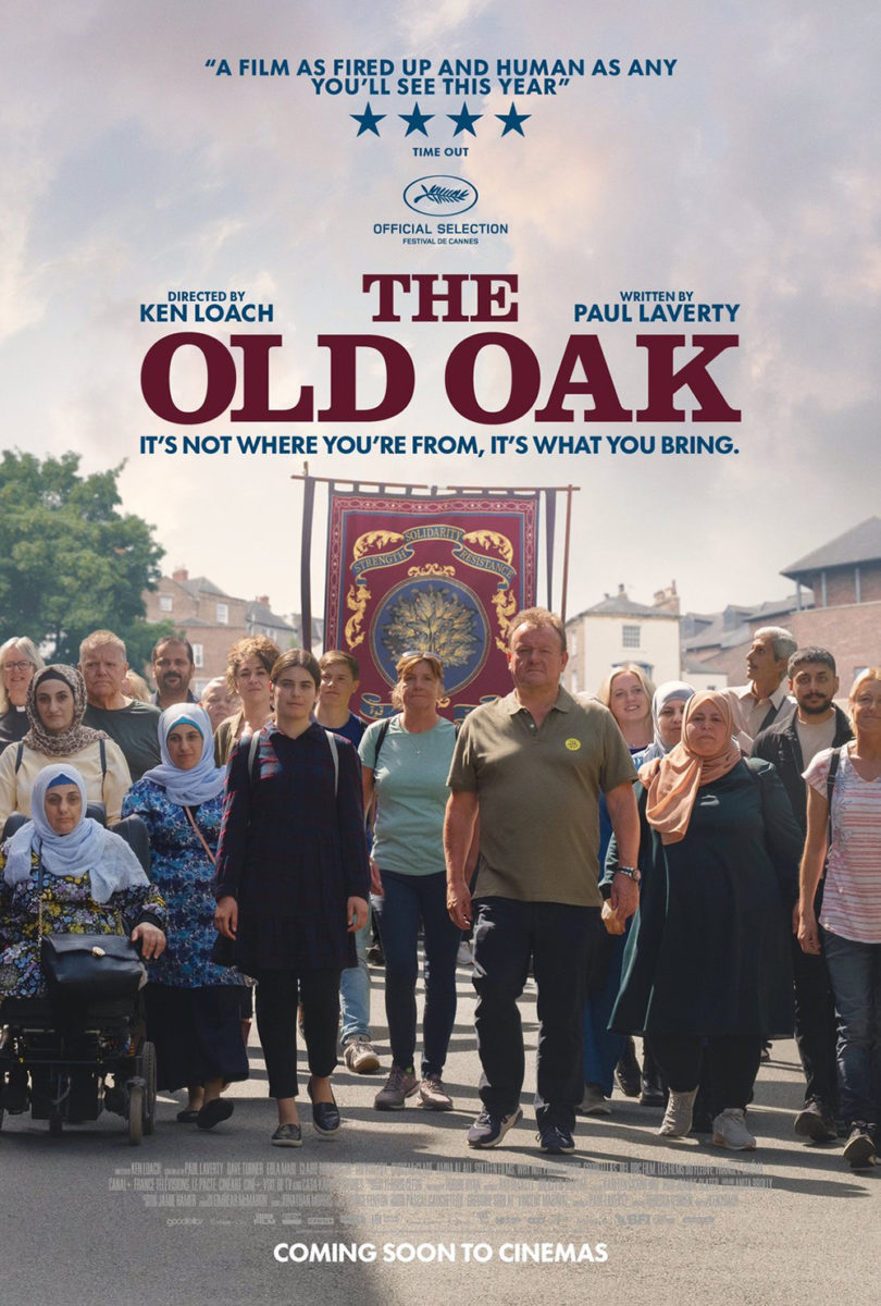
What I noticed most (besides the stellar coloring with deep-red background, blue highlights, and gold leaf-like text / flourishes) is the fact that this design is proving how some films can still be sold by the filmmakers’ names alone. Not only are there no faces to be seen––there are no actor names beyond the credit box at all. This is purely about aesthetic and the pedigree that follows the Loach-Laverty partnership. That’s all you need to know to decide whether to buy a ticket.
Not that the alternative isn’t equally effective. It’s still about telling a story instead of selling a celebrity. Yes, we see the actors now, but the purpose is to showcase the faces of this fight. These are Brits and Syrians walking together (the illustration now used as a flag) in a show of strength and solidarity. They are the “oak” of the title. Not a tree. Not a pub. It’s the human bond that turns strangers into a community.
The one-sheet for Indigo Girls: It’s Only Life After All (limited, April 10) is, qualitatively, on the opposite side of the spectrum. Whereas The People’s Joker exemplifies a specific art form and The Old Oak an elegant lavishness to its symbolism, this documentary goes for the crude idiosyncrasies of a one-of-a-kind, impromptu doodle.
Everything is off-kilter, right down to the credit box lines tilting up and down. You can almost imagine the whole as being animated, the triangles and lines slightly vibrating as they draw themselves onto the white page and outline / embellish the two black-and-white images of the subjects. It feels impossibly precious as a result––like a concert poster printed in bulk that’s been colored and emblazoned by lyrics and shapes on-site to ensure every attendee leaves with their own bespoke version.
Faces


The poster for Girls State (AppleTV+, April 5) is so much fun. A documentary about adolescent girls in Missouri coming together to organize a mock Supreme Court to debate our current political issues represented by a smile with colored heart braces is inspired. It puts the governmental motif onto the subject rather than its subject onto the motif (like cold open did with Boys State). It understands the draw is youth rather than tradition. It’s about the future rather than the past.
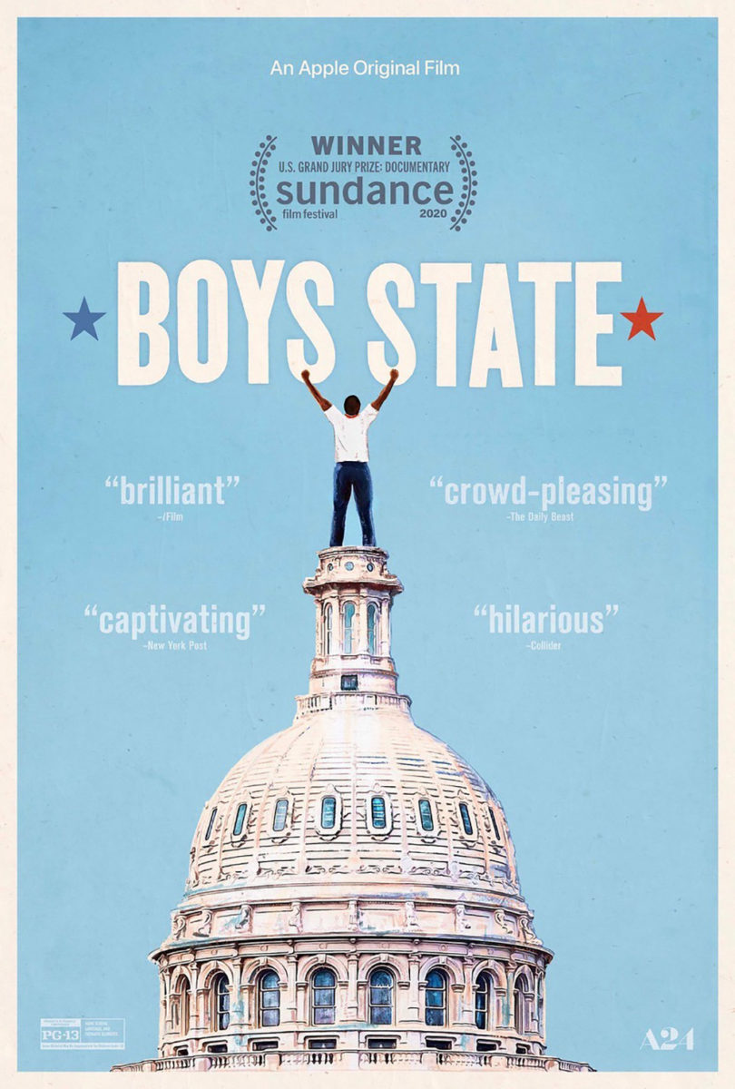
It’s also just a well-made teaser (a loose term here considering it’s a streaming poster and thus doesn’t need to follow the same rules as theatrical with credits boxes, etc.). The close-up crop adds humor. The stars nicely mirror the title. And there’s even an additional silver sticker on her nose to add another flourish that pushes us forward (not that nose rings are “new”) rather than back (to the notion that piercings and tattoos are “unprofessional”).
As for the face on Yannick (limited, April 5), it’s just as fun for a different reason. Here the humor arrives through the act of vandalism. Someone has drawn on the photograph with black marker, turning this man into a joke (or, perhaps, reiterating that he’s already proven to be said joke himself).
You really can’t go wrong with a poster for a Quentin Dupieux film. Most (if not all) are memorable because they end up being as absurd and surreal as the movies themselves. This is no different with the blurring of the line between art and appropriation. This is a poster that is probably born from an in-film utilization that is then drawn upon to become a poster for our use as promotion. Its graffiti therefore possesses layers by simultaneously defacing and creating anew.
Kudos to MUBI for letting the image speak for itself. It’s just Yannick on a black background with simple white text jammed into the frame; when the title dares to overlap the frame and image, it becomes our focal point and bridge between the two.
And that leaves us with the beautiful painting that is Terrestrial Verses (limited, April 26). For a film built upon vignettes of “ordinary people navigating institutional constraints imposed upon them by society,” there’s no better way to depict that complexity than through a woman in a hijab. She must contend with patriarchal misogyny. Religious persecution. Racial prejudice. This is a human being trying to live in a world that often refuses to believe she deserves that right.
It’s a captivating, simple image with all ancillary text beyond the directors’ names and Cannes laurel pushed to the bottom in very small type. The composition lets the woman’s face take center stage––so much so that it tilts the title and breaks up the two words in a way that allows them to frame her expression rather than distract from it.
Add the hand-written letters and non-uniform nature of a paint brush or chalk streak and there exists a real sense of personality and purpose here. There’s a truth to this image that a glossy photo and crisp type couldn’t match. It ensures the emotional resonance of the scene draws us in without the need for context.