Holidays and awards season collide with a plethora of Oscar contenders vying for screens––whether it’s The Color Purple (December 25), Ferrari (December 25), or George Clooney’s latest, The Boys in the Boat (December 25).
The latter I only heard about last week, courtesy of a poster standee in the back of my local Regal Cinemas, but they’ve each been given a rather generic marketing campaign thus far due, the pedigree of their source material and / or director doing most of the heavy lifting. It’s the indies below that needed to go above and beyond to throw their hats in the ring and make sure some of that box-office money moves their way.
Cast shot


A24 and GrandSon come in to try their best that The Iron Claw (December 22) gets a fighting chance. They do so with an unconventional cast photo wherein no one’s face is visible. Yes, their names are listed above them (an impeccable list, no less), but none are presented as being above the whole. It’s about family. Camaraderie. A powerful embrace amongst muscle-clad men.
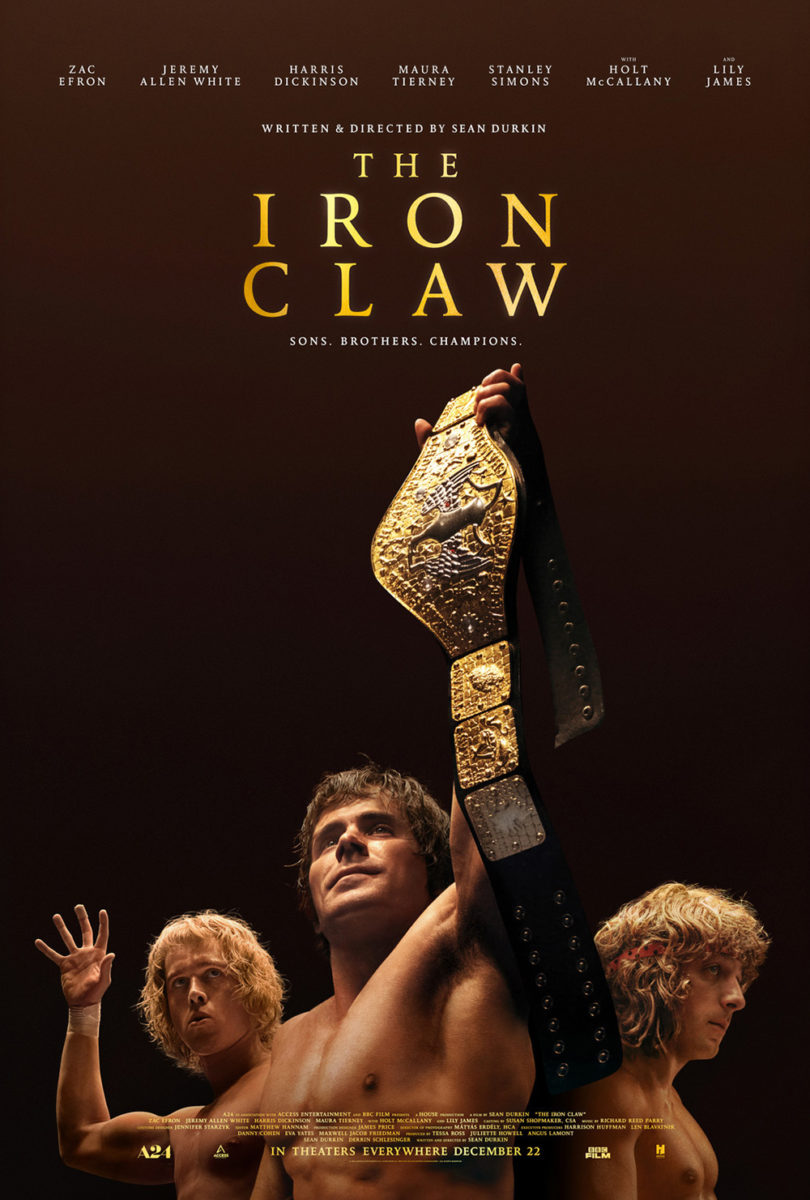
It’s an inspiring and emotional image too––one that I believe sells the movie much better than the follow-up ,despite its clear depiction of stars Zac Efron, Jeremy Allen White, and Harris Dickinson. While the vantage point from below lends a welcome bit of intrigue, it can’t help from proving a conventional (albeit effective) choice.
That’s why I like the poster for Concrete Utopia (NYC & LA, December 8; expanding, December 15) so much. They could have just put the cast together via photoshoot or Photoshop, the three actors singled out at the bottom of the page presented a bit bigger than the rest, and call it a day for fulfilling everyone’s contractual obligation.
The designer chooses a different path. They provide the whole cast, but in a scene of broken rubble that presents environment, context, and space with which to comfortably move our eyes from one person to the next. Hierarchy is then created by authentic placement rather than manipulated size via collage. They even give Lee Byung-hun a “throne” by way of a toilet amidst the concrete. Add a translucent streak of blood behind the title and you start to understand those sternly determined faces. This isn’t just a utopia. This is their utopia.
My favorite cast shot of the month, however, goes to Netflix and Aardman, courtesy of Empire Design’s brilliant Chicken Run: Dawn of the Nugget (limited, December 8; Netflix, December 15). While it might just look like your normal animated kid’s movie poster chock full of character faces on the surface, it’s actually a Where’s Waldo? of clandestine infiltration. Because despite suggesting the beret-wearing chicken at the bottom is the only one not under some sort of dystopian mind control via numbered electric collars, he has a couple friends with him.
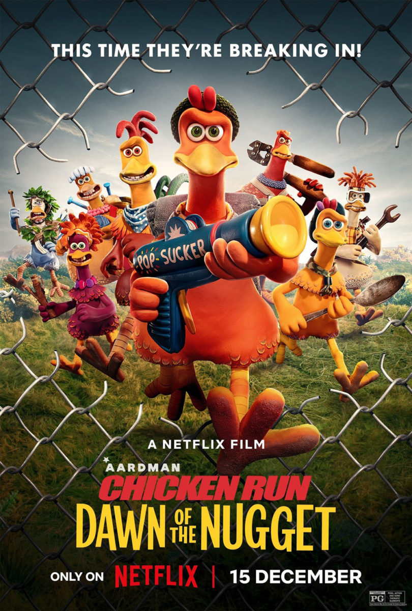
You can find them by the eyes. Unlike the majority of wide-eyed, centered-pupil stares, two (that I have found) are without necklaces and looking offline towards each other instead of us. It’s a subtle yet memorable detail that has the tagline (“The plot chickens…”) hitting home with a mystery to unravel.
The jailbreak follow-up is fun, too, but much more familiar with its composition and character focus in lieu of narrative tease. It’s about crazy goofs and their unorthodox weapons rather than a conspiracy puzzle to solve. This one is for people who are already sold, kids looking for a laugh, and a studio hoping for merchandising potential.
Vertical pan


Intermission Film’s teaser for All of Us Strangers (limited, December 22) is really exploiting its axes. You have the x-axis balanced by Andrew Scott looking down so our eyes can follow and see Paul Mescal. And there’s the y-axis shooting back up through the middle windows to read the title and cast list. Down we go, left-to-right gradually, only to be whisked back to the beginning once we reach the end.
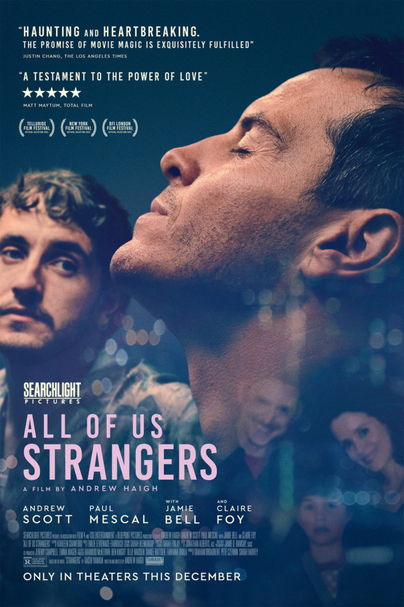
The imagery itself almost becomes secondary to this composition, yet it’s attractive too with color scheme and metallic appearance. The contrast of industrial and emotion is nice, telling us a story without needing to explain who any of the characters are yet.
That’s the job of the follow-up: a less inspired look at the lead actors cluttered by a ton of text and translucent photograph of a family to get Jamie Bell and Claire Foy into the action. This one is all about Scott’s expression, centering him between the other actors and turning the angle of his face into our z-axis slope from top to bottom.
P+A’s Occupied City (limited, December 25) uses that z-slope too––not as our pathway down, but as a means of disorienting our expectations. Because a poster like this with text superimposed upon the empty space of an image more or less bisecting the frame is generally a matter of reading the top, reading the bottom, and moving on.
The slant tilts us as the viewer. It trips us up, sliding us off the page rather than releasing us to head down to the title. We become taken in by the scene, joining these children as they play in the snow. It’s therefore easy to forget ourselves in that moment, making the text below a discovery upon the end of our transfixion rather than simply a means to an end.
Kellerhouse, Inc.’s The Zone of Interest (limited, December 15) flips that notion on its head. Instead of capturing us with the motion of an image, it sucks us in with the vacuum formed by a complete absence of one. This is a stunning piece that really captures the disquieting tone of the subject matter. It puts us into the mindset of these people going about their charmed lives with blinders on so as not to let the atrocities occurring on the other side of their property line disrupt their pleasure.
Thus there’s power in that blackness, and creating it isn’t as easy as a simple mask. The design team needed to ensure we understood something is missing. This isn’t a night sky with clouds or stars. It isn’t about an obscured vantage point or a wall blocking out the truth. This is willful. Intentional. A product of a warped mind altering its very reality.
Portraits


If you can’t beat them, join them. I haven’t seen American Fiction (limited, December 15), but that seems to be a theme. Its synopsis describes a novelist, frustrated with the establishment, who propels himself into the zeitgeist by writing a new book under a pen name. BLT Communications, LLC’s poster leans in that direction, taking a photograph of said novelist (Jeffrey Wright) and drawing over him the image we can assume the public believes belongs to his nom de plume.
The result is a fun, damning portrayal of identity, preconception, and misconception. It brings into question the sort of dualities this character must face where Blackness and professionalism is concerned. Where do you draw the line? When do the public’s assumptions start to dictate social imperatives? Is what this man wrote less real because he’s not who the people think? Or more real because he was able to manipulate them into that mistake?
Brian Hung also plays with duality via in water (limited, December 1). Here it’s more of an aesthetic use than a narrative one wherein, despite only presenting one version of his subject, he supplies it through the filter of an impressionistic window.
The image is thus both a literal representation of a man standing in water (his feet covered, body remaining upright on the shore) and a figurative one (we are seeing him through water as depicted by the title slowly sinking into the rectangle). Is it therefore a painting or a mirage? Reality or story?
Either way you think about it, the craft is impeccable. The canvas texture and caked on paint. The translucent effect that makes it seem the title is positioned behind what we know to be a solid image. The delicate stanza at bottom-right giving us a poem to begin figuring out what’s happening.
And through it all is just a giant picture unencumbered by its film-poster trappings. It’s a scene that speaks for itself without the distraction of its repurposing as marketing. You get to dictate when you’re ready to exit the frame and seek out the details.
In contrast, Vasilis Marmatakis hopes to trap you within his poster for Poor Things (limited, December 8). By skewing towards the absurd and surreal, he captures your attention and feeds it through a loop whose beginning is also its end.
Is Emma Stone popping out of her own body? Is it a camera trick? One example of many wherein we might find a third Stone at the bottom? He has, in effect, given us the repetition of a house of mirrors without the device––creating a Michel Gondry-esque perspective shift that plays with space and identity, considering we have two people in one (or one person in two).
Add the shaky font stretched thin for the title and expanded wide for the cast list and you get a hand-made effect toeing the line between fantasy and nightmare. It’s Alice falling down the rabbit hole… or, in this case, rising from it to return to the surface.


The other two posters Marmatakis made are equally alluring if a bit more overt. Whether a face adorned by prone men in paint-smeared make-up or frills as diorama, the effect is more about imagination then discomfort. Only the above instance leaves you with a sense of uncertainty. Of dread. That’s it’s true success.