A lot of generic posters are hitting theater walls this month. That doesn’t mean I still didn’t almost put Argylle (February 2) below just because I cannot believe no one told them their teaser looked like a Minion that ate a cat. It’s simply the time of year where studios release titles they don’t have much confidence in and thus barely bother spending much resource on in hopes of breaking even.
There are a few gems bucking that trend, though––unsurprisingly, the indies and foreign films vying for prime counter-programming real estate. Now is their chance to lure in unsuspecting ticket-buyers and become a sleeper hit.
What a Pair


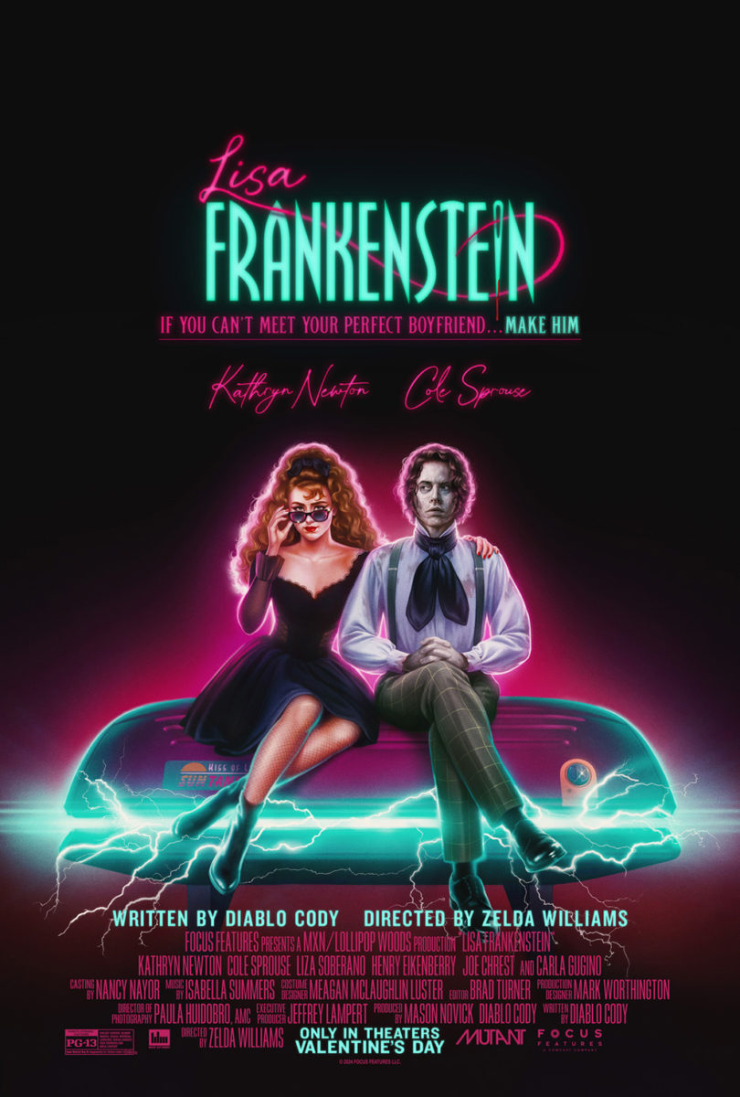
The simplicity of GrandSon’s Lisa Frankenstein (February 9) is what makes it a winner for me. The clean silhouette of its actors in a loving embrace (despite the ax at the ready) against a pink moon renders it a perfect Valentine’s-adjacent mood piece to scare up the romantics. And that gorgeous title treatment with sewing needle and thread does wonders to pull it all together.
I actually like the second poster’s variation on that title concept better, though. It’s a more legible font with the “Lisa” moved left to make it a bit less clunky (although I probably would have moved it a little further to create an overhang that matched the right-side loop).
The poster itself is somewhat less inspiring with its ’80s-comedy vibes. I probably wouldn’t think twice if the teaser wasn’t so good, but the contrast can’t be ignored either. A great illustration, nonetheless.
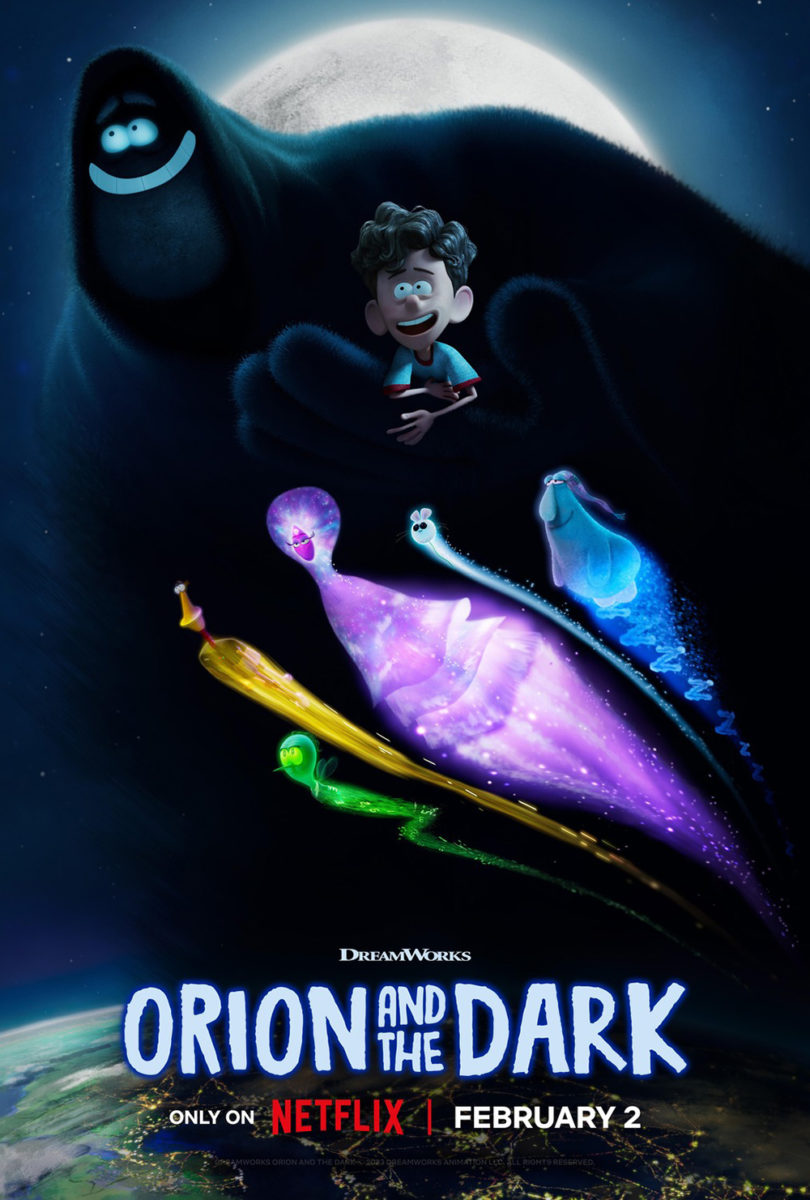
My feelings on Hustle LA’s Orion and the Dark (Netflix, February 2) are very much the same. I love the mood of the teaser with those floating eyes and seemingly disembodied hands reaching around the young, scared boy’s headboard. It has a Jim Henson Muppet style that really works to make the fear palpable while also maintaining a wholesome atmosphere that ensures audiences know things won’t get too dark.
Its success is a product of “less is more” thinking, considering the second sheet loses the mystery by turning from uncertainty to adventure. Suddenly the darkness has a full body and smile to match the boy’s––any sense of foreboding gone in a blink. Add the quintet of flying characters beneath them and it just starts settling in your mind as another familiar tale of nighttime imagination. It sells safety whereas the first sold a more intriguing danger.
The same happens with The Taste of Things (limited, February 9). MOCEAN’s stunning American poster really utilizes the composition of the image in a way that builds tension and drama in a scene of love manifested through the culinary arts of romantic teamwork. The chemistry this couple possesses becomes a product of the act itself rather than a separate focus slapped atop its background scaffolding.
That’s not to say Myredje’s French poster is bad. I think it also works good enough; it’s just not as effective when it turns our gaze away from the kitchen and onto the characters themselves. Rather than showcasing love and food, it’s love amidst food. It’s about their smiles for each other within a setting, not how that setting helps create their smiles.
I know. It’s doesn’t seem like a huge difference, but––boy––is it impossible to avoid when looking at these two side-by-side. The dynamism behind MOCEAN’s choices is just breathtaking by comparison.
Faces


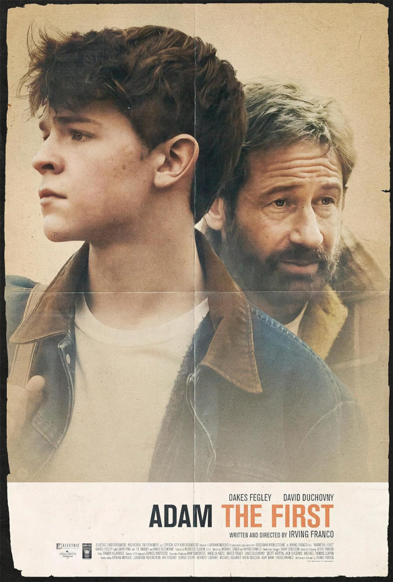
I’m a sucker for a well-made illusion. Too often an attempt like that with Adam the First (limited, February 14) will think a fake fold and fraying is enough to pretend the poster is a “real” artifact despite the text and photos being as crisp and glossy as a computer-generated design. You need the texture. The muted colors. The grain.
This one has all that… right down to the text possessing a softer focus, like it should after being mass printed on a crappy printer to hand out as fliers. The rips continue along all four sides and the fold is more a crease flattened-out so as not to detract from the imagery itself. And I’ll take the top version with the supporting cast boxes every day if the alternative is an obviously Photoshopped second-billed actor like on the right. That line of faces adds to the motion of the whole, too, drawing us down towards the title.
I really like the P+A’s poster for The Promised Land (limited, February 2) below, but there’s something about the one riddertoft made above that hits harder. It’s probably that stare from Mads Mikkelsen threatening to tear you apart in its silence. Maybe it’s also that it reminds me so much of, coincidentally, P+A’s poster for First Reformed.


That fire line cutting across the bridge of Mikkelsen’s nose merges the two images together to show how the potential for brutality lies in nature and man both. It bisects the page into light and dark in some sense, too––the two halves of this character who only wants to be able to farm his land and earn a title before discovering he’ll need to fight one more war to do so.
The P+A version is more storybook and regal in its opaqueness. You still get the fire line, but it’s part of the background rather than part of him. And he stands tall and proud rather than wild-eyed and ready to pounce. All the same pieces are present, but the tone is so very different.
Skin Deep (limited, February 2) similarly utilizes the same concept in two different ways. For a film about a place where you can transfer your consciousness into another person’s body to feel exactly how much the physical impacts the psychological––per health and identity––a superimposition of characters upon each other to blur that line of self is an obvious choice.
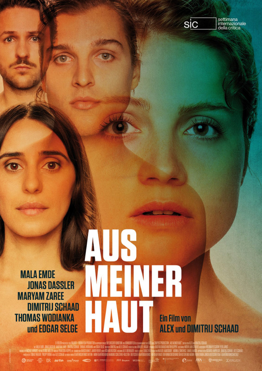
Whereas the original German-language sheet uses opacity alone to bleed one face into the next, its American counterpart goes one step further in creating a whole new cast of characters via profile and portrait mixing between each other. It’s a captivating result that uses shifting perspectives as well as overlaps. Two eyes become three. One nose becomes two. And the division of the portrait into two profiles adds a level of fractured self to the whole: body and spirit diverging.
Beyond just that image, though, I can’t say enough about the layout itself. The use of the bright-white division to hold a critic quote and the perfectly sized neck and shoulders to house the credit block for legibility without words clashing on multiple backgrounds. Everything is measured with precision, even as the faces seem to ebb and flow like an untamed lava lamp perpetually morphing its shape.
Title First


I may be going against my thesis here, considering the first thing you see on the poster for Invisible Fight (limited, February 23) is the man in sneakers jump-kicking like he’s a Mortal Kombat sprite, but the beautifully illuminated title is placed above him––so I’m going to say it works.
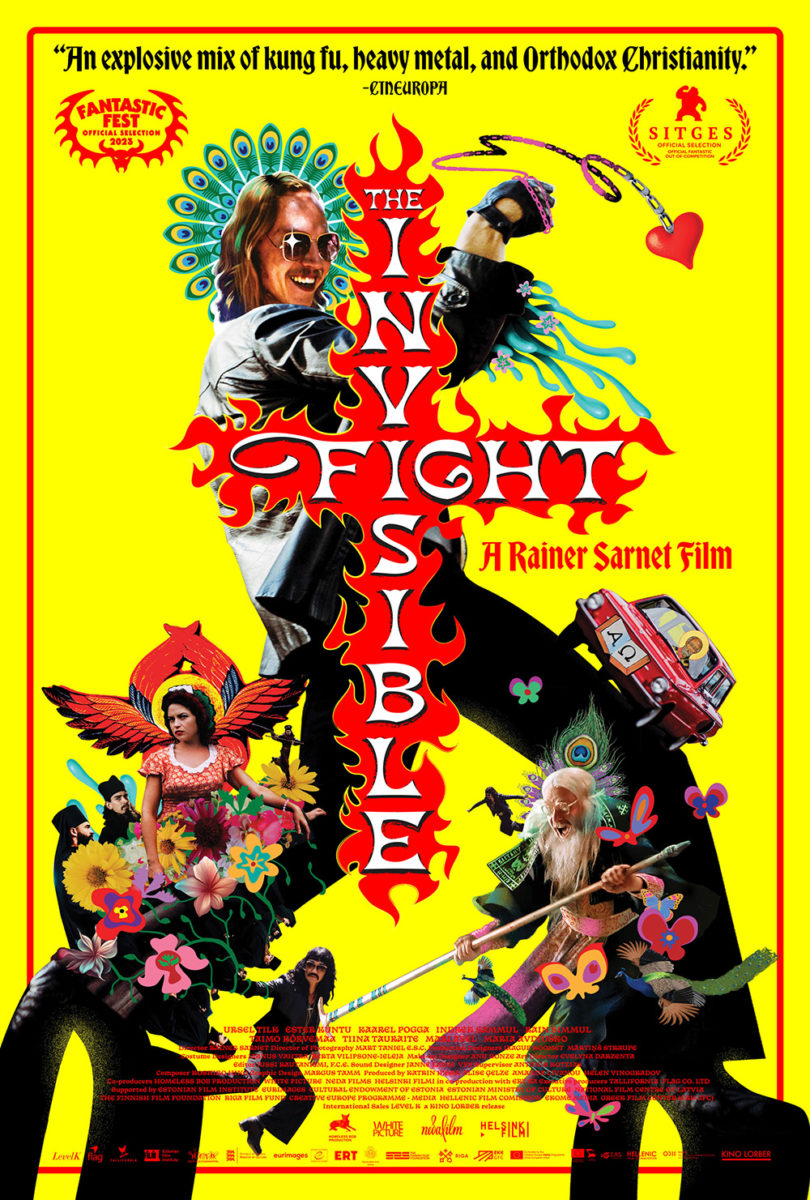
This sheet is just wild. You want to think it advertises a comedy due to its juxtapositions, but it’s played so seriously that you must pause and consider that it might not be tongue-in-cheek after all. That’s how good this scene is at epitomizing the dual threat nature of a genre hybrid. Lean into the tropes while you subvert them.
The second iteration sheds a bit of that duality by going full chaos with its bright-yellow background and augmented character collage with animated embellishments. It delivers much of the same impact and intrigue (retaining the title treatment even if the new coloring makes it a bit harder to read), just without that mask of mystery.
AV Print’s neon drive-in sign for Drive-Away Dolls (February 23) is, however, fully aligned with the thesis. So much so that you would be forgiven for missing the fact that both Margaret Qualley and Geraldine Viswanathan are in the frame. This thing is text upon text in a faux-realistic style to match the myriad ways in which such signs vomit more information than they can feasibly contain.
Title. Tagline. Cast. Crew. Florida? I love that that last bit is upside-down, literally spinning your eyes around before finally hitting the scene below the giant arrow that’s screaming for you to find it. That both women can make us desperately want to know what’s in the trunk while completely ignoring the bullet holes adorning the side of the car shows the power of context clues and intuitive design.


It’s why I’m still so flabbergasted about the studio’s other poster decisions. A graphic hourglass woman with car driving towards her genitals à la The Refinery’s Movie 43? A slapdash collage balanced on an “X” formed by tire tracks and spread legs? You have a real sense of artistic nuance battling a pair of raunchy comedy clichés. And––maybe it’s just me––the latter outnumbering the former 2-to-1 has me worried about the film’s overall success.
One title you shouldn’t worry about, however, is Molly Manning Walker’s brilliant How to Have Sex (limited, February 2; MUBI). This is a great movie matched with an equally great poster by Intermission Film. And it happens courtesy nothing but a memorable still and immaculate typography.
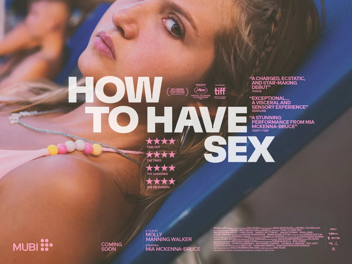
It’s so good that it works as one-sheet and quad-sheet with little alteration. The image is still expertly cropped to leave Mia McKenna-Bruce with one eye watching and the title is still boldly placed front-and-center to grab our attention. I’ll admit that the one-sheet is tighter insofar as building around the title with its quotes, stars, and laurels, but the drop-off is minimal once things expand outwards.
Both leave block arms protruding from each side as though handles with which to spin the group. These words are showing us around its nooks and crannies to then branch out and take stock in the photograph’s mix of fun (beach wear) and anguish (a face begging for help amidst an environment too preoccupied with its own pleasure to recognize it).