It’s a weird month. No one is talking about the new Marvel movie. Everyone is clamoring for offerings from streamers Netflix and Apple. And somehow another Trolls movie’s coming out already. Ask anyone on the street if they know the title of Disney’s new animated movie Wish (opens November 22) and you might be hard-pressed to find the answer.
Primed for International Oscar hopefuls and small-scale indies to take your local multiplex over, November should be delivering some gems your way as a result. So take a look at the walls and see if any of the below are hanging besides the glossier mainstream fare. They might just be worth a ticket.
Two-hander


While there’s obviously more than two people on the poster for Radical (limited, November 3), the story being told concerns two entities: teacher and students. And rather than focus on the former standing in front of the latter so that we see his face––especially considering the “he” in question is the only billed actor––the image provides the reverse. It shows us his impact instead. The engaged, entertained, receptive kids hanging on his every word.
It’s a wonderful photo made even better by its composition and vantage point from the floor. This is a huddle rather than a lecture. A community of equals rather than a starkly segmented dichotomy. And that scene is allowed to shine despite the title being so big and bright due to the compressed nature of the angle, giving it the breathing room at top and bottom to house all text without overlap. Simple yet effective.
So too is P+A’s May December (limited, November 17; Netflix, December 1). Two women given equal share of the frame with only the positioning of foreground and background delineating them. Which is given more power in that dynamic, though? The one in front or in back? I think the uncertainty is the point. It changes depending on context.
The real star of the poster is the typography. The outlined sans serif is legible and big enough to be read, but also open as a window to the image rather than closed as a wall blocking it. The photo is king with this decision confirming as much while not sacrificing the title’s importance to the advertisement itself.
And it provides a contrast wherein the “less-important” text appears as a thin sans with a similar weight of the outline to ensure the size and negative space pops the title out instead. You lose that in the French sheet with all the text becoming a jumbled mess together––made worse by the layout. To me it reads that Portman and Moore are in a movie called May and it arrives from Haynes in December.
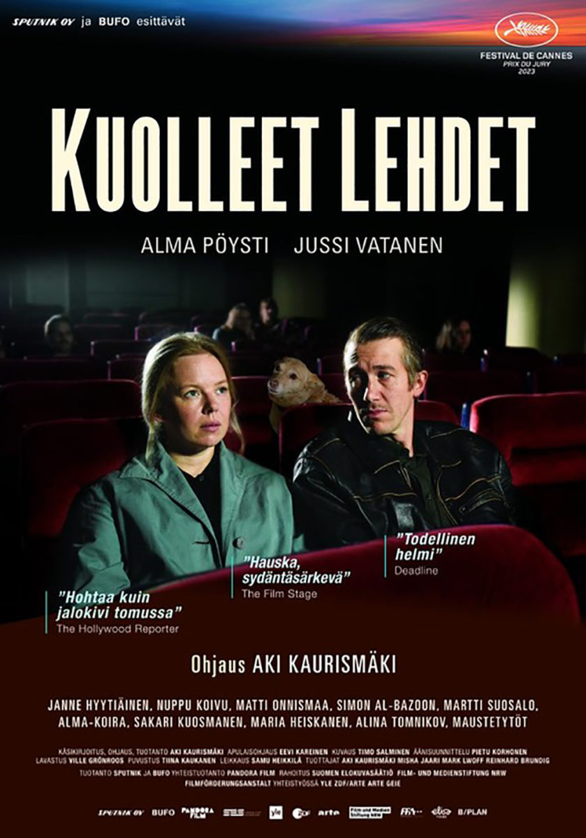
The best two-hander of the month, however, comes via Fallen Leaves (limited, November 17). This definitely has a story being told with Alma Pöysti looking at the movie screen in front of her while Jussi Vatanen looks only at her. More than that sense of romance and longing, though, is the humor that exists between them in the form of a dog doing the same. Vatanen better watch out.
The text is also gorgeous––perhaps the real reason I like this design so much. The font’s stenciled breaks give the whole a handmade feel while the crisp, headline nature of its base serif retains an austere regality of permanence. And the use of size and color to allow for symmetry and legibility despite alternating line breaks is perfection. The foreign-language alternative is bland by comparison.
Combustible


Thank goodness for Oscilloscope––they seem to be one of the few indie studios consistently fostering unique posters that go beyond straightforward, glossy portraiture. Derek Gabryszak’s This Much We Know (limited, November 10) is no exception: it seeks to portray both the film’s main intent (a suicide) and its over-arching revelation (the potential connection between a nuclear-waste dump and the town having one of the country’s highest suicide rates).
The assumption, then, is that the person in the middle of the radioactive symbol is the deceased and radiating out from his photo are scenes of the place, death, and survivors connecting to him. It’s concise yet informative; simple yet complexly cogent. Add the symmetrical layout, bold title, and napkin background and the whole becomes more than just a marketing ploy meant to turn heads. It becomes a contextual collage that boils the film down to its core so viewers can get a sense of what to expect.
Monster (limited, November 22) is just a glossy image of its young main characters, but it is certainly not straightforward. Not only do we get a handwritten typeface reminiscent of brushstrokes that could easily signify something sinister in blood, but there’s also the slowly burning bottom edge with fire threatening to consume the otherwise-playful scene.
Or does it actually prove the scene isn’t playful at all? That what these kids are celebrating might not be innocent? The duality of that flame causes us to question what it is we’re seeing. Maybe it’s a truth soon to be upended or maybe it’s a lie seen through an unreliable filter. Either way, the mystery begs for us to find out.

And while Youth (Spring) (limited, November 10) isn’t combusting, you can imagine that a spark might send that mountain of cloth up quick. That’s not the intent, of course. It’s just my way of shoehorning it into this trio. There’s no real sense of urgency at all: just a scene of comfort meets stress since we can’t know whether he’s lying on the pile because he doesn’t have to worry about it or precisely because he must.
The poster for The Chambermaid instantly came to mind when looking at this one––its use of a fabric in excess as a means of creating negative space with which to design atop. There it’s the bold white contrasting with her dark clothes. Here it’s the dark grays consuming him until only his skin pops out from the shadows. Both are compelling in their extreme sense of overwhelming environments making it so the character within simultaneously becomes a product and creator of the mess. We must watch to discover which.
Overlap


At the Gates (limited, November 3) has some major thriller vibes as its Rockwellian portrait of a family at dinner shifts from caring to foreboding with a gilt iron prison created from the shadow of an outside gate.
It really gets to the heart of the synopsis: an affluent family’s housekeeper and son are given shelter from INS by her employers only to find themselves wondering if they aren’t hiding at all. What if they’ve been trapped?
To look at the children opposite them is to also jump to conclusions that whatever sinister dealings beneath the façade of suburban life exists for Ana and Nico also exists for them. Maybe that will make them allies against their parents. Or perhaps it will give them an opportunity to exploit their prisoners and earn leniency for themselves.
The tagline for All Dirt Roads Taste of Salt (limited, November 3) is “Time is a tender embrace.” It’s a romantic sentiment embodied by the overlapping arms and hands of a woman and her children. And it’s also a wonderful thematic image for a film that spans multiple generations of one family while explaining how our ancestors live on within us. That one limb doesn’t end where another begins, but instead continues through it.
These arms are weaving a tapestry of history, life, love, and loss. They are the roads traveled with the salty sweat of the title as much as proof that this family put down roots with which to grow and evolve from. It’s a beautiful image for a beautiful film that seems to have stuck with everyone who saw it at Sundance this year.
So, too, is Geoff McFettridge’s hand-painted illustration at the center of A Still Small Voice (limited, November 10). It’s one person in triplicate, each instance creating new shapes where they cross and combine into darker colors. Do we infer an evolutionary path? A spiritual shift? Or perhaps an echo of the voice from the title growing louder or softer via its reverberation within the frame?
The words speak to a manifestation of God to Elijah and the film is about a hospital chaplain attempting to help her patients through spiritual care only to find she “must look deep within herself” for success. So where does the voice originate? Her? The infirm? God? Add the possibility of the abstract image being a sort of holy trinity of body, mind, and soul, and you can get lost in the depths of its metaphorical potential.