It’s Oscar month. And that means Best Picture alt-poster time.
Four of my favorites are below, courtesy of the usual suspects. I love that some (George Grey and Eileen Steinbach) use a consistent theme to connect their line-up while others (Haley Turnbull and Matt Needle) create whatever that title inspires in them. There’s obviously no wrong direction to head and, regardless of which they choose, we get to enjoy the spoils of extra art long past the actual marketing campaigns.
And despite those nominees not necessarily needing the added boost, it is nice for us to receive another in-road to talk about them again. Because, as is usually the case, the morning after the Oscars unofficially moves everyone’s attention towards next year’s hopefuls (if Sundance praise hasn’t done so already).


Artists: George Grey (Killers of the Flower Moon), Haley Turnbull (Poor Things), Eileen Steinbach (The Zone of Interest), Matt Needle (Anatomy of a Fall)
Paired up


You must love the happy couple on the poster for Lost Ladies (limited, March 1) precisely because they aren’t a happy couple. It’s the perfect image for this very entertaining mistaken-identity narrative wherein two grooms end up with the other’s wife after the custom of staying covered with near-zero visibility leads the two women to be passively guided by the wrong hands.
The one-sheet is a play on one of the film’s best jokes: a wedding photo given to the police to find the missing bride doesn’t show her face. Maybe the image itself can’t convey the absurdity of that situation, but the choice of a fun retro font for the title goes a long way towards ensuring the tone stays light.
Femme (limited, March 22) leans the other direction with its red hue and bold sans title. This is a drama through and through with an air of mystery and suspense crafted by the image’s blocking and shallow depth of field. The tagline “seduction is revenge” helps create a tense mood too.
What I like about the construction of the image, however, is the shape of Nathan Stewart-Jarrett and George Mackay’s faces. One could say they merge to make a sort of cubist visage with two eyes at different angles and a sideways nose despite the front-facing gaze, but I see a heart instead. Their eyes become the rounded bumps at the top with Mackay’s chin and Stewart-Jarrett’s lips meeting to form the point at the bottom. I keep tracing that shape, going up one cheek, around the eye, and down the other.
It’s a perpetual spiral between the two men that works to pull them closer and closer until the bright-white letters below wake us up with a loud scream.
And then there’s Silver Haze (limited, March 1). It’s a more straightforward scene of two characters like Lost Ladies, but possesses the same air of mystery as Femme from its coloring and atmosphere.
I’m struck most by the ease of its composition and expert precision in balancing so many pieces without creating a single distraction. The title and credit block receive their own section to both breathe and earn our attention. The laurel and top-billed names find themselves grounding the wealth of empty white space at top without falling into symmetrical or center-justified cliché. And the image itself isn’t merely a portrait nor a scene with a narrative––it’s both. These women are together yet separate, adding tension as well as the gap that lets the text above draw us down without sacrificing harmony.
It’s a gorgeously simple and effective piece.
Collaged


A collage of heads and actors has been the scourge of the movie-poster aesthetic for decades, but that doesn’t mean collage is inherently bad. Case in point: Butterfly in the Sky (limited, March 15).
This illustration is all about movement rather than static boredom (see Dune: Part Two, amongst others, for the latter). It utilizes a rainbow as its backbone and propels us out of the television at bottom-left into the imaginative wonders that Reading Rainbow provided for generations. It takes us through history and geography, technological achievement and the natural world. And it feels very much like the show itself.
And then there’s the collage of Carol Doda: Topless at the Condor (limited, March 22). Here we get the “scrapbooking” technique of cutout figures reconstituted elsewhere, regardless of true scale or size. It uses the halftone newsprint of archival material shown in the documentary to provide a sense of time and place to the topic while also self-“censoring” the titular topless dancer.
It also utilizes spot color in a nice way to create balance. Half of the whole is red and half-black-and-white, but that background color and the yellow of the title also come into the protestors nestled behind Doda’s folded arms. They keep her figure from floating against the heavier backdrop while connecting a diagonal line from top to bottom as a guide for our eyes.
Now, while it may seem counterintuitive to end this section with a poster that wields the exact type of collage I said Hollywood has driven into the ground, I’m using La Chimera (limited, March 29) to show that an assembly of faces and actors doesn’t have to be forgettable. You simply must do it right.
I know that’s easier said than done when it comes to contractually obligated hierarchies, but you can’t tell me the artist here doesn’t adhere to such stipulations insofar as making Josh O’Connor the biggest head with a gradual cascade downward as we move farther back.
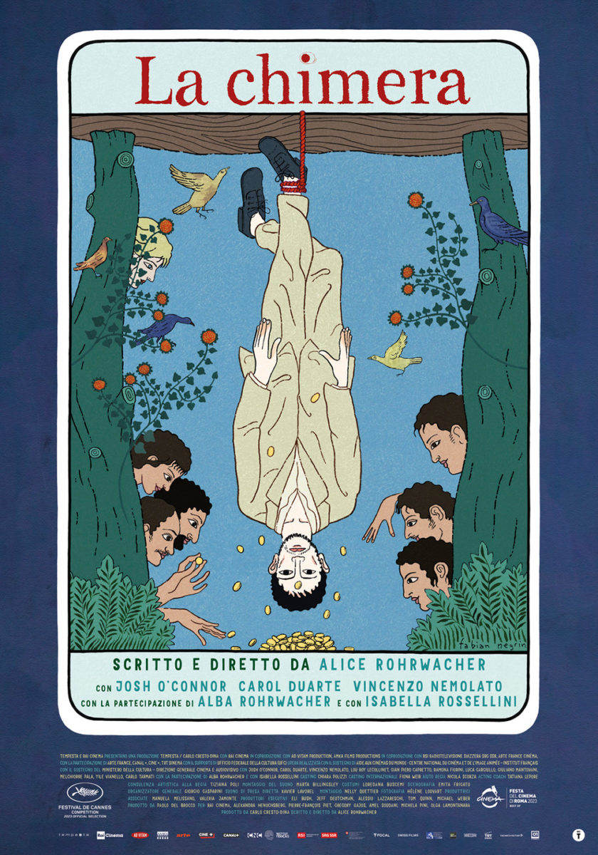
What truly sells this illustration, however, is that it’s not merely a totem pole of characters on the center-vertical. There’s a flow here. An “s” snaking down with O’Connor as the midpoint between supporting cast and statuary. Add a hand-drawn title and imperfectly rolled squares of ink as backdrop and you get motion, intrigue, texture, and celebrity all at once.
It shows that you don’t have to embrace the glossy impersonality of floating heads or the completely interpretative thematic left turn of a cartoon tarot card (e.g. the original poster). You can find a balance between them if you’re willing to let the artist inject some life into an otherwise long-dead archetype.
Prominent titles


If you want to evoke late-70s/early-80s children’s fantasy films, choosing the same font as Tom Jung’s poster for Ralph Bakshi’s Lord of the Rings should do the trick. It’s literally the only thing I thought about when first spying the artwork for Riddle of Fire (limited, March 22). I wanted to discover that this “neo-fairytale” had orcs and hobbits in it too.
Beyond the font, though, this poster works as a retro pastiche with its high-contrast photo, hand-drawn fire motif, and fun little sun asterisks labeling genre, setting, and character names. You can almost see freeze-frame introductions for each kid with an overly serious voiceover describing their weapon of choice or some weird fact for comic relief. It just feels DIY and extremely charming––as if these kids made the movie themselves.
For MUBI’s High & Low (limited, March 8) there’s no way the title isn’t the first thing you see, regardless of nostalgia or intent. It practically fills up the entire frame with its thick brushstrokes of white covering the wild fashion look beneath. On a quick glance, you might even think someone really defaced the movie theater wall, scandalized by the wardrobe choice.
The fact I really don’t have anything more to say about it speaks to how strong a choice this typography is. When something proves that eye-catching, you need only make sure not to ruin the effect with everything else. So you edit two critic blurbs down to one word each to subtly bookend the bejeweled skull. Match the handwritten nature of the main title to present the subject’s name via subtitle. And stick to MUBI’s credit template at bottom so that graffiti can fly free.
And that leaves us with a stunning poster for Yuni (limited, March 22). Yes, the title is also the biggest piece of the whole again, but it’s not necessarily the most prominent considering the photo of Arawinda Kirana takes up three-quarters of the page. The job is therefore to balance things so the text garners just as much attention in a third of the space.
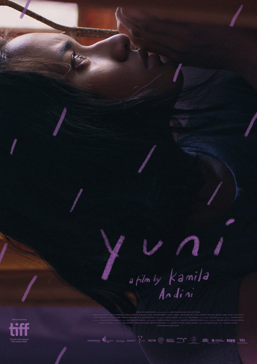
Having the word pop off a white background while the image’s muted purple flattens out should probably be enough, but the designer goes one step further by mimicking the scene’s rain with lines in the same bespoke scrawl. The choice renders the image as the canvas rather than the frame itself––a backdrop to be drawn upon in a similar color that’s dark enough to be legible yet homogenized enough to keep our eye on the figure being outlined by the “rain” first and foremost.
“Yuni” thus becomes an extension of that weather. More short lines coming down from the white “cloud” above her. It may not be quite as dramatic as the darker, 90-degree-tilted alternate sheet, but it’s more powerful in composition and visual language. The second may draw you into its ready-made mystery; the first presents a window with which to interact and create your own. Though both are great, I’ll take the original every day.