Just two bona fide horror movies opening wide this October, eh? And both have existing IP to help get them across the finish line whether it be cinematic legacy (The Exorcist: Believer opens October 6) or a videogame franchise (Five Nights at Freddy’s opens October 27). I guess that’s the result of genre films releasing year-round now. Halloween somehow became home to the sure things that might not be quite as original or inventive to sell on their own. It’s no surprise then that neither had a memorable poster campaign to include here.
Speaking of that. Neither did Killers of the Flower Moon (opens October 20). The stuff Apple put out makes it look like your run-of-the-mill mediocre drama with three heads (Leonardo DiCaprio, Robert De Niro, and Lily Gladstone) and a lot of giant text. I really hope it earns a Best Picture nomination just so the alternative poster community can try and liven things up with actual creative marketing takes. Fingers crossed.
Straight on


There’s no excess when it comes to P+A’s poster for Foe (limited, October 6). You have your stars in cropped close-up, the title big and stretched end-to-end, and as few credits as possible—three stars, writers, and director. It’s as much a teaser as it is a final sheet. I think the original quad was exactly the same. Only the “coming soon” has been changed to an opening date.
Many posters try to do the same and fail because they cannot find an attractive and compelling composition to deliver it all. By turning the image ninety-degrees and using the “O” of the title as a center point, everything feels as though it is moving when you aren’t looking directly at it and stopped when you do. Our eyes want it to rotate so we pretend it is, the “O” becoming as much an axis as a bullseye. Add the precise positioning of the word to cover one of Paul Mescal’s eyes while framing one of Saoirse Ronan’s and it starts to almost seem too perfect. There’s beauty in that cold calculation.
Kellerhouse, Inc. goes for provocation instead with their sheet for The Killer (limited, October 27; Netflix, November 11). James Paterson paints Michael Fassbender so that he’s not only looking straight at us, but also pointing a gun. Much like with Foe, the circle of that barrel becomes impossible to ignore. We want to look inside at its darkness. Its black void. Fassbender’s dark soul. The bloody bullet hole directly above his head.
I love the image. I kind of hate the typography. That ultra-bright text with crisp black drop shadow feels way too mechanical when juxtaposed against Patterson’s brushstrokes. You cannot deny the intrigue born from that title treatment, though. Kellerhouse is great at making memorable logotypes that buck the trends and feel wrong in some way. Knocking the “I” in “Killer” down and pushing the “LLER” so far over that it becomes difficult to read does exactly that.
And what is the purpose? The “I” doesn’t seem worse for wear. It’s almost as if it dodged the bullet. Ducked, scrambled, escaped. Yet the blood still flows. It makes no sense literally, but perfect sense figuratively. It holds your gaze.
So too does Bianca Moran Parkes’ Anatomy of a Fall (limited, October 13). Not because it challenges us by facing us straight-on like the last two examples, but because it allows us to face it. We’re floating above the scene. Looking down at a murder in the snow, but also the intentionally off-balanced words making up the title. It almost feels like a puzzle. Like we’re supposed to be reading more into the total shape itself. Is it a “T”. A “Y” courtesy of the actors? Something else?
You may wonder why I say “unbalanced” considering the whole is perfectly symmetrical. I’m not speaking of the composition as much as the decision to stack each word of the title on top of each other despite the first being so much longer than the others. It becomes a sort of precarious Jenga board as a result. A seemingly sturdy pedestal holding the “V” of its scene above (you could describe it as a heart too) that itself is about to fall.
There’s danger in that depiction. The promise of more tragedy to follow. And that’s why it’s so strange that the French sheet leans in the complete opposite direction. Here are two people laughing and smiling. We can say it’s the calm before the storm knowing what the US poster depicts, but not without it. By itself we think comedy. Romance. Only together do they conjure horror.
Cropped pairs


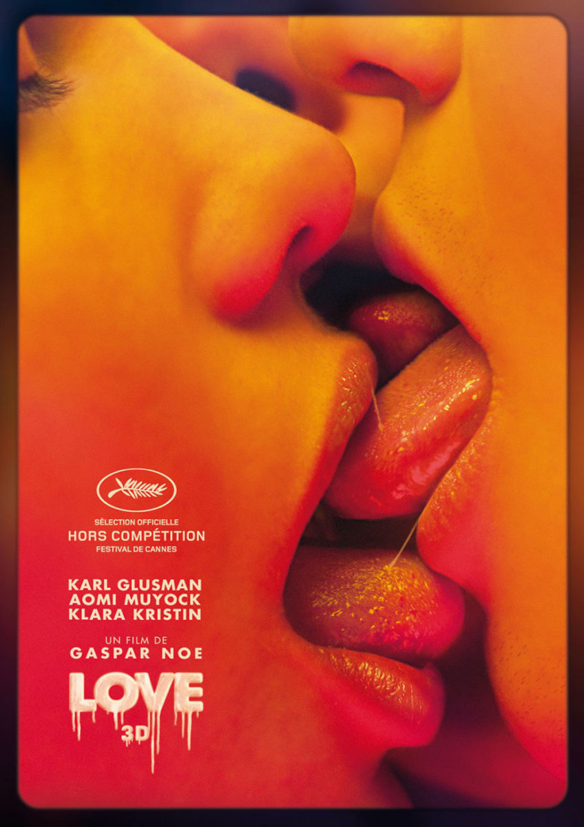
The crop of Empire Design’s Cat Person (limited, October 6) isn’t unique in and of itself. Studios love to focus on a couple up close and personal—kiss or no kiss. What’s different from say Gaspar Noé’s Love is that they aren’t equally devoted to the act unfolding. He’s all-in. Eyes closed and mouth open. She is not. What does it mean? I’m sure I’d know if I read the infamous short story on which the film is based. There’s a good chance you do.
It’s okay if you don’t, though. Her expression is enough to pique interest and get you to want to find out more. Because it is in many respects a teaser despite all that text. If you can’t read any of it due to its size and being condensed, is it really text at all?
I really like the subtle shake of the title. It alludes to there being a rip in reality or perhaps two worlds colliding without ever being able to fully meet. There’s added tension in that. A question of veracity. Can we believe what we see?
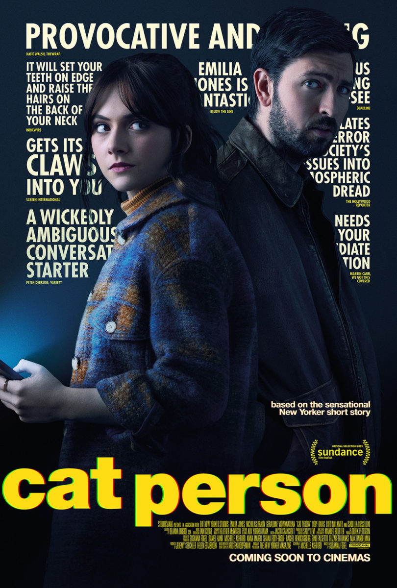
So, it’s nice that that piece carries through to the critic quote iteration. Nice because it provides the whole’s only real sense of suspense since the actors’ pose is much more generic. I am fascinated by the choice to cover so many words, though. You must really play Mad Libs with some of that praise. It reminds me of that time Legend printed a two-star review in such a way that it appeared to be four.
GrandSon’s The Royal Hotel (limited, October 6) crops its pair in close too, but with drastically different effect. And not just because they aren’t kissing. No. It’s more about the claustrophobia of the framing. This is a vertical shot cropped horizontally. Its left and right edges are pushing inwards. They’re squeezing the space until both women have become trapped.
It’s a great psychological effect augmented by their expressions. They do not like what it is they are looking at and yet they cannot get away. They’re frozen in place. Stuck knowing that whoever it is knows they know. It becomes a waiting game as a result. Not a case of if the other shoe will drop, just when. So simple, yet powerfully riveting.
And then there’s the much brighter disposition of The Robot Eye’s Remy & Arletta (limited, October 13). A pair in name rather than image, we’re given a look at lead/screenwriter Micaela Wittman in repose. Is she truly tranquil, though? The dramatic crop may say otherwise as it adds an introspective air of complexity insofar as whether her gaze is one of longing or defeat. There’s a sadness in her eyes to contrast the pastel colors; a melancholy that makes us wonder if her other half is missing for a reason.
The soft texture and washed-out image create a gorgeous visual that should play well next to the heavily saturated, glossy posters Hollywood loves to put on the wall. It feels like a time capsule back to the 60s with its palette and font, if not a fleeting dream. Our interest therefore lies in the aftermath of her inevitable awakening. Does she find love or heartbreak waiting?
Graphic art


Now this is how you flip the script. Fantastic Machine (limited, October 13) is about “humanity’s unique obsession with the camera’s image and the social consequences that lay ahead.” Is there a photo anywhere to be seen on the poster, though? No. Just the words “Science, bitch.”
And with zero context as to what that quote describes beyond the general sense of a camera being a technological advancement and the reality that many people today us it to create memes on the internet, there truly is no better way to drum up excitement. Maybe it will also turn some people off, but the notion that anyone choosing this title based on this black and white advertisement is forced to go in blind feels fresh. It feels divine.
The poster for The Pigeon Tunnel (limited & AppleTV+, October 20) skews closer to text than image too by covering its page in Morse code. Besides an image of subject John le Carré, it’s all horizontal stripes from top to bottom with just the birds flying out from behind him to vary the thickness of the bands.
It’s both busy and minimalist at the same time thanks to those crayon lines in the background working to counteract the rigidity of its otherwise meticulous grid. The actual words can be hard to read due to the overpowering nature of the dots and dashes, but I like the idea of answers being shrouded much like the author’s political thrillers.
I only wish I knew Morse code to read the message hidden within those lines.
Grier Dill’s Once Within a Time (limited, October 13) also falls into the category of being simultaneously too much and just enough. A collage of multiple, disparate graphics overlapping in different colors, the work mimics that which is done on a letterpress—each plate carefully positioned to fill a gap that’s just a little too small to fully contain its content alone.

And yet it’s quite easy to navigate, regardless. The red text cascades down like a waterfall over the pictures’ cliffs. Each line a staccato jump point to the next as our eyes travel through diagrams, drawings, and clip art graphics. There’s seemingly no rhyme or reason to the images themselves either: an embodiment of the title presenting us a look within time rather than upon it. They all exist together for us to pick and choose where to go next.
There’s even an animated version (Dill is an animator who also handled the visual effects on this film) that adds some fun to the chaos as it speeds up from words to pictures, but it also sadly avoids leaning into the letterpress aesthetic by popping in each part separately rather than together, matched by color. It’s a personal preference, being a fan of that printing technique, but I imagine all the yellow populating the page first. Then the blue, green, and black before the red finally stamps down to give it its full name.