“Don’t Judge a Book by Its Cover” is a proverb whose simple existence proves the fact impressionable souls will do so without fail. This monthly column (with a special year-end retrospective today) focuses on the film industry’s willingness to capitalize on this truth, releasing one-sheets to serve as not representations of what audiences are to expect, but as propaganda to fill seats. Oftentimes they fail miserably.
It’s kind of crazy to see how far the poster industry has come in the past few years. Where we used to get excited for the latest Mondo sheet because of how rare and wholly original they were six years ago, it seems as though every IMAX release these days gets an illustrative “limited” print regardless of the title. Studios have embraced that aesthetic without sacrificing what they know, compromising so fans get the pretty designs and theaters get the fifty character sheets to assault ticket-buyers with over-saturation.
One good thing to come out of all this, however, is a merging of styles. You can see it via the universal praise bestowed upon James Jean and the unique look of post-photo portraiture he’s brought to multiplexes through Honorable Mentions The Shape of Water and mother!. Studios are hiring artists to give them a broader palette to choose from. Their design firms can still use the same typography and excess of text as their photo-based work, but the illustrative effect stands out just the same.
It was tough to therefore whittle my shortlist of 60+ sheets to the 25 you see below. Many firms wielded mood and atmosphere in a good way (see the synergistic similarities of Art Machine’s Murder on the Orient Express and BOND’s Three Billboards). Others played with composition to stage mystery (see the pushed off-center focal points of InSync Plus’ Personal Shopper and Leroy and Rose’s Only Living Boy in New York). And two decided to utilize Jennifer Garner as object: spy (Devon Gibbs’ The Tribes of Palos Verdes and target (InSync Plus’ Wakefield). I really like all six of these and yet none made the cut. That’s a good sign for the art of movie marketing.
Honorable Mention:


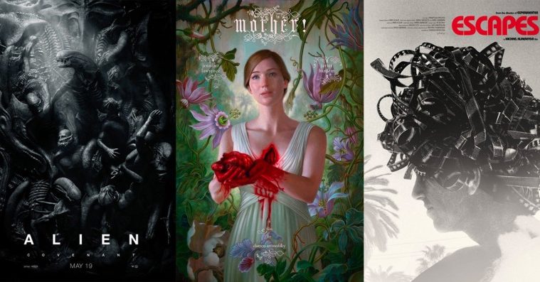
#25 – The Post (BLT Communications); #24 – Justice League (BOND); #23 – Risk (The Boland Design Company); #22 – Table 19 (MIDNIGHT OIL); #21 – The Shape of Water (James Jean); #20 – Alien: Covenant (BLT Communications & Ten30 Studios); #19 – The Lost City of Z (BOND); #18 – Wonder Wheel (The Refinery); #17 – Darkest Hour (Empire Design); #16 – Human Flow (Gravillis Inc.); #15 – Downsizing (Unknown); #14 – Get Out (LA); #13 – Star Wars: The Last Jedi (Midnight Marauder & Tony Stella); #12 – mother! (James Jean); #11 – The Void (Phantom City Creative).
Top Ten:
#10 – Blade of the Immortal (Gravillis Inc.)


Gravillis went all out on their Blade of the Immortal sheet with dramatic typography, tactile layering, and kinetic composition. To look at the placement of the actor is to feel as though he’s slo-mo spinning in mid-air, ready to slice and dice whatever is in his path. The red circle around the title enhances this motion while also lending a Japanese signature stamp aesthetic. This is a straw buff page put through a one-color letterpress of detailed black etching topped off with a blood-red seal. Add a couple of splotches and watch as you become his eviscerated victim bleeding out atop him.
#09 – Escapes (Brandon Schaefer & Jump Cut)


For Escapes, Brandon Schaefer delivers a captivating image that excels beyond the product it advertises. Do you need to know what this documentary is about to find yourself mesmerized by the artwork? Does it matter if the man beneath that brilliant Medusa hair of film is Hampton Fancher or some nobody? No and No. This is a work that draws you in; an image that lingers in your brain after your eyes find another object to view. You want to know what’s on those strips, what stories will be told. You want to get in that head no many its owner’s identity. And you will remember the brightly colored title to do exactly that.
#08 – Spettacolo (Brandon Schaefer & Jump Cut)


I was happy to put Schaefer’s Spettacolo after his Escapes because it shows how talented designers can be when left to their devices and not forced into straight contractually-obligated portraiture (or into mimicking a single style ad nauseam). He moves into full optical illusion with this one, turning the page itself into a scene with enough depth to invite us inside. He breathes life into the tagline with intuitive visual metaphor, the vibrant colors that should overwhelm taking a backseat to the dark abyss of the unknown at center. And the title stands out in its subtlety, whispering its name as we seek the adventure we’re being beckoned closer to enjoy.
#07 – Machines (Marcel Weisheit)


I knew it would land on this list as soon as I saw Marcel Weisheit’s poster for Machines. It’s just a gorgeous example of typography and the way in which text can integrate with the image rather then compete. He actually did two (here’s the other), but this one is my favorite because of how the letters adapt to the photo. The reason that the “HIN” is pushed right and the “ES” left by itself is because the man in the foreground would block legibility. This title block is therefore photo-specific—it loses part of its purpose when combined with that other image. These men are the “machines.” They work no matter what is in their way.
#06 – Raw (P+A)


It’s great that a foreign independent horror like Raw has multiple posters, but P+A’s cannot be beat. While I still don’t love how big and compressed the credit box is at bottom, it doesn’t distract from the gorgeous textured grain of the photo or the razor sharp Modern Serif font’s high contrast thick to thin construction cutting into it. The way the blood drips off her nose towards the title keeps our gaze focused on its absence of color, its placement at center making it impossible not to still feel her laser-focused eyes at top. Looking up at them risks altering her view towards you instead, though. That blood isn’t from injury, it’s a warning to run.
#05 – Free Fire (BOND)


BOND distills Free Fire to its aesthetic of guns and 70s style. I love the limbs’ three-dimensionality as they simultaneously exit the center with a goofy lilt similar to when two people get stuck in a single doorway. The concept embodies its ensemble’s trigger-happy nature and yet the designers refuse to sacrifice art for commerce. They add intrigue with the bold font’s subtle diagonals providing motion and comedy with the inspired decision to pump the shotgun with two different hands. This and Empire Design’s genius character sheets depict a one-two punch of unyieldingly violent chaos with stunning economical beauty.
#04 – It Comes at Night (InSync Plus)


The best suspense horrors generally have one thing in common: an ability to scare without revealing their monsters. But while you can build dread with the combination of performance, cinematography, and sound, selling that mood with a single static image is near impossible. InSync Plus rose to the challenge with It Comes at Night‘s darkened vacuum of unknown terrors and succeeded. The typography coming at us rather than leading inward conjures a sense of something ready to pounce. It’s purely psychological—this mystery freezing us in place—but like the dog we stare with futility until everything goes black for good.
#03 – Carrie Pilby (The Refinery)


The Refinery’s Carrie Pilby embraces the graphic approach to portraiture that’s needed to break free of the stranglehold glossy photography has on the industry. Simply putting Bel Powley on the poster isn’t enough to draw us in because another actor’s face is on the wall at either side. But when you deconstruct her image into a duotone of flat hair and softly detailed features with a hint of red to imply rosy cheeks and lips, you create the potential of reaching a viewer’s imagination. Let your audience fill in the images blanks by engaging their brains. Mark them with a memory of something familiar experienced in an unfamiliar way.
#02 – Super Dark Times (Gravillis Inc.)


There’s no better way to engage your viewer than directly. The question is how to do it without feeling silly. Just because your actor looks at the “camera” doesn’t prevent us from looking through him/her onto “it”—the art. Give Gravillis credit because they’re Super Dark Times dissolves all sense of “it.” They flip the dynamic between art and consumer so that the three silhouettes transcend the page via their act of “catching” us. Their flashlights imply we’re sneaking around and currently stuck in the open with nowhere to go. Those dots are like tractor beams forcing us to divert our eyes towards the hand-scrawled title below. We’re active participants.
#01 – Colossal (Akiko Stehrenberger)


I saw Akiko Stehrenberger’s insanely good Colossal sheet in April and knew it would reign supreme. The film begs you to go in cold so as not to ruin its surprises, but NEON never managed a poster or trailer devoid of spoilers. Where they failed, Stehrenberger dazzled. On the surface this painting is a minimalist portrait of Anne Hathaway’s character—simple, attractive, and mysterious. Once you watch the film, however, it rewards you by transforming into a keenly measured optical illusion worthy of awe. Every poster should aspire to approach the levels of intellect and artistry this gem provides.
What is your favorite poster of the year?