The amount of high-ish profile movies coming out this month almost makes it seem like the industry is back in business. It’s not. They’re mostly all limited release / drive-in / VOD hybrids, but the fact that distributors are ramping up for the fall season regardless of everything shows that the tentativeness about forgoing a wide release to let a title enter this brave new world has somewhat dissipated.
A lack of big studio pictures creating a vacuum that must be filled helps and the little guys are finally taking advantage. So the need for good art becomes paramount even if few people will see it under glass on their local multiplex’s wall. There still needs to be brand recognition online. There still needs to be widespread exposure. A return of fierce competition incentivizes the demand for aesthetic strength to set your product apart.
Back to the crowd


It’s a hero’s pose. We don’t need to see their face because we know our protagonist like the back of their head. And let’s be honest: it’s also easier to manipulate a scene if you’re not worrying about features when it comes likeness. Turn that body around and do whatever is necessary to create a captivating air of intrigue around them.
Does Concept Arts succeed in doing that with The Trial of the Chicago 7 (Netflix, October 16)? I’d give them a single thumb up and reserve the second for the fourth entry of this section.
It’s not all their fault, however, considering they were forced to include twelve names in order to satisfy contracts. This thing is like a real life Avengers film with Abbie Hoffman positioned as Tony Stark. Rather than fly through the sky looking for Thanos, he can simply ascend the steps of a courthouse and help to ensure democracy lives to fight another day (and be tested again and again). Leave his face out of it and the other eleven cast members won’t have their agents screaming at the producers over the phone.
The symmetry ensures we see Sacha Baron Cohen isolated between police blockades and perfectly above the shaded steps he climbed and below the darkened doorway he’ll be entering. His figure is a virtual silhouette against the lighter stairs in direct contrast to the white title popping against the gray stonework. Our eyes know what to look at. Our minds retain the information. It does its job.
The same can be said for the firm’s other Netflix release, Over the Moon (Netflix, October 23). You can’t miss the bright title framed inside a crescent sandwich (moon and shuttle fire trail) against a darkened sky nor the determined visage of our hero standing in awe of the sight right alongside us. It’s both an enthralling tease and competent final—giving us the best of what each poster type can hope to provide.
I say that in large part because of how disappointing the final sheet is by comparison. If you’re just going to throw a bunch of other characters on the page, maybe create a scene? I have less of an idea of the story here than I did with the teaser. And besides being much busier in a general sense, it’s also confusing brand-wise thanks to the use of a glowing castle beneath that same fire trail. How can you look at this and not think Cinderella’s castle with Tinkerbell flying around?
The Robot Eye goes all Big Brother with their poster for The Antenna (virtual cinemas, October 2). The Turkish thriller puts its protagonist at the bottom of the page to be mesmerized by the signal being sent to his brain either by visual or auditory stimuli. The eyes are watching him as he watches them, the threat of red tracking likes entering the frame at top right showing the TV screens are definitely winning.
It’s an interesting sheet in that it’s obviously depicting something serious and yet comes off with an almost cartoonish flair that seems perfectly calibrated for the old red/blue 3D glasses of our childhood. There’s an appeal in that fact because it makes it difficult to pinpoint exactly what kind of tone to expect beyond the critic quote promising a “stylish, surreal shocker.”
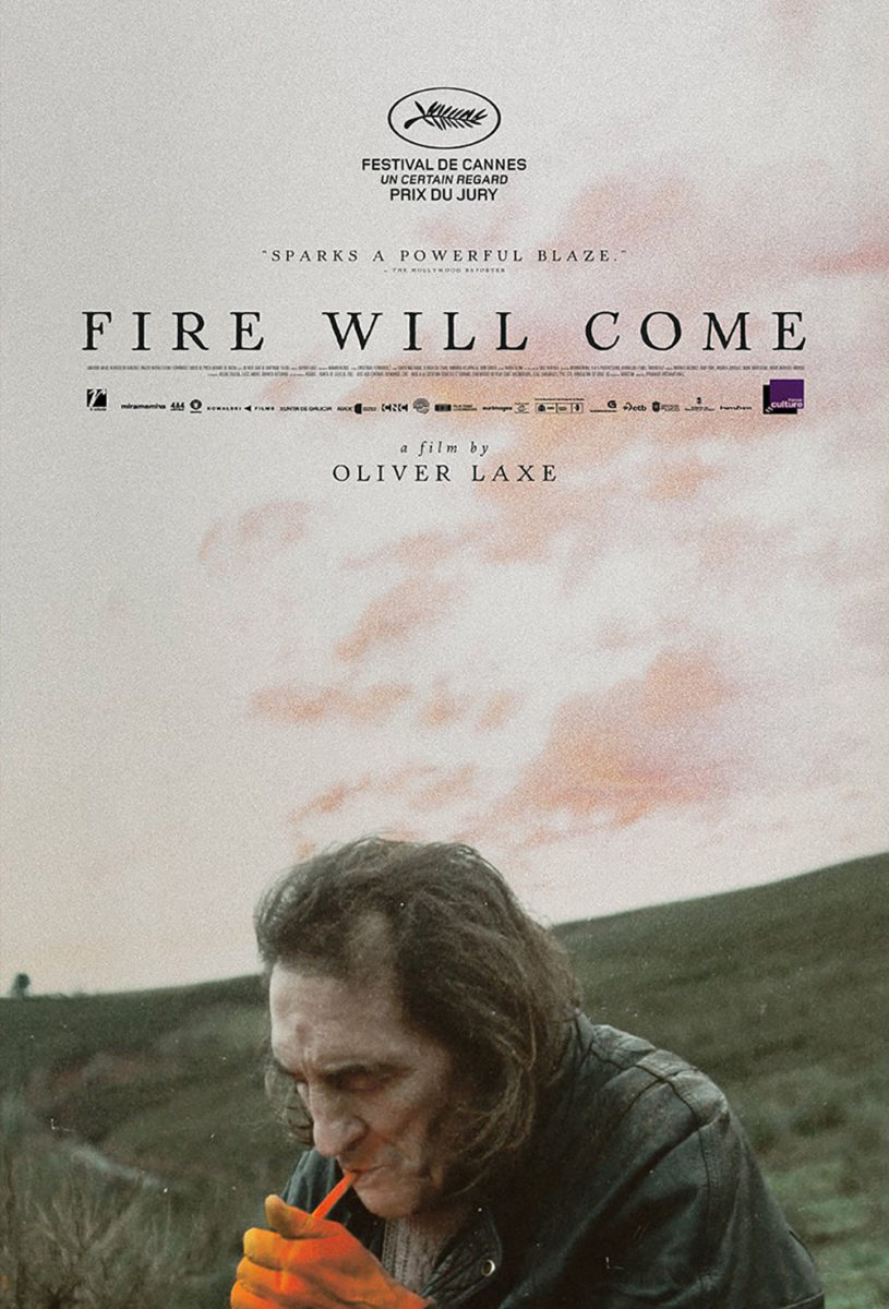
If you really want to see how this trope is done, however, look no further than Fire Will Come (virtual cinemas, October 30). I love the depth of field with the actor standing in sharp focus as everything around them blurs back into the distance. I love that the image is allowed to simply fill the page without distraction so the breadth of its setting and power of nature can reach their full impact. And I love that it’s not cluttered by text: one laurel stacked above two actors, a title, and the director.
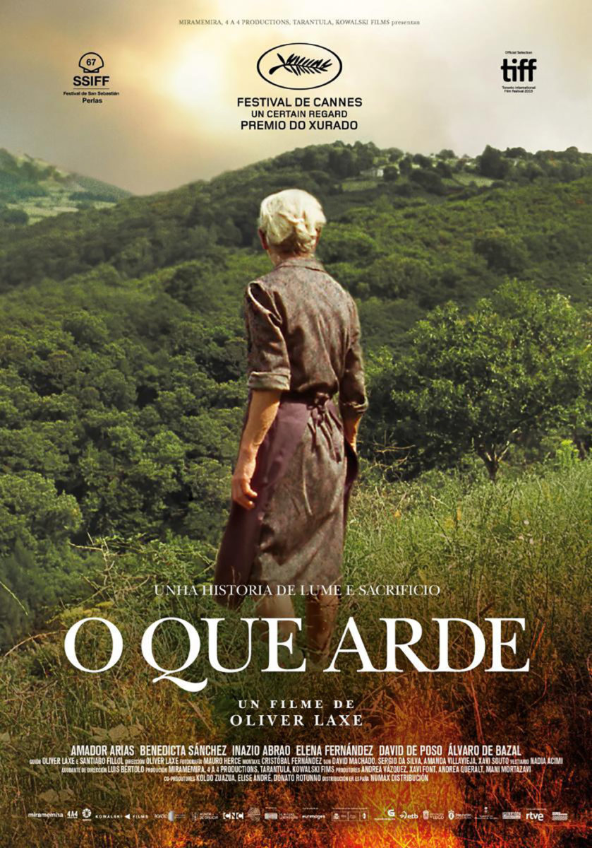
Usually it’s the European iteration that allows things room to breathe before the American version ruins the composition. I’m not saying the international sheet is poorly composed, but it’s decision to push in on the image and focus on the actor rather than the environment definitely loses something where that aforementioned power was concerned. The festival logos at top also create a vice-like frame squeezing the center rather than the more appealing open-air nature of the other rising high. The one thing it does have going for it is the title, though. The English translation is so long that it flirts with leaving the page altogether. O Que Arde fits perfectly.
And then you have Midnight Marauder’s latest installment that at first seems as though it’s flipping this theme on its head before you realize it’s actually just utilizing it in a different way. We now see a face and its actor is now cropped low rather than set against the sprawling vista, but the impact is identical. The scale remains with its giant sky. The delicacy of its typography continues to let the image breathe. And the subtle glow of his cigarette draws our eyes in with its undeniable atmosphere.
Text marks the spot


I really like the minimalist nature of The Refinery’s advert for 12 Hour Shift (limited & VOD, October 2). It’s simple yet dense with its blood-splattered close-up, eyes obviously peering off behind us at something we probably don’t want to see for ourselves, and compact text box highlighted by a natural downward slope from “12” to tag.
My favorite part, however, is the playful use of a hospital plus sign as the “t” in “Shift.” It adds some character to the whole and embodies the setting without having to pull away from the central face. There’s definitely risk to the choice where the color is concerned since the other letters are bright enough to make it read 12 Hour Shif at a glance, but the red pops enough for legibility’s sake while also complementing the blood beneath.
I don’t usually enjoy posters that do little besides create a grid of film stills, but The Place of No Words (limited, October 23) is a pleasant exception. The main reason for this is the unique typography as it adds so much character. Add the rough photo edges for a consistent texture with the scrawled letters and there arrives a DIY aesthetic that fits what looks to be a family surviving on its own in nature.
The juxtaposition of idiosyncratic lettering (one “E” barely has a bottom arm, the “A” has no crossbar, and the “D” is huge) against the meticulous image crops (our eyes follow a zigzag down from face to face like a lightning bolt crashing through) is quite wonderful too. The care that went into this one shouldn’t be dismissed.
It may not seem as such at first blush, but Empire Design’s poster for Rebecca (Netflix, October 21) is quite precise in its construction too. Yes, it’s just a photo from Jason Bell placed under a color filter so the gorgeous elongated font of the title can get lost in the warm hue of Armie Hammer’s skin tone, but his glare is so very telling.
She looks at him with love. He looks past her with longing. What better depiction of their relationship is there than that? The word “Rebecca” is placed between them and atop them as that which risks ripping them apart. The “B’s” crossbar and the second “E’s” middle arm are pointing right at his eyes to make certain we follow them. You may even turn your head to see if she’s there in the distance.
And that leaves us with a sheet that’s virtually all text: Adrian Curry’s The Projectionist (limited, October 2). I’m not kidding. Just look at the critic quote. It’s practically a paragraph compared to the buzzwords we’re used to seeing. Add giant letters, a teeny tiny credit block, and Nicolas Nicolaou smoking a cigar, and there’s plenty to read, parse, and enjoy.
The title is the real stunner, though. It’s the sort of free font you find during a Google search for “marquee” fonts and yet it feels fresh in its use. The flagrant refusal to break lines on syllables, the arm of the first “T” going past the whole so the vertical stems all align, and the extra tight kerning make these letters a force to reckon with—daring us to trace the dots and pull out the two words we’ll need to utter before reaching the cashier.
Building intrigue


With a premise like that of Dick Johnson is Dead (Netflix, October 2)—wherein director Kirsten Johnson stages numerous ways in which her dementia-riddled father could die, with him participating in each scenario—you need a poster that’s just as silly and inventive to promote it. Brandon Schaefer at Jumpcut takes on the challenge and meets it with a humorous skull and bones motif placing the titular victim in decapitated peril with an expression that exudes sarcastic artifice.
The bold yellow background and floral graphic giving the usual black and white symbol a realistic (albeit two-dimensional cut-out aesthetic) makeover lend the whole a playful sheen contrasted by the heavy, severe font trying so hard to make us take the lark seriously. And there’s reason for that considering the subject matter. Death and dementia aren’t laughing matters, but to have the courage to find humor in them is what lends Johnson’s film such universal appeal.
A film that can’t say the same is A Rainy Day in New York (limited, October 9). What Woody Allen project can in today’s world? Say what you will about the man and his art, but don’t deny the reality that his producers seem to always conjure stunning imagery for marketing purposes.
Cardinal Communications USA is this entry’s firm and they’ve really captured a gorgeous moment that both portrays the secretive affair between Timothée Chalamet and Selena Gomez and represents the title without needing the weather itself to muddy the pristine white background. Their kiss is hidden behind a translucent umbrella, the red of which draws our eyes against a page that appears monochrome despite color in the actors’ hair and clothes. Everything falls on the vertical axis for ease of vision and there’s only one miscalculation in my opinion: putting a cheap looking drop shadow on the title.
Now compare it to its more recent offspring. The white space is gone. The soft image is rendered with an over-saturated crispness that loses all semblance of romance. And the addition of photos at the top clutter things even further. This is elegance versus blunt force trauma.
The hope is to improve upon what came before and that’s exactly what Legion Creative Group did with their work on Possessor (limited & drive-ins, October 2; VOD, November 6). This thing makes an already gnarly image of a rubber mask molded from Andrea Riseborough’s face and takes it ten steps further with a plastic wrap and drag between reality and nightmare. Their red version seems tame by comparison: creepy and yet nowhere near as viscerally dread inducing.
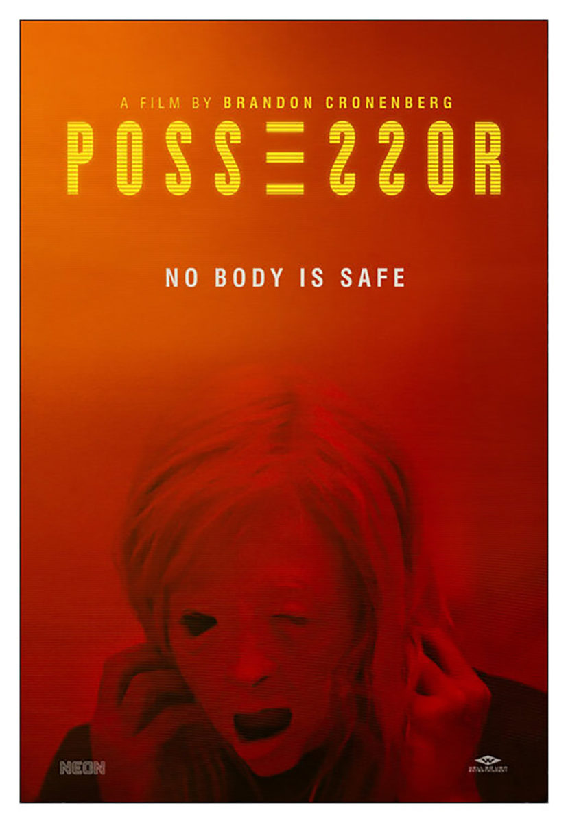
What I truly love, though, is the title treatment. Possessor isn’t a palindrome, but it’s just an “R’s” leg away from it. So they make it a mirror (I wish they flipped the “R” too) much like the film’s eventual inability to distinguish who’s who when a character’s consciousness is inside another’s body. Find the “E” made solely from its arms and move back and forth through the word until the end and beginning can no longer be discerned.
There’s a similar infinity loop at play with Synchronic (limited & drive-ins, October 23). Yes, the figure is falling from top to bottom, but anyone who has seen the film knows that there’s generally a snap back to the origin point built into the surreal journey of a single place through time. So we move down the spherical ribbon and back up once we reach the end—traveling from forest to city and back again with mastodons and wars in between.
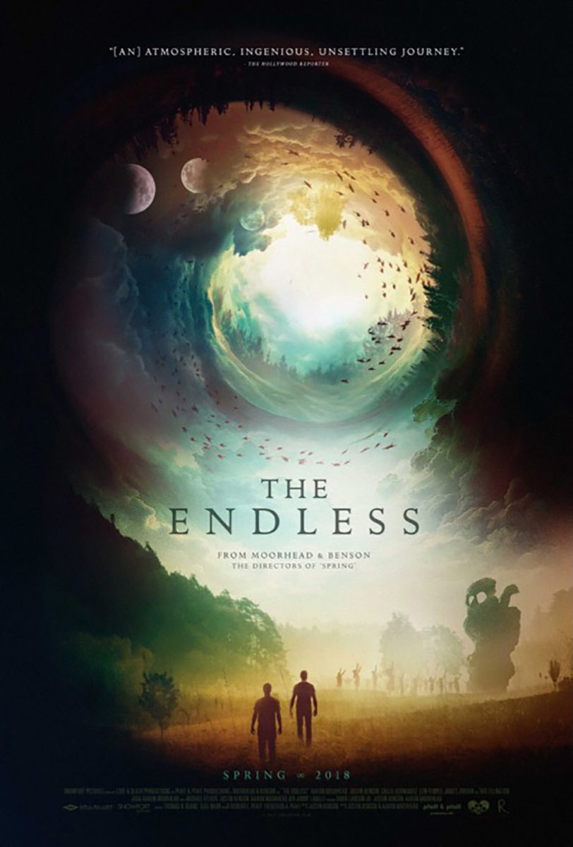
It’s a gorgeously rendered distillation of what the titular drug allows a user in-film to do that both draws viewers in with its intrigue and puts a smile on the faces of those who recognize the entire story’s trajectory on the page. And while it works really well as a companion piece to Brandon Schaefer’s The Endless (Moorhead and Benson’s last feature) in style and construction, he did not design this one. I’m still not sure who has, but I have to believe that’s where they drew some inspiration as an aesthetic starting point.
What is your favorite October release poster? What could have used a rework?