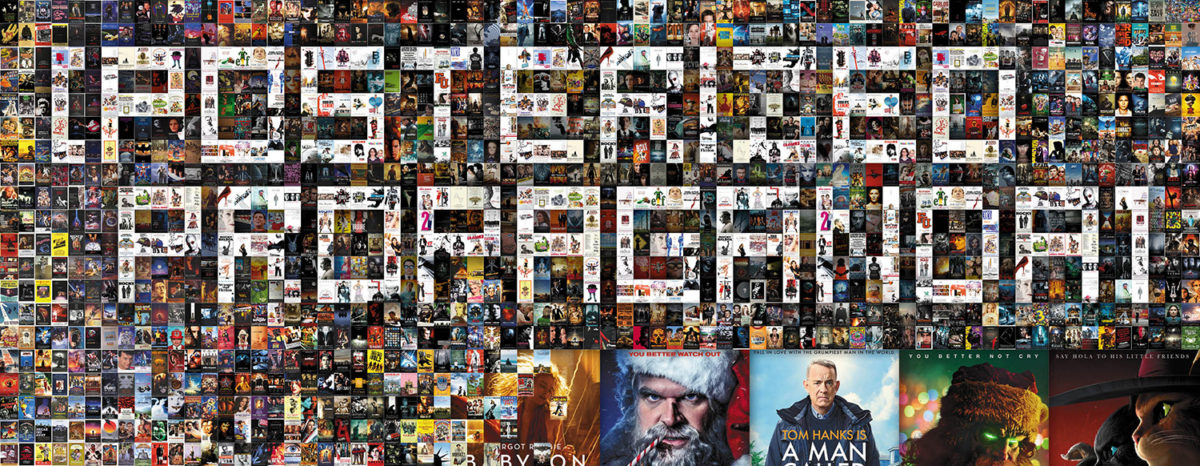
Sadly, I can’t say Hollywood finished the year off strong when it comes to posters. Whereas some months have me trying to figure out ways to get more titles included in this column, December saw me racking my brain on which from the discard pile I could cobble together into a trio.
As such, I did still leave a couple good ones out. Not because of an embarrassment of riches, but because there were others that better fit into the arbitrary boxes of subheads I ultimately was able to create. Sorry, No Bears (limited, December 23) and Saint Omer (Oscar qualifying run on December 6; limited, January 16).
That’s not to say some of the ones below are bad. They just might be a bit uninspiring. Sometimes studios pick “serviceable” over “exciting.” It’s their prerogative.
Superimposition


There’s something inherently fake about Empire Design’s poster for Pale Blue Dot (limited, December 23; Netflix, January 6) and I think it has everything to do with the typography. It’s one thing to choose an old-timey font as a means of adding a vintage aesthetic, but it’s another to utilize it with the crispness of twenty-first century technology. Rather than transport us back, it highlights the fabrication.
That’s the problem with Hollywood’s trend for glossy photos. If you’re not willing to desaturate the color, add texture, or do anything to make the whole feel out of time, the result will prove unsatisfying.
I do like the use of superimposition where the images are concerned, though: dark silhouette coming through the trees that are seen beneath a layer of star Christian Bale. The drama is undercut by a lack of any true contrast, but the mood is felt.
The sheet for Nr. 10 (limited, December 2; VOD, December 9) does a bit better on the latter point. It lets the blacks be rich so that actor and scene don’t become muddied from their transparency-fueled convergence. Tom Dewispelaere is allowed his shape. It and the background remain solid so that his coat can be a window rather than a veil.
Nothing about the design is going to get someone’s head to turn, but it does do well to maintain interest from those already looking. You want to know what he’s staring at. You want to know where that long hallway is going both in a literal sense and figurative considering its placement leads us inside him too. And I enjoy the title treatment: the way the top of the “NR” aligns with the offshoot of the “1” and how the period tucks underneath to lend the whole a nice box shape that pops out so it isn’t lost as just another line of text.
It’s the poster for The Eternal Daughter (limited, December 2) that really shines where it comes to merging two or more images into one, though. The doorway shadow provides a frame with which to highlight Tilda Swinton and the lit windows of a house in the distance—positive and negative space shifting so that the absence of light creates image while the presence of light blocks it. There’s a painterly quality to its horror-tinged suspense that makes me think of an old paperback on a spinning wire rack.
That said, my favorite part is the text. Not the title, but the rest. Where the former’s boldness stretches the letters to odd shapes, the all-caps words surrounding it has an eccentric elegance that really shines. The curves of the “S” and the fat loop of the “U” give it an inviting, almost playful tone. Where the imagery begs us to turn away, the text quietly soothes us while beckoning to come a little bit closer.
Follow the line


How can you not enjoy Showtime’s (in partnership with Melt) one-sheet for 2nd Chance (limited, December 2; expands, December 9)? It’s just Richard Davis shooting himself in the concealable bulletproof vest he invented—an inherently funny image. Add the target practice lines and the gag goes even further.
Is it perfect? No. You can’t really have wrinkles and bullet holes at the same time considering one pretends it’s affixed to a wall and the other pretends it’s hanging in such a way that a hole causes a rip rather than a divot. Trying to get away with both does add to the silliness, though, so you can’t really blame the designers for going for broke.
The lines on the Broker (limited, December 26) campaign are subtler. Peer upon the poster from far away and you probably won’t be able to see them at all. Get closer, however, and you’ll find their circuit board connections linking one character to the next in accordance with their respective angles.
What it has to do with the plot of dropping unwanted babies into boxes is beyond me. I simply like the way it looks. Like a neon sign turned off. Or a roadmap. It’s so unnecessary and yet it also brings the whole together.


The compositions help with bottom-heavy images possessing their own gradual slants downward. The happy faces make each look like a clothing advertisement—happy-go-lucky Old Navy wearers enjoying the day out with names and prices listed above. Meaning aside, they’re also just more appealing than their English-language counterpart zooming out with tire-track text. It may have more drama, but far less character.
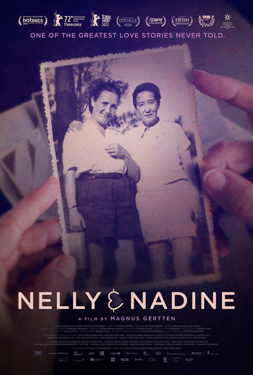
And that leaves the most powerful lines for last courtesy of Annelies Vaes’ Nelly & Nadine (limited, December 16), a documentary about two women who fell in love in a concentration camp. While the poster at right by The Robot Eye gives us exactly what we would expect from that premise in a literal sense (hands holding an old photograph of the pair), the stunning, minimalist illustration above wows us.
On the surface it’s just painted lines with hands meeting in the middle. Pull back, however, and it becomes Nelly and Nadine in their striped camp uniforms standing side-by-side. There’s power in that juxtaposition—love amidst terror. And that cute little sideways heart as ampersand lends a welcome sense of optimism too.
Front and center


I love the old school 60s-era vibe of Joan Horne’s Lowndes County and the Road to Black Power (limited & VOD, December 2). The fat lettering. The color palette. The center axis composition. And the confidence to leave it as minimal as possible with single quote, single laurel, and title so nothing distracts too much from the panther itself. That is the draw. What it represents and how its keenly presented as going off the page—moving forward with progress.
Everything comes together to update the iconography and themes showcased within the documentary while staying truth to its original ethos. It doesn’t incite. It inspires. Walk that road and see just how far it goes.
The Super 8 Years (limited, December 16) also runs off the page with repetition—a film strip paused on a single frame. If the title is describing a medium, why not showcase that medium in the marketing? Sprocket holes and all. It becomes a gorgeous representation of the object itself while also pulling back the curtain on the magic of cinema it creates.
And while the text block can feel a bit clunky in how it interlocks everything together so that the family photo can exist unencumbered, it is a wonderful feat of ingenuity. Subheads and credits are tucked. Letters are merged to keep the leading tight. And a festival laurel is added to offset the whole right up against the rounded black frame of the film.
You can almost imagine those white letters ascending off the page so that the next frame of this vacation can replace it, the warm orange hue below promising the beauty of imperfection that digital simply cannot match.
It’s a similar disparity to that which separates old printmaking processes from today’s digital printers—a juxtaposition wonderfully made with Midnight Marauder’s Corsage (limited, December 23). You have the photo cutout of Vicky Krieps, but the rest is a single color as though etched onto a plate and pressed atop for added effect. I can imagine an expensive print wherein the portrait is given a smooth gloss finish as the rest shimmers in foil.
The image breathes with all that white space, even as the text is enlarged to sizes you don’t generally see considering everything else that’s usually thrown in the mix. Look at Grandson’s actual portrait for comparison. Because it has chosen to let its full image be visible, everything else must be shrunk to fit inside the shadow of her ear. It’s a stunning sight (love the three-sided frame with photo bleeding off bottom) with a lovely typeface, but it loses the boldness of the above.


Grandson tries to add some boldness of its own with a second sheet depicting Krieps as she flips us the bird, but the text-heavy, filled-in rectangle lends it a magazine cover sense of pure consumerism that turns its tongue-in-cheek nature into eye-rolling manipulation. It’s provoking us while Midnight Marauder’s original feels austerely secretive. I’d rather be honored to have watched the coronation than berated for leering like a paparazzo.