Here, in one post, we have a perfect example of PR campaigns in every form: good, bad and otherwise. Movie posters are selling something that’s far different from what’s in the film. They’re selling what they want the film to be about; what they hope viewers will believe the film is about, in order to sell more tickets. It’s a perfectly acceptable business, full of hotshots (Hitchcock’s Saul Bass, Tim Palen), company (wo)men (Universal‘s Tracy Masington) and mercenaries (Screen Gems‘ Loren Schwartz).
Even in a world drowning in interactive media, a poster at a subway stop or local billboard near the highway can still sway considerable influence, and companies still spend a considerable amount of money on that notion. There are the tried-and-true formulas, the retro radicals and strange and beautifully ambitious posters that constantly surround us.
Here’s a perfect example of something strange and beautiful [The Playlist]:

Expect Pedro Almodovar’s The Skin I Inhabit to screen at Cannes in a few months.
Here’s tried and true [The Playlist]:

Somewhat unfortunate, considering the high quality of Kirostami’s latest. Notice the blue, orange and orange-ish red all over the poster?
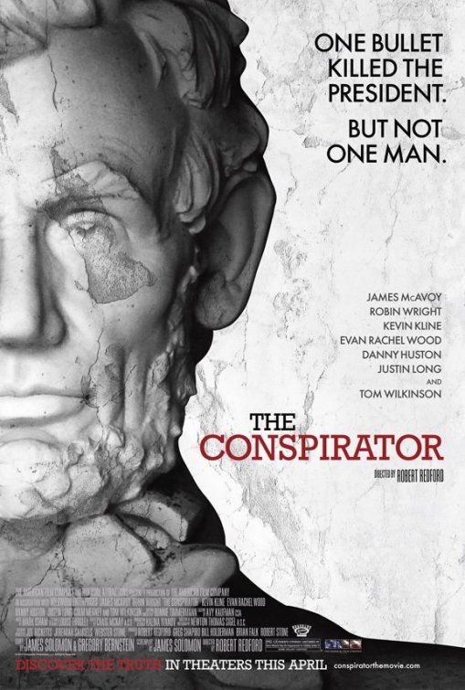
And, finally…no, nothing particularly retro or radical but a good point to bring up: taglines. These days they don’t seem particularly necessary, especially something as lazy as this.
Or this below [IMP Awards]:

Apparently the film’s not much better than it’s tagline. Another thing about this poster, fewer and fewer people (at least in this country) care who’s in a movie. Wasting precious space on a cast listing seems dated.
Which poster do you like the best?

