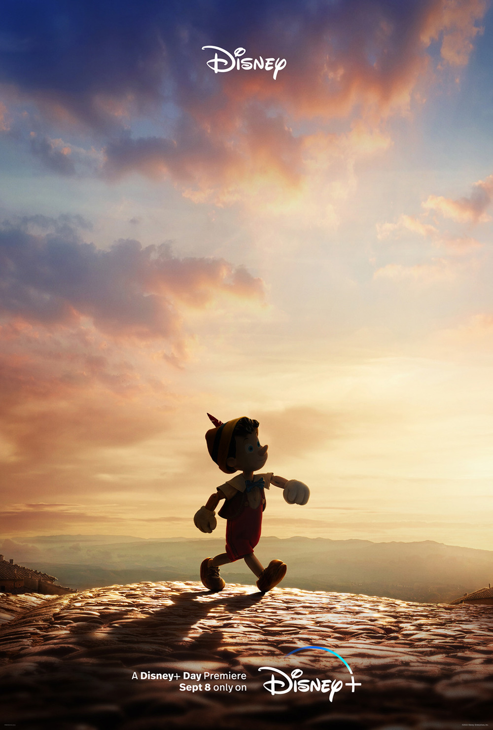
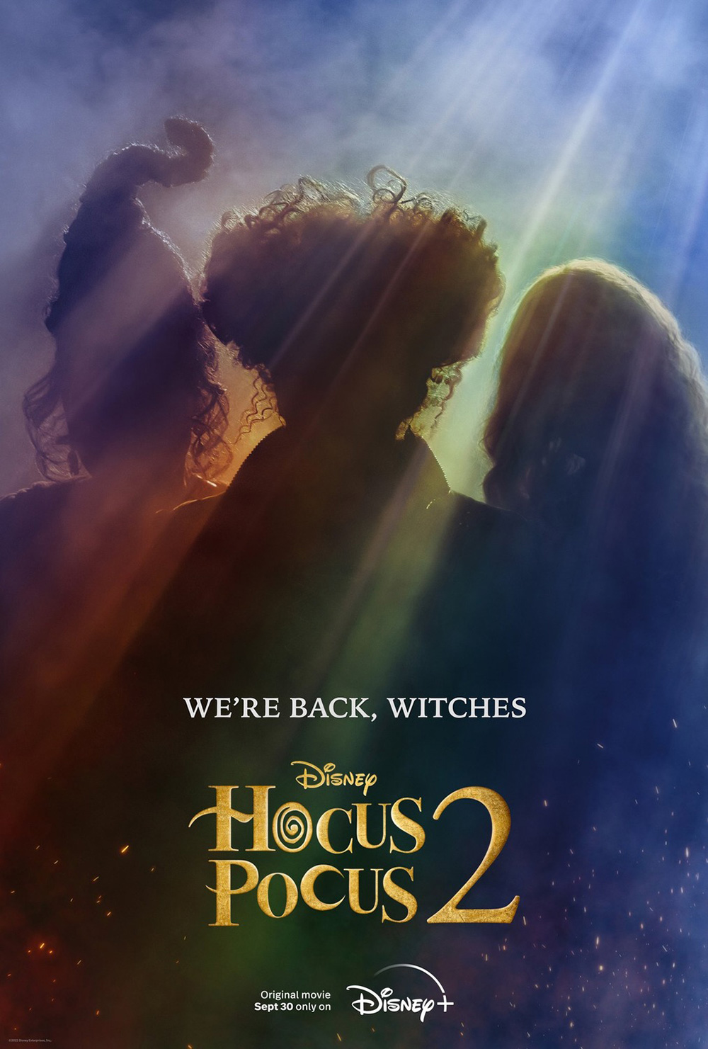
It’s another month devoid of big studio properties hijacking theater screens unless you consider a week-long engagement of Clerks III (September 13) from Lionsgate and Fathom Events fits the bill. Not even Disney wanted to compete with festival season as both Pinocchio (September 8) and Hocus Pocus 2 (September 30) are going straight to Disney+ (the teaser posters by Concept Arts here and LA/Nino Munoz here respectively are quite attractive, though).
So, welcome to the continued free-for-all of untapped potential vying for your hard-earned money at the box office. Maybe one of the posters below will be just enough to entice you into giving their film a chance. That’s the hope anyway.
Framed


It’s a simple yet effective tease. BULLDOG’s Don’t Worry Darling (opens September 23) seeks to deliver the juxtaposition between an idyllic utopian surface and its darker underbelly of control. So, we get a tiny Florence Pugh and Harry Styles at the bottom, kissing before he leaves for work, and a tiny plane freefalling through the air. Except that it’s not air. It’s water. What then is the surface? Is utopia trapped beneath the cruelty of reality? Are these lovebirds drowning with no thought to swim up?
The white frame gives it a nice clean magazine aesthetic to lean closer to the fabrication angle. So too do the lines of the palm trees and the trajectory of the plane, leading us up and in and down respectively to the words at the center: a hybrid tagline and tourist billboard. It reveals that this is both Victory the place and victory the ideal.
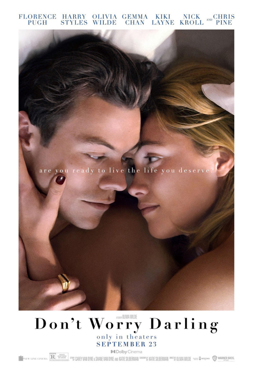
With so much going on despite the simple image, however, the next sheet can’t help but pale in comparison. Suddenly the film is nothing but a romance. It’s Pugh and Styles in love, their heads combining into a heart. There’s zero conflict. Zero struggle. It’s as though it’s advertising a completely different movie.
What’s great about the poster for The Cathedral (limited, September 2) is that we have no idea what it’s advertising. Who is this person? Why are they looking away from us? The entire construction becomes an unsettling mystery. Are we supposed to fear them? Are they supposed to fear us? We want to scream at them to turn around—to release this mounting tension for which we have no power to stop. The photo is in full command.
The reason is of course because it still feels normal. It’s a portrait. A school portrait perhaps. So, it’s not supposed to be confusing or combative. Its familiarity is supposed to calm us. The complementary colors aid in this sense of the unreal because they soothe us as that mass of hair laughs. The whole effectively turns our every expectation upside down.
Silenzio Communication looks to do the opposite with their homage for Peter von Kant (limited, September 2). They want to exploit familiarity. They’re literally adapting something we already know to honor, critique, and excite. And why not? If director François Ozon is going to riff on Rainer Werner Fassbinder’s work, they can riff on Andy Warhol.
The decision goes beyond just mirroring a single work, though. Because, while Warhol’s original artwork is for a Fassbinder film, it’s not for The Bitter Tears of Petra von Kant. It’s for Querelle. Does that therefore mean Ozon is less interested in speaking about the film than the artist? Maybe. Or maybe it was simply the more captivating poster to recreate.


That Silenzio keeps the Warhol trend going with a second sheet depicting four actors in pop art filter would almost have us believe the exercise is merely about capturing the essence of any artist regardless of their marriage. Ozon chooses Fassbinder. Silenzio chooses Warhol. You’ll have to watch the film to see whether the connection goes deeper.
What’s in a face?


Speaking of Warhol: how could you not conjure his silkscreen aesthetic when thinking about Marilyn Monroe? I’m a little surprised Leroy and Rose didn’t add a bit brighter of a yellow to Ana de Armas’ hair on the poster for Blonde (Netflix, September 28) to really go bold with the bright red of her lips. Perhaps it would have skewed too cartoonish? This is a best-of-both-worlds scenario instead with allusions to Warhol’s iconic Marilyn portrait while still staying entrenched in reality with textured skin and bright yet natural colors.
The duality makes sense considering Andrew Dominik’s film takes a fictionalized approach to the starlet rather than a biographical one (the novel’s author Joyce Carol Oates has been adamant with ensuring the public know the difference). So, it’s as much about the image of Monroe as it is the person Norma Jeane Mortenson.
On its own, the design is a nice, captivating crop of her face, expertly composed to fit the text in a way that ensures the eye and beauty mark aren’t covered. The latter confirms the identity. The former guarantees our attention. And if you want to see more, you must tune in.
ARSONAL’s The Silent Twins (opens September 16) gives us two faces for the price of one. As the text at the bottom states, the film is based on a “fascinating true story” about June and Jennifer Gibbons, twins who refused to communicate with anyone but each other. So, you do get a sense of kinship and overlap. They become a joined entity against all external forces, merging as two halves of one whole.
The intriguing opportunity this provides is of course depicting the space between. Half of the face is Tamara Lawrance. Half is Letitia Wright. And inside those surreally drawn shells is a treasure trove of creatures that we can assume play a role in the story of their lives. There’s a real Michel Gondry feel to the imagery, as though these women are but vessels for those beings within to stay safe until they’re alone and able to come out.
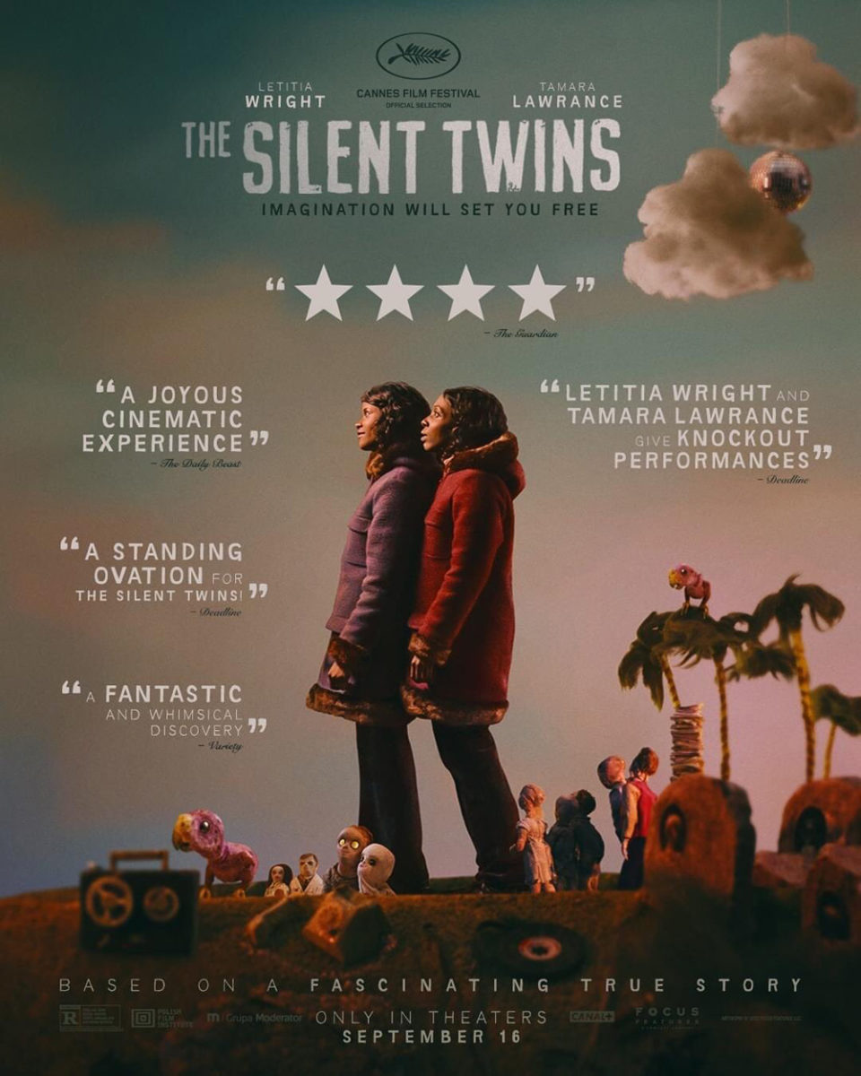
The second poster loses that internalization by skewing even more towards a Gondry-esque romp with strings shown atop the clouds and all the toys loose to explore under their own volition. The idea is to spark interest with critic quotes—to sell us through text rather than visual metaphor. I’m sure it works better for some who’d rather not have to do the heavy lifting before sitting down in the theater. For me, though, I’ll take poetic distillation every day.
It’s probably why Brandon Schaefer and Jump Cut’s To the Moon (VOD & Digital HD, September 20) is so mesmerizing. This thing is all mood and atmosphere. No actors. No faces. Just an approximation of where a face should be, shifted into a folk terror nightmare of hands, berries, and a triangular totem we can only presume is at the center of whatever transformation is underway.
There’s a sense of fairy tale and horror. The familiar and the unknown. It’s as much about innocence a la Little Red Riding Hood as it is terror via pagan ritual and hallucinatory multiplication. And the uncertainty of where we exist in the middle is only exacerbated by the closely kerned text, the proximity of the letters making them just a bit harder to read than they should be—culminating in a full convergence of “The” within the title, slinging us from one plane of existence to another like a worm hole into oblivion.
Please come in


It only makes sense for an essay film about cinema such as Mark Cousins’ The Story of Film: A New Generation (limited, September 9) to have a poster that invites us into the frame. That’s exactly what Sam Ashby and Mark McGillivray (for Intermission Film) do with their ladder up to the “O” of the title.
The piece is playful in its desire to interact with the audience. We want to climb those rungs behind the man entering this unknown doorway. We want to see what’s beyond the screen. Because it does remain an image as well—a film still pixelated and augmented as though it has been enlarged beyond its resolution and projected through a television screen. We’re watching a film and searching for the answers it hides beneath its surface. A projection as a means for exposure and deception.
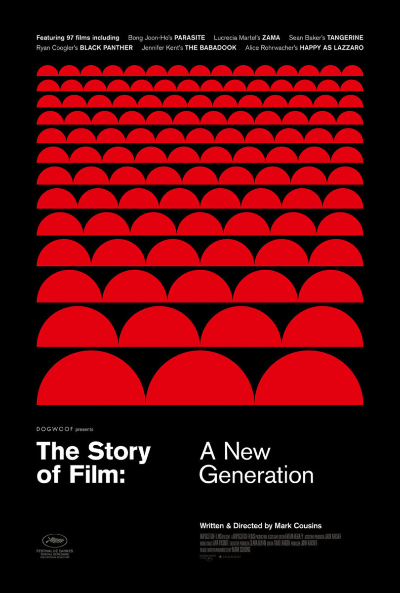
The second sheet is almost a complete 180-degree flip both in style and substance. Now we are in the position of the screen looking out at the auditorium’s red seats. The people watching become the story and they are infinite in scope. It makes sense considering the subtitle “New Generation” alludes to the fact that there will always be more filmmakers and film lovers to advance the medium from their respective positions. A few half circles say it all.
Putting riddertoft’s gorgeously atmospheric sheet for Speak No Evil (limited, September 9; Shudder, September 15) under this heading is a bit of a stretch since we’re already in the frame—no invite necessary. It’s what makes the scene so captivating. We are here and yet we’re helpless. Helpless to assist those screaming in the car and banging on the windows. Helpless to run away ourselves. We’re stuck in a silent moment of abject terror, unable to move, speak, or look away.
The coloring is hypnotic as the washed-out reds and oranges at bottom create a barrier of sorts for us to wade through. And the text is small and unobtrusive, fading into the background to leave us under the dark night’s sky with nothing but a three-word warning (Or is it a command?) that matter-of-factly hangs in the air. There’s no escape from seeing that woman’s fear. No escape from witnessing what’s to come.
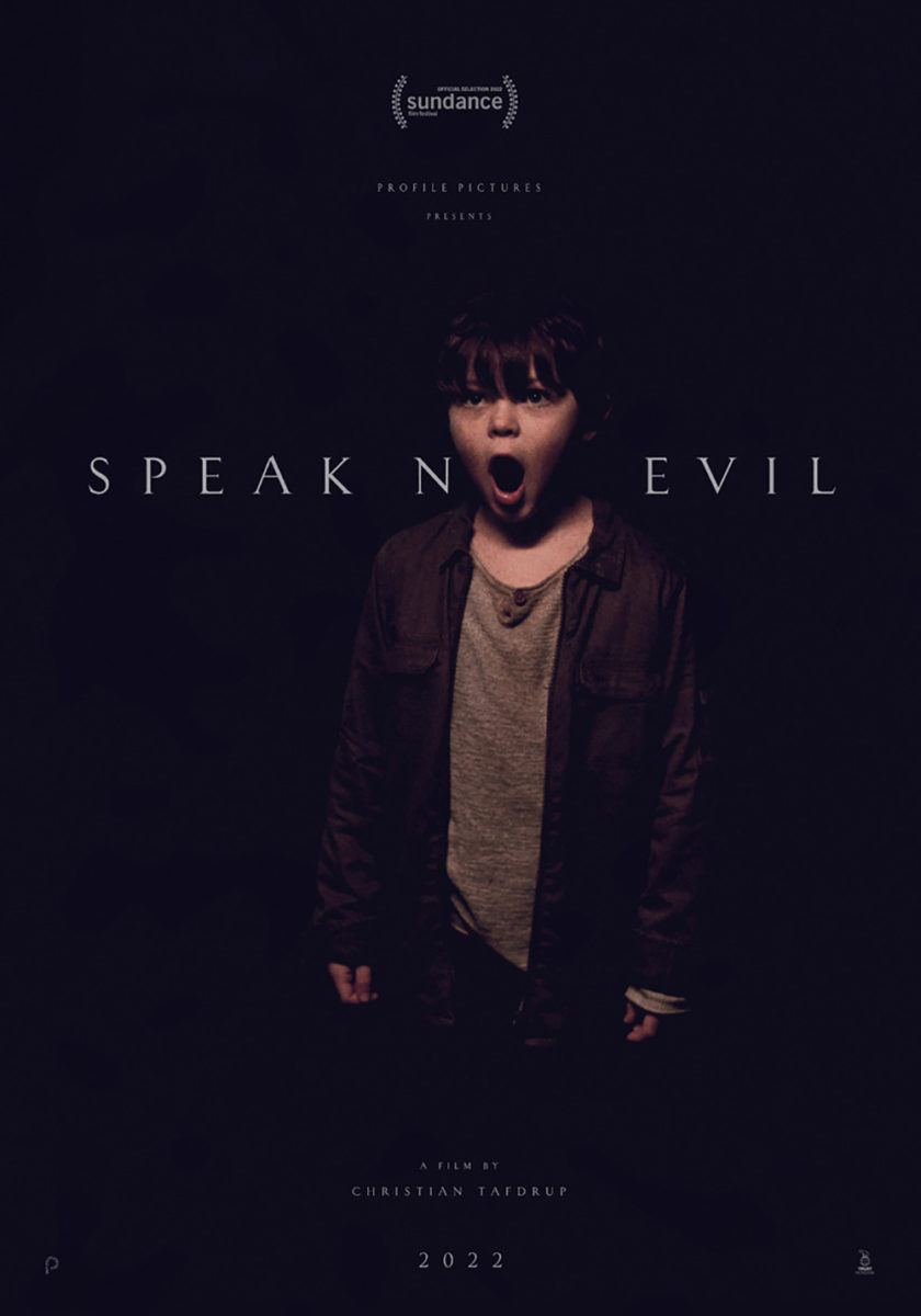
It’s a wonderful design that’s inexplicably rivaled by its absolute antithesis in a black teaser with little besides the title and a boy. Similar to A New Generation, we get another “O” opening up into a tunneled abyss. Where that one was inviting, however, this one is anxiety-inducing. Because it’s not about going in. It’s about coming out. Words? Demons? I don’t know. I only want him to shut his mouth so we never have to find out.
Conversely, that’s all I want to do when it comes to Mark McGillivray and Intermission Film’s Land of Dreams (limited, September 16). I want to know what’s going on. Where she’s going. And whether everything is an illusion.
Considering the film is about an America that has grown more insular than reality’s own version and an Iranian American seeking to discover what it means to be “free” within it, I’d hazard a guess to say most is a lie. As someone whose job it is to record other people’s dreams, it shouldn’t be a surprise that she’s caught in front of a mirror that at once presents a future to come and the past she’s left behind. What then is progress? Can progress even exist? Not in a place that asks us to dream without ever actively working to fulfill the promises our dreaming is supposed to provide.
The visual is alluring in its ability to bring down the curtain and expose the strings of our own delusions. And whether it’s the angle of a product of the metaphor, you can’t deny the power in not letting her see her own reflection. Is she therefore present in the future? America’s future? Her own future? Maybe not. The real question, though, is whether she’ll be able to reach the other side anyway.