Tony Soprano. Eddie Brock. James Bond. Edgar Wright. There are some big names coming to the big screen this month. If that’s not an indication of Hollywood going full steam ahead regardless of COVID, I don’t know what is.
And alongside them come a bunch of other must-see titles leaning on advertising to take some of the profits from that quartet. Almost half of the films I’m highlighting below come from streamer,s too—a testament to theaters loosening their grip on the day-and-date strategy by allowing them theatrical debuts. If those studios didn’t believe they needed captivating posters for digital releases alone, surely they’ve embraced creativity for the additional space on multiplex walls.
Black-ground


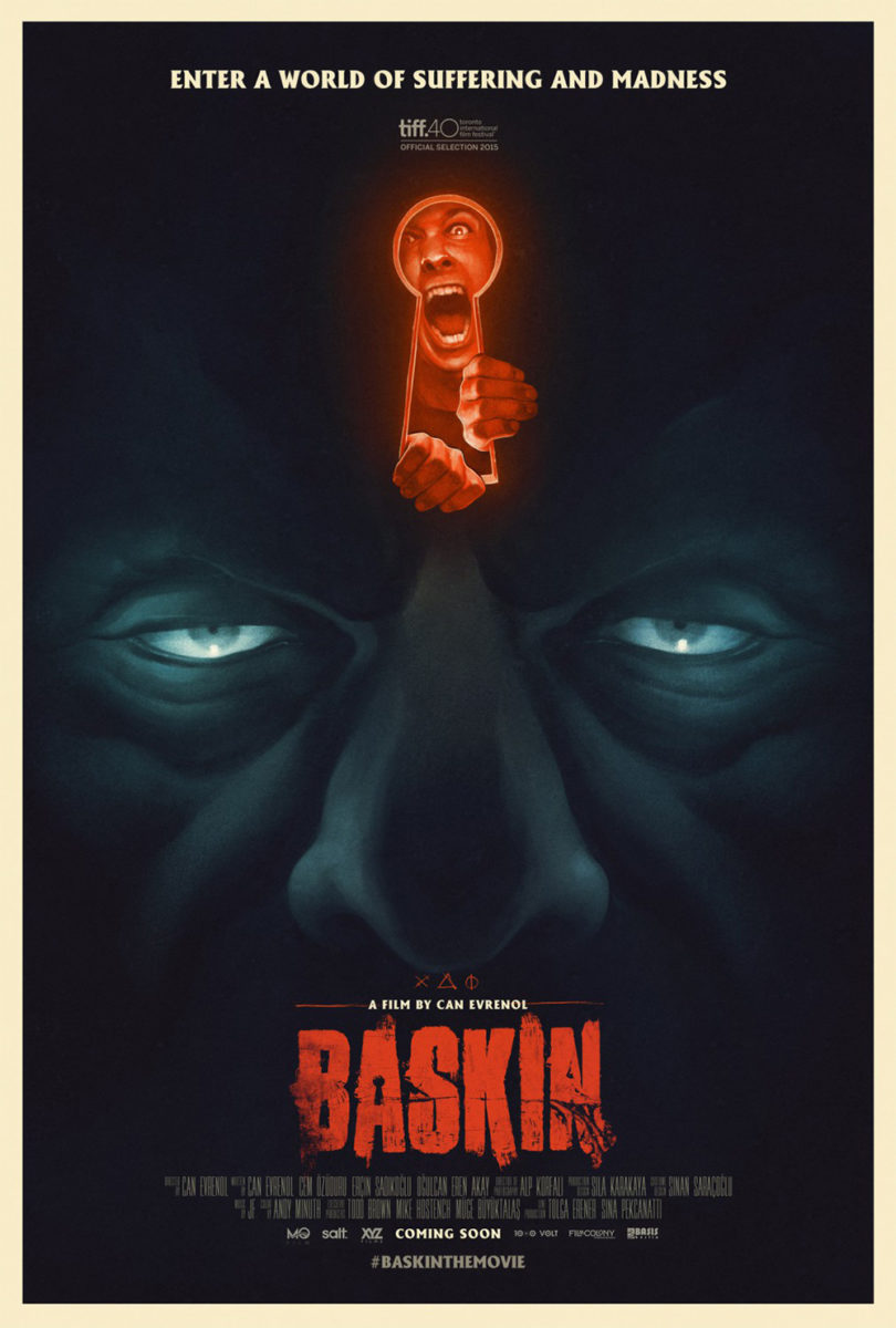
The Blazing World (limited & VOD, October 15) takes a page from Baskin‘s wonderful poster by moving the keyhole from forehead to eyeball while transforming its character from prisoner to adventurer. The red title pops on the cool, dark blue descending into a black abyss within the pupil. Will she swim in or past?
It’s a wildly surreal, imaginative image that probably only scratches the surface of what the film has to offer if the critic quote (“visual masterpiece”) is any indication. And by adhering to the vertical axis of that keyhole for symmetry, the actor’s off-center placement makes her our focal point—even as the black and red vie for attention. My eyes almost hallucinate the eyeball coming towards me, readying to swallow the swimmer whole before continuing my way.
The sheet for Titane (limited, October 1) utilizes a similar vertical axis courtesy a car filling up the bottom of the frame as flames consume it. You might even miss that there’s a woman on the hood, basking in the glow of that fire as it reflects off everything but her skin. The black of the background puts full focus on the bright-white title so the yellows and pinks become muddled into a mid-tone mass shielding her from view—until she, eventually, becomes the only thing we see.
I like this design better than Silenzio Communication’s festival advert, even if it seems much simpler by comparison. It’s basically a production still with text while the latter highlights make-up effects with an extreme color filter, providing a bit more variety. Yet its content proves somewhat staid. The above electrifies as much as it confounds with its white text always finding flames as opposed to blackness, the legibility just off enough to draw us in closer. Silenzio’s captivates, the other transports.
As far as “simple design” goes, however, I don’t think anything beats South of Heaven (limited & VOD, October 8) and its sunset silhouette. From the western slab-serif font choice—it’s a very attractive type with built-in imperfections that make it appear hand-lettered—to the black border merging with waving grass, it becomes almost like a graphic woodcut whose well of negative space was painted orange. There’s drama in that magic-hour setting, as well as action (the shotgun) and romance (Evangeline Lilly’s head upon Jason Sudeikis’ shoulder). We’re given a full story with one solitary park bench.
Flipped


Beyond the mood OC imbues with their poster for Coming Home in the Dark (limited & VOD, October 1), its gorgeous texture, and charcoal-like aesthetic, I find the flip at the bottom—road with grass and a tiny, upside-down man at the center—extremely captivating. Is it a depiction of what the larger figure is looking at? Is it a different version of him from the past or future? There’s definitely a conversation between them—one we can’t quite know until we sit down and watch the film ourselves.
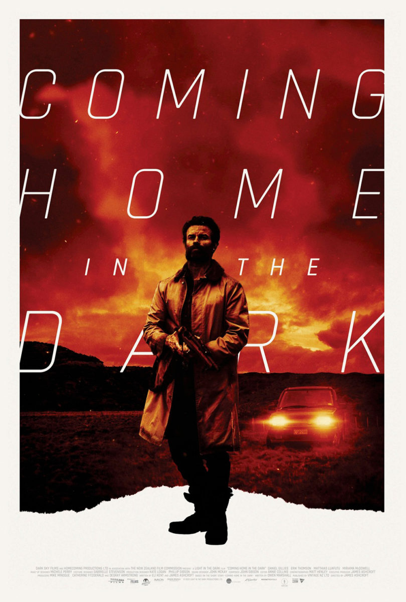
I also like the typography. The leading causes us to pause as we read each word for added dramatic effect. Where Sister Hyde’s graphically bold alternate does this, too, her expanded kerning makes it into more of a scream than punctuated whisper. Both have their merit and show how slight stylistic alterations give very similar compositions completely different tones and weight. One is introspective and mysterious. The other is confrontational and dangerous. Color, typography, saturation—it’s all powerfully malleable in the right hands.
With ARSONAL’s Introducing Selma Blair (limited, October 15; Discovery+, October 21) we see how a shift in layout can create fresh meaning too. When a poster has this much white space, it’s often pushed to the top so we can gaze down to our focal point at the bottom. And that could have happened here if Blair’s body was floating on the surface, her back upon the water. That it’s been reversed, however, makes a leisurely float into a haunting stare towards a deep abyss.
It makes sense, considering this documentary is about Blair adjusting her life to a multiple sclerosis diagnosis. There needs to be a sense of uncertainty and fear—as well as a belief in hope by way of her still being at the top, looking down rather than lost at the bottom looking up. The sheet says so much with little more than an intentional crop.
P+A uses a bit more for their Fever Dream (Netflix, October 13) advertisement. What makes it so fascinating is that the reversal of its actor doesn’t let the sight line to the figure and horse in the distance make any more sense than it would have right-side-up. She’s still looking away from them as they lurk behind her. What it does do, however, is create a sense of disorientation augmented by the disintegration of the title. The blurring of top and bottom alternatively force us to see her face crisp and clear, the tagline “Pay Attention” surely a call for her as much as us.
And we lose so much of that when flipping the page upside-down. Suddenly this dream-state notion of fantasy becomes a woman on the grass with a figure behind her. It becomes a scene—plain and simple. That 180-degree turn adds intrigue and foreboding we simply don’t get otherwise.
In concert


Why create a generic totem of cast faces when you can strip things down to a dual portrait of your leads instead? That’s what Rhubarb does with Madres (Amazon Prime, October 8). Ariana Guerra and Tenoch Huerta become glued together as two halves of a whole, fear and uncertainty drawing them to the red bassinet meant for their yet-unborn child.
The image of their faces is more than just collage, too, as they become ripped with deckled edges merging into one another when not soaking into the background like paint strokes. They become echoes—glimpses at characters that have become as helpless to the horrors they’re experiencing as we are in the audience. Only the bassinet is solid and opaque enough to rival the dark title, its furls turning to dripping blood a nicely sinister touch.
And the kerning on that word is impeccable. The “A” is absorbed by the “M” and “D” to single out the word “MAD” from the whole while the “E” gets lost behind the “R” and kisses the “S” with tiny gaps between them. Is there something to it? Maybe. Why carve space for some and not others if there wasn’t? Or maybe it’s just about being unsettled. It gives us something to ponder, if only to draw us nearer.
Neri Rivas and Legion Creative do the same with The Last Duel (wide, October 15). Its graphic depiction of dueling swords is cut into by the black of the background to create a minimalistic body for Jodie Comer’s head peering into the white of a blade. She becomes almost like an elongated Aubrey Beardsley figure, witnessing and lamenting between two sides of a war that leaves her a victim regardless.
It’s a gorgeous design with teaser sensibilities, made better by the fact that it includes everything you’d need on a full sheet. This could have been it—”got it in one.” (Relatively speaking, considering there were likely hundreds of comps before it.) That it’s a Hollywood film with pedigree in front of and behind the camera, however, guaranteed another would have to be released with the men as more than simply names. And that’s unfortunately where things fall apart—P+A commits a sin that goes beyond mere homage. As Slashfilm reported earlier this week, you can’t look at the poster at right without seeing Martin Ansin’s Game of Thrones from 2012’s Comic Con.


You can guess the thought process, too. Rivas’ design, with its swords as opposing forces in bare geometry, probably conjured some latent memory of Ansin’s similar use as a diagonal platform to spring forth the show’s cast. The swords P+A use, however, are much closer in style to it than Rivas—as is the cut-in silhouette of architecture at bottom-right, the placement of its characters, and the shape of its stark, white space. The comparisons are thus more than mere coincidence, even if their birth was. Sometimes a design sticks in your head without knowing to be reborn without intent. It’s a testament to Ansin’s work and something 20th Century Studios should acknowledge with some form of verbal restitution, if nothing else.
While that seemingly smooth transition from swords to cast is now tainted, the trajectory from LA’s teaser of The Velvet Underground (limited & AppleTV+, October 15) to their final sheet is not. The former is brilliant on its own as a screen-press plate fully backwards and ready to be inked. It perfectly captures the feel of old-school concert posters made on the cheap for mass reproduction before pasted on walls and street poles. The blue emulsion, the scuff marks, the sense of regular wear and tear—it’s a legitimate treat.
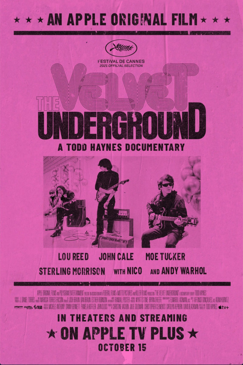
And only made better by letting the final sheet become the print that would be made from that plate. It’s not exact—it can’t be; finals need a lot more information than teases—but the spirit and purposeful aesthetic drive mean more, anyway. I love the creases from quick applications and the missing blotches of ink where the even quicker inking process proved not quite firm enough. It transports us back to a time we expect the film will too.
S’il vous plait


You can’t speak about October 2021’s poster output without highlighting The French Dispatch (limited, October 22). Javi Aznarez knocks these illustrations out of the park. They recall Eric Chase Anderson’s work on his brother’s Criterion Collection covers while also moving past his American sensibilities for a more European flair. That they look like covers for the titular publication only adds more depth to their meta narrative as a complement to their film narrative, too. We’re getting cast, characters, setting, context, etc. all at once.

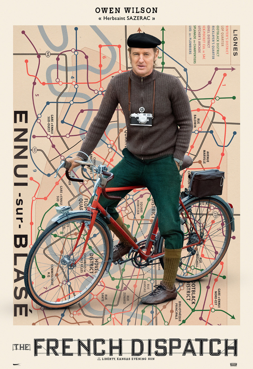

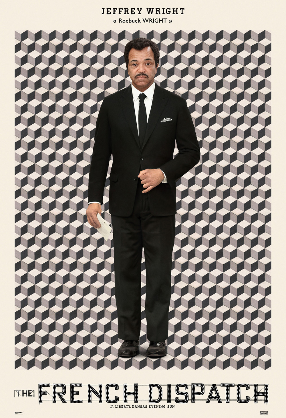
To then take that conceit and bring it to the real world for stunningly original character sheets proves an embarrassment of riches. I’m not sure who created these (Searchlight does a lot of their marketing in-house), but they are an absolute delight. The colors, designs, and poses are all eccentrically unforgettable, never so like another to prove redundant. With just as much effort offscreen to cultivate world-building as there is onscreen, they’ve done the impossible: matching Anderson’s other-worldly attention to detail with their advertising of it.