Disney is taking over May with Guardians of the Galaxy Vol. 3 (May 5) and The Little Mermaid (May 26) taking over screens across the country. Right when the first trails off, the second takes its place. So, the smaller titles need all the help they can get to compete. As always, a memorable poster can pave the way.
Windows/barriers


The most recognizable image you can use to sell a film about Dutch painter Johannes Vermeer is The Girl with a Pearl Earring. Whether the Scarlett Johansson film or the countless memes (Pearl with a Girl Earring is a personal favorite), you don’t need to be well-versed in Renaissance art to know this masterpiece. The trick is therefore presenting it in a unique way.
For Close to Vermeer (limited, May 26), the designers choose to simply take the title at its word. Wielding a magnifying glass, they bring us closer to this painting that we all know. Suddenly we can see the cracks in the paint and the white splotches that become reflected light when viewed from far away. It’s approximating the dissection process that the documentary engages with to find answers about Vermeer’s technique and style. We’re one level deeper with more to go. So, flip a stronger lens into place and continue this journey straight into the canvas.
Chile ’76 (limited, May 5) uses its glass in a different way. Rather than a window into the image, it provides a window out with the help of a thick door between. The twist is that we can see what’s outside our room rather than in it. We become privy to Aline Küppenheim’s reaction to a secret (the man being sheltered by the family priest that we can barely see in the reflection). Is she on the phone talking to someone about him? Is she steeling herself up to ensure she doesn’t mention his presence? Is there something more happening between the lines?
For an image that on its surface depicts a woman’s portrait, the crop and context deliver so much more complexity. Add the words “Searingly intense” and you can’t help but wonder just how explosive this secret might be as far as what happens if she tells or what might happen if she doesn’t. There’s the potential for danger. Perhaps even sexual intrigue. We can’t know without watching for ourselves to see how that door literally and/or figuratively protects her from and/or delivers her to whatever is unfolding.
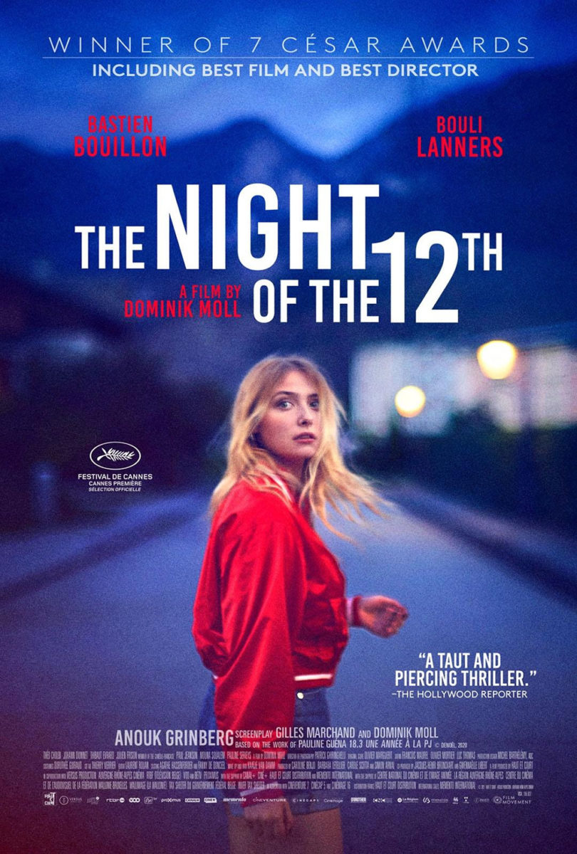
I love when two different sheets use the exact same image in different ways. With The Night of 12th (limited, May 12), we have the original French utilizing its title as a foreground and background to give Lula Cotton-Frapier a sense of physical place within the perspective and the English redo choosing a more conservative two-dimensional flatness with everything existing on the same plane.
Neither is bad. The image conjures enough suspense all its own with the expression on her face and the captured moment of fight or flight that will either take her running towards those blue mountains or at us. Where the second freezes things into a snapshot that we can merely look at, however, the first lets us enter the scene. The “du 12” pops out. The “La nuit” fades back. It’s like a static representation of Spike Lee’s famed double dolly shots. There’s almost a sense of vertigo that slingshots us in and out, forever wondering what it is that has her so spooked.
Faces


You can’t go wrong with a compelling close-up portrait in extreme lighting with a stark white title on top. Key word is compelling, of course, since you lose so much if BIG JELLYFISH®’s sheet for Monica (limited, May 12) was just Trace Lysette smiling into the camera. It’s all about the head tilt. The closed eyes. The blue shades and orange highlights. Her face is being treated more as a statue than a person—an object, a landscape, a dramatic backdrop to the bright letters telling us her name.
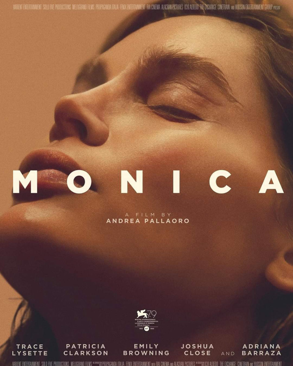
Now look at a second version of the same image to see how crucial that coloring is. Take away the steely metallic light and her face returns to its natural skin tone—the impact shifting from hyper-stylized to natural calm. Without the filter, the poster just becomes a portrait with minimal intrigue. We meet her. We wonder what she’s thinking. We move on. With it, however, we become transported into another world. We haven’t even begun to understand this woman. We’ve only caught a glimpse.
The poster for Sanctuary (limited, May 19) possesses similar impact with its heavily saturated colors. The richness of the black and red lend the shadows a chiaroscuro effect. It feels like a painting—some warped pieta with Margaret Qualley holding Christopher Abbott’s dying body in her arms. Because it’s more than just an embrace. More than a potential kiss. There’s a symbiosis in play. These two need the other to survive. To breathe. They are each other’s sanctuary. Minimal. Austere. Unforgettable.
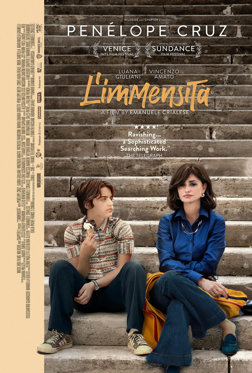
And yet you don’t need a color filter to be compelling (sorry, Instagram). They can help, but so too can emotion, focus, and composition. Case and point: L’immensità (limited, May 12). Penélope Cruz’s eye, mouth, and hand give us everything we need to understand the devastation being portrayed. The blurring (whether an in-camera product or a post-production augmentation, I’m thinking the latter) highlights those areas to see that glassy sadness. It’s a gorgeous image that would only get ruined if covered, so the designers create a barrier instead. The lipstick script of a title subtly crosses that border to connect both frames while not distracting from Cruz.
I’m therefore not sure why Music Box decided to go in a completely different direction for its domestic sheet, but here we have an overly Photoshopped scene of stairs with Cruz and her character’s son. The title is replaced by a homogenized brushstroke font (good try making it seem “unique” by using a capital “M” in the middle instead of two identical lowercase ones), the mood changed from suffocating love to blank indifference.
In a row
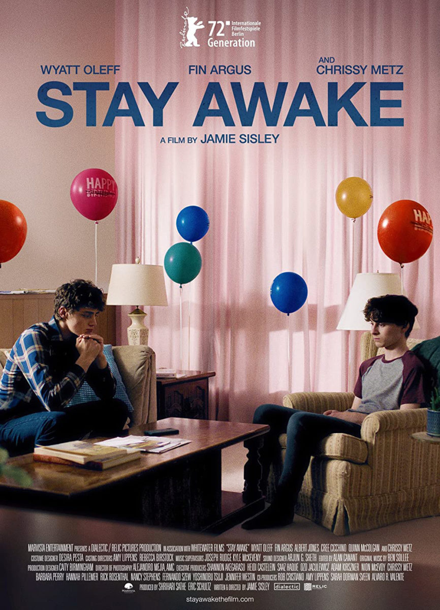


I’ve enjoyed the poster for Stay Awake (limited, May 19) for a couple years now, so I’m glad the film is finally getting a proper release to include here. The juxtaposition of Wyatt Oleff and Fin Argus’ utter lack of joy opposite the balloons (they’re in celebration of their mother’s sobriety/recovery, if memory serves, and thus the “birthday” has been crossed off) is the kind of imagery that makes you want to smile and frown at the same time. Because it is funny. Constructing that scene is built from comedy. The truth of the disappointment and realization that “happy” might not be in the cards demands that humor to stay sane.
Sometimes the right image is all you need. The designers didn’t have to play with anything here beyond ensuring the crop fulfilled their purposes both as a representation of the scene and as a canvas for the text. Then it’s simply a matter of not throwing the equilibrium off. Keep the color of the title complementary to the balloons and the white as minimal as possible so as not to steal our focus. Our eyes go from top to bottom, level to level, always returning to the boys’ numb stares.
The Boland Design Company’s sheet for The Starling (limited, May 12) also presents a nice image for our eyes to travel down through. Instead of balloons, the line of color comes from Eliza Scanlen in five different dance poses—a deconstructed pattern of motion and a personal celebration of faith (even if the church would rather that she stops singling herself out).
Her heads become the easy entry point, dark orbs against a completely white canvas. What should be a display of God becomes a display of her—a nice metaphor for the constraints of religion where it comes to identity and desire. The middle form showing Scanlen with arms outstretched is thus a necessary companion to the crucifix formed by the text above. There’s a conversation to be had rather than a marriage to be forced. She’s not on the cross. She’s creating one of her own. A path forward from its iconography’s insistent demand to always look back.
I’m fudging the “row” idea when it comes to It Is Night in America (limited, May 9). The halftone orbs are about texture rather than focus or movement, but the aesthetics do a decent job keeping our eyes moving in circles around the dark blue and black duotone regardless. They’re what make us look closer. Little dots in big dots merging to create an image we can’t quite see without taking a step back to readjust our perception. That’s when the face of a tiger appears. Two dark eyes and a triangle nose staring straight at us.
Does it give a sense of its documentary’s so-called “eco-horror”? I don’t know. Maybe once you read that description. Maybe not if you don’t. Either way, plot and purpose have little role in its success. This is about intrigue and attention. It’s about turning heads to look at that blue rectangle on the wall that both hurts your eyes and hypnotizes them to never look away. It’s like one of those exercises in school when you stared at black circles on a white page for twenty seconds before shifting your focus elsewhere to witness how those shapes burned into your retinas. This is the result: an image that’s half real and half imagined. An illusory dream hiding in the night.