“Don’t Judge a Book by Its Cover” is a proverb whose simple existence proves the fact impressionable souls will do so without fail. This monthly column focuses on the film industry’s willingness to capitalize on this truth, releasing one-sheets to serve as not representations of what audiences are to expect, but as propaganda to fill seats. Oftentimes they fail miserably.
The box office is facing a huge dilemma these next couple months with the COVID-19 virus causing theaters to shutdown overseas and residents here to avoid crowded activities. These posters are thus simultaneously unimportant and absolutely crucial.
While it won’t matter how well these sheets sell their films if the consumer isn’t allowed to or is unwilling to attend a screening, those people throwing caution to the wind to go anyway will find themselves picking and choosing what to see even more carefully. Because let’s be honest. These titles will be available on home video eventually. A theatrical release all but guarantees it. So will you wait? Or will you go? It will depend on how well you’ve been sold.
Diversify


It’s not rare for a studio to ask multiple firms to design campaigns for their films. The options allow them to go in multiple directions with some choosing one to handle teasers and another to handle character sheets. Mulan (March 27) using four at once, however, is kind of crazy.
What’s more is that these four firms are all operating with only two concepts. BLT Communications, LLC and Ignition are both showing Mulan’s duality through the reflection of her sword. Art Machine and BOND are utilizing a more straightforward approach to the character by letting her embody both sides of her persona at once.
The result is a perfect case study of how one person can create something wholly different from another despite the same doctrine. It also shows how difficult it is to do so if your supplies are limited.
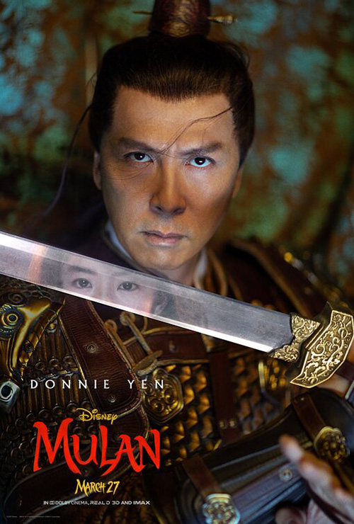
BLT leans right into this duality by turning princess into soldier thanks to the metallic blade. Her face remains intact with features lined up and hair unabated—the shift occurring with long hair contrasting helmet. Ignition goes for a subtler approach—one that doesn’t work as well on Mulan’s own sheet. You see, the others in this series all have her reflection in the sword to ensure she’s always on our minds. On hers it merely looks like a reflection. The sword itself represents her fight.
Take away the blurred debris that shows up in so many character series for action films and Art Machine does a real nice job showing Mulan’s two halves in one with long flowing hair (itself a rather archaic and gendered way of connoting “woman”) and armor existing at once. She’s in the battle now and it doesn’t matter who she is as long as her heart is true. Traveling from there to BOND’s version is almost comical then since it’s practically the same image in close-up. Except here we don’t see armor or sword. We just see her in martial arts pose. Or is she readying to throw an element towards her enemy? I don’t think she’s a bender …


Disney thankfully lets their designers go more outside the box for aesthetics where their special run sheets are concerned. Ignition created the RealD 3D look with some East Asian flair while BLT goes (semi) flipper by bisecting their Dolby Cinema poster in half. It’s interesting that the latter puts her soldier form in reality and princess form in reflection. This is thus a soldier keeping her identity as a woman under wraps, not the other way around. Nine times out of ten a bottom-line hungry establishment entity like Disney does the opposite.
Text & Image


Would Universal have rather released The Hunt (March 13) last September as scheduled? You bet. And they probably would have regardless of the latest shooting on US soil (we’re a long ways and too many massacres away from the days when Boondock Saints was buried to distance itself from Columbine) if not for Fox News and the POTUS of all people coming out against it for baseless reasons.

So what did Universal do? They shifted it to this month and spun the controversy into promotion alongside LA. This isn’t the first film to use “damaging” quotes as a means to selling itself, but it might be the most visible considering what occurred. Add the reality that this avenue means you don’t have to show anything else (spoiler or not) means your final sheet can be as mysterious as your tease (itself a fun gag via LA). Let the vitriol reign supreme.
BLT doesn’t have the blurbs to do the same with First Cow (limited March 6), but they do have a simple title with a simple image to retain a similar air of the unknown. What is Kelly Reichardt’s latest about? I don’t know. Is the title in giant yellow letters behind a rafting cow enough to make me buy a ticket? Heck yeah. And even, though, I know it’s a drama, this poster is low-key comical enough to make me hope Reichardt gave it some laughs too.
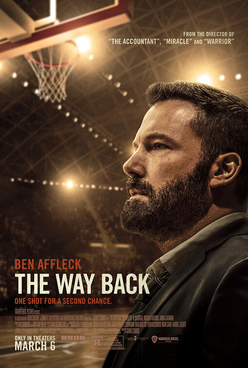
Text on posters doesn’t always have to be titles and quotes, though. Sometimes a great use of text comes from the image itself like with Gravillis Inc.’s The Way Back (March 6). I really like this piece because it’s doing the usual things (putting the star at the forefront and keeping things simple with title and reduced information) in interesting ways. Yes the bottom quarter is boring, but the top three-quarters is gritty, dramatic, and visually pleasing with its quasi reflection/projection of the scoreboard atop Ben Affleck’s pensive uncertainty.
Compare it with the final sheet and you see just how drab things can get. It’s the exact same image of Affleck, but the added light removes all emotion. The empty court behind him lacks excitement as tension is removed for low stakes sterility. The first asks us to wonder what might happen. The second has us wondering why we should bother.
Frost Foundry takes things even further with The Booksellers (limited March 6) by making its text into the image. It’s about bookstores and so it becomes a bookstore with lettered vinyl, open sign, sleeping dog, and reading customer. We’re about to enter this world literally and figuratively—the feeling of the camera pushing in through the glass to let us step upon that rug and turn around is palpable. There’s no better way to represent what we’re about to experience than this quaintly elegant manipulation.
Roll call


We have another film opening this month that was supposed to bow last year and I like the new poster to accompany the shift. WORKS ADV’s My Spy (March 13) isn’t unique, but it does do a great job illustrating the tone thanks to the simple addition of a Band-Aid on Dave Bautista’s cheek. It’s a nice touch because it makes it so Chloe Coleman doesn’t have to be “a kid” as contrast to his CIA operative. She’s allowed to scowl and show that she’s just as tough as him if not more. Her character isn’t being undercut. His is.
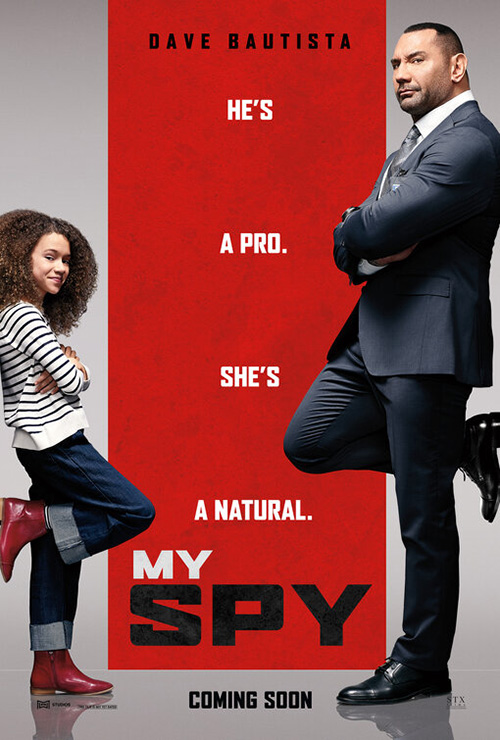
It may not seem like much, but that’s an intentional statement. It allows Coleman to have equal footing with her co-star—something the original teaser didn’t by forcing her to smile and him to be annoyed. Suddenly she’s the problem for him to compromise his identity to protect. If you’ve seen the trailer, however, the opposite is actually true. That’s why the above works so much better.
For Never Rarely Sometimes Always (limited March 13), Desi Moore takes the challenge of having nothing but a film still and runs with it. Rather than let the image fill the entire frame, she crops it into a square and forces us to stare into Sidney Flanigan’s eyes.
The whole being so bottom-heavy makes it so that there’s nothing else to look at—each line of text melding together and squeezing downwards besides a single laudable quote floating above air at the top. This makeshift window’s claustrophobic nature creates nothing less than a full-blown confrontation. You’re either ready for it or not.
This Time Tomorrow does a similar thing with The Truth (limited March 20) without being so antagonistic. It’s as though they took the conceit of The Farewell‘s poster and mixed it with The Favourite‘s flourishes to supply a familiar yet off-kilter portrait of a family with matriarchs front and center. It’s partially masked in order to create a frame around it and the focal point is staring back at us.


While Goodlab (the Italian sheet) and InSync Plus (the other English sheet) are using the same image, how they do so alters its impact. The first does exactly what The Farewell did last year and loses its potency as a result. We should be looking at Juliette Binoche and Catherine Deneuve, but a standing Ethan Hawke prevents it because he becomes an outlier to them in height and isolation. The second crops inward, removing the framing device and thus refocuses upon the women. But moving so close means the text must go on the image rather than around it. This competition means everything gets lost in the process.

Deerskin (limited March 20) sees Frost Foundry creating an image within an image. They’re taking the theater wall into consideration knowing that they’d lose the drop shadow effect and three-dimensionality of the piece by making the poster into the painted canvas itself. We now thus see the stitch work rather than ignore it along the fringes. We can recognize the craftsmanship of the wood frame where it would have been otherwise out of sight.
At the right angle your mind might even be tricked into thinking this “painted” canvas was being housed in a light-box with the text superimposed atop it via a glass cover—that great title font and its tag a brand selling leatherwork instead of a movie. It therefore possesses levels of interpretation that the sparer alternative can’t with its bold sans serif and photography. It loses its tactility. What had been art is now merely glossy advertising.
To catch an eye


Stuff like Leroy and Rose / Concept Arts’ Onward (March 6) teaser generally doesn’t look this good. It’s funny too since the ones that don’t are generally for live action films you’d be able to take a photo for while this is the work of computer animation.
The title looks like a patch. The pins look like a mix of enamel and metal. The jean jacket looks worn. And the lighting effects look natural. Compare this to Spider-Man: Homecoming‘s faux collage of drawings and stickers to see what happens when you operate from a place of pixels to create something “real” instead of the opposite. It’s too perfect in how it looks messy and yet calculated at the same time. It’s working to the frame’s constraints rather than framing the content at its disposal.


Leroy and Rose are also responsible for Onward‘s main sheet and its cross between fantasy graphics and cast totem. I like the frame design’s 70s-era car paint aesthetic and the desire to build a crest from it, but making every quadrant of the latter into a window with a different scene from the movie is overkill. Our eyes are too busy peering into each to see the disparate environments to register that the whole is so much more interesting from a distance.
Concept Arts’ Vivarium (limited March 27) is equally eye-catching in that it looks so unlike everything else that generally graces a multiplex’s walls. It’s a dollhouse rendered as an optical illusion puzzle just left of reality. Think Hereditary, but with a humorous lilt in lieu of suspense—strangely absurd rather than overtly sinister.


And while the original variation on this theme (with Outer Arc teaming on the creative) is basically identical, taking the boy out to be the focal point changes everything. Where the new one places him on a similar plane of existence to Imogen Poots and Jesse Eisenberg—each trying different doors to discover there’s no escape—this one makes it seem as though he’s put them in their current predicament to enjoy their reaction. The one above lets us be a player to reach out and twist this box like a Rubik’s cube. The other forces us to become a bystander forever on the outside looking in.
The posters for The Wild Goose Lake (limited March 6) all use shadows, but the above example is by far the most alluring of the trio with its mix of photography and illustration. It could be advertising another Nicolas Winding Refn movie soaked in neon if it weren’t so subdued to embody depth above surface. Yes it’s pretty with a red glow illuminating a triangle of puddles amidst a downpour of rain, but we feel drama and frustration. There’s emotion beyond aesthetic with a hatted shadow looming in the background to introduce suspense.


That same figure is seen in the window of the second sheet almost like a painting. Without the mystery the other’s simplicity evokes, this one comes off as highly generic with a heavy sans replacing the former’s unique font doing it no favors. The third is a little better on the intrigue scale considering the shadow has now manifested a ghost, but it remains a distant runner-up to the magic of the first.
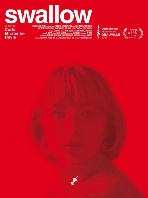
You could argue that P+A leaned a bit into Refn territory too with their poster for Swallow (limited March 6). Filter it through the lens of a softened Douglas Sirk melodrama with reds and purples pulsating through the air and you begin to approach the gorgeously sumptuous tone of what’s on the page. Add the glazed over mannequin look of Haley Bennett’s face and the surreal atmosphere of the film’s first two-thirds comes into focus too—that nightmarish dreamscape of being lost in a life outside of your control.
It’s a nice departure from the film’s original advertisement by sticking with the same idea while augmenting it with photography (a shift that usually ruins what worked best). That one is good too as Bennett looks past us in shocked surprise, the white x-ray of a thumbtack lodged in her throat proving the secret she’s keen to keep under wraps. Her expression being lucid and in control, however, makes the whole feel like a thriller. The other’s dazed wonderment that simultaneously looks at the tack and beyond it is more akin to the uncertain social horror the film truly possesses.
What is your favorite March release poster? What could have used a rework?