Summer is here with Woody and the gang, He-man, DC supers, “jackasses,” Spielberg aliens, and a Cindy and Brenda reunion all arriving to scoop up most of your local theater screens. That doesn’t leave a lot of room for everyone else.
This season always carries a bit of a wild west atmosphere as a result. Enough that you wouldn’t blame smaller studios for wanting to avoid such crazy competition altogether.
Enter the counter-programming angle. When not everyone trusts big IP to be worth the price of admission anymore, it might just prove the perfect time to release that foreign action flick or festival darling after all. The posters below go a long way towards providing an audience’s evolving attention the alternative road they crave.
Sharp objects


It’s one thing to talk about a poster like Akiko Stehrenberger’s Maddie’s Secret (limited, June 19) and another to learn about its intent and influences from the artist herself. Because you can see the obvious earmarks to King Kong with John Early serving as the damsel and the fork standing in as the monster. This is a film about a food influencer dealing with bulimia, so the themes shine through perfectly. Yes, the utensil is causing her strife as a villain, but things are always more complicated.
What you might not see, however, are the design influences. The color choices and contrasts with “shimmering” legs à la Showgirls and an Interview Magazine cover. It’s easy to miss how important angle and execution become to both pay homage and build something wholly new and unique. Because who is Maddie really scared of in this image? It’s not the fork. This surreal, dream-like imagery is telling us the fork holding her in its grip doesn’t reveal it as a threat as much as it is a tool revealing her true horror.
The sharp object on P+A’s The Death of Robin Hood (June 19) is also a tool alluding to unseen danger as Hugh Jackman carries his arrows into what we assume is battle—the darkening sky, the flaming embers. There’s a weight to the drama that’s inherent in the color palette as well as the specific cropping choice of the composition. We don’t get to see his eyes—only the stern profile of his mouth paired with the determination of his gait. We don’t get to see the object of his attention—only the almost monochrome atmosphere alluding to its danger.
The tagline is great too: “He was no hero.” It speaks to this rendition of the myth not adhering to the usual tropes of Robin Hood being a man of the people who fights tyranny and gets the girl—it speaks to a darker truth of sacrifice, futility, and guilt. There’s a reason those words are at the center and just as large as the title on this teaser. We’re supposed to read them first. We’re supposed to understand the world this poster provides a window into and erase the Disney version from our minds.
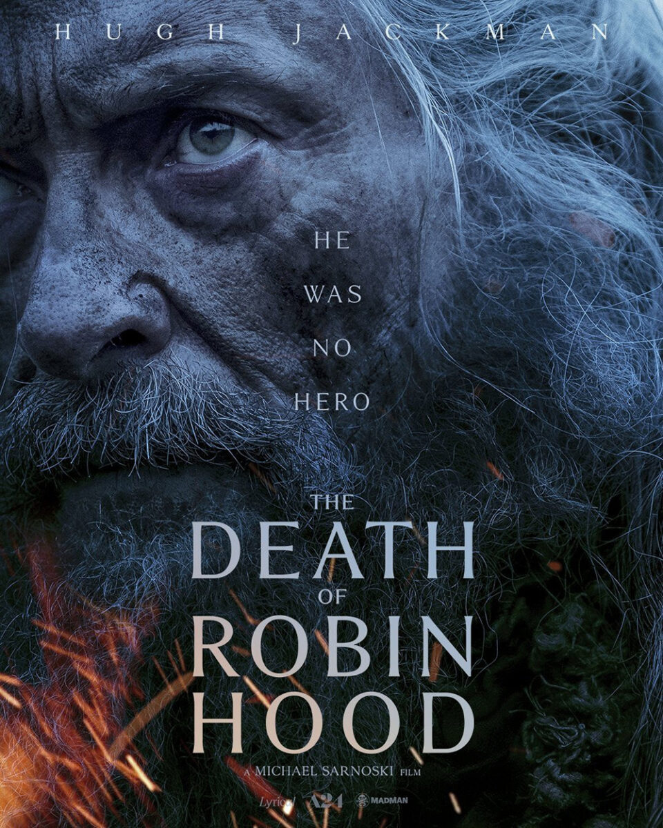
I find it a lot more effective than the alternative version: Jackman’s face superimposed with the same elements. You still get the blue hue and flying embers, but the title is now twice the size of the tag and all we can see is his face. Thus we don’t recognize a motive, an intent of action, as much as enter the character’s haunted mind. Maybe there’s no target at all. Maybe he’s just been left to battle the ghost of himself.
Drew Wills and BOND’s poster for The Furious (June 12) doesn’t have cutlery or weapons—just fists, boots, and a fantastic use of sharply measured perspective to put us into the action unfolding on both sides of this concrete corner. One kick pushes us in from the left to follow the “The” around the bend so “Furious” can slingshot us around to the carnage on the ground. And there at the center are stars Zie Miao and Joe Taslim dropping more bodies to join the wreckage.
Its kinetic image sets the mood and energy via an almost 45-degree tilt that keeps us off-balance while the actors hold firm. There are also three visual triangles dictating our focus within it. Two are formed by the perspective moving to the left and right of that central corner; the third enters from the top via the shortening lines of laurels and text. The latter leads our eyes downward as the former pushes us out to the edges. Our eyes never stop moving.


Khang Giate’s bloody illustration achieves a similar feel as the red splatters create a spiral of motion from the hammer to its victim while the triangular backdrop makes me think I’m inside EPCOT’s Spaceship Earth. Their other international sheets prove more generic with actor collages. Despite preferring those first two for their off-kilter compositions breathing life into the action, I can’t fault the studio for wanting a couple portraits too. Placing them side by side, however, hopefully shows the powers that style isn’t always about adding more to an image. Most times you just need a slight shift in perspective to turn heads.
Chunks


I have BLT Communications, LLC’s The Invite (limited, June 26) here because of the windows separating its cast list into two chunks that enhance the y-axis symmetry, but the more glaring feature is its Woody Allen font. The aesthetic is so unmistakable that you know it was intentional. After all, Variety did describe it as “like Who’s Afraid of Virginia Woolf? redone as vintage Woody Allen.”
Regardless of that nod, however, I just like the clean design. A colorful couple number one meets a colorful couple number two beneath the tagline “It’ll be fun.” The cast list and title seem to be the same size to express the importance of the former while the claustrophobic leading of the names helps them fade into the colorful setting behind their glass panes to ensure the latter pops a bit brighter for extra attention.
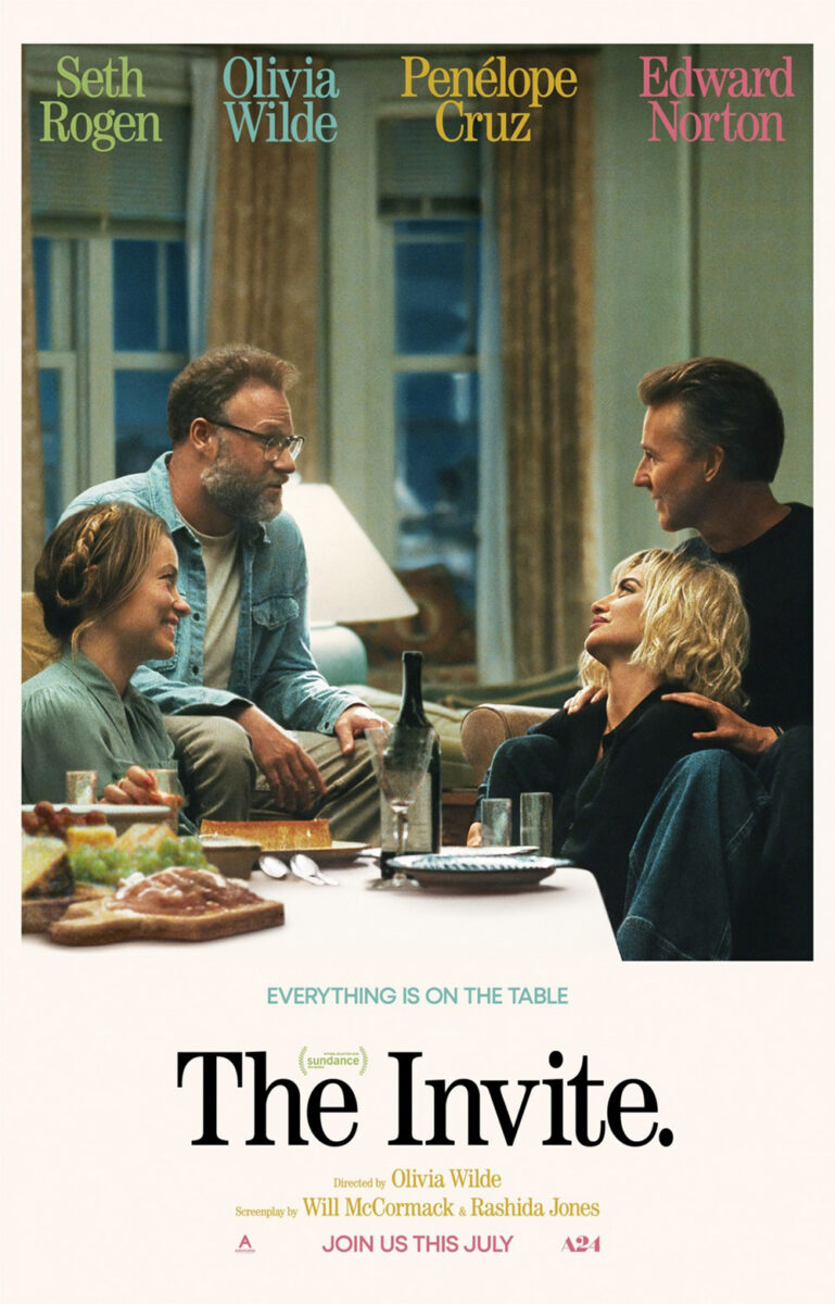
The full sheet brings in a photo of the quartet and thus ruins some of the mystery behind that original tag. Whereas we could presume “fun” was more for us than the characters, this image shows the opposite. It’s just two couples enjoying each other’s time. It shifts the potential of fireworks into a promise of quiet wit. Is that what the film actually gives us? You’ll need to watch to find out. As the new tag states: everything is on the table.
The chunks of content making up the Bouchra (limited, June 26) poster aren’t naturally found like that bisected window. These segmentations are made by the artist to create a sort of triptych via two parts. The top two-thirds show an outdoor scene of a cliff looking out to water wherein the giant red title fills half the space. The bottom third is a black field housing an Arabic translation of that title with an illustration of the lead wolf.
There in the middle is a character jumping into the water to help our eyes move from the strobe-like color effect that occurs from the red-on-blue down to the calmer black to read “What’s on your heart?” and wonder what it is this film has in store for us. Anthropomorphic animals. Multiple languages. Animation. Heavy philosophical questions. It’s the sort of intriguing tease of possibilities that can sway a ticket buyer’s impulse to try something new.
That leads us to Beth Morris’s Promised Sky (limited, June 12) and its own gorgeously constructed triptych. While also composed of two disparate images, it too separates into three distinct fields. This time, however, they aren’t equal. Here, the bottom quarter holds the top of three faces (from the nose bridge up) on a white field while an expanse of water fills the top three-quarters. Then it’s the horizon line’s demarcation between blue ocean and blue sky that lets the top quarter stand alone as a backdrop for a bold-white title.
It’s an expert use of white space in the middle, whereas most designs would bring that title down so the white space breathes off the top of the page. It thus becomes less of an escape for our eyes than a carefully built window to draw us in for contemplation. That space becomes our focal point—confining us to look deeper and understand the gap between that “promise” and a reality that presumably doesn’t quite match. The characters take a backseat to their thoughts and emotions as signified by that Rothko-like field of blue.
Hand-made


Fresh off their collaboration on Bogancloch (which was in my Top Ten Posters of 2025), director Ben Rivers and designer Sam Ashby reunite on the poster for Mare’s Nest (limited, June 24). While the story about a young girl roaming an adult-less world is based on a Don DeLillo play, it seems there’s also a “film within the film” aspect wherein the children onscreen make their own a short (Rivers’ The Minotaur).
The poster’s handmade quality therefore appears thematic in nature—especially with the multiple cross-outs of “featuring.” We can assume the idea is that this was created by lead character Moon in-world, since the figure on the page has horns like that mythical beast. The circles become as much about reflection as duplication, inferring upon the layers of artifice in play in front of and behind the camera.
It’s also just a captivating image. The scrawled circle housing the title and credits in a child-like penmanship. The crescent moon alluding to the character’s name. The mysterious well of water being peered into as the sole landmark on an otherwise empty page. You cannot help but crave an answer to how it all fits in concert with the movie.
From hand-drawn to hand-sewn we go courtesy of a needlework Drunken Noodles (limited, June 26). Whether just inspired by the “thread painting” of Sal Salandra (as is the film) or taken from an actual piece of his (although this is much less homoerotic than the examples I found online), the choice to use that aesthetic for the poster is an inspired one.
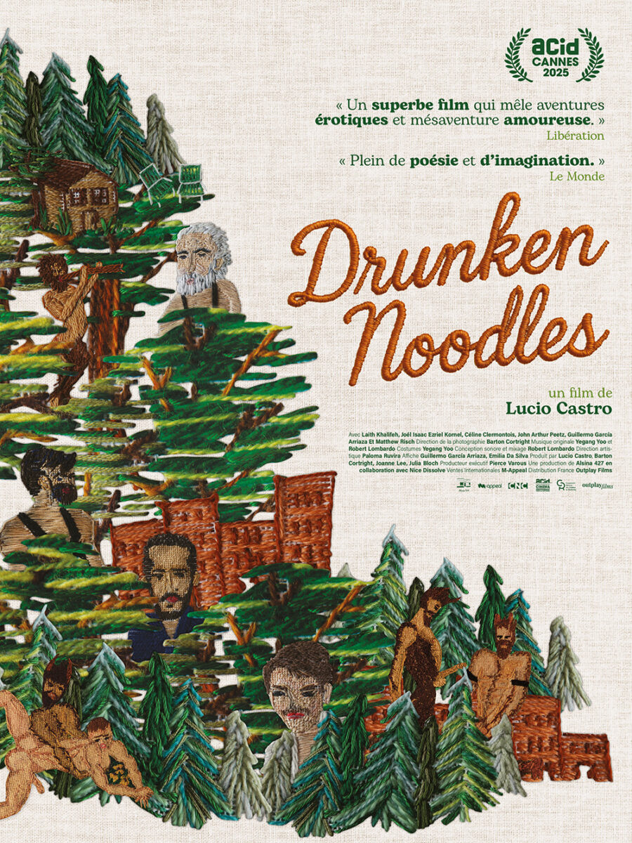
It’s an avalanche of trees and buildings and faces (four men alongside a fifth figure that looks like Pan playing a flute) popping out between them that slides down the left side of the page. The stark white background forces us to go to the image first before riding its slope down to the title below. Simple, unique, fun.
The French counterpart gets a bit more risqué with naked men engaged in sex acts added to the woodland scene. It’s also a little more congested with the image blown up to fill half the page (bisected at a 45-degree angle from top left to bottom right) while the text is all moved to the opposite corner, but I won’t deny that the fabric background texture and embroidered title add a lot to the whole. It’s a case where both iterations prove successful in their own way.
And that leaves Flag Day (limited, June 12) to anchor this month’s feature and let it end exactly as it began: with artwork by Akiko Stehrenberger. Her painting is a perfect encapsulation of the tagline “One flag. Many voices.” as its stars and stripes morph into faces with mouths open wide in song—presumably with the words of Francis Scott Key or Katharine Lee Bates on their lips.
The paint is laid on thick, brushstrokes still intact to give the whole that handcrafted, American-made feel with the title’s text given a similar treatment in a lighter, more watercolor-like base. It all comes together to provide the patriotic symbol refracted through a humanist lens of absolute equality that our country desperately needs.