It’s a five-Friday month and those last two look a lot sparser than the first three. I don’t think you can really blame studios for wanting to avoid The Mandalorian & Grogu (May 22), but it still feels weird considering that decision also means avoiding Memorial Day weekend.
The Star Wars property proves the biggest name on the schedule. The Devil Wears Prada 2 (May 1) is probably number-two. Then it’s maybe Mortal Kombat II (May 15)? Throw in Billie Eilish’s concert collaboration with James Cameron on May 8 and that’s not too tall a mountain to climb for some box-office parity from the little guys in-between.
So the poster game becomes crucial yet again. Coax some unsuspecting ticket-buyers into your films with a head-turning one-sheet. Go crazy like Thom Muir did for Yellow Veil Pictures on Salt Along the Tongue (VOD, May 1) and dare the theater to be bold enough to hang it on the wall next to Grogu. Talk about a conversation starter.
Colors


Argentina is turned neon green with the poster for Our Land (limited, May 1). A drone shot from the film is stripped of its natural color to become a duotone of dark blacks and green atmosphere with critic quotes floating above its mountain peaks. This stark contrast allows for the title to pop as our eyes wonder whether it’s been superimposed above the foliage or opened as a window through it onto the green background below.
The treatment of that title captivates, too. Rather than just sitting horizontally across the page, the designer slants its boxy font to slope up from left to right. It provides a nice sense of motion vertically through the page so that we don’t merely read the title and leave. Slanting Lucrecia Martel’s name above it in the opposite direction then adds even more visual intrigue by creating an incomplete “X,” or perhaps a film slate readying for its “action” call.
If there was any focus on insects during the film (there isn’t), I’d might go so far as to say the title block looks like a bee flying across the frame—green body and white wing.
For obvious reasons, Jack Staniland decides to go blue with his poster for Blue Film (limited, May 8). More than a background or image tint, however, he doubles down by using the color for the text too. It’s a confident move demanding viewers come closer to discern words that are perfectly adjusted for legibility with a slight squint. Much like the voyeuristic porthole framing of the actors grabbing focus to move through the barrel of its telescopic illusion, it’s almost like we aren’t supposed to read them at all. So be brave and do it anyway. Just don’t get caught.
While the title itself is a simple bold sans serif, I do love that it’s not just a static white contrast to the rest. There are layers to its drop shadow of different blue tints to give it elevation against the circle’s depth. Add that little red recording light as a superscript icon to the “M” and there’s no escaping the sense that someone’s privacy has been invaded.
What’s truly bold, however, is AV Print’s choice to spark intrigue in Kane Parsons’ Backrooms (May 29) with an image that’s ubiquitous enough to be found in countless iterations online as free desktop wallpapers. It’s the motif he used on the Blender-generated walls of the liminal-space labyrinth at the center of the viral shorts he’s now expanded into a feature film. And it’s the perfect image to confuse unsuspecting passersby.
It’s also the perfect image to excite fans of the series who can instantly recognize its chevron stripes—it’s probably on their cellphone lock screens right now. Those in the know will want to approach it in the hope of being no-clipped through the theater floor right into those backrooms themselves.


Through their extreme crops, the follow-up character sheets thus arrive as a great campaign evolution. They are simultaneously claustrophobic in how the actors feel trapped within their tight frames and infinite in the way the wallpaper extends past the edges towards unknown or nonexistent ends. All that space yet nowhere to go.
Women


Considering a new glass balcony ledge that allows for an unencumbered view of the sea below is a plot point in Forastera (limited, May 29), I like how Emilio Lorente’s (photo by Monica Lek) poster conversely creates a barrier. Because, as the film quickly reveals, nothing is fully transparent in life. Our hearts are constantly blurring lines that our brains attempt to keep intact.
More than just a shroud above Zoe Stein’s face, however, those halftone circles are also providing a surface with which to see a reflection. It’s easy to miss, but there’s another face floating in the water above Lluís Homar’s name. It’s Stein’s character’s grandmother—the woman her grandfather keeps confusing her with after tragedy strikes. So we’re seeing an echo of sorts on the page: a ghost looming large over a grieving family trying to breakthrough to the other side of sorrow.
Rather than a portrait with hidden meaning, Suspiria Vilchez’s painting for Fucktoys (limited, May 29) is more about aesthetic homage. It seeks a connection to cinema of yesteryear with a fun, lively energy that augments the title’s obvious subversive nature. Add the “I love trash!” dialogue above a baby goat in cowboy hat and it’s impossible not to smile.
Director-star Annapurna Sriram calls the film a “big love letter” to all the “art house, cult, grind house, new wave films” she grew up with and you get the sense that Suspiria ran with those words as the basis for the image. The colors pop. The light glints everywhere to lend a fantastical sense of glamour. And the heart lollipop held to Sriram’s lips accompanies another three floating around her to tease that romance is in the air.
For I Love Boosters (May 22), George McWilliams and Grandson distill their lead down to a brilliantly composed title treatment providing her limbs via embellished letters. It’s a woman in flight with yellow high heels pumping that “S” and “R” to run while the “V” and “T” supply hands with which to clutch objects taken during the getaway. My favorite part, though, is the wig representing her head: it looks to be affixed backwards, considering the text clearly moves left to right, but it’s actually showing her glance back to see if anyone is giving chase.
The color scheme is wonderful with a repeated pattern of five bright hues. The cast list moves from yellow to purple to magenta to blue to red and over again. The “body” consists of a blue blouse, red pants, and yellow shoes with a purple purse and yellow hair sporting magenta highlights. And the simple act of justifying all the text to the right (besides the title) manufactures a walled edge our thief can use in escape.


While this teaser gives off major Saul Bass vibes to win me over, I do enjoy the full sheet’s jam-packed cast photography. It’s very Muppets (designed by Proof) in its jumble of faces, but also intriguing in its repetition of Keke Palmer, Taylour Paige (three times each), Naomi Ackie, and Poppy Liu (two times each) in different costumes. It’s a candy-colored collage of fashion and disguise that only becomes more blinding in a series of Pantone character sheets.
Stacks


One look at the poster for Stolen Kingdom (limited, May 21) had me asking myself, “Did Matt Needle make this?” Its clean-edged collage style screams Needle Design and, sure enough, I found the credit via the film’s Instagram after striking out with his portfolio.
It’s a great aesthetic for the story of a lo-fi heist at Walt Disney World. The whole feels as much like a scrapbook account of the crime for the thieves themselves as it does an investigation board for the police to try figuring out the how and the who. We get news articles, schematics, graffiti, and a great tag in the bottom right with official “do not destroy” messaging. The sheet is as much a treasure trove as what the film is billed to provide in its interviews with a community of underground explorers who frequented the theme park.
Whereas Needle stacked documents atop each other on a flat surface, the designers for Saccharine (May 22) stack ambiance onto a kitchen scene featuring the illuminated shelves of an opened refrigerator. What should be a rather innocuous photo suddenly turns sinister when you glimpse the shadow on the floor. Because its human form is coming out from the fridge despite there being no one present to be its source. Is the appliance human? Are we witnessing the presence of a ghost?
The tagline “What’s eating you?” presents another alternative: is the shadow the last remnant of a victim who’s succumbed to the nightmare of what’s sitting on those shelves? Maybe we’re looking at the split second someone disappears. Or perhaps it’s an allusion to the horror inherent to being a slave to one’s appetite and the unhealthy sugars hiding in plain sight.
The poster can’t help feeling a bit humorous. Yes, it’s dark and foreboding, but there’s also a callback to Dana Barrett opening her fridge in Ghostbusters before finding Zuul’s altar inside. Regardless of tone or intent, however, it’s also just a well composed image with great lighting and exquisite typography that lets the focal point of light draw us in without distraction.
By comparison, there’s no mistaking the tone of Dylan Haley’s Renoir (limited, May 29). After all, the first critic quote is literally “Whimsical.” We’re meant to feel as if we’re inside a dream wherein Yui Suzuki can be both popping her face out from the clouds and standing atop her own head. It’s a delightful image of imaginative surrealism completed by the presence of a butterfly and a fun title font with loopy “O” containing the Japanese translation as a floating director credit is blown away by the wind to its right.
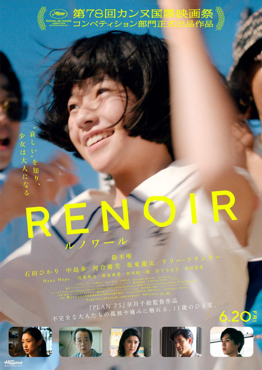
The original Japanese poster is just as whimsical in a different way: it utilizes a film-still close-up of Suzuki jumping into the air with arms high and a smile plastered to her face. It exudes joy and playfulness, the slanted text almost moving with her against the static constraints of the page.
Only that wavy “O” (and zero in the release date) adds a bit of uncertainty to the otherwise consistent atmosphere of excitement. Much like the positioning of Suzuki in the quieter English sheet teases a sense of sorrow and avoidant fear, that “O” suggests a bubble ready to pop and bring everybody back to reality.