The theatrical experience has returned and the tent-pole titles held for over a year are finally here. While many were excited to go back, however, AMC and Regal have thrown a new wrinkle by allowing vaccinated customers to go maskless via the honor system. Seems like a one-step-forward, two-steps-back decision where cinephiles seeking the safest return possible are concerned, but it’s not surprising.
It therefore makes sense that studios haven’t reversed course on their limited theatrical windows or day-and-date release strategies. Someone recently posited the question to me about whether “theatrical release” will still be its own term in the coming years. They’re not wrong. The difference between titles getting a theatrical-only debut and those going straight to VOD/streaming is now about money, not quality. (It honestly always was.) Why should that suddenly make a whole swath of cinematic art “inferior” from day one?
Luckily the poster game for blockbusters and indies alike continues to get stronger as visibility becomes key, with so many viewing options currently at our disposal.
Rich colors


Most days would have me saying it’s impossible to make a good character collage poster, yet here I am about to praise LA for doing exactly that with F9 (wide, June 25). Is it the crisp Photoshop work? The dynamic, slanted composition? I’d argue it’s the brilliant use of rich colors to not only punctuate the visuals, but also add movement and depth separating foreground, midground, and background with compelling drama.
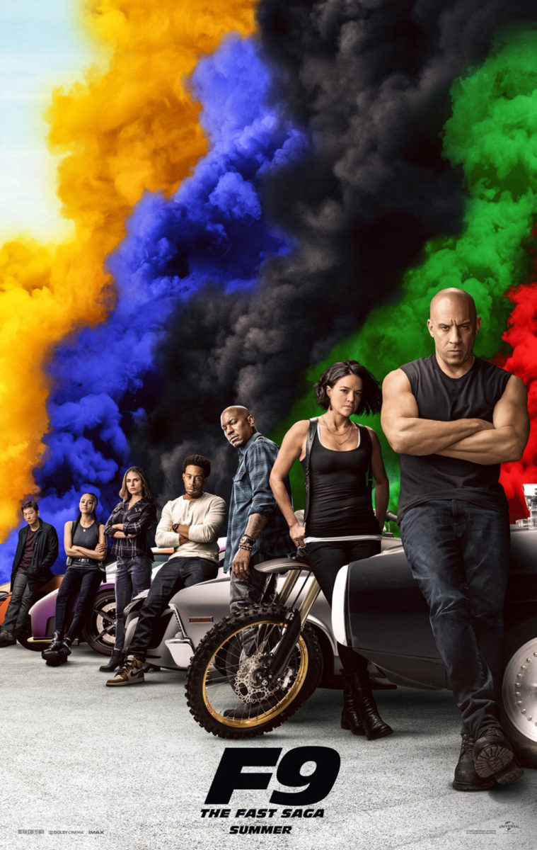
It helps when you can reduce your title to a letter and number and when you can skip the usual cast list that’s often a contractual obligation for A-list stars (such as the who’s-who of actors showcased), but those things don’t make this type of design a slam dunk by any means. Give credit where credit is due.
Because let’s face it: the version with only seven characters lined up is much less effective. The colors and white space are nice, but there’s zero motion outside the horizon line. We need the collage format to free it from its constraints—I’m as surprised as you.
In the Heights (wide and on HBO Max, June 11) takes a different approach, in large part because it’s being sold as an entity with history that soars well beyond the names of who was cast. No wonder, then, that Statement Advertising would pretty much make the teaser sheet look like a graphic playbill cover: minimal setting with textured colors, attractive title font, and familiar logos (almost just as big) to get audiences remembering what else the creatives made that they loved.


So when BOND enters to create a series of environmental complements, they find themselves with a wide-open tapestry unbeholden to anything besides excitement. There are no faces or names to clutter things. No critic quotes, either—they’re unnecessary with IP this recognizable and hyped. It’s all about dance. Motion. Color. We’re supposed to feel the music coming from the images even if we’ve never heard the cast album before. That’s what you get when you create something more about place than individuals. This isn’t about Anthony Ramos or Corey Hawkins. It’s about the electric energy of Washington Heights.
If unadulterated mood is what you’re after, though, look no further than Midnight Marauder’s Siberia (limited & VOD, June 18). Bluish-black space. Shining stars. And the slimmest of bright highlights bringing Willem Dafoe’s face into focus before letting it disappear. Is he a ghost? Is he a dream? Where does the man meet the place and where do they diverge?
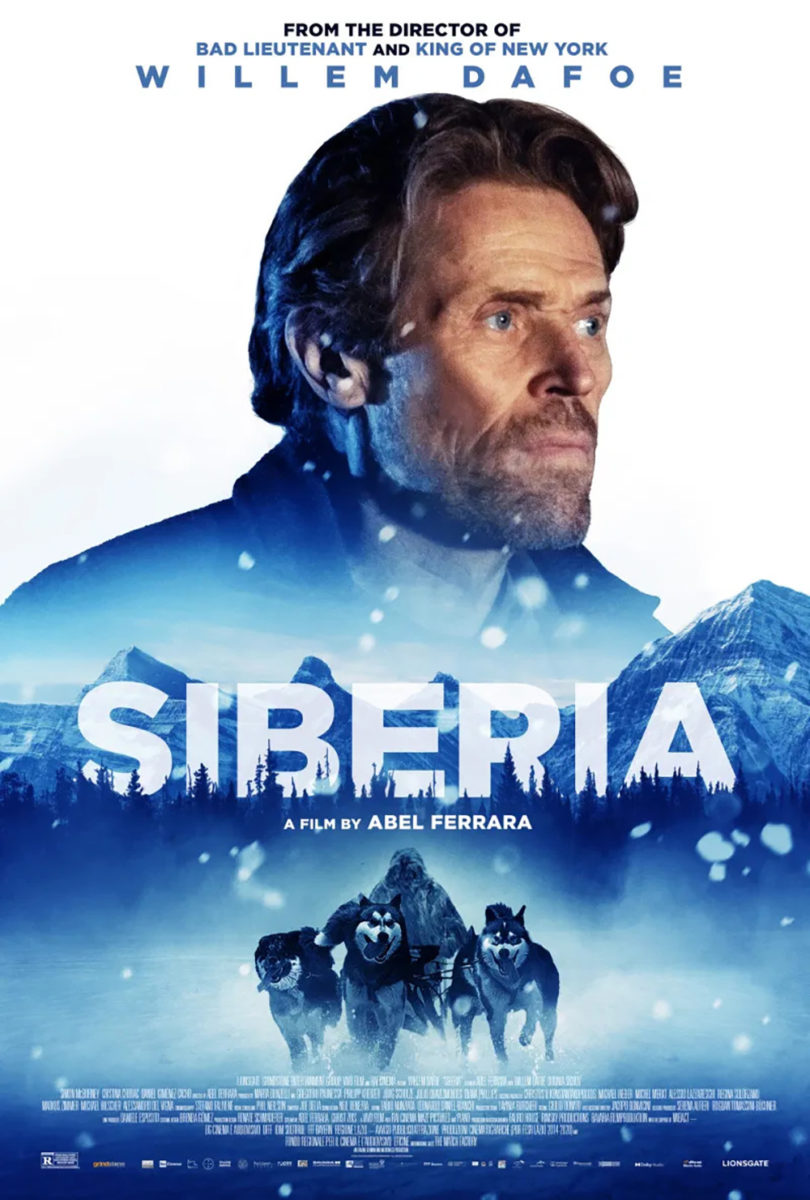
Add an austere font with ample kerning that makes it feel as though the letters are moving off the page thanks to borders that cannot contain them and you’re ready to let this film consume you whole.
So why not keep that momentum going by enlisting someone else to create a second poster… that looks like a VHS cover from the 1990s? It’s one thing to rush the masking job on Dafoe’s head, another to place it on a white background so we’re forced to notice the eraser marks where loose hair could have been easily blurred into a darker color instead. The title treatment is interesting, but it’s lost beneath that huge face and the “action” scene of dogs below. Talk about night and day.
Quote-heavy


Critic quotes have to go somewhere. Should they be as bold and big as the title? No. Never. That doesn’t, however, mean they don’t sometimes end up that exact type of glaring distraction. Thankfully the three in this section know to avoid this trap. Just because there’s no marquee name to highlight doesn’t mean you need to put something in the void. Let the design win.
One way to do that is keeping to a strict y-axis with everything in line and stacked from top to bottom, like The Refinery’s Censor (limited, June 11; VOD, June 18). The image is perfectly aligned with this choice as Niamh Algar stands as that y-axis herself. Text becomes horizontal lines—tracking marks to go along with the aesthetic of warped pixels going end to end above the title and at the bottom of the page. The axe in her hands becomes one more rung on the ladder.
And the blurbs aren’t just as small or smaller than the rest, save the teeny-tiny director’s name; they switch to sentence case instead of all-caps. Thus they can remain bold without drawing our eyes away from the more important (and subsequently bolder) tagline and star. They become just bright enough to read… if we decide that’s something we want to do.
MUBI and Binalogue’s poster for Sweat (limited, June 18; MUBI, July 23) uses a similar technique, albeit with a lot more intrigue. It’s wild to think something so simple as shifting the y-axis slightly away from dead center can create that new dynamic, but it just goes to show how delicate the compositional balance is when it comes to guiding a viewer’s attention.
That’s not to say the image isn’t also doing a lot of work here. Having the bar at the mirror double in reflection on a diagonal up and out from the center of that shifted axis is huge. It makes the “A” in the title our focal point with everything radiating from it. We read the large title bisecting it before bleeding off the edges and go north to south to catch those critic quotes precisely positioned in the windows that separate dual Magdalena Kolesniks. Some of the text is difficult to read, but the bigger picture benefits from it.
All Light, Everywhere (limited, June 4) doesn’t have that problem as it takes us back to dead center with high contrast white-on-black coloring. And while the heavy saturation is crucial for the blurbs at top to be as small as they are (although you better make sure your printer is good enough to not lose the thin serif used for the publication names), the title is just large enough to pop above a more diffused color scheme created by the grain-filled, fluid lights surrounding the sun.
That grain adds a lot all its own—a character you don’t always get on theater walls with glossy photography everywhere. There’s a soft tactility to it that allows us to be cognizant of the fact we’re looking at an image of the sun rather than the sun itself. Obvious or not, this is a subconscious shift in perception that takes us one step further in our engagement with the whole by acknowledging there’s more going on. Anyone who has seen the film knows to glimpse a layer depicting a human optic nerve in the mix. And that white dot is more than a glare spot. It’s Venus moving across our vision.
Face-off


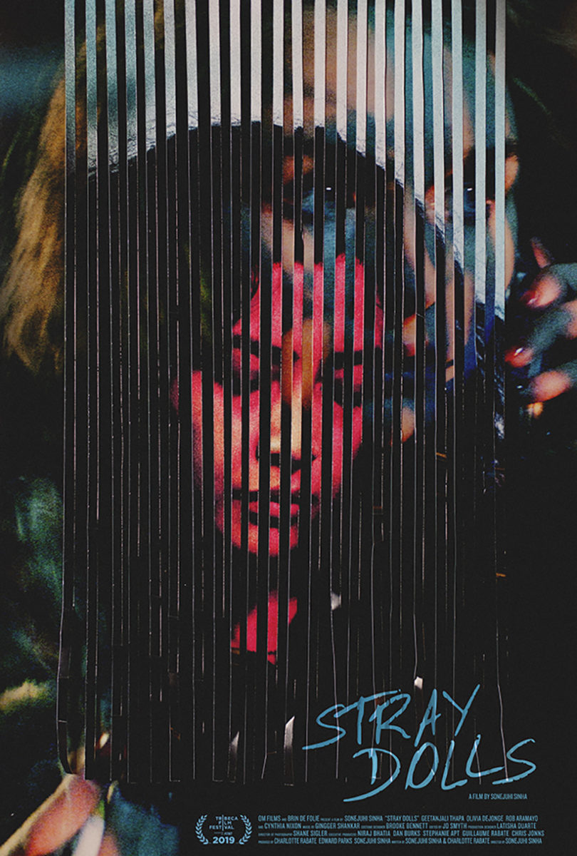
The poster for Akilla’s Escape (limited & VOD, June 11) was probably the best to come out of last year’s TIFF. It ingeniously captures the mirroring of its characters by mashing two portraits together via alternating vertical lines similar to one of my favorites from 2020, Stray Dolls via caspar newbolt / (version_industries). More than that, however, is how the designer weaves the typography through those lines. By putting them inside, outside, above, and below, each bar becomes as much a barrier to the text as a window onto the actors—the sense of imprisonment conjured proving a relevant theme.
It’s also just a singular piece before you even have the opportunity to dissect its parts. You almost want to slide left and right in order to see if more of the image can be revealed. (If this was a big studio film, you can bet there’d be cardboard stands where each portrait becomes whole depending on where you’re positioned.) The way it boldly turns its photography into a geometrically graphic puzzle is undeniably memorable.
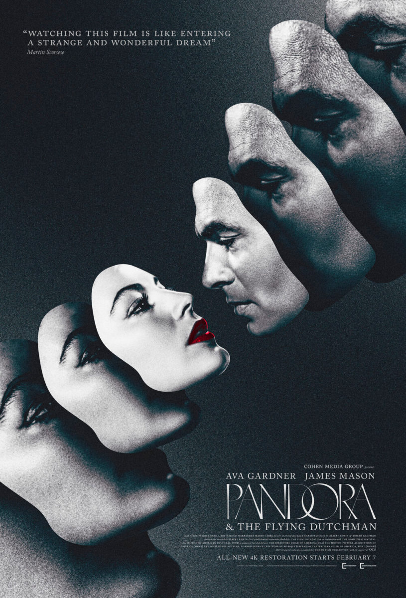
AV Print’s The Sparks Brothers (limited, June 18) may not be as formally shocking, but it is just as stark in its strangeness. It reminds me of Mark McGillivray’s sheet for the 4K restoration of Pandora & the Flying Dutchman with its use of faces as masks. Where that one utilizes the effect as its main motif, however, this one treats it as a gimmick worthy of earning the double-take I know I took upon my first glance. Is this one person or two? The answer is: yes.
The shadow work is wonky, but I wonder if that’s an intentional choice to give these two musicians a two-dimensional, flat feel and thus an even weirder look than they already give on their own. Using the fun logotype that appeared on the band’s sophomore album A Woofer in Tweeter’s Clothing is a nice touch too. Making it the sole splash of color (along with the release date) against the black and white imagery is a solid move to guarantee nothing gets in the way of what’s important.
One face outshines them all this month, though, and it belongs to Lincoln Maazel—star of George A. Romero’s lost film The Amusement Park (Shudder, June 8). The artist who ensures it does with a playfully surreal illustration is Aleksander Walijewski. A disciple of the Polish school of design that anyone familiar with the history of movie posters knows and loves, he’s been getting more and more work lately within the Hollywood sphere, helping bring its unique style back in fashion.
He outdoes himself here with a wonderful image that proves as terrifyingly nightmarish as it does entertainingly nostalgic. Its juxtaposition of a carousel with the graying and bloodied visage of an old man projects its subject matter (the horrors of aging) to perfection. And those eyes—so scared—trapped within the bodies of two horses are haunting enough to make certain we do not follow where they lead in case the danger he spies has decided to torture us as well.
What is your favorite June release poster? What could have used a rework?