“Don’t Judge a Book by Its Cover” is a proverb whose simple existence proves the fact impressionable souls will do so without fail. This monthly column focuses on the film industry’s willingness to capitalize on this truth, releasing one-sheets to serve as not representations of what audiences are to expect, but as propaganda to fill seats. Oftentimes they fail miserably.
The January doldrums have finished and Oscar season’s close has arrived. So say goodbye to the critical darlings and dump month horrors because cinemas nationwide are ready to deliver super-antiheroes (more on them below), familiar claymation friends (A Shaun the Sheep Movie: Farmageddon opens February 14), and videogame panache (the reworked Sonic the Hedgehog opens February 14 too).
That doesn’t, however, mean there won’t be some indie and foreign holdovers to satiate the appetites of cinephiles fighting against the studio takeover tooth and nail. There’s plenty of room for creative advertising to turn some heads alongside this unavoidable increase in glossy photograph.
Worth a look


I’m not going to lie: I opened LA’s sheet for The Invisible Man (open February 28) in Photoshop and played with the levels to see if something was hidden in the darkness. It obviously wouldn’t have been a person per se, but maybe an outline or something (handprints in condensate, etc.). Alas, it’s just black. And that’s okay. That’s the point.
While the title treatment could use an added bit of intrigue, the rest of this poster works even if it falls more in line with mainstream aesthetics than avant-garde trickery. The crop is perfectly executed thanks to the tagline’s paranoia and Elisabeth Moss’ eyes helping us to gaze into the abyss and wonder as fear mounts.
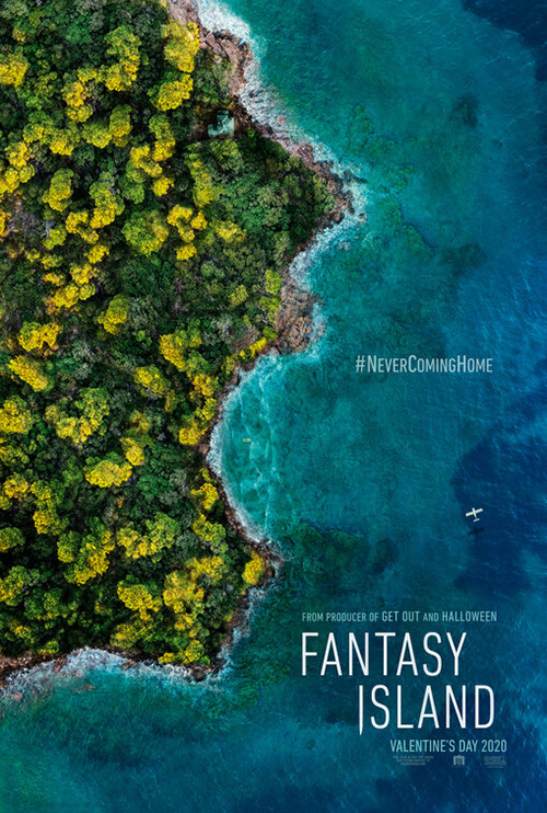
BOND conversely shows us exactly what’s shrouded in the depths of its ocean locale by making Fantasy Island (February 14) visible through the water. It’s a cool image because it’s not just a regular skull motif extending down past shadowy forest eyes to a cavernous mouth. No, this face has its head tilted back in a siren scream. It’s taking a big gulp of liquid as it threatens to consume everything in its wake.
cold open’s tease is a little too on the nose with its island outlined as a face instead of constructed by topographical markers. I do like its typography a lot better, though. The crisp, thin lines lend a horror vibe to this genre-flipped remake that’s only augmented by the “I’s” pointy descender. The other’s bold, translucent letters in wavy swirls feels too hokey.
Moving from photo manipulation to illustration, I give you I Was at Home, But … (limited February 14). It’s a simple piece that’s uninterested in excess with little more than a cast list, title, and laurel to go with its striking image of a bird.
The latter has a woodcut feel with delicate line work—handmade like the imperfect scrawl of cursive below. The result beautifully contrasts the measured, boxy sans serif surrounding it to deliver a juxtaposition of personal versus impersonal. Fact versus flourish. And with all that white barely touched, it’s nearly impossible not to take notice.
You could say the same about Gary Pullin’s Come to Daddy (limited February 7). It too is two-colors on a white-ish background, but it’s also trying to do more with its image beyond mere objectification. It’s telling us a story by putting a house above the alcohol-soaked ice cubes of a shot glass opposite a figure standing alone.

He can do this because he’s working with even less than the previous film. His cast list is but a single name and his cursive font is left alone without any competing festival logos. Rather than woodcut, Pullin’s aesthetic skews more towards letterpress. First came the orange-hued field of liquid and then the black-inked structure set to house it.
It’s almost funny to think this is advertising the same film as Kustom Creative’s goofy sheet with a bug-eyed Elijah Wood and old school, 1950s horror typography. Theirs has a charm all its own that makes it difficult to say one is better than the other, though. They’re both uniquely suited to a tone that should successfully cajole two very different subsections of moviegoers to the box office.
Vibrant colors


I like this poster for Goldie (limited February 21) because it knows its colors will prevail whether or not they’re given their full brightness. This realization allows for a black transparency gradient to cover the bottom half and do two things: provide a darker background for the critics’ quotes and mute Slick Woods’ yellow jacket enough to let the title pop instead.
The squiggles lend a playful flavor as though someone took markers to a plate of glass between the subject and them. I can almost see it all in animated motion—the lines shaking in a time-lapse loop while Woods walks towards us in all her glory.
Guns Akimbo (limited February 28) goes for a more pop art feel with solid colors stamped atop each other. Similar to Come to Daddy (a funny bit of synergy considering the Daniel Radcliffe is Elijah Wood memes), we’ve got yellow laid down first, purple second, and black third. It’s an interesting choice considering the film is about a live-action online hunt that would probably get artists thinking digital rather than analog. That they went with a lo-fi Xerox look therefore proves a welcome and inspired choice.
Now dial that electric energy back and take a look at the subdued by comparison Balloon (NYC February 21, LA March 13). Its colorful fabric full of hot air is just as striking as the previous two canvases—perhaps even more so due to its soft light being used as a beacon of focus against a tumultuous gray sky.
The designer doesn’t stop with atmospheric attention to detail, however. They go further by adding a second scene of drama below with three figures running through trees as a spotlight illuminates them from above. While so many Hollywood iterations of this bisected sheet would leave both halves straight up and down, this one plays into the visual mirror of the triangles formed by both the balloon and light respectively. They tilt everything at a 45-degree angle and create a consistent axis for our eyes to travel to and from both with the title boldly announced between.
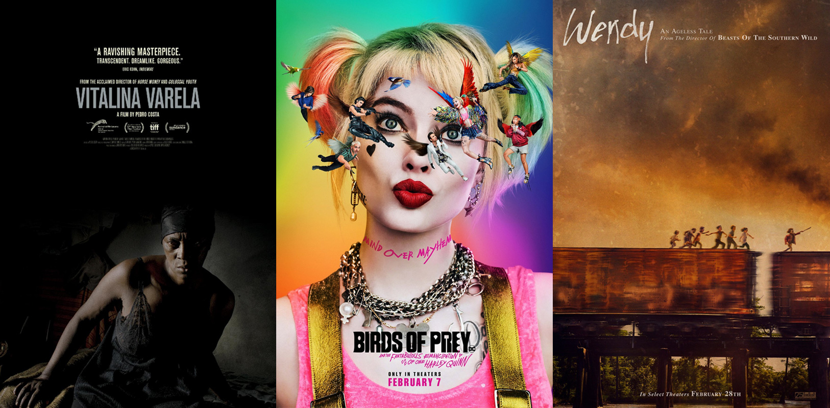
There’s nothing subdued about BOND and their wildly fun tease for Birds of Prey and the Fantabulous Emancipation of One Harley Quinn (February 7). I love this first one because it truly couldn’t care less about whether or not we see Margot Robbie and her hyena against the Post-It wall of rainbow triangles. The stark white of her skin gives us a way to do so, but the golds and tans absorb in with the rest. That leaves the yellow triangle housing a brilliant logotype that utilizes weapons to augment the letters (and create some as well) as our attention stealer. Juxtapose the bold sans of the first three words with the erratic scrawl of the extended title and the whole becomes a delightful window into the film’s bipolar psyche.


Then you have Concept Arts coming in with the great underneath angle that stamps an abbreviated acronym as gum on Harley’s shoe. There’s BOND putting Harley on a bullet flying through a shattered heart, Concept Arts’ surreally cartoonish Harley seeing the other actors flying in front of her eyes as though she was hit over the head with a mallet, and BOND’s full cast sheet putting the film’s women in action, front and center. The yellows, greens, and reds are saturated to an extreme to create an infectious roller coaster ride of visual splendor.
Emotional faces


There’s a playfulness to Emma (limited February 21) too as P+A has Anya Taylor-Joy holding court with the viewer, a coy smile inviting us into her world. Whereas the trope of putting text above an image is tired, the firm has found a way to make it work here through integration rather than distraction. The title and descriptors don’t compete with the actor herself. They complement her and exist in a way that gives her three-dimensional place within the flat page.


What’s great about this decision is that it still works when adding in two more characters. They can get pushed behind both Taylor-Joy and the title to create a triangle of importance without having to mess with scale. Compare it to The Refinery’s Love & Friendship for instance. The men look disproportional because they’re obviously not part of the same picture, but pasted atop each other in post. Emma doesn’t lose its sense of authenticity since its figures feel as though they belong together. Depth and not size differentiates them.
I also like the regality of the serif font and the kerning that centers it despite the period. It irks me to no end when a title includes punctuation as a part of its whole (or a logo and its registered trademark icon) because they always look unintentionally off-center.
Blood & Chocolate frames Zoey Deutch’s expression of manic insanity as its focal point with Buffaloed (limited February 14)—for better or worse. I think it works as far as selling the film, but the way they simply plop the photo down and cover it with color fields and text leaves a lot to be desired. There’s no co-existence between its parts. Everything is segmented as though it was put together at the last second.
And why are those stripes at bottom so prominent? Deutch’s image pretty much fades away with the red to leave the drop-shadowed title and blue/white stripes as our main focus. Is Buffalo so synonymous with the Bills that they had to make this look like the top of a football helmet? Nothing about it seems fully thought out.

Check out Corpus Christi (limited February 19) as a contrast. It too relies on an image of its lead, but it doesn’t shrink the frame in a way that makes it secondary to everything else. The addition of film grain and a nuanced depth of field (I wouldn’t be surprised to learn they masked Bartosz Bielenia out of the image, blurred the background, and put him back on top to pop out a little more) gives it texture and character.
It’s shocking then to see an international variation wherein his masked figure is thrown through a 1980s R&B music video filter as though he’s singing in the rain. What were they thinking when they hatched this one?
Less is more in a lot of these cases and InSync Plus knows it as they treat Horse Girl (limited February 7) much the same as that first Corpus Christi advert. The image is paramount with its text merely there to provide information. And it shows just how powerful a crop can be when it’s used to enhance composition and not stifle it like Buffaloed.
By closing in on Alison Brie’s face, less literally becomes more as she herself becomes abstracted beyond the physical. Shadows take on shapes, her eyes become a line of sight for us to move from left to right, and her expression becomes bigger than her celebrity. She isn’t selling the film. Her performance is.
Empty spaces


Not only does eclipse keep a lot of empty space at the top of their poster for Downhill (limited February 14), they also inject some between the lead characters too. It’s that relationship tension that helped make Force Majeure (the film this is a remake of) so good. It’s the distance that sometimes forms despite love that makes these people feel small and insignificant, not the scale of nature’s majestic breadth.


Regardless of the care that went into composing this scenario, however, the one-sheet is still very mainstream Hollywood studio fare. Will Ferrell and Julia Louis-Dreyfus have a glossy sheen that makes it appear as though they were Photoshopped atop the background and the bright orange title ends up blandly forgotten above.
It’s still better than the firm’s second go-round and its endearing gag of a too-long chairlift that earns eye rolls where the simple back-to-back frustration of the first conjured resonant understanding. Suddenly you have to wonder how closely the producers followed the original film and how much they embraced Ferrell’s usual penchant for absurdity.
A White, White Day (limited February 28) epitomizes that first Downhill poster needed to be less “Hollywood.” It ignores gloss for hazy atmosphere as the actors feel a part of their surroundings rather than additions to them. The title isn’t simply bolstered by more text to be a bright oddity amongst the mundane either. Here it arrives with a lack of color to help it blend into the fog as though the whiteness approaches to consume us all. And don’t forget the intrigue of the blood-soaked shirt. Where have these two come from? What have they escaped?
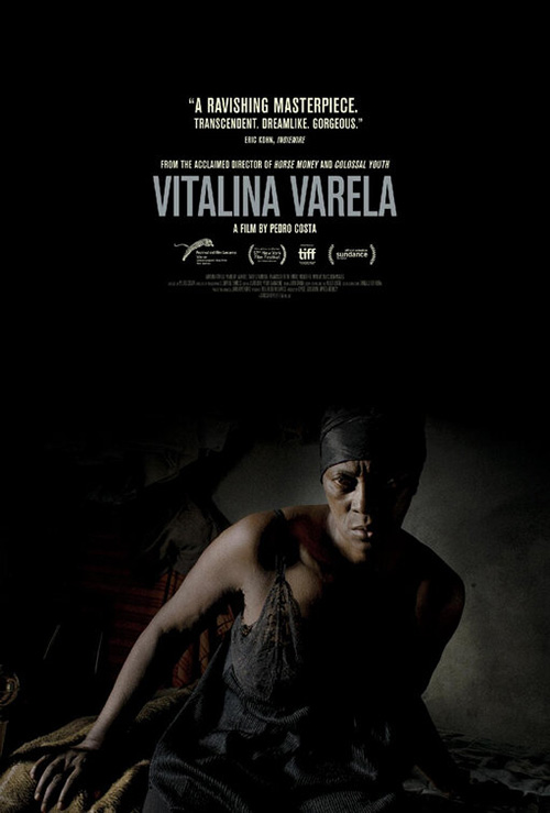
Vitalina Varela (limited February 21) carries a similar danger to it as the darkness of the frame shrouds its lead with a chiaroscuro aesthetic as though she’s moving through the shadows with purposeful intent. The red text exits the blackness as though a fire burning, perfectly complementing the intense look we’re being given below.
It’s no surprise then that the American release would utilize the same image for its marketing materials. It’s also not shocking that the result is much less captivating. The black has been muted with increased light shining through to remove a lot of that danger that drew us near. Now it merely seems as though she’s leaning to see past us rather than readying to pounce. The text loses its aggression too as its cooler coloring supplies calmness rather than desire.
And that leaves us with eclipse’s mesmerizing tease for Wendy (limited February 28). Its empty sky above is rendered with a painterly expressionism similar to Legion Creative Group’s Monos a couple months back. There’s something ethereal and menacing in its otherworldly presentation that the dark smoke of the train below renders even scarier.
But the children at the center aren’t scared. On the contrary, they’re running with excitement and sword in the air. Despite all the chaos they surely face in an existential crisis of being that they probably can’t even fully understand, these “lost” children are confronting madness with cheer. We can see it even from afar as the vehicle (and them) blur from the speed at which they travel. Body language and context trumps faces to provide what we need without compromising artistic motives.


The second version with credit block added is almost identical, but not quite as good. The sky’s painterly quality is removed so foreboding clouds can take its place and the title is enlarged and glowing rather than tucked in and crisp. You can say it adds drama, but I’d argue that drama comes across as manufactured. Sometimes a first draft doesn’t need fixing.
What is your favorite February release poster? What could have used a rework?