A lot of smaller films are coming out this month to help fill the void left by titles that members of the AMPTP have recently pushed back indefinitely––a move that seems to prove just how valuable creatives are to the filmmaking process before and after a movie is completed and their worth to be paid fairly in that role. Theaters need product to survive, so here’s hoping a return to more independent fare reminds ticket buyers what it was like before the big studios monopolized screens.
Inventive marketing is therefore needed more than ever to cut through the noise. How will that poster of a small film compete with the giant standee in the lobby? It’s one thing to finally get it on the wall, it’s another to make certain customers see it there.
Cutouts


Because the trailer for Jules (limited, August 11) feels like an old 1980s movie à la Cocoon or Batteries Not Included, it’s only natural that cold open would lean into an Amblin-esque poster. It looks like a Photoshop job to me, but this scene with its three stars looking at us as a crashed UFO rests behind them could easily have been given the John Alvin treatment if they wanted. Bright colors, goofy expressions, and a starry sky of possibilities.
Kudos for not giving in to putting the alien itself on display, too. Leave that reveal to the movie and simply tease its existence through a cutout window upon which the entire poster hinges. It creates more fun than mystery and shows that humans are the real focal point. This is their story. The alien is merely its catalyst.
Speaking of aliens: how can you look at BOND’s sheet for Landscape with Invisible Hand (limited, August 18) and not want to know everything you can about what this creature is and what kind of script has been crafted around it? It’s a perfect tease that gives away nothing but the intrigue of uncertainty. We don’t even know who is in the cast without squinting down to the credit box to discover its trio of names.
In this case, the alien is the draw. And it seems like it wants to make sure you know it too with a steely eyed stare and domineering body language. This thing looks like a high-powered executive sitting you down to tell you you’re fired. Hands on desk, mouth clamped into a frown, and an air of pregnant anticipation as it takes your love away.
You don’t therefore need more than a blue sky of clouds. Put a frame around the scene to create a barrier that doubles as the table for its hands and you get a window into a fantastical world that seems a little too real. The typography is odd with its wavy full-justified aesthetic, but it isn’t too distracting against the otherwise regimented whole. It’s just another intriguing element to pique interest.
As for The Elephant 6 Recording Co. (limited, August 25), the cutout isn’t a window separating foreground from background but the process of creating its collage of faces piled atop each other with a wonderfully DIY scrapbook style. I could do without the drop shadows making it seem each person is floating above the others rather than pasted down, but I get the desire to highlight the four bigger figures in the front with that faux distance. They become the focal point with the others taking on a supporting role.
What I really love is the top third of the page, though. The subject’s old-school psychedelic logo repeats itself to create a circle with which to house the film’s title in a gorgeous sans serif with hearts that fade at the edges to drive home a thickly inked stamp/letterpress look. The cotton ball clouds glued on and framing those words, helping the text pop against the matte blue and black. It’s the perfect counter-programming for every big budget glossy portrait destined to be hung at its side.
Awry


Like an image ripped from Alanis Morrisette’s “Ironic,” the poster for Love Life (limited, August 11) captivates with its juxtaposition of celebration (balloons) and sorrow (pouring rain). Fumino Kimura gazes at us with an unmoving expression of fatigue––unable to muster the effort to escape the weather. You get a real sense for what the film’s tone might be as a result. That place between needing to care too much or too little wherein you can’t bring yourself to care at all. Because every attempt at making things good only ends ruined.
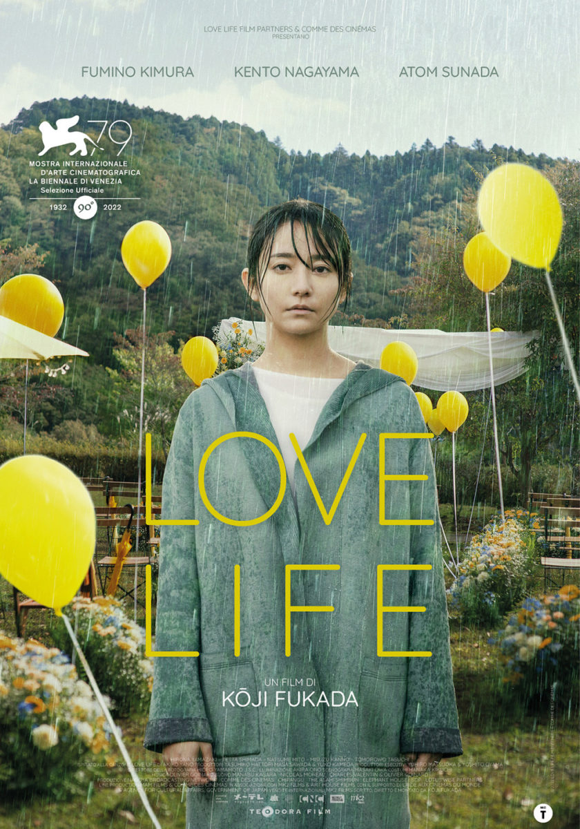
This Oscilloscope-funded version possesses a nicely designed composition that greatly improves upon the former festival sheet. The subject is identical with minor revisions in the relationship between Kimura and her background. She’s been slightly increased to fill more of our focus just as the whole scene gets zoomed in too. And by moving the Venice laurel to the top (with two more), another balloon can be added to really balance things and ensure Kimura earns our undivided attention.
The title is brightened up with a more captivating font of detached lines and its drop shadow is removed to let it better congeal with the whole. I hate that this US release decided to erase the actor names under the assumption that American audiences won’t know them enough to move the dial anyway, but it is otherwise a great example of how little tweaks can make a world of difference.
Men of Deeds (NYC, August 4; LA, August 11) also delivers an odd juxtaposition. Rather than thematic like with Love Life‘s rainy party, however, it does so aesthetically.
Our eyes are trained to search for the main figure of an image. We go to Kimura above because she, as an isolated human being, is more important than any one of or the collection of balloons surrounding her. So when looking at a photo of a chicken in the grass, head cocked to stare into the camera, it should be our subject. It’s alive. It’s interacting with our vantage point. It has the potential for drama.
Choosing to therefore make the chicken blurry despite it being in the foreground simultaneously creates an off-putting dynamic with the whole wherein our brain cannot compute with our eyes and demands we search for something to replace it. In that process of trying to ignore the chicken, we scour the rest of the frame to finally find the real star of this one-sheet: a severed ear.
The weathered edges and crisp slab serif text becomes almost an afterthought by comparison. More pieces for us to fight through to find that ear in the grass. It’s as if the designer constructed the image as a visual puzzle to prevent us from finding that bit of horror as a warning of sorts. It takes work to dig in and hooks you when you do. After investing this much in the poster already, you must see the finished film too.
My favorite of this month’s off-kilter sheets, however, is Piaffe (limited, August 25). A film about a young introvert thrust into a role that provides immense discomfort and who begins growing a horse tail as a result, the advertising ideas must have been vast. That the one chosen proves as eerily atmospheric and dramatic in its minimalist approach is therefore a welcome sight.
We’re ostensibly looking into this woman’s mind to see this struggle. Is she succumbing to the pressure? Rising out from beneath it? Her bent and crouched body is both supporting and fighting against those forces that are beyond her control. And the horse tail––arguably the most fascinating bit of the whole––becomes relegated to the edges. If you aren’t looking close enough, you might even miss it as it fades into the shadows of the background.
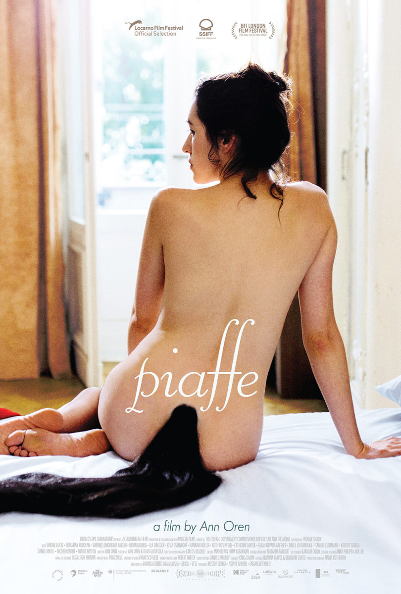
The cool yet foreboding coloring really helps its grainy contrast and blindingly white title pop. Danger and relief seem to coexist as we wonder which might prevail, the pose delivering dance vibes as if preparing us for an interpretive show of gestural movements that embody this character’s very soul.
That’s not to say F. Ron Miller’s latest poster isn’t just as captivating, though. It simply does so differently with more literal imagery that proves as beautiful in its austere portrayal. The view from behind keeps the drama intact too by letting us still stand apart from what she might be thinking and feeling. It also provides a greater sense of hope by bathing her in light rather than darkness.
Echoes


Intermission Film’s Passages (limited, August 4) is so simple in concept yet profound in execution. The movie is about a love triangle… mostly. It’s actually about one man’s selfish desires hurting the two people who give him their love. As such, the imagery used in repetitious echoes isn’t necessarily interacting with itself. It’s interacting with his journey.
Franz Rogowski is the one who loves both Ben Whishaw and Adèle Exarchopoulos. He is the one kissing him and kissing her. They’re the ones longing for that kiss. Rather than have the two middle images of Rogowski mirror each other for better symmetry, however, they both face her due to the fact he’s pursuing her despite him. It’s like a fast-forward button’s double arrow. He’s trying to move past him to reach her only to discover he can’t quite let go.
This story told in static photos isn’t all, though. The poster is also expertly composed with a heavy horizontal grounding things at the title and a lighter vertical rising through the colors to read the praise only after you’ve been enthralled by the embrace.
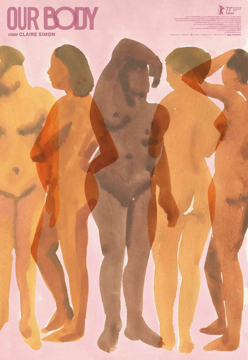
Our Body (limited, August 4) is less about echoes than it is about overlap. It’s about comparisons and contrasts bleeding together to unite the women depicted under a unified umbrella of humanity and femininity no matter how differently those labels may manifest for one subject above the other.
Leah Goren’s watercolor illustration effectively renders these five women into one. Like the title above, it’s not about her body or hers. It’s about the communal body. Our body. And those two words are provided with a similar treatment, by designer Brian J. Hung, of translucent overlaps and incongruous typefaces, sizes, and kerning. One recalls the other. Both project the whole’s thematic meaning.
The real echo therefore lies in Gary Dalton’s kaleidoscopic Lola (limited, August 4). It’s a memorable visualization of the machine these two women have invented––a machine that intercepts radio waves from the future.
Its echo is thus very much intentional. The repetition is as much a depiction of sound traveling through a space as it is the many different possible futures that might result depending on how these sisters use the information they collect. It becomes a gorgeous hybrid of geometric design and photographic verisimilitude that sucks us in at the same time as it spits us out. The machine pulses, calling out to us to see what we might have to say to the past by screaming into the middle of the page.
And by making it all black and white except for the yellow title, we can fully grasp which of these three figures is the real focus. The film isn’t named after Thom or Mars. It’s LOLA––the machine that has taken control. The vanishing point from which everything else originates.