So far so good on theaters remaining open despite changing CDC recommendations (wear your masks). It will be interesting to see what happens if things devolve further since there are a ton of big Hollywood titles coming this month. Unlike last month, however, most have reverted to the usual bland character sheets and collages, surely putting contractual obligations above creativity. Nature has apparently healed.
Thankfully, a few smaller titles from the boutique shingles hold onto the knowledge that attractive and unique is what turns heads. Some focus on typography, others photography, and the best embrace illustrative flourishes that really pop above the gloss. Sorry, The Suicide Squad (wide, August 6) and Free Guy (wide, August 13). Be glad you didn’t really need the help anyway.
Superimposition


The most intriguing part of MOCEAN’s poster for Demonic (limited, VOD & Digital HD, August 20) is that the digitized crucifix superimposed above Carly Pope’s profile is right-side up. I say that because anything to do with evil and Hell usually defaults to upside down. Just look at the “I” in the name, itself a necessity considering right-side up would look like a “T” instead. Why the shift? Is it an allusion to the digital world being her character’s salvation? Maybe.
Regardless, the effect is great. The tag saying that dream and reality have nothing to do with what’s happening puts us in the headspace for artificiality. So we wonder what is therefore real at all. Is she real or a manifestation filtered through some unknown lens? Is the cross a barrier keeping this vision trapped behind it for our benefit? Or is it a weapon to break through that barrier and save her?
Time Tomorrow’s Ema (limited, August 13; VOD, September 14) one-sheet utilizes a similar effect purely for aesthetics. They’ve superimposed text to provide us levels in which to access what’s being show as well as a shadow to split the frame in half for a glimpse into Marianan di Girolamo character’s schizophrenic existence between light and dark. Putting the credit block on end to help serve in that delineation is an inspired choice, knowing its position adds more to the whole than its content.
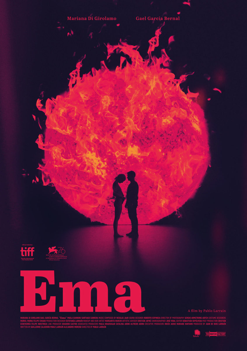
What I really love, though, is the title treatment. It’s unique, memorable, and completely devoid of actual letters thanks to its intentionally deconstructed look. The white blinds us to ensure we look there first while its lines move us through the page in ways a regular “E” never could.
The piece is in direct contrast to the festival campaign. It’s most like the stunning black-and-orange sheet with silhouettes on flaming sun where color and focus is concerned, but on another stylistic level completely to the rest. The other quintet are courtesy Dan Petris and his more measured approach that elegantly puts image and text together in a familiar (but no less attractive) way. I’m partial to the thin cursive title myself, but they all have their own singular appeal.


Then there’s the old-school vibes of Isabella (limited, August 27). Halftones, geometric shapes, and opacity shifts—who needs anything more? There’s a mesmerizing sense of motion here, as though we’re caught in an optical illusion vacuum sucking is into the center of the frame. You can feel the flicker of anger, anxiety, uncertainty, and surprise as we move layer to layer in what could be an abstract representation of the main character’s realization that the woman helping her rehearse for the titular role is competing against her for it.
I can hear a siren à la Kill Bill—the camera moving in and out as the Maria Villar’s face remains still and intense. We don’t know whether to fall in or climb out just as she’s unsure whether to think that aforementioned assistance was altruistic or some form of sabotage. So we become stuck in the middle, waiting to follow in her footsteps upon her choosing her path.
Star appeal


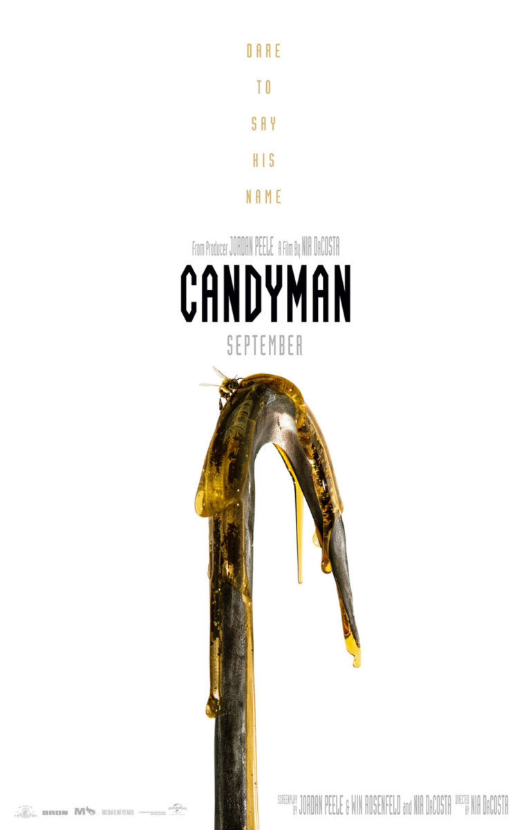
LA answers the question: Who’s the star of Candyman (August 27)? Yahya Abdul-Mateen II? Or the monster itself? It appears the correct answer is the latter, considering this early teaser didn’t even think it worthy to add Abdul-Mateen’s name—let alone his face. And since the media has consistently pushed director Nia DaCosta aside when billing the film as “Jordan Peele’s,” it’s honestly no surprise. Universal knows the IP’s appeal as well as their bankable commodity. And they’ve leveraged both well with little more than hook and bee (see second teaser at right from GRAVILLIS).
Both posters are minimalist and effective, but I put LA’s over the top mostly because of the typography. The lack of counters in the typeface is unsettling in the best way (though I would have stopped short of doing the same effect with the credits as it does go overboard). Whether I’d think the same had I not seen the trailers and their paper art animated sequences is up for debate—I do believe their appeal is in some part a product of that choice—but success is success. Sometimes an artistic flourish just works.
Jump Cut and Brandon Schaefer’s poster for IFC’s Swan Song (limited, August 6; VOD, August 13) doesn’t have the same brand recognition, so it utilizes its biggest strength: Udo Kier. How can you have an actor of his caliber dressed like that in your film and not use him as your showcase. Add that look of disinterest while starring into the distance post-cigarette drag and you realize the actor and character are both way too cool to even believe yourself worthy of gazing upon them from a photograph.
That title treatment, however, might be even more sublime. Love the font, the expanded serifs creating nooks for actor and director names, and the choice to leave the credit block left justified to fill the empty space as the production company logos bottom left offset the heavier top right. My only nitpick is with the choice to lift the critic quotes to the height of Kier’s name rather than the height of the title. That white space at the top left of the latter tricks the eye into thinking the quotes are now higher and thus more important. The bolder font and darker color don’t do this misjudgment any favors either.
Not even Kier’s costuming is a match for eclipse’s stunner advertising The Night House (August 20). The coloring is gorgeous and foreboding with its red highlights on darkly menacing shadows. The carefully measured spacing between moon, Rebecca Hall, and house in the distance is perfect. And the decision to eschew reality for formal abstract in creating negative space to present an unseen second person rather than infer its presence is genius. That invisible hand isn’t just on Hall’s face–it’s erasing it from existence. The literal and figurative ramifications are profound.
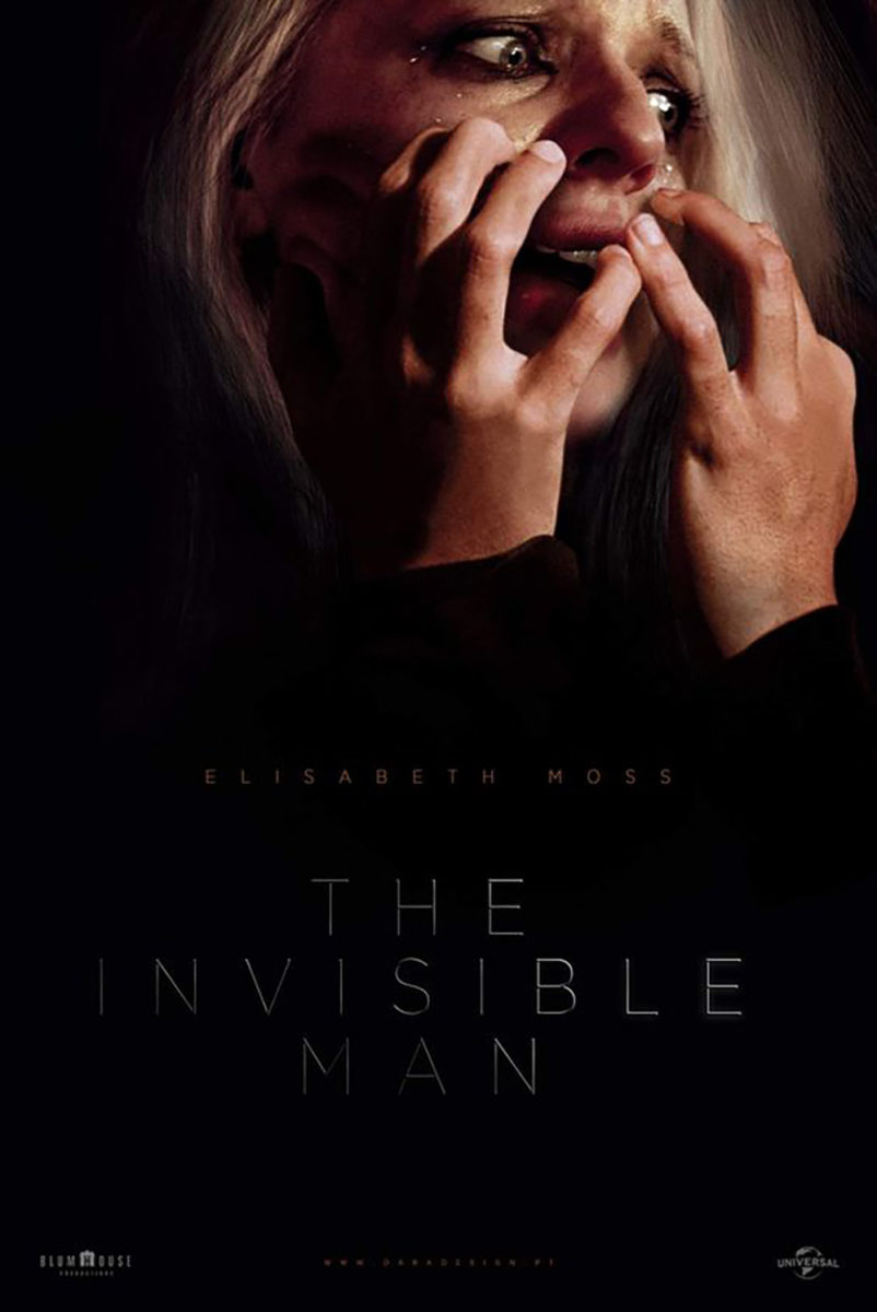
It recalls Nuno Sarnadas’ brilliant alt-poster for The Invisible Man and his ability to give form to that which we cannot see. Elisabeth Moss isn’t bringing her hands to her face in fright. She’s wrapping them around her assailant’s own fingers as they cover her mouth. Hall isn’t merely experiencing a vision of someone else; that someone else is interacting with her too. That we can see as much with concrete evidence despite no concrete form says so much about the power of an artist to visualize the impossible.
Shapes


For WORKS ADV to look at a gun trigger long enough to manifest it as the contour of a woman’s face and add the red lips to tie everything together is genius. There’s no other word for serendipitous discoveries like this. That’s not to say the poster for The Protégé (August 20) didn’t pop out of the designer’s head fully formed. I don’t actually know. The probable reality, however, is that they had an image of a gun on their screen to shrink, enlarge, and turn around as often as they could until the exact right crop or detail eventually rose to the top.
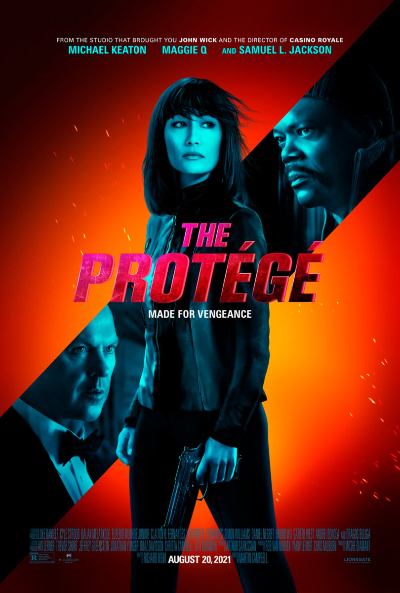
Despite a miraculous image such as that, this is still a big studio film. There remain obligations to include cast names in whatever designated ratio has been agreed upon opposite the size of the title. Add the credit box, release date, and previous film comparables and you have a lot more work yet to be done. But while WORKS ADV could have just found this exact compositional placement and called it a day, they went the extra mile to render the whole like it was printed via letterpress. The imperfect letters, worse kerning, and inability to hold a straight line seem so tiny in scope and yet each had to be meticulously planned. Bravo.
The glossy one-sheet that follows only breaks my heart by comparison.
Not that the right glossy photo can’t work wonders like it does with John and the Hole (limited & VOD, August 6). What better way to put us in the film, so to speak, than to place us at the bottom of the unfinished bunker where young John leaves his family so he can enjoy the freedom of unearned adulthood above? I’d argue that four out of five people would conceive an image from above looking down if for no other reason than the title presenting the person who’s not in the hole as the one with power. By going the opposite direction and then refusing to show John at all is therefore memorable all its own.
Add the austere serif font in all-caps at the middle in a barely legible color and you’re forcing your audience to step closer for a more detailed glimpse. Throwing the kerning to the wind to increase the gap between “The” and “Hole” so the whole becomes full justified is a bold maneuver, too, because of how it leaves the “N” floating, but the way the “T” and “E” work to trick our eyes into thinking the second line is shifted right steals our attention away from noticing. All we see is the sky and that which we cannot have within our cement prison.
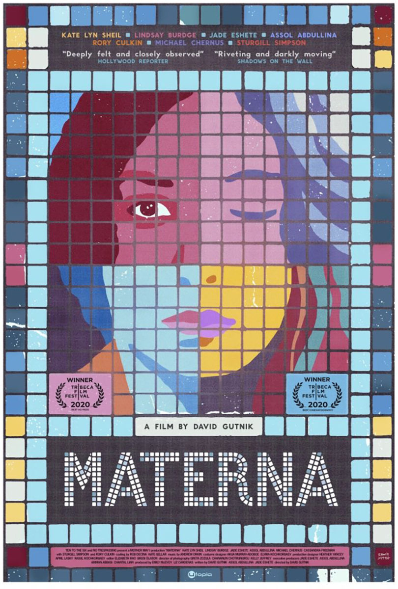
And that leaves us with my favorite posters of the bunch, courtesy Materna (limited, August 6; VOD, August 10). It was actually the sheet at right (by Sam Smith) that I saw first, and it might have earned this spot anyway with its gorgeous mosaic-tiled imagery of the film’s four leading women and unforgettable title treatment. The way it’s both exactingly symmetrical and intentionally flawed through color and “wear” allows it to simultaneously exist as illustrative cartoon and site-specific mural. There’s no way it doesn’t pop besides the other posters hanging on the wall.
But then I saw InSync Plus’s design and it quite literally took my breath away. It too looks to give each lead an equal share of real estate, but it does so in a completely different way by trapping them together in the same line-drawn head. They are at once separate and merged with none spilling out from the border designated to the whole. Kate Lyn Sheil is obviously given a bit more focus considering her face matches the outline, but its more by necessity (someone had to) than hierarchy.
The way that tiny peninsula of color breaks through as image shifts from line ever so slightly around the collar creates a map of mountains and lakes that subsequently adds a whole other layer. It’s about place as much as Smith’s—the New York City subway is key to the film—even if it’s not drawn to mirror that specific setting. It’s just a beautiful and dramatic portrait of connection above cast, despite providing the latter as though it was the impetus rather than the other way around.