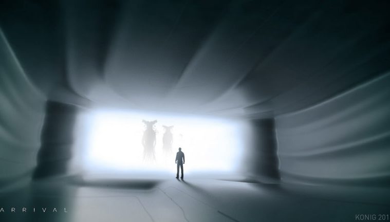
Having been in theaters for nearly a month, chances are if you had any interest in Denis Villeneuve‘s Arrival, you’ve taken the opportunity, but it goes without saying that spoilers are to follow. With the sci-fi drama in development for many years and Villeneuve having circled it since back around Incendies‘ release, the producers had some time to experiment with the visual style and today we have a look at what could have been with some early concept art.
Courtesy of concept artist Peter Konig, below one can see a gallery featuring designs he was commissioned to do. One can see how one of the alien designs actually mirrors the way they would end up writing their language, while the concept art of ships have more of a brain-esque quality. I actually prefer some of these less-rigid designs to what was ultimately used in the film, but alas.
“I worked on it pretty early in the film’s development and little of my work ended up being used, but here it is,” he says. “The first creature is the one director Villenueve favored at the time, but he did end up going a different direction. Them’s the breaks. Also the ship took a different direction obviously. At first they wanted a nearly perfect sphere, but yeah…that changed as well. Some of the ship interior sketches seemed to make it through though.”
Check out some of the concept art below and more on Konig’s site.


Check out our in-depth discussion of Arrival below.

