Even though New York State is slowly easing restrictions on theaters in a bid to right a ship that’s been sinking for months, it happening when COVID-19 cases are at an all-time high throughout the country makes it seem as though another nationwide shutdown might render the effort moot—depending on the election, of course. As you’ll see below, however, most distributors are still maintaining the status quo where it concerns pandemic protocol via theatrical windows lasting a couple weeks if not day-and-date.
Big studio films remain missing, though. Their loss is Netflix, Prime, and the others’ gain. It’s also ours since another shutdown will most likely be smoother than before thanks to the evolution of what had benn an all-or-nothing release plan. Rather than living out March and most of April with nothing, this holiday season should keep us “at the movies” without actually needing to be at the movies.
Portrait sitting


Our gain unfortunately won’t always be a great poster. Case and point: BOND’s Sound of Metal (limited, November 20; Prime, December 4). It’s been over a year since the film debuted at TIFF and yet its advertisement remains the same still image that was available way back then? That’s not just lazy, it’s borderline willful sabotage. And I don’t blame the firm. They can only do what they’re told in a case like this. They obviously weren’t tasked with more than picking a title font.
For a movie that’s so unique in its construction with default accessibility closed captioning and a unforgettable sound design that puts us into the process of losing one’s hearing, this direction for the advertising feels very last minute. This is something you’d expect from Netflix two years ago, not a studio like Amazon that embraced the theatrical experience much earlier. And this is being released in theaters, so you can’t say it was a cost-saving measure. They will be putting this on walls.
Look at Zappa (limited/VOD, November 27) for comparison. It too is just an archival still with some really unattractively drop-shadowed text, but there’s excitement thanks to the giant, meandering scrawl of the title. Just the grain alone makes the image more intriguing than your usual glossy photo. By no means is this a great sheet, but it will definitely turn more heads than the previous one. It retains character in the face of sterile homogeneity.
The international sheet for Dirty God (virtual cinemas, November 13; VOD, December 15) is where we finally see some actual design work start to happen on this theme. It plays with composition by pushing Vicky Knight’s face off the page. It forces us to look at her eyes instead of her head as a whole—deliberately bisecting the page between them to really compare the scarring on the left with the smooth skin on the right. It tells us what to do rather than just plop a photo on the page.
The advert also has the luxury of not worrying about so much text, whether critic quotes or detailed release information to cover all its bases. It’s able to use what text it does have as a design element in its own right—bullet words describing the woman in frame succinctly and methodically until we reach the title.
And that leads us to Koko-di Koko-da (virtual cinemas, November 6; VOD, December 8). Where The Robot Eye’s version at right looks to jam pack it’s information in a way that competes with itself while we follow the spiral to the center, this first example uses scale to deliver just as much information in a much more palatable way.
Why have all those people vying for our attention when you can make them tiny in a field beneath the real focal point via portraiture: a giant cat? We still get a sense of its surrealism without being asked to parse things ourselves. Here the people are an afterthought. They are characters we’ll soon meet and discover what they’re doing while the cat becomes a God-like figure in a bowtie with glowing cane (wand?) and building block toys to distract it from them. The title adopts a visually sing-songy vibe with multiple colors to match the blocks and keep things balanced. It’s naturally playful whereas its counterpart proves to be more of a calculated attempt at manufactured fun.
Translucent overlap


P+A isn’t the first to go grainy and grungy for a rock biopic, but it’s hard to dismiss a good example of the trope on originality’s sake alone. Who cares if their Stardust (limited, November 25) poster uses a well-worn aesthetic when it looks this good? From the buff colored background that shows through those places without ink (including the title) to the heavily saturated abyss of black dissolving into red hair, it feels like a down and dirty screen-print quickly orchestrated before tomorrow’s concert.
What I love about the image is that it isn’t just two images overlapping, but three: big Johnny Flynn, tiny Johnny Flynn, and the specks of stars dusting the void of space and shadow. Throw the text real tiny at the bottom, stack the pertinent names and tagline together in contrasting colors, and hear the roar of a crowd just off the page screaming their heads off.
Rather than superimpose two separate images for The Giant (VOD, November 13), Midnight Marauder provides us one in motion. Whether the effect was created in-camera or not, it’s a great flourish for two reasons: portraying a lead character in an interesting way (like she’s rising from slumber) and alluding to a very neat visual trick utilized throughout the film that elongates lights as though viewed through sleepy eyes unable to adjust to reality.
Those streaks supply motion and intrigue, our gaze sloping upwards to see the mammoth red letters spelling out the title above. You won’t be able to walk past this sheet on the wall without at least reading it, but a desire to decipher the tiny “The” being crushed by its “G” might get you to walk a little closer. I do wonder what might happen if the image and title were married somehow rather than separated so far away in different hemispheres, but not enough to dismiss the merits of this current set-up.
For Monsoon (limited/VOD, November 13), Intermission Film is also utilizing an effect (whether in-camera or via post) to create on image from many—this time via reflection. It’s a gorgeous combination of layers placing the actors atop their background with another placed atop them. The result is akin to an opacity gradient removing clarity as it travels down the page past the centered title. The hustle and bustle of city life keeps moving below as Henry Golding’s smile cements itself in static bliss above.
Legion Creative Group’s Ammonite (limited, November 13) is similar, albeit in a much different way. Rather than use foreground and background to build to a focal point, it takes two equal levels of character profiles and overlaps them to create one in the middle. Kate Winslet and Saoirse Ronan are in effect ghosts traveling their lives alone, lost and adrift until they find each other. And just like when you put your index fingers together and cross your eyes, the left and right fields of vision that separately host them combine to manifest a third entity: a whole from two halves.
It’s an attractive visual representation and a crucial metaphor for the film without simply going to the title’s definition and including shell motifs. I wouldn’t be surprised to learn there are some unused comps floating around that do exactly that, but all parties were probably correct to leave them aside. This image is effectively concise at portraying the emotional heart of what we as viewers can expect. No “literal” alternative could compare.
Standing out


There’s no better way to stand apart from the pack than going lo-fi—really lo-fi. That’s what’s happening with The Twentieth Century (virtual cinemas, November 20). It’s just three colors. It’s just geometric shapes (the figure too as its three-dimensionality is stripped away to become its own flat field). It’s just one atop another: colors creating new colors and shapes creating new shapes.
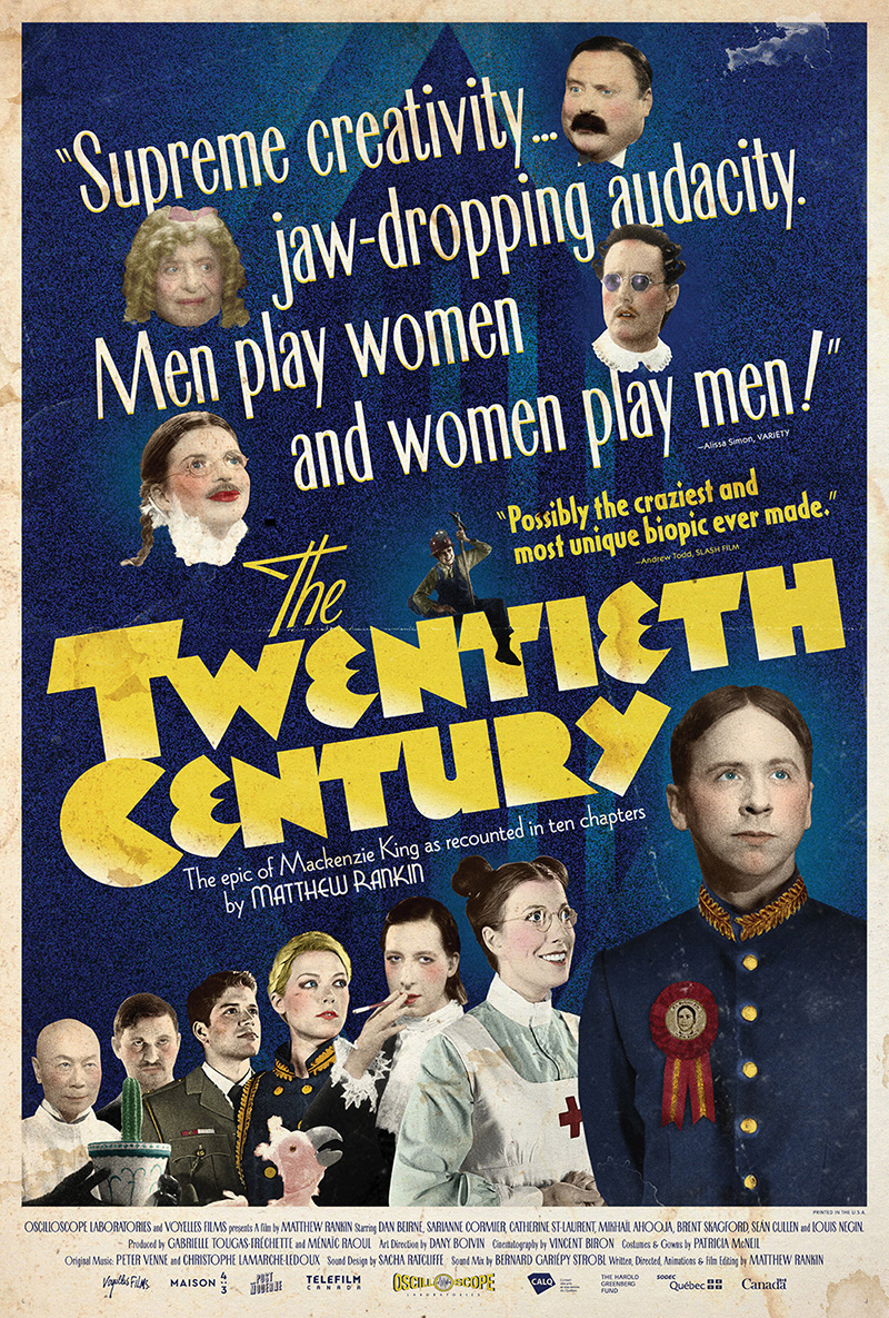
The font choice is idiosyncratic with a drop shadow that’s more so as the letters look more like they’re on hydraulics rising higher than evidence that they’ve always been raised. They move towards us as the image moves back like a cutout piece of paper falling between the triangle peaks—a Plinko coin descending through pegs.
The more recent iteration is a lot by comparison. A lot of words. A lot of faces. A lot of “let’s pretend it’s a poster from the early days of Hollywood.” And while there is charm to that choice, it is too much. Strip back the floating heads, pick one quote, and really get that homage down with drawn illustration rather than filtered photos. It’s a cool concept that needed a few more passes.
I’ll admit, though, that that’s a product of taste. I’ll generally pick the minimalist, clean design over the busy collage any day. Wouldn’t you when one comes along like Brandon Schaefer’s The Dark and the Wicked (limited/VOD/Digital, November 6)?
It’s a perfect distillation of a very good film with rural windmill aesthetic, upside-down cross in paint, and boldly bright text that pops even when it’s tiny (I do feel for the directors who end up discovering their name isn’t as bankable as the film they made a decade ago). It’s blood, the Devil, and ornamentation all in one. And it steals your attention from every angle to draw you into those spinning blades.
Schaefer’s final sheet is memorable too thanks to his ability to render an image as simple and arresting as its graphic counterpart. The red sky, single light, and silhouette rising like a cross of its own in the sky provide horror-infused iconography as well as a center line to brings us from body to title—itself a more stylish, thin font that’s stacked with more personality than the previously uniform block.
You might not think that Anna Park’s Mank (limited, November 13; Netflix, December 4) has a comparably streamlined quality to it on first blush. Why would you after quickly parsing the number of actors included and the even longer list of names rattled off in differing sizes below them? The more you look, however, the more you realize just how in concert every element is from the angle of the bar housing these beautifully grotesque caricatures to the old school marker scrawl of the title.
This achieves what that second Twentieth Century poster hoped. It fulfills the nostalgia of the past while leaving its own mark on the present. Why? Because it’s artistic style isn’t Hollywood idyllic. It’s warped, chaotic, and expressionistic. Park holds a mirror on their world rather than a camera. She brings out the imperfections and emotions, the opportunism and the greed. And she does it in a way that perfectly suits the canvas removed from its typography and the poster that marries them together.
Even so, the work I can’t get out of my head this month is the international sheet for Collective (limited/VOD, November 20). It’s a provocative sight with a three-by-three grid of dead bodies lying exactly where they’ve fallen before getting covered by a sheet to keep them away from prying eyes able to find a connection between them. And like any good journalistic endeavor, those connections are often accomplished by a story: a newspaper article daring to pull back the covers.
Since you don’t need more than that tiny corner of newsprint to get this idea across, the whole doesn’t have to be thrown off-balance to add it in. The festival logos can stay centered on the page to align with the bodies and the whole can rest atop the bold, red title beneath it. And I’ll bet there was a lot of time spent making sure the body shapes and shadows were just right where darkness and color were concerned to not interfere with the stark power red on white possesses.
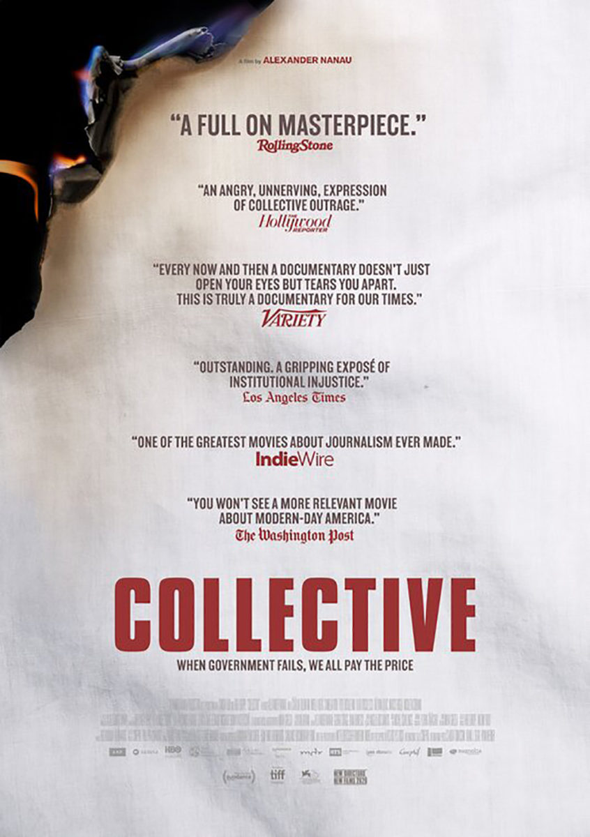
P+A’s American counterpart loses so much by removing those figures to literally be red on white and nothing else. It’s darker and all the text is red to drown out the title’s impact. Line upon line replaces the bodies to render the whole inert despite those flames licking the top corner that risk burning everything. Now the danger is in the present—something we can turn from and walk away. The other’s horror lay in the past. What was about discovery has been transformed into preservation, but uncovering the mystery of those skeletons is infinitely more alluring.
What is your favorite November release poster? What could have used a rework?