2023 is in full swing with chaos (Cocaine Bear opens February 24) and sequels (Ant-Man and the Wasp: Quantumania opens February 17; Magic Mike’s Last Dance opens February 10) doing their thing to get those box-office numbers rising. Along with that studio fare, however, are a ton of smaller titles doing their best to keep up too. Hopefully your local theater has a screen or two to spare for some of these posters to grace the lobby–if Avatar also decides to slow down, of course.
Edge-to-edge text


Is the poster for 88 (limited, February 17) easy to read? No. Not at all. But I’ll be honest: that’s kind of why I like it. Because amongst those letters and numbers depicting financial gibberish are actor names like Orlando Jones and William Fichtner. Think of it as one of those memes where the first 3 names you see are the ones who will grace your screen when you buy a ticket.
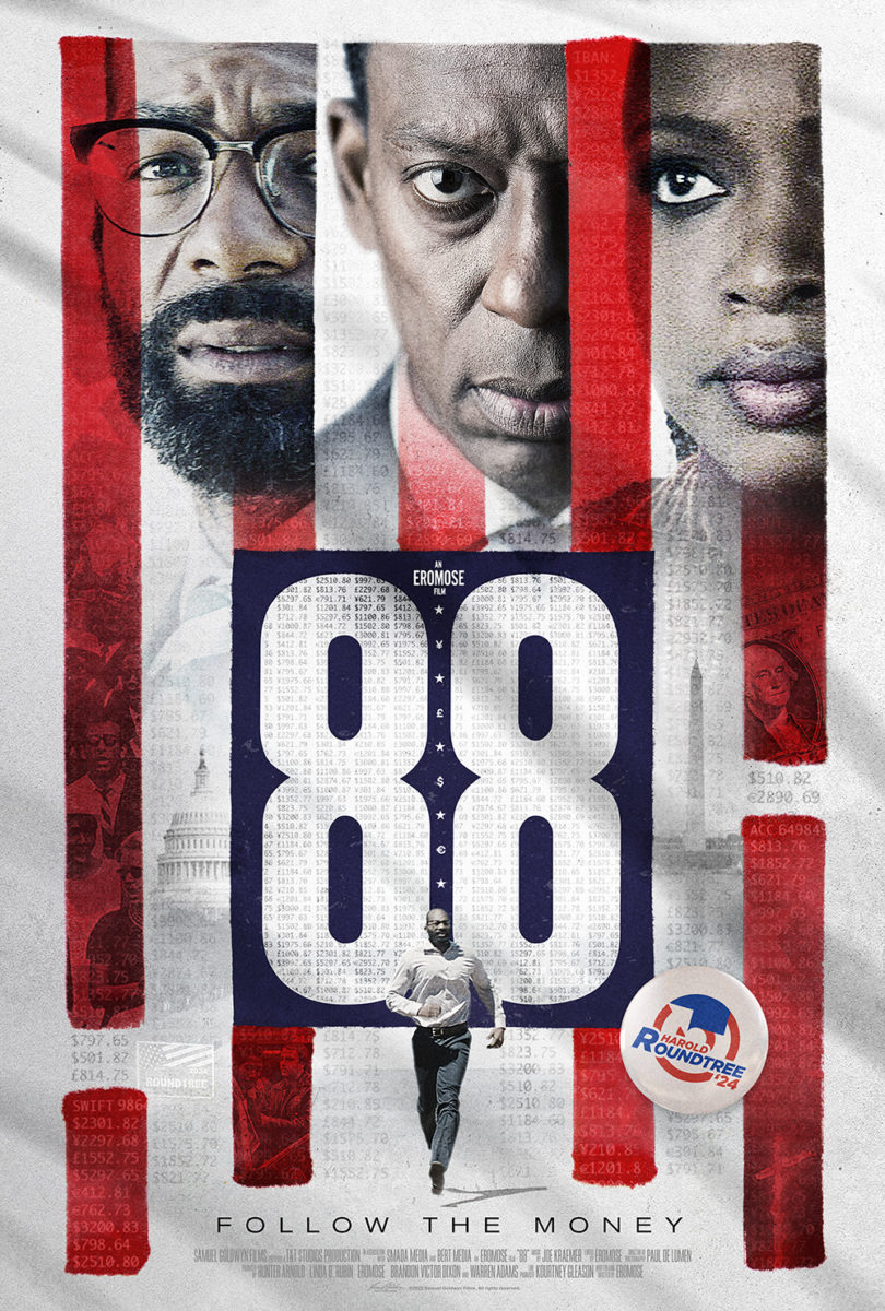
The grid lines and faux stains are a bit much–the text’s lack of spaces beyond the cast list hardly makes the page look like anything resembling a “real document”–but the charm of it all remains. The credit block’s font choice and compression show this wasn’t designed by a big marketing firm, so the fact it leans hard into its aesthetic means a little more too.
Though I do like the polish of the theatrical sheet. The numbers are in a more authentic pattern, the red stripes provide a redacted motif while alluding to an American flag, and the addition of a campaign button is a nice touch. The thriller aspect (man running to nowhere) really shines with glimpses of locations and events (burning cross) adding intrigue. It’s a welcome evolution from the teaser.
Swallowed (VOD & Digital HD, February 14) isn’t edge-to-edge in the same way, with its text mostly relegated to the top-right corner, but that critic quote’s size and orientation mirrors the title while also creating a solid border straight down the right side. Both do their job well, forcing us to tilt our head and read from top to bottom so our eyes can’t help but follow the actor’s esophagus (and tear) down to whatever is bulging through his skin as it crawls lower into his body.
It’s a compact, effective image that may even conjure a gag reflex of your own: the title’s yellow tongue-depressor stands tall as more of a tracheal tube than popsicle stick. And I’m a big fan of the use of bold type in the credit block–allowing it to double as a top line talent showcase without the need to clutter things up by duplicates.
Where I would normally rather see the white space afforded by a nice empty third of the page, the giant title on She Is Love (limited, VOD & Digital HD, February 3) works as a sort of declarative statement trying hard to make us believe it. Because you wouldn’t necessarily agree sight-unseen with this image of Haley Bennett hiding beneath her bedding. The easy assumption is that she’s an introvert–isolated and uninterested in human connection let alone love.
This visual is great because it–despite being a shot ripped from the film–seems as though the artist flattened everything back against that wall. Besides the blurring on the footboard, there’s nothing to delineate it from the headboard with cutout blankets and head balancing on top like a Terry Gilliam illustration. It lends an uncanniness to the whole. An uneasy confusion as to whether she’s hiding from someone specific or the world at-large. What does her fear stem from? Someone waiting outside her door or her own response to seeing them?
A touch of red


Red as the focal point to an otherwise monochrome or subdued color palette is hardly a new concept, but it is interesting to see three examples of the technique in use this month.
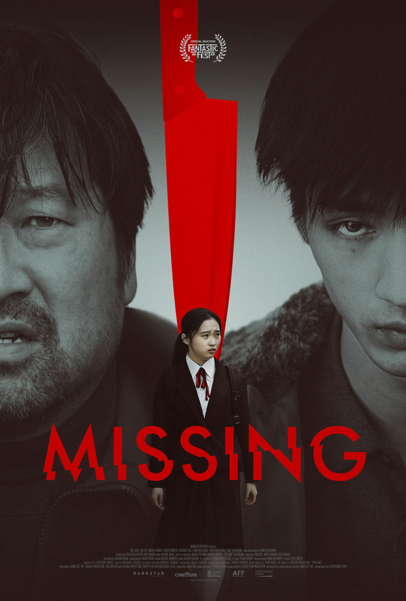
First up is The Refinery’s A Lot of Nothing (limited & VOD, February 3) going with the more obvious use of separation. Much like The Robot Eye’s Missing from last year, the red becomes a wedge into the frame to separate left and right–each area housing a different lead character.
I like the use of close-ups versus full-body here. The sad eyes and futility opposite the duct-taped object of their vision. While they’re the ones who have put Justin Hartley in that chair, his presence remains a weaponized force that both cuts into their lives and perhaps drives them apart. The film pits Black against white, civilians against cops, economics against politics, etc. It asks us to bring preconceptions to the table and seeks to make us both question and confirm them for an entertaining satire of our current social climate… even if the poster doesn’t exactly make you think you’ll be laughing.
The Refinery wields that red for horror, too, with their sheet for Consecration (limited, February 10). It also places the color in the middle as a point of juxtaposition, but not as a wedge as much as a mirror. Each of the women lying face-down on the white tiles is posed like the crucifix in the center–the bloody snake drawn as a coil around it, like we can assume a demonic presence will soon do the same to them. I can imagine each of them slowly turning upside down to match the “t” in the title.
Beyond theme, however, the poster is also just a clean, effective composition in its symmetry and contrast. The blasphemy of it all creates a provocative tone, but sometimes it’s okay to simply be an attractive piece with simple design elements that grab attention amongst the usual glossy faces of A-list talent. Motif and symbolism allow us to understand what’s at play without giving up the game. If you want to see what the evil truly looks like, you’ll have to buy a ticket.
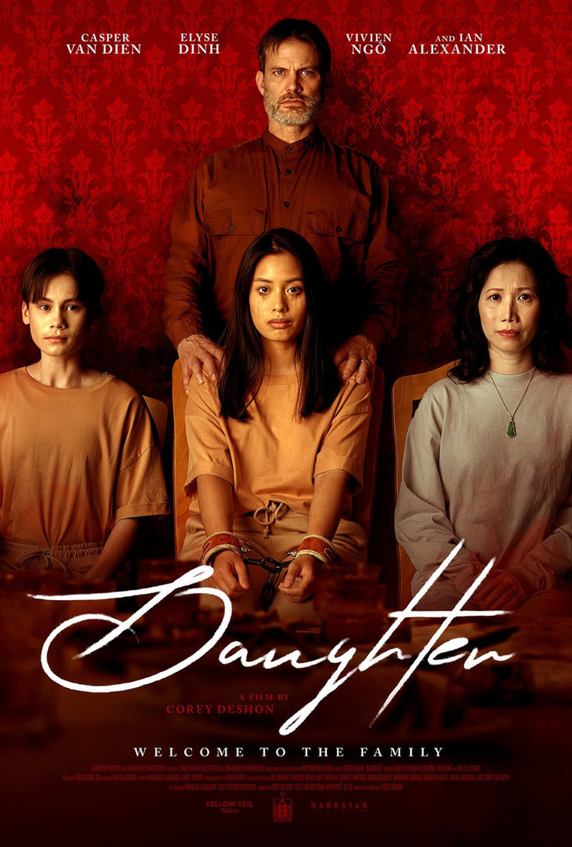
And then there’s Daughter (limited, VOD & Digital HD, February 10) taking things a step further to make the red a filter instead. While it remains a physical separator, it’s much less literal in its depiction of the same people in the black-and-white photo. Instead of just singling out the daughter from the rest of the family by way of a wedge, it finds a way to add a story point to the whole. Because it’s not enough that she’s the odd person out with hand restraints and a leg chain while the others stand free. She’s also the only member of this quartet not wearing a gas mask for whatever is coming next. Where they stay calm, she screams.
It’s a captivating scene made more so by the slight shift in perspective with the son. Mom and Dad look forward in portraiture and attack. He does not. His gas mask is turned to look at his sister. Is it curiosity to see what happens to her unprotected respiratory system? Is it a glimpse of compassion that hints at him becoming a secretive ally, either to her benefit or his own demise? With that one little alteration, our minds are sent reeling for answers.
Thus it’s a shame the studio decided to go with a more conservative approach for their final poster (see The Robot Eye’s portrait at right). The mystery of motivations is replaced by stoic faces surrounding a tear-streaked focus. Yes, we wonder who she is and what they’re doing to her, but the playfulness and intrigue of that double-exposure is sorely missed. The font choice is still on point, though. Love a nice handwritten script with character.
Title first


There’s something about the simplicity of Ignition’s Sharper (limited, February 10; AppleTV+, February 17) teaser that appeals to me. The text and shadows remind me of the opening titles to Panic Room, the shapes formed by those shadows and empty spaces akin to some elaborate perspective trick meticulously built by hidden molds diverting the light just so. It gets me thinking of a heist with numerous moving parts expertly weighed against each other for maximum impact. Five players in the big city embroiled in a huge score.
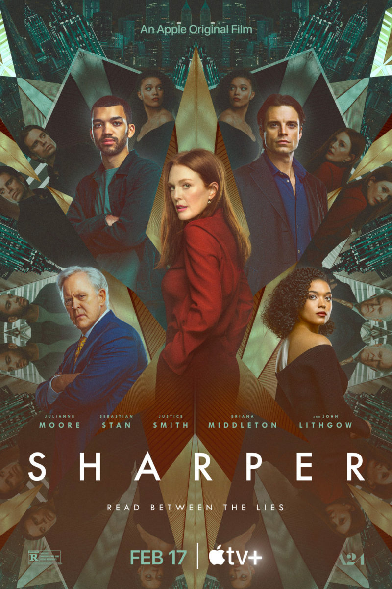
The firm’s full sheet looks to play with that sense of fractured illusion, too, via kaleidoscopic patterns, but proves so convoluted and over-produced that it’s tough to parse. I therefore get the need to put a halo around each of the principle cast members, allowing them to pop against the washed-out background repetitions. Unfortunately it only shows how muddied and ineffective the whole is. Where the teaser excelled at telling us where to focus, this one becomes so overwhelming that we’re more likely to ignore it and walk on by.
That’s not the case with Jethica (Fandor, February 14) and its hand-drawn title. It’s just roughly filled block letters yet possesses the sort of personality a Photoshopped collage of faces could never match. And the use of space to separate Jessica and Elena from the former’s stalker is perfectly measured–the large letters forming a barrier wall with which to force someone to make the first move.
The grainy texture lends it a nice indie feel. The shaky critic quotes supply an eerie, if comedic, contrast to the pillared figures below. And the use of triangles in the title (to the point where the “A” looks more like a symbol than a letter) makes you wonder exactly what getting “help from beyond the grave” means. Is it a wood carved incantation? Is it a play on Jessica’s name through speech impediment that’s scrawled onto a school desk somehow holding magical powers? I guess we’ll have to watch to find out.
My favorite poster of the month, however, is The Blind Man Who Did Not Want to See Titanic (limited, February 3). Plot and star appeal are thrown out the window for a rendering of the titular character as both someone we can see and someone who cannot. It’s as though a frosted glass has blocked our vision to make him a hazy blur as the title is translated into braille so that the dots become our best way to understand who it is that sits in front of us.
The best part: the way the composition matches two of those dots with Petri Poikolainen’s eyes. Our mind sees that and gets lost in a game to find out whether any others are highlighting parts of the image, even as we know, intellectually, that they are words and not decorative elements. It’s a wonderful–intentional or not–bit of synergy that helps connect text with image, touch with sight.