“Don’t Judge a Book by Its Cover” is a proverb whose simple existence proves the fact impressionable souls will do so without fail. This monthly column (with a special year-end retrospective today) focuses on the film industry’s willingness to capitalize on this truth, releasing one-sheets to serve as not representations of what audiences are to expect, but as propaganda to fill seats. Oftentimes they fail miserably.
If there’s one consistency throughout the sixty-plus posters I shortlisted this year for Top Ten glory, it’s a conscious desire to play with and spotlight unique typography.
Big Hollywood studios are often too old school to want anything but the same bold sans serif with high-contrast color differentiation that pops their title off the page. It’s a generic, numbers-driven format that sees them refusing to let their designers find a complementary balance between type and image as though legibility can’t be achieved alongside a little fun.
To therefore gaze upon so much cursive, period-specific lettering, and full-blown contextual and aesthetic integration below is exciting. The art of movie poster design is gradually overtaking its capitalistic utility for the kind of pop cultural longevity that can survive any shortcomings of the product its selling. While you can’t blame a studio for thinking outside the box when hocking a false bill of goods with a clunker, it’s difficult not to applaud them for taking risks on the sure-things too. A one-sheet will often serve as the final visual distillation of the whole. That’s a role worthy of its own genius.
Honorable Mention:


#25 – A Cool Fish (Unknown); #24 – Suspiria (Sara Deck for Mondo); #23 – Proud Mary (LA with Cullin Tobin); #22 – Slice (BOND); #21 – The Endless (Brandon Schaefer & Jump Cut); #20 – Madeline’s Madeline (Brandon Schaefer & Jump Cut); #19 – Private Life (P+A with Chris Ware); #18 – Grace Jones: Bloodlight and Bami (Unknown); #17 – A Simple Favor (LA); #16 – The Commuter (LA); #15 – Wildlife (P+A); #14 – Boy Erased (BOND); #13 – Shoplifters (Huang Hai); #12 – Flower (Gravillis Inc.); #11 – First Reformed (P+A).
Top Ten:
#10 – The Sisters Brothers (BOND)


To spy BOND’s sheet for The Sisters Brothers from across the room is to see a visualization of the film’s atmospheric mood. John C. Reilly’s name is still top-billed (he’s been the driving force behind the project since buying the novel’s rights in 2011), but he is not in our face to spark any misconceptions towards comedy. Instead it’s all about the sunset purples of a western setting shrouded in mystery as death lingers above these outlaws’ heads. The title pops, interacts with the imagery, and crackles like fire beneath the smoke of a foreboding skull. The whole sucks you in and dares you to come along for the arduous journey that waits.
#09 – Tully (ARSONAL)


ARSONAL outdid themselves with their poster for Tully because their brilliant concept is the type that could have easily been phoned in. They could have picked a glamour photo devoid of shading or chosen a profile view rather than two-thirds to avoid any contouring when “applying” their stickers. Instead we receive the dramatic lighting and off-center crop to bring the dejected mood that sells Charlize Theron’s character’s fatigue and futility to life. The rainbow barely hangs on. The stars glimmer. And the title owns its fuzzy, puffy construction as it wraps across her cheek. This is a self-portrait perfectly embodying its all too relatable subject.
#08 – Zama (Unknown)


There’s a great duality this advert for Zama that cleverly depicts the dynamic between colonizer and colonized. First is the Spaniard gazing home, back to the land he’s conquered. Second are this new world’s trees imprisoned within the confines of the title’s large letters—one struggling free to breathe the air of freedom. The color contrast of cool against warm conjures juxtapositions of relief/anxiety, power/oppression, and a climate disparity between European comfort and South American heat. Add an exacting compositional grid with the “M” calling its focal point out and you have a work that knows exactly what it’s doing.
#07 – A Fantastic Woman (Dan Petris)


The simplicity to Dan Petris’ portrayal of Daniela Vega’s A Fantastic Woman is incomparable. He’s chosen an image suspended in motion with wisps of hair flowing bright as flames behind a somber, blue-tinted face. There’s excitement and chaos with an energetic space above towards which she can ascend if/when the tragic circumstances rife with prejudice faced cease. The hand-written title appears atop her cheek, drafted in light to ensure we know she is whom those words describe. Rotated 90-degrees, they trend upwards with optimism and hope. We see Vega as an angel unafraid to reveal herself to the world.
#06 – The Favourite (MIDNIGHT OIL)


While many prefer The Favourite‘s surreal festival sheet, it’s MIDNIGHT OIL’s more straight-forward hierarchal depiction that delights me. Along with its quick overview of character dynamics with Emma Stone on the outside looking in is a minimalistic visual panache. The frame around Olivia Colman and Rachel Weisz signifies their literal coupling as well as the figurative construct of which their new acquaintance seeks to infiltrate. It’s both there (the royal gown hanging atop its bottom stanchion) and not, regal portraiture and prize to destroy. The attitude of the film oozes from its comparably just left of center period aesthetic.
#05 – BlacKkKlansman (Gravillis Inc.)


Gravillis Inc. distilled BlacKkKlansman to its purest form with this unforgettable poster of John David Washington donning leather jacket and KKK hood while holding pik and fist in the air. The iconography is blatant enough in its juxtaposition to keep us off-balance about whether to laugh or cringe—much like the film itself. You want to guffaw at the absurdity of it all yet don’t want the cause of your mirth to be misconstrued. It speaks to the importance of the subject matter and why it matters to help fight against injustice even if doing so seems impossible or against your narrow definition of “best interests.”
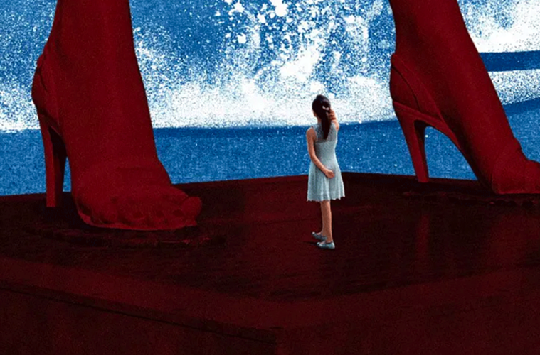
#04 – Angels Wear White (Huang Hai)


This brightly-colored, graffiti-grunge, painted pop art curio has haunted me since watching Angels Wear White a year ago. Its giant Marilyn Monroe legs dwarfing Meijun Zhou as waves of tradition crash ashore mix all the themes of sexuality, abuse, conservatism, and escapism you need to truly appreciate what director Vivian Qu has crafted. These are worlds and cultures colliding while unfortunate universal tragedies mar everything on their path to dismantle humanity in the name of progress. Purity is tainted with ignorance, trust broken by shame, and idols transformed from hopeful beacons to harbingers of darkness.
#03 – November (Argus Oak)


It’s apt that the year’s eeriest sheet is for Estonian fantasy horror November. A stunning black and white mood piece with demonically-possessed objects, mud-slinging devils, and witches helping regular folk descend into madness should be represented by a goat’s empty eyes peeking out from behind a woman frozen as though underwater. This is the sort of ghostly apparition to earn the necessary mindset to appreciate its lunacy while the trisected title in rough, bold letters screams for us to acknowledge the beauty and terror of a disturbing yet funny fable depicting the inevitable sorrow born when sacrifice trumps obsession.
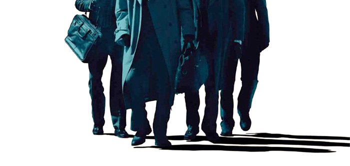
#02 – American Animals (Empire Design)


The inspiration was flowing when Empire Design took Bart Layton’s docudrama hybrid American Animals from film to page. They craft masks from John James Audubon’s The Birds of America—the object of these trenchcoat-wearing amateur thieves—before tearing the page in a way that makes us want to lift those disguises to see what’s underneath. But what would we find? The real culprits who periodically arrive to tell their version of events or the actors channeling their bored adolescent audacity? Or are those avian visages of wild animalism their true identities once they relinquish their humanity to do what must be done?
#01 – We the Animals (The Boland Design Company)


Discovering the crayon-scrawled field of color atop The Boland Design Company’s We the Animals poster is an animated effect used throughout the film only makes its lo-fi, confrontational declaration of existence more powerful. By itself it’s the visual manifestation of the boy’s silent yell, the title exiting its acidically yellow breath of wild rebellion and juvenile excess. How that infers upon what’s put onscreen therefore magnifies its emotional outburst, the poetically composed tale of a boy finding his place within an ever-cruel world of contradictions exploding out of frame so as not to consume its subject whole.
What is your favorite poster of the year?