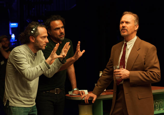
“A cinematographer is a visual psychiatrist — moving an audience through a movie […] making them think the way you want them to think, painting pictures in the dark,” said the late, great Gordon Willis. As we continue our year-end coverage, one aspect of 2014 we must highlight is among the most vital to the medium: cinematography. From talented newcomers to seasoned professionals, we’ve rounded up the 21 cinematographers (across 24 films) that have impressed us most this year. Check out our rundown below and let us know your favorite work amongst the field in the comments.
A Girl Walks Home Alone at Night (Lyle Vincent)
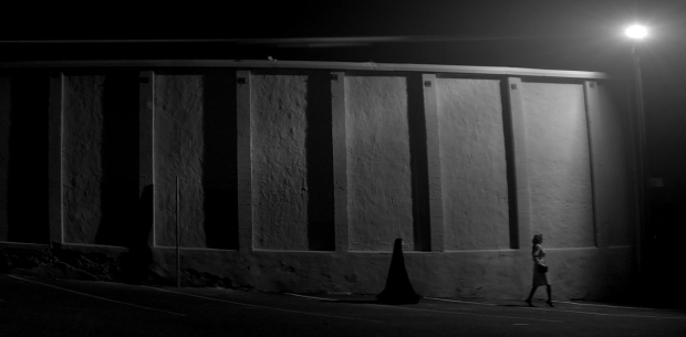
In one of our much-deserved selections for best directorial debuts of 2014, newcomer Ana Lily Amirpour creates a vivid, treacherous landscape for an Iranian vampire “western,” aided greatly by the stark cinematography from Lyle Vincent. With patient, calculated photography — black-and-white images, no less — we’re immediately sucked into dangers lurking around every corner. Add in one the year’s great tension-filled long takes as we follow an intimate, music-backed encounter between our leads, and it’s among the most distinct films of the year. – Jordan R.
The Better Angels (Matthew J. Lloyd)
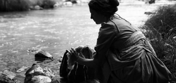
We technically didn’t get a new Terrence Malick film this year (only a preview), but the next best thing arrived in the form of A.J. Edwards‘ debut, The Better Angels. The Tree of Life director is on producing duties here, and his style is beautifully evoked throughout the story of a young Abraham Lincoln. Matthew J. Lloyd is channeling Emmanuel Lubezki‘s work to capture the harsh, albeit beautiful nature of the Midwest setting with his roaming camera, one which often pushes us towards something otherworldly. – Jordan R.
Birdman (Emmanuel Lubezki)
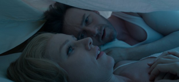
Emmanuel Lubezki’s work in Birdman may be the most-discussed piece of cinematography from 2014. Beyond its impressive technical aspects, having been constructed to look mostly like one take, Lubezki’s tricky cinematography succeeds in two key ways. First, it rarely feels like a gimmick. The camera traps us in a chaotic and claustrophobic environment as flamboyant actors and temptresses chip away at the protagonist’s delicate sanity and artistic creation. This style of filmmaking, which has made its mark on films as different as Russian Ark and Rope, can be demanding of its actors, and Birdman’s ensemble rises to the challenge with key members turning in dynamic performances that match the energy of the camera’s movements. Second, Lubezki’s eye polishes off the film’s rough edges. Director Alejandro González Iñárritu jumbles philosophical ideas and media critiques during Birdman’s runtime; they don’t all land, but it’s Lubezki’s artisanship that keeps Birdman literally gliding from one idea to the next and never giving pause to hone in on any one particular shortcoming of the script. The film stands as one more towering achievement for this immensely talented cinematographer. – Zade C.
Enemy (Nicolas Bolduc)
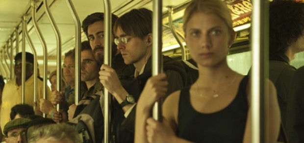
The Toronto on display in Enemy is a hostile, uncertain place filled with imposing structures of unnerving symmetry dotted amid vast planes of nothingness. It also happens to harbor one man’s exact double, a man in possession of his every physical attribute yet devoid of his wilting nature. It is no surprise, then, that this story, with its bizarre setting and twisted narrative, should be shot to look like it is filmed on an arid, alien world. Nicolas Bolduc creates an other-worldliness through his lens, conjuring a nicotine-and-parchment aesthetic that makes every onscreen event all the more threatening and odd. There’s a haze in the air that blurs the edges of reality and even seeps into the interiors. In a movie rich with so much menace and symbolic density, Bolduc’s photography manages to enhance, underline, and sometimes outshine it all. – Brian R.
Godzilla (Seamus McGarvey)
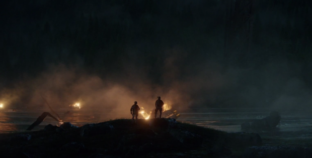
So few images in the current blockbuster climate leave an impression. What “spectacle” we’re given is often presented in dully lit medium shots, and wonder is so scarce that the experience of watching another X-Men film is genuinely disheartening. I haven’t seen Godzilla since its May release, yet can still recall individual images from almost any scene — even the exposition dumps — because of the evident care poured into them. How strange that Seamus McGarvey worked on the expressionless Avengers before this, a visually varied (both in terms of palette and “mere” shooting styles) effort that can overcome the occasional script lull with something as essential as an eye-catching (but non-ostentatious) camera angle. If he isn’t exactly on par with a Spielberg-era Jaws, Gareth Evans should at least take pride in having mounted a monster film that can be considered a descendant without embarrassing itself. – Nick N.
Gone Girl (Jeff Cronenweth)
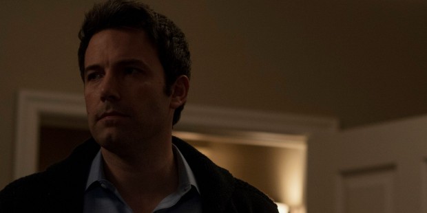
The Fincher-Cronenweth collaborations are as immediately recognizable as anything in current mainstream cinema, but these films aren’t immediately, clearly identical. While Gone Girl manages to be as clean, steely, and precise as The Girl with the Dragon Tattoo, its vision of mediocre American suburbia, so key to this entire effort, becomes evident on every cinematographic level — whether it’s the lighting of a Recession-era home or the atmosphere of dirty motel rooms, no stone is left unturned (or saved from a nice pissing-upon, for that matter). Months after the fact, this film’s most lasting impression is hardly where that girl’s gone. More troubling is the recurring vision of walls closing in on an environment we’re silly enough to consider safe. – Nick N.
Goodbye to Language 3D (Fabrice Aragno)

The director’s most technically innovative film raises many utterances of “how did they do that,” not least of which is wondering what relationship Jean-Luc Godard and Fabrice Aragno established to achieve some of the most amazing 3D images. Interviews with the latter shed some light on this process, but you almost don’t want to know — thinking back on the experience, it’s evident how much I’d prefer to just let the images (literally) come towards me and leave worrying about it all for a later date. If it were just for those two shots — if you’ve seen it, you know of what I speak — this would deserve to be here. But it’s 70 minutes of formal exertion like nothing that’s come before, and is one of the few titles that earns a spot entirely uncontested. – Nick N.
The Grand Budapest Hotel (Robert Yeoman)
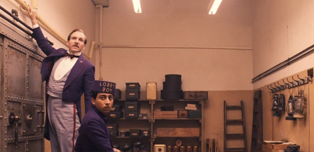
The Grand Budapest Hotel marks Robert Yeoman and Wes Anderson’s eight collaboration, and it’s easily their most decadent creation, even eclipsing the cross-section depiction of Zissou’s ship in the The Life Aquatic. A sprawling film, it encompasses a fabricated history of the world wars, bygone European sensibilities, and features stories within stories. Yeoman is adept at capturing the many details here, such as the emblem for the Society of Crossed Keys and the graphic painting that replaces “Boy with Apple.” New to Anderson’s repertoire of tools is a shifting aspect ratio. Here they’ve delineated the film’s various timelines by switching aspect ratios from 2.35:1 all the way down to 1.37. This taller image, introduced in the 1920s, is used for the core story of concierge Gustave (Fiennes) and his apprentice Zero (Revolori). Budapest is an ambitious step forward for Anderson. As his sense of formalism grows, one wonders if Yeoman is the only working cinematographer who can keep pace with him. – Zade C.
The Immigrant and Magic in the Moonlight (Darius Khondji)
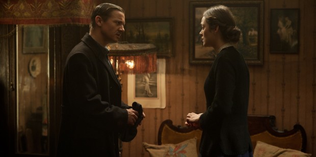
The Immigrant is an old-school melodrama in the best possible way, using form and story beats from another era to show the its own trials and tribulations, creating a movie that feels born almost wholly out of time. Taking it a step further is the sense of freshness brought about by the direction, the actors, and the look and feel of these images. Darius Khondji plays into our expectations with some of the golden hues he evokes, while simultaneously bringing a certain truthfulness to his colors and contrasts that make the world of 1912 New York feel more real than one would expect. He gilds without sentimentalizing and illuminates without dazzling. It’s a balancing act of formal skill that is pulled off ably and allows for a sumptuous feast for the eyes in the midst of so much emotional desolation. We’ll also throw out an honorable mention to the work on Woody Allen‘s latest, a light, forgettable farce elevated by Khondji’s radiant eye. – Brian R.
The Homesman (Rodrigo Prieto)
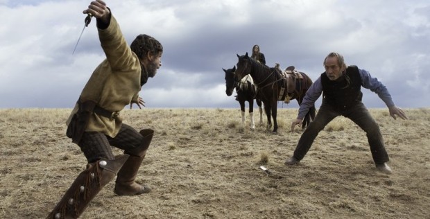
After capturing the west in Brokeback Mountain, it’s no surprise cinematographer Rodrigo Prieto gave Tommy Lee Jones‘ latest feature a reserved elegance. The Homesman is a strange beast of a film, juggling different tones and unexpected twists, but one thing that stays constant is Prieto’s pristine view of the landscape. Shot in a wide 2.35:1 aspect ratio on 35mm film, it’s the sort of approach that’s seemingly rare nowadays. Jones doesn’t often direct, but we hope the collaboration will continue. – Jordan R.
Ida (Ryszard Lenczewski and Lukasz Zal)
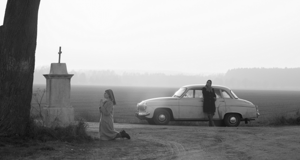
Black-and-white photography seems to be in vogue when it comes to showcasing desolation and isolation, but rarely does its contrast and shading achieve something we could call truly beautiful. Ida, with cinematography by Ryszard Lenczewski and Lukasz Zal, goes a long way toward correcting this oversight in the film community, using delicate black-and-white compositions to not only create a sense of time and place (communist Poland), but also a reflection of the film’s moral ambitions. A nun comes from a world where right and wrong are, indeed, an absolute binary, as does her communist judge of an aunt, and yet their ideals are in conflict, and their morality influences the other in subtle ways. It feels almost reductive to categorize this film as being shot in black-and-white, because the hues are more like faded ink and rich creme, more nuanced than one would expect. It is a soft, dreamy palette, and one that gives the spiritual and moral duel of the two leads and their own natures the feel of a lucid dream. Understated, unexpected, and perfect, just like the film itself. – Brian R.
Inherent Vice and Nightcrawler (Robert Elswit)
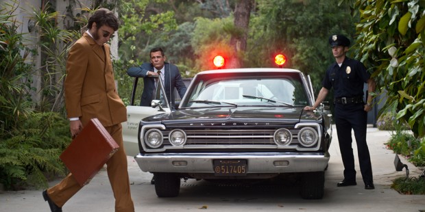
An entire essay can be devoted to Robert Elswit‘s camerawork in Inherent Vice, but briefly: its most cogent qualities lie in the way this DP is able to create an idyllically hazy atmosphere while pulling us into each conversation Joaquin Phoenix‘s Doc Sportello encounters on his journey. With such a vast ensemble, the careful use of two-shots Elswit and Paul Thomas Anderson employ will gradually invite us to hang on to every last one of Pynchon’s magnificent words. Capturing a much different side (and era) of Los Angeles, Elswit also shot Nightcrawler, which takes a more external, nocturnal view of the city. With an unsettling immediacy, Elswit’s style makes for a perfect marriage with Jake Gyllenhaal‘s disturbing go-getter Lou Bloom. – Jordan R.
Listen Up Philip (Sean Price Williams)
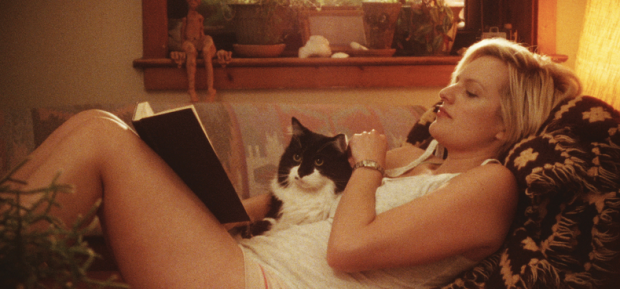
Sean Price Williams‘ work on Listen Up Philip exemplifies the best of DP-helmer collaborations for how cleanly it brings a screenplay’s specific qualities to the fore. There’s something in this Perry-scripted effort that defies a temporal space — unlike just about everything else here — and yet the autumn-burnished New York / New England settings are like a memory of times past, working in concert with irascible characters to suggest, true to this film’s cynical heart, that some things never change. – Nick N.
Mr. Turner (Dick Pope)
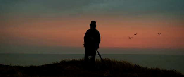
If one is going to capture the life of a painter, they should be certain to convince us that the world surrounding the artist is one of deep inspiration. Director Mike Leigh and cinematographer Dick Pope excel in this notion with their biopic Mr. Turner. While much of the film may be contained to the conversations the painter had with his loved (and hated) ones, there’s more than a handful of sequences depicting the many journeys of the artist, venturing from a raging storm at sea to a serene mountainous landscape. Evoking the master’s paintings, Pope creates his own works of art — perhaps the highest compliment we can give. – Jordan R.
Norte, The End of History (Larry Manda)
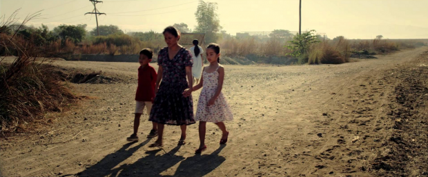
Although newcomers to the work of Lav Diaz might struggle against Norte: The End of History’s epic length of four plus hours and its sometimes frustratingly langorous static, wide shots, the Filipino director’s newest is not just one of his shortest films, but also his most visually accessible. In working with cinematographer Larry Manda, Diaz expands his own technique and formal mastery, creating a slow-burning portrait of his country’s social struggles through the lives of characters who move from metaphor to painfully real. Like some of his other, longer film experiments, Norte shares a desire to not simply illustrate a story, but to inhabit and configure an entire social headspace as a literal, tangible environment. There are several new tricks in the bag, including a decisive and textured use of color, as well as a versimilitude in shooting styles that gives Norte an emotional identity richer than its more mammoth counterparts. Moving between wide, expansive shots that often divide the action into quadrants of activity, to a more intimate, documentary-like style, Diaz has conceived a work as ambitious as any made by the humanist directors of yesteryear. – Nathan B.
Selma and A Most Violent Year (Bradford Young)
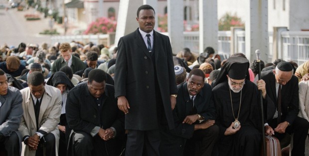
First grabbing our attention with Pariah and Ain’t Them Bodies Saints, this year — or, rather, the next few weeks — marks the breakout of cinematographer Bradford Young. Having shot Selma and A Most Violent Year, the director of photography proves his hand at two vastly different films. With the former, he directly involves us in the incendiary protests that helped change the course of history (with much work still to go, as our current state proves), and lent gravitas and emotion with his framing of David Oyelowo‘s Martin Luther King, Jr. With the latter, he recalls the best work of Gordon Willis, warmly capturing a New York City in turmoil. Out of all the rising cinematographers on this list, Young’s career is the one we’re looking forward to seeing sprout the most. – Jordan R.
Stop the Pounding Heart (Diego Romero)

The neorealist drama Stop the Pounding Heart completes Roberto Minervini’s Texas trilogy, which began in 2011 with the road movie The Passage and continued the following year with the white-trash 400 Blows homage Low Tide. Part-documentary, part-fiction, the work follows Sara Carlson, the 14-year-old daughter of devout Christian goat farmers, and Colby Trichell, an asthmatic cowboy obsessed with riding bulls. The two non-professional leads and their families basically play themselves, and are filmed in their own homes, which lends a distinctly authentic vibe to the story. Adding to the physical nuance, Minervini develops his characters through intimate close-ups that betray their internal struggles — though she barely speaks a word, Sara’s confusion and conflict of faith reveals itself with each long, patient take. – Amanda W.
Unbroken (Roger Deakins)
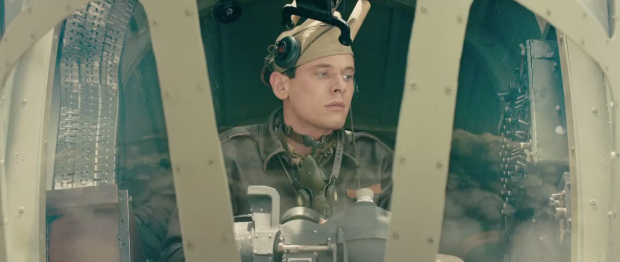
Roger Deakins is a cinematographer known for composing shots of visual beauty both epic and occasionally mythic. Shooting on digital — for practical reasons related to a heavy number of fx shots — Deakins steps outside a comfort zone and adds a classical grace to Angelina Jolie’s Unbroken, the story of Olympic winner and war hero Louis Zamperini. Although the film’s pursuit of Zamperini’s amazing true-life survival story is driven by a respectable but traditionalist narrative, Deakins gives the film a kind of spiritual resonance through his detailed and delicate capturing of a number of awe-inspiring settings. Whether it’s the cramped-but-light-saturated interiors of a B-24 bomber, the vast stillness of an unforgiving ocean, or the foreboding starkness of a Japanese POW camp, Unbroken combines sublimely grand sights with a powerful sense of individual immediacy, as seen through the eyes of Zamperini. It’s not out of line to bring the likes of David Lean into the equation, but the work of Jolie and Deakins stands on its own as a new, lush take on very familiar tropes. – Nathan B.
Under the Skin (Daniel Landin)
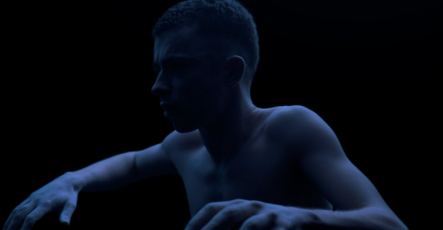
The visuals in Under the Skin range from surreal to hyper-realistic, and the interplay between these two styles unfolds with spellbinding results. Director of photography Daniel Landin deserves praise for accomplishing Jonathan Glazer’s risky proposition that the film feature oblivious citizens interacting with lead actress Scarlett Johansson. The framing is always precise in these unscripted confrontations, but, more importantly, the potential danger of these situations are felt by the audience. Glasgow, its roadways, and the outlying Scottish countryside have never looked as alien as they do here. When the film ventures into its darker sci-fi tropes, Landin concocts some of the most potent images 2014 offered. Skirting between erotic and horrific, Under the Skin commands its audience frame by frame until a stunning conclusion, in which the camera tilts to the sky and suggests something beyond what we just saw. – Zade C.
Visitors (Graham Berry, Trish Govoni, Tom Lowe)

Operating at a slow, deliberate pace as it digs into its grand theme of humans as aliens living on Earth, Godfrey Reggio‘s masterful film Visitors — a welcome return after a decade-plus-long wait since his last feature — leans on a mostly-digital aesthetic to capture every detail of its subjects. A wonderful reminder of what a handful of powerful images can achieve. – Leonard P.
Winter Sleep (Gökhan Tiryaki)
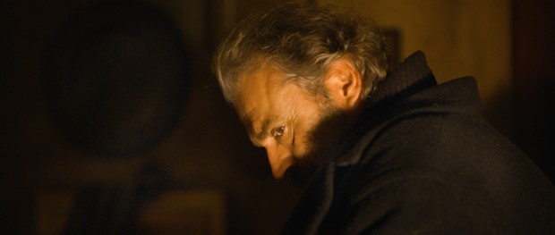
Anyone who has experienced previous films from Nuri Bilge Ceylan knows that his cinematography is one of the key enveloping aspects for his extensive, personal epics. With his Palme d’Or winner Winter Sleep, frequent collaborator Gökhan Tiryaki intimately places us into our main setting, a Turkish hotel, but rather than delight in the surroundings (which he does accomplish), it is the framing and hues in which our ensemble are captured that keep us gripped for well over three hours. – Jordan R.
What film’s cinematography impressed you most this year?

