“Don’t Judge a Book by Its Cover” is a proverb whose simple existence proves the fact impressionable souls will do so without fail. This monthly column focuses on the film industry’s willingness to capitalize on this truth, releasing one-sheets to serve as not representations of what audiences are to expect, but as propaganda to fill seats. Oftentimes they fail miserably.
The seasons are starting to mix as summer makes way towards fall. Sprinkled amongst the Hollywood blockbusters this September are five Toronto International Film Festival selections (not to mention Venice and Telluride)—some hitting your local cinema the week after they debut. And the coming months are only bringing more (as well as some holdovers from last fall such as The Limehouse Golem opening in limited release September 8).
Choose your selections wisely as some of what’s coming may still be talked about at the Oscars in 2018 while many others will be forgotten save their box office gross. So there’s no more important time than now for these movies to have posters that stand out from the pack on every cineplex’s walls.
Character set coin flip


When you have a cast of characters such as Kingsman: The Golden Circle (September 22), the desire to go crazy with poster sets is understandable. Between the posh wardrobe and the sprawling weapons cases a comedic Bond-type tale provides, there’s infinite fodder for having fun. But the idea still has to be good. The design still has to be effective. The line between cheap and stylish is thin.
Just look at the first set from Empire Design. It’s not perfect or exciting, but it is effective as a tease. We get a flavor of characters through dialogue and one single accessory to find a bit of humor and a bit of charm. I like that “glasses” as a concept moves beyond one definition of the word and I hate that the skew of the text differs depending on the length.
The second set has nothing to like. These sheets are Photoshop disasters composed of floating objects that look nothing close to “real”. Those pens on Merlin’s wall. That cheeseburger on Poppy’s shelf. The drop shadows render each one a flat cardboard cutout much like the actors themselves. And the amount of blur being used is laughable.
Thankfully the third set sees the problems of the second and fixes them. It allows the characters to be crisply cut. Putting them on a solid color background doesn’t force us to see them in any sort of deep perspective. And the perfume ad aesthetic is a silly one to use considering just how huge “style” is to these people. I also like the “Suited. Suited. Suited. Deluded.” gag. It’s worth the payoff.


You may think the line between cheap and cool is non-existent with children’s fare, but you’d be wrong. Just because you can literally throw anything on a page and get the young-ins excited, artistic worth doesn’t have to be sacrificed in the process. I get why it often is, though. The studio wants to highlight scale, scope, or in this case products to sell. At least Art Machine got the opportunity to do both with The LEGO Ninjago Movie (September 22).
The first row is great. Every background and composition is character specific so as not to be just another swap out series like Kingsman. We receive scale as a means for excitement and atmosphere, these tiny LEGO people interacting in real world settings rather than those created from blocks. And dare I say they’re also pretty? Without a title (there’s only one LEGO movie to come this year) or cast list proving necessary, the frame can be a true scene. The designers can create a “photoshoot” with more than contractual obligations as motivation.


Unfortunately, LEGO isn’t going to be pushing sales with tiny little figures. In this case the “people” are the accessories. The kiddies need to be shown the vehicles and mechs that these heroes ride. In doing so Art Machine is more or less handcuffed into lazy template mode. They replace environments for faux attitude while spotlighting the actual toy you can build at home. Don’t assume the names are big to learn each character. They are merely reference points for finding the box your child wants atop the store shelf.
A perfect world would be one where the only poster series consisted of these illustrative homages to old Japanese masters like Hokusai at right.
A mainstream aesthetic


We can’t expect every poster to have art appeal beyond what’s necessary to sell its product. Marketing is a capitalistic construct wherein certain imperatives cannot be avoided. Some studios let a generic layout pass through because they don’t think they need to appeal to anyone else but fans of the actor. Others need a little more oomph.
The former camp is one driven by the A-list power of someone like Tom Cruise. He is the commodity—not the film. His swagger and smile is what sells tickets—not the director (sorry Doug Liman). So it’s no surprise that American Made (September 29) puts its star front and center. This guy is cool. This guy is who you want to be. The woman is a perk. The money is a perk. Rather than be about a story, this film is sold as a vicarious experience.
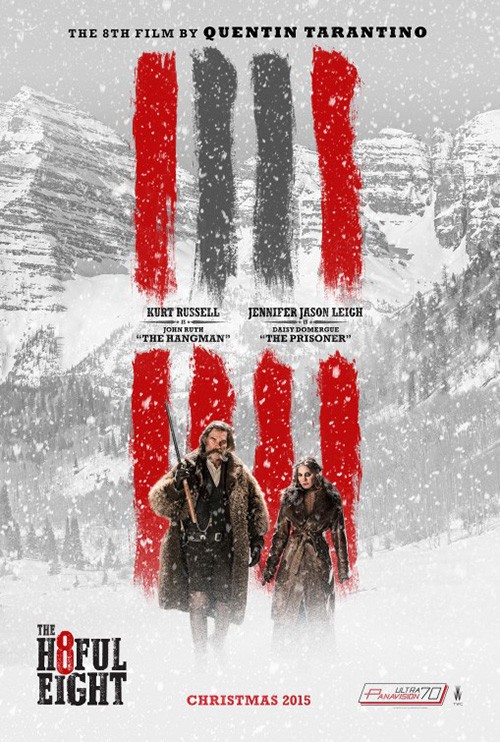
And that’s fine. I simply wonder what a pan-flute has to do with anything. Or perhaps there’s some unseen connection between this film and The Hateful Eight? Does Cruise kill six people? Seven? Is he covering a seventh smudge line of blood? I don’t know. But for someone who won’t blindly go see any Cruise project, those lines are the only things I can see here.
If anyone in the Hollywood generation after Cruise can command his type of artistic and celebrity presence, Jake Gyllenhaal is a good candidate. So why not let the poster for Stronger (limited September 22) be Jake Gyllenhaal? I’m sure you can think of many.
Where I see the biggest missed opportunity in Gravillis Inc.’s poster, however, is the fact that nothing here lets us know this man’s “inspiring true story” has to do with the Boston Marathon bombing. Suddenly this isn’t a poster about an event or a man—it’s literally about Gyllenhaal. Sorry, Jake. That’s not enough (see Prince of Persia).
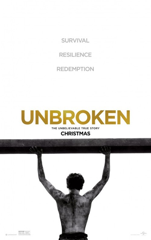
The image’s crop only corroborates this fact by barely letting us know his legs are gone. You need to be looking at this thing for a long time to see it. If I didn’t already know about this film I’d think he’s just some random gymnast and pass on by. Like the poster for Unbroken, less is sometimes less because resilience and strength need context.
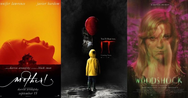
This is why a lack of celebrity can often help a design firm force creative license onto a client. Look at Canyon Design Group’s It (September 8). There’s no Tim Curry this time around and Bill Skarsgård’s iteration of Pennywise isn’t one you necessarily want to see in full. His creepy impact comes from hiding in the shadows. It’s about children believing he’s cute and fun like clowns should be until the last possible moment. That’s where the dread comes. The idea of “less is more” has returned.


The same goes for cold open’s foggy Comic-Con sheet. Its horror isn’t as palpable as the first, but the atmosphere is nice. All those kids are looking in front of them, but their enemy lingers behind. Why he’d be darker and thus more visible then them is beyond physics, but we can let that slide.
If any Hollywood blockbuster took aesthetics to heart this month most, though, it was Flatliners (September 29). Concept Arts goes above and beyond with this tease as it takes Ellen Page’s profile and phases it through the aether. I absolutely love the color warping of the shimmering pulse line and the multiple layers of her face shifting as though in motion on the page. We understand the concept of the title and the premise of “going somewhere” through the process. It’s a far cry from the boring gazes of celebrity elite seen on the original’s poster.


B O N D’s advert isn’t as effective, but it does look to augment the notion of being terrifying. Here we see that which is created by crossing over to the afterlife. It’s not pretty and the pulse line is way too overpowering in its boldness, but it delivers the horror underpinnings the studio hopes to sell.
Typographic flair


In all honesty, Loving Vincent (limited September 22) works because of its subject and his aesthetic. The idea of this film being hand-painted is very cool and thus the only thing one should highlight to advertise it. Use one of those faux Van Gogh frames with all the expressionistic swirls and mercury-based oil colors. Whether you know the film will look like that too or not doesn’t matter because this legend’s style turns heads regardless.
The typography is therefore just an added bonus. Yes, it’s probably just one of those fonts you can find online for free that use an artist’s handwriting as its basis, but it works beautifully in this context. And that’s all that matters. Not every font should be used for every occasion, but they all have their perfect use somewhere.
I’m not entirely sure P+A’s font for Literally, Right Before Aaron (limited September 29) is one such example, though. It’s interesting, but not without problems. Just look at the kerning. It’s very tight to keep things close except for where those pesky ‘Rs” are concerned. Capital or lowercase, the space to the right of each is vast enough that staring becomes unavoidable. It fractures the fluidity serifs should lend to our reading just like having ‘Literally’ so small makes it difficult to realize the title isn’t Right Before Aaron.
Thankfully the firm makes up for its awkward font with some fun visuals. All the nameless/faceless nobodies that Justin Long must contend with for Cobie Smulders’ heart as plastic cake toppers is relatable in its metaphor and the pink pops off the wall. I’m not quite certain about what the title means in context to the imagery (She marries the guy before dating him as though dating him was assured?), but its comedic tone is read loud and clear.
For an example of a font that has no real connection to the work but excels anyway: Midnight Marauder’s Lucky (limited September 29). The image of Harry Dean Stanton is anything by “solid” what with him in his underwear and boots to water a cactus. It therefore needs a font that exudes the strength it does not—something to counteract the imperfect haze and wrinkles below.
Enter the font’s blocky serifs in all caps that build their own block of color to both standout against the background and support the heavy black text surrounding it. Any thinner and the black would have drowned it out. Any darker and it would have been lost in a mass of darkness. So the shape and hue are very purposeful as contrasts and complements alike to everything sharing the frame.
The Tiger Hunter (limited September 22) font is all about tonal consistency. You could argue that it’s actually hard to read as a result because its colors and position do no favors as far as drawing attention to it above all else. The poster is instead built to ensure Danny Pudi’s face is our focal point. This is what happens when everything above the horizon line is centered and everything below is diagonally shifted up. The intersection is on the actor, his gaze directly on us.
It’s a wacky design with geometric-based (paper-made?) architecture where Pudi’s character comes from and exactingly metallic skyscrapers where he’s going. His loud jacket and suitcase act as an enhanced drop shadow to the title, their orange/red an extended darkened surface to pop its yellow.
And as far as the font itself: well the look obviously seeks to bring to mind an eastern flavor from India while also lending the modern sharpness of his destination. It’s playful and stylish and almost illegible—but in a way that makes you peer closer rather than walk away.
Mood trumps celebrity


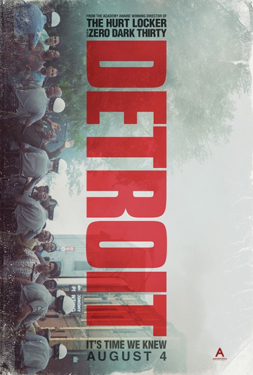
I really like this poster for The Force (limited September 22). It’s so simple in construction and yet profound in execution. It delivers a similar situation as Detroit did with its scope and scale moving past the confines of the page. Here is police (badge) and community (reflection) co-existing in what amounts to a quarter of the frame, yet both seem infinite nonetheless.
And it’s not just a badge in the center either. There’s depth and perspective—character. We see this as a close-up of a police officer’s chest as opposed to a Photoshopped construction meant to signify one. Too often firms feel like the freedom of creating everything in a computer is king and forget just how important realism is to a film like this. If you can pose the photo, do it. It goes a long way.
As sharp and defined as that one, Woodshock (limited September 22) is mysterious and ephemeral. The directorial debut of fashion moguls Kate and Laura Mulleavy pulls no punches as far as letting an aesthetic speak above their star. While we know this is Kirsten Dunst, her portrait isn’t driving the poster’s motives. Instead it’s the sense of dread and uncertainty, the look of malice flickering back and forth from two images layered atop each other. And both look as though they are dream and about to disappear forever.


It’s the same feeling you get from the title treatment—something that would work great on the screen as it appears and fades, but not so great on the page as a static state. I applaud the use of a filter that makes it both close to unreadable and unnoticeable, but wonder if there’s too much going on to make it truly effective.
And while I do like Kellerhouse, Inc.’s floating body in the trees for its directness, I prefer the Dunst portrait and its mystery. It does what I believe Nocturnal Animals tried to do and failed. A bit more blur and a bit less opaqueness are all it takes to turn a strange superimposition into an unforgettable psychological experience.
Taking a page from the teaser for The Runaways, Fox Searchlight went incendiary on an otherwise innocuous object with Battles of the Sexes (limited September 22). All it takes is a fuse to turn an otherwise banal image combatively explosive and the fuse of this true-life story is the politicizing of tennis. It may have begun as a media stunt, but Billie Jean King and Bobby Riggs exhibition match quickly became a legitimate fight for equality on an international stage.


What better way to portray that than a tennis ball ready to blow? It’s perfect. The mustard yellow background is just muddy enough for the ball to separate itself and the faux folds lend it a vintage quality that says this was the real leaflet for the event back in 1973. Add the dotted font for a newsprint-meets-marquee lights look and you have a true minimalist winner on your hands.
Compare it to Empire Design’s photographic-based sheet and you see how distracting things can get when you move beyond metaphor. It’s not bad per se, but you do have to force yourself to separate Emma Stone and Steve Carell engaged in shenanigans from the weight of what King and Riggs did. This is all about star-power rather than content.
It only makes sense then that the American poster would combine both. Add a more pronounced halftone to the image so it mimics the aesthetic being used and it could work. As it is, however, the ball-bomb becomes overpowered despite still being the most powerful part of the whole. They would have been better off removing it altogether.
If you really want mood cranked to eleven, however, you have to admire my favorite poster of the month: Gravillis Inc.’s Super Dark Times (limited September 29). Not only is it fantastic as a result of its realistic silhouette creating negative space against a fiery sky littered with branches or its markered scrawl of a font neatly packed into a box, it brings us into its horror. Suddenly we become the predator or prey depending on what these three kids will prove. They’re looking at us in the beams of their flashlights and we’re helpless to do anything but squint back. It’s gorgeous.
Do you think they’ll drop the bomb?


The most interesting campaign of the month, however, has to go to mother! (September 15). We have creepy porcelain cracks from LA, creepy paintings from James Jean, creepy Rosemary’s Baby homage and creepy mirror effects from BLT Communications, LLC. None of them give us an idea about the movie besides atmosphere and yet it’s enough to guess on what to expect.
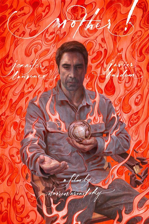
My favorite is the first because of how eerie it proves. There’s a sense of “deadness” to her eyes as though Jennifer Lawrence has been made into a doll. The cracks are very well rendered and the chips perfectly placed to catch our attention. You can believe there’s also a reflection in her pupil, but that’s neither here nor there as far as intrigue. Cap things off with the angry flick of a calligraphy pen to provide the title and voila: instant nightmare fuel.
That’s not to say Jean’s paintings aren’t stunningly off-kilter and horror inducing in their own right. The juxtaposition of classical style and gothic imagery is captivating and the detail undeniably astute. I prefer the elaborate textual flourishes of the “her” version, but the flames of faces in the “him” are pretty unforgettable.


I’m not sure then why the studio decided to keep going and release more. We are ramping up to the release date (and festival bows), but these three are so timeless. To go and water-down the campaign with homages (intentional or not) seems misguided. The Rosemary’s Baby one will never stand alone without that classic pulling at you; the moth wing mirror is a common trope (used by The Blackcoat’s Daughter just this year to better effect by not actually mirroring); and the Spanish Phantom of the Opera redux is nothing if not generic. I’ll personally pretend those last three simply do not exist.
What is your favorite September release poster? What could have used a rework?