“Don’t Judge a Book by Its Cover” is a proverb whose simple existence proves the fact impressionable souls will do so without fail. This monthly column focuses on the film industry’s willingness to capitalize on this truth, releasing one-sheets to serve as not representations of what audiences are to expect, but as propaganda to fill seats. Oftentimes they fail miserably.
—
Festival season is upon us, so forgive me if I’m more concerned with the films whose posters will be included in future posts than those releasing now. That’s not saying there aren’t any of worth—movies or posters—just that it’s a hectic time of year.
The craziest detail, however, is noticing exactly how many studios currently use festivals like Toronto to serve as premieres rather than venues to buy and sell. I count at least six selections I could theoretically be watching this weekend at TIFF. It’s a reality that speaks more towards the festival coveting exposure than the films needing it and ultimately provides an excuse for many to skip the slam-dunks for lesser-known works they may never have the chance to see again.
What’s in the box?!
 |
 |
 |
 |
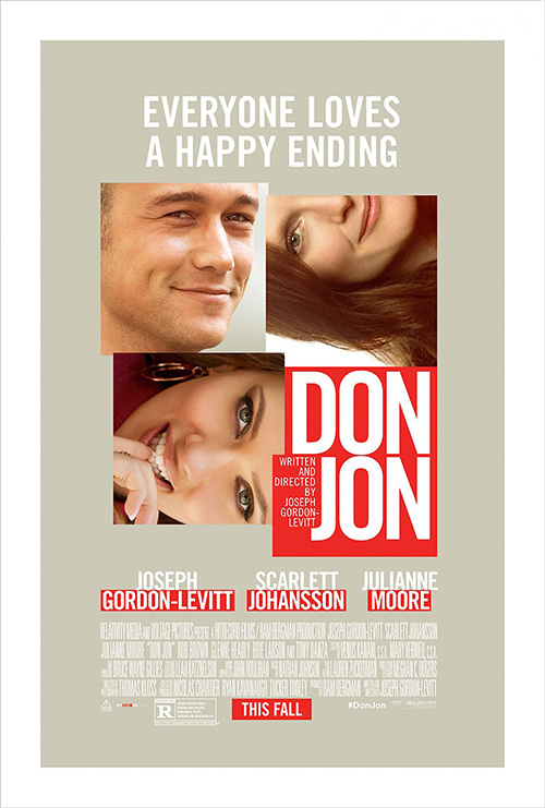
This month’s collection of lazy poster tropes goes to segregated film stills in different size quadrilaterals. Sometimes they span the entire poster, sometimes a cross-section, and more often than not “fun” little motifs of boxes upon boxes that could either be an intentional collage effect or the product of a firm lacking the time to Photoshop everyone out of their backgrounds. September has one of each.
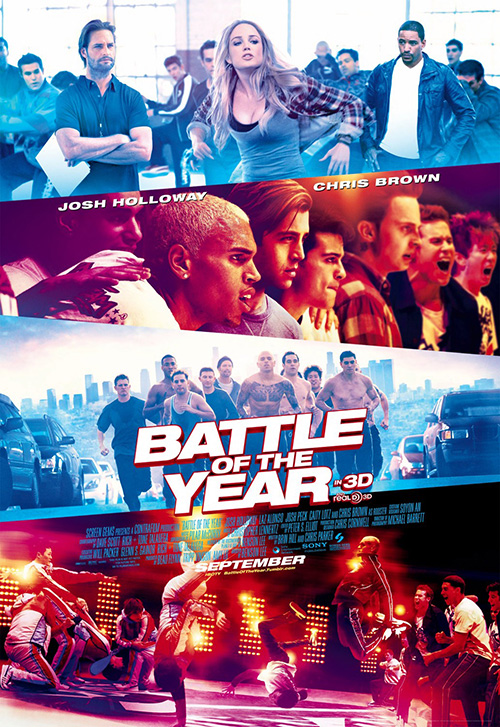
The first comes via Sony’s Battle of the Year (open September 20) in glorious 3D! I completely forgot this was a film until I saw Josh Holloway’s smolderingly serious mug in the top left and remembered laughing at the trailer when I caught it months ago.
I’ll give the designers credit for not just sticking to straight rectangles so that the slants can enhance the shadowboxed font at the center. And I’ll applaud them for not just putting Chris Brown’s peroxide hair front and center. Although, it would have been hilarious if that tiny detail in the credits box saying the singer plays “Rooster” were a focal point.
Blue filter, red filter; blue, red—is the fight pitting cool colors against warm? I don’t know, I’m too far removed from the target audience for a dance flick, so maybe this is exactly what people need to fork over ten plus bucks for a seat. The diagonals do make your eye cut through top to bottom and a little faux motion is added in blurring—so I guess it’s a success?
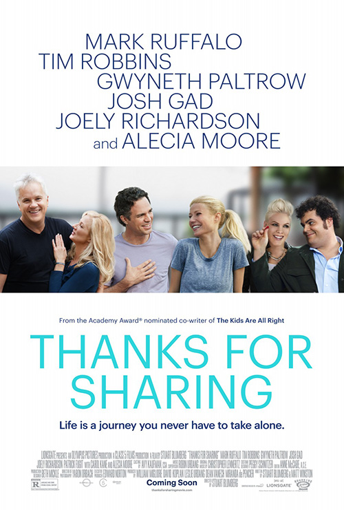 |
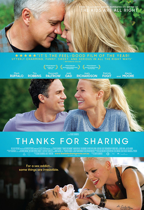
Carnival Studio’s sheet for Thanks for Sharing (limited September 20), however, is definitely not. Three couples, three stills? That’s some original thinking there. Even the boys and girls are aligned with each other—all they would have needed to do was dye Tim Robbins’ hair so it was a dark/blonde system the whole way though.
Even the blue/yellow/white color scheme is lacking courtesy of the conformity in font size. The title kind of sticks out—and I really love the “R” of that typeface—but it’s just fake smiles without the jokes and a ton of thin white letters. I’d almost say The Cimarron Group’s starkly color-less counterpart is better besides its horrible masking job with hair. Is P!nk glowing?
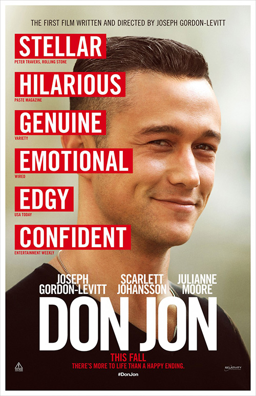 |
Ignition Print at least tries to add some character by making its boxes rotate at 90 degrees for Don Jon (open September 27). There’s no Tony Danza anywhere to be seen, but whatever.
The poster is light years better than the previous platitude-heavy portrait, but I can’t stop looking at the red title box’s added area with Joseph Gordon-Levitt’s hyphenate. Couldn’t the order of overlapping have been changed to retain full squares? Or is Scarlett Johansson’s field supposed to be cutting into his red? It’s awkward and glaringly bad. At least Julianne Moore’s slight overhang spans her entire edge.
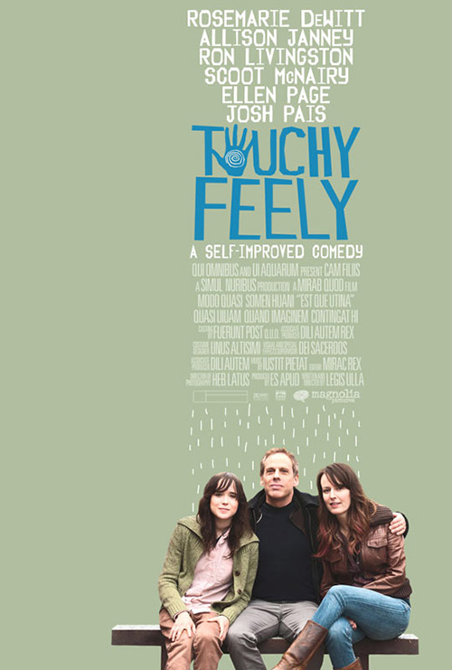
How does Touchy Feely (limited September 6) fit into this subsection, you ask? How about me liking its decision to “Think Outside the Box”? Right? See what I did there?
Honestly, though, I kind of like this layout. It’s simple, fun, and unafraid to center its mass of text without the need for full justifying the credit box into a regimented square. The colors are nice and earthy, the handprint “O” a cute flourish, and the roughly drawn rain a Peanuts-esque representation of emotional turmoil juxtaposed against the actors’ smiles. Throw it all slightly right of the middle and you have yourself a graphic that may just stick in people’s consciousness.
Now playing at TIFF
 |
 |
 |
 |
The above Don Jon is also playing at TIFF—as well as Enough Said (limited September 20)—but it fit better above and my sections are in fours. It’s the format I chose, so I can’t very well change things up …
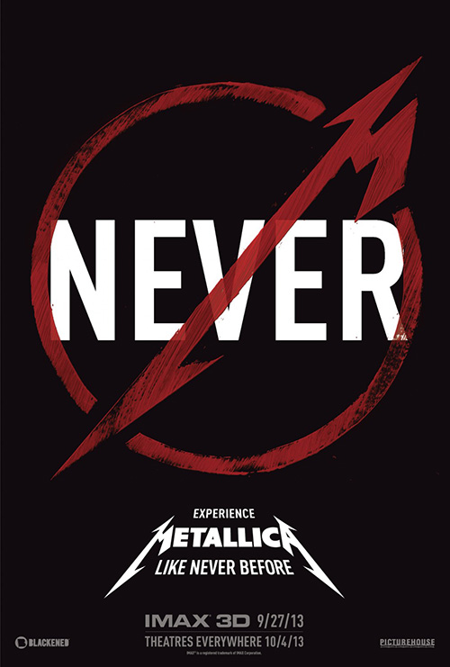 |
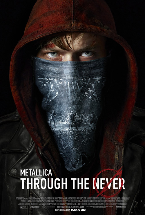
On to new posters: here comes a surprisingly effective Photoshop job for Metallica: Through the Never (limited September 27), an intriguing hybridized concert film/thriller from Nimrod Antal. The band’s logo gets some play as the “No” sign above “Never”, Dane DeHaan is easily recognizable despite only getting his eyes and brow, and the lit-up stage finds some glory through its projection onto his face-shrouding scarf. That’s a pretty good job of hitting all your bases while still creating a rather ominous image.
The foreboding feeling equals that of the trailer and I will admit I want to see this thing. I have absolutely no clue what to expect but I need to know. Thankfully the studio released saw this potential to stir up like-minded individuals’ interest because their first teaser screams redundant concert film that no one could care less about.
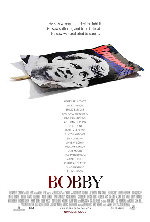 |
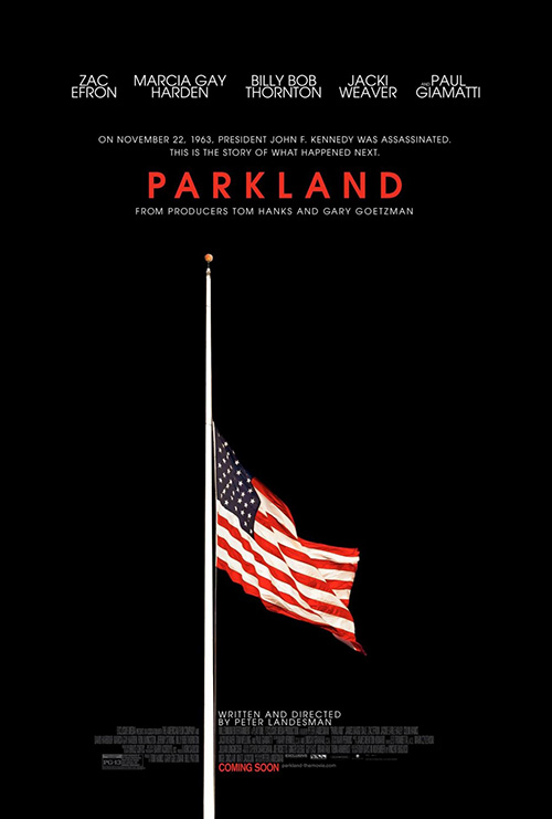
Continuing the trend of pitch-black backgrounds is Ignition’s Parkland (limited September 20). As the tagline says, this is a film about the aftermath of JFK’s assassination. What better way to depict such tragedy than the obligatory flag at half-mast in mourning?
It’s a similar decision as Bemis Belkind had with Bobby a few years back deciding an overflowing ensemble cast would be too much—not to mention take away from the true meaning of the film by making it about celebrity. Good on them also for keeping it simple and respectful, because I’m sure someone in that brainstorming session suggested putting blood on that flag.
 |
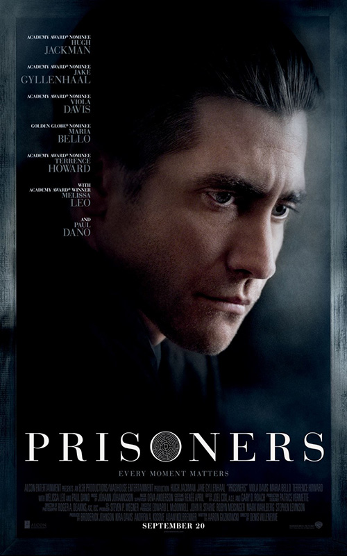 |
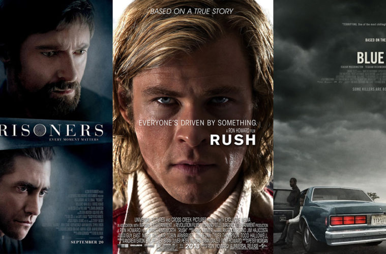
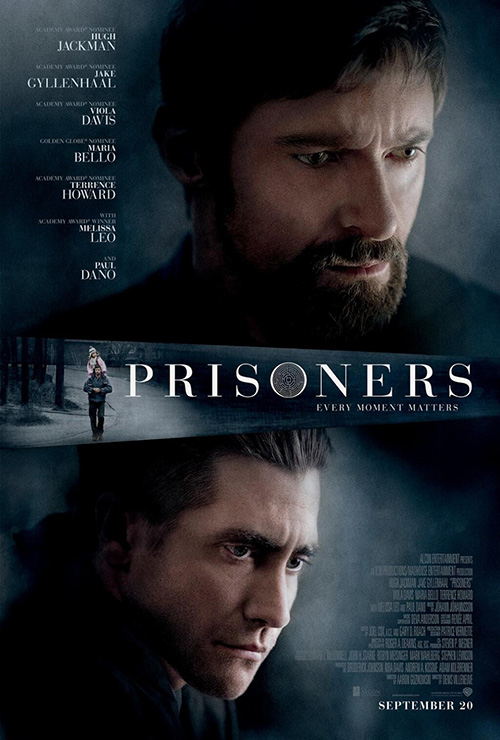
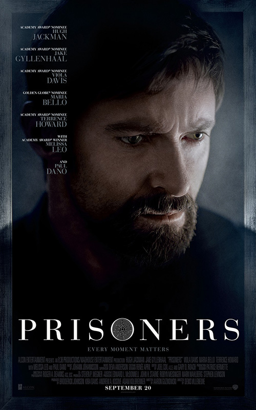
Too bad Art Machine, A Trailer Park Company didn’t follow suit with their campaign for Prisoners (open September 20). I guess Hugh Jackman and Jake Gyllenhaal are too big to sweep into the background. Look closely, though, and you’ll see a cool circular maze in the center of the “O”. Now how awesome would it have been if they created a design around that motif? I’d almost bet they did and the studio somehow declined it.
“We want depressed severity looking down and to the right at nothing!” Putting Jackman with his little girl on his shoulders would have at least been more interesting than this. As for separating them—I think each actor’s expression is made weirder on their own. Nothing about the film’s premise is explained and that maze keeps grabbing your eye, refusing to let go. They really missed a golden opportunity there.
 |
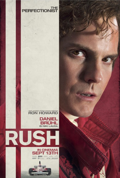 |
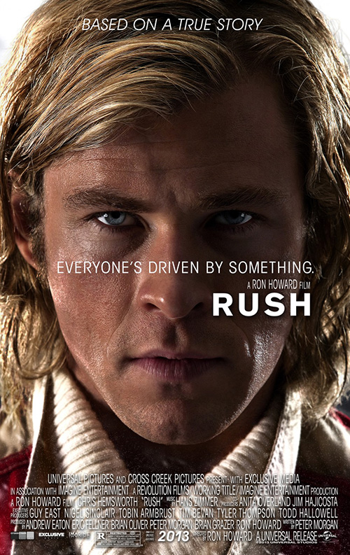
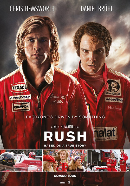
The festival of faces isn’t over as Concept Arts utilizes Chris Hemsworth’s determined eyes as its central detail for Rush (open September 20). It’s a high definition photo where every pour on his face is noticeable as well as the sweat-matted hair atop his head. The tagline keeps his eyes in our sight and the bolded title incorporates itself into our hypnosis.
Definitely my preferred choice of the Rush bunch, anything with Daniel Brühl is a disaster. Boy, did they do a number on him in the advertising game—he looks scary and this is before a crash burns off his face. The one with him and Hemsworth together looks as though he’s going to jump off the page and murder us slowly and painfully.
And no cars? Really? I understand that audiences love Thor, but come on. Show us a little of the high-octane action I’m still assuming will be included.
Seeing red
 |
 |
 |
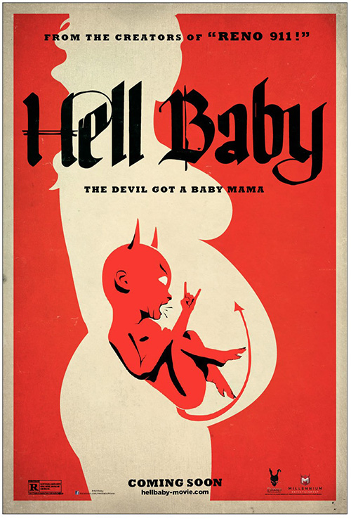 |
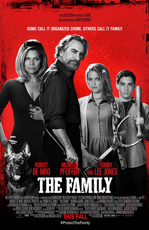
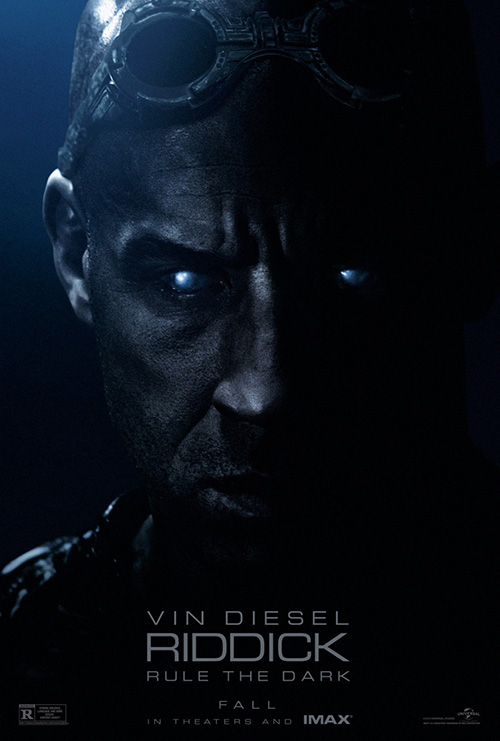
Just like the Chevelle song, September is all about the crimson. It’s got it in biography, sci-fi horror, black comedy, and horror comedy—pretty much whatever you want, red has it. Maroon, blood red, bright red, orange red … you get the picture.
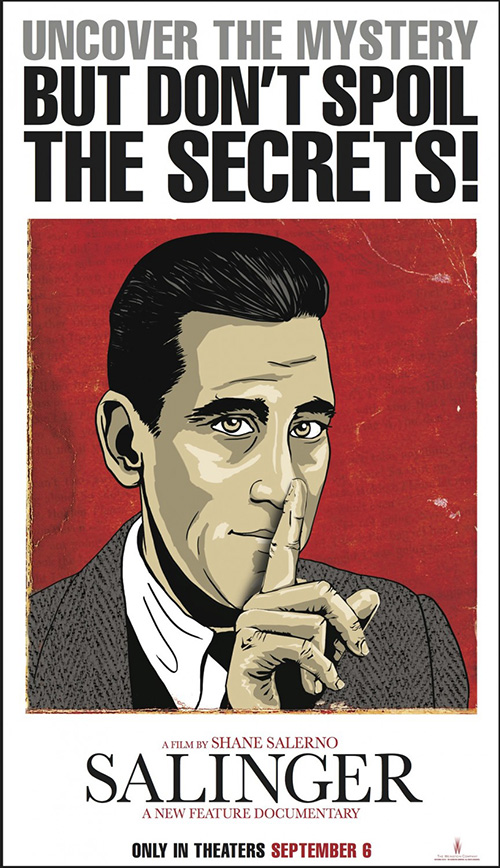 |
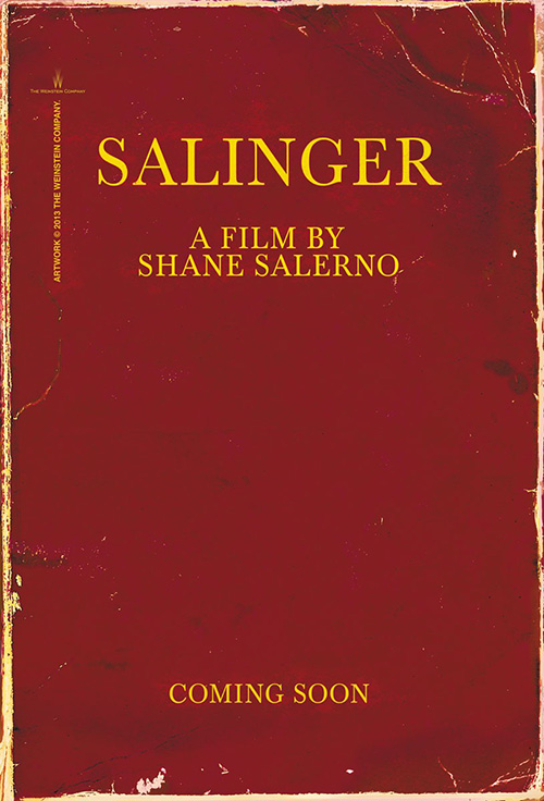
How great is this poster for Salinger (limited September 6) from Allied Integrated Marketing? Okay, its text is way to crisp to go full Trompe l’oeil, but it still gets the job done and I admire the concept.
We’re talking about an author known for being a recluse whose life is more or less a mystery to many having only his novels to provide an inkling of the man behind the stories. Why not give us the battered and torn cover that holds all the answers? It’s simple, metaphoric, and absolutely like no other sheet on theater walls right now.
As a result, let’s just forget that Allied also made a second, sad attempt at an old school mystery illustration. The sans serif at top looks weird due to its full justification, the cartoon is very rough and out-of-place above a realistically textured background, and these dueling aesthetics are too overpowering a battle.
 |
 |
 |
 |
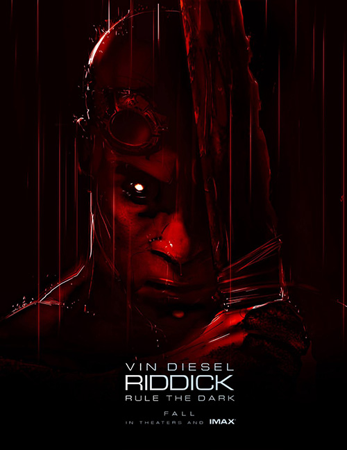
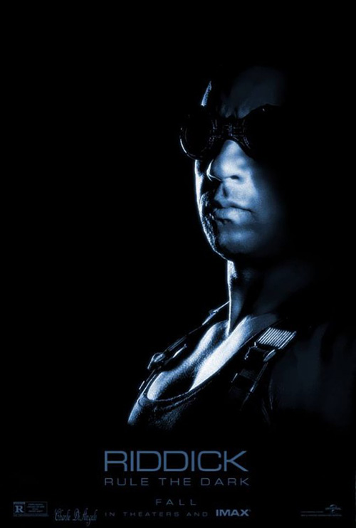
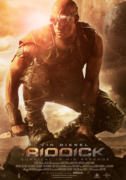
On the flipside, the illustration for Riddick (open September 6) is badass. Well, I think it’s illustration—there’s definitely a cartoon feel, right? The wetness of the raindrops pooling around his nose, the comic book lines of still falling droplets, and the sketchy hand holding the blade—it’s a captivating image.
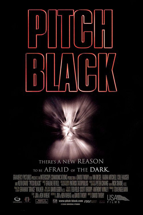
It’s much more enticing than the weirdly eyed dark blue entry by Ignition. The glow there is creepy and thankfully covered by goggles in a second blue tinted shadow. Blue or red, though, they’re all most intriguing than the final poster’s cloudy, planetary haze in broad daylight. And to think, the original Pitch Black didn’t even bother having Vin Diesel’s face decipherable in its grayish warp blur.
 |
 |
 |
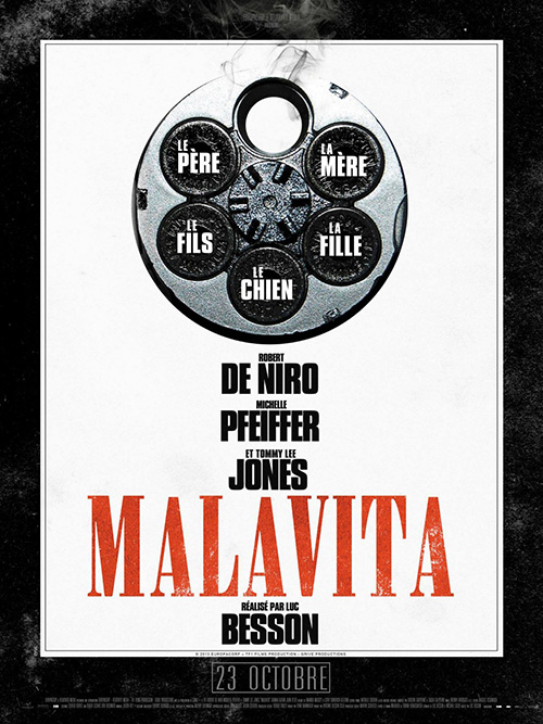 |
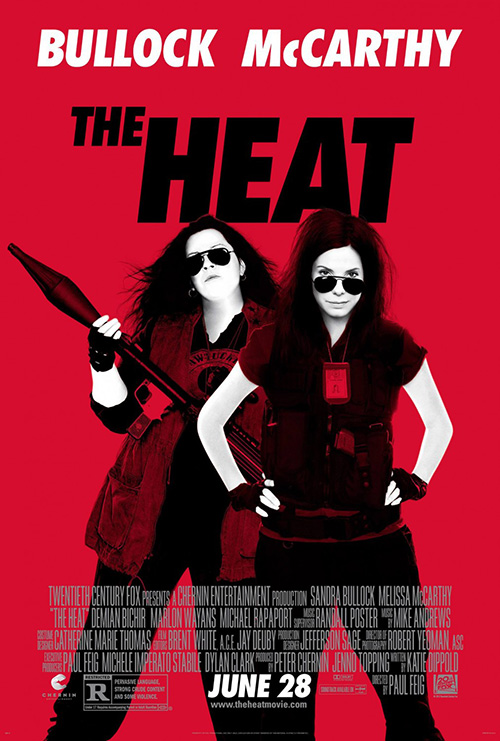
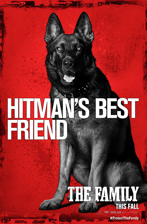
You know what I really love, though? Black and white photocopy-filtered actors above red backgrounds. Oh wait, no, I hate that. Thanks Ignition, thought I’d finally gotten away from it and out comes The Family (open September 13).
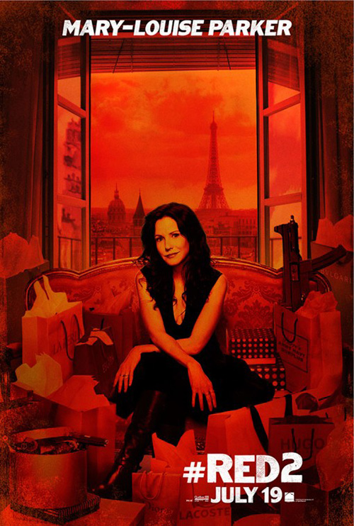
Like Red 2 and The Heat before it among countless others, say hello to cutout characters that can be easily slapped together or separated depending on your needs. Even the dog gets to come along for the ride this time, yay! It kind of speaks for itself so I’ll just say kudos to KINGSHOKO and RYSK for adding some flair in their French release. With a neat bit of symbolism, my favorite part is its deservedly large credit to unretired director Luc Besson.
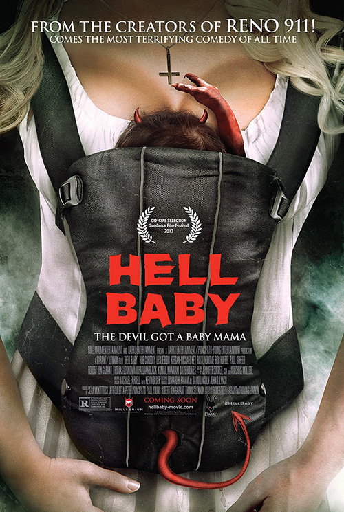 |
The Cimarron Group joins the gang and they are up to the task of giving the devil’s color some justice in a very fun illustration for Hell Baby (limited September 6). Like the title says, it’s a Hell Baby rocking out and waiting to rule the world.
I like the texture, muted two-color simplicity, maliciously Old English font, and how a couple tiny horns were added to Millennium’s logo in the bottom right corner. It’s tongue-in-cheek, earns a laugh, and gets at the heart of the subject matter.
Sadly not enough, however, Cimarron also created a (barely) photographic representation with a big-breasted woman and her devil child. The gag with an upside down cross would be better if the child was turning it himself. Having it already affixed inverted only increases the yawn factor. And it’s a pretty big yawn by itself.
Attractive stylings
 |
 |
 |
 |
Well, now that all those are out of the way, we can finally get to the posters worth talking about.
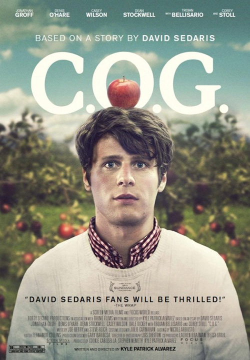 |
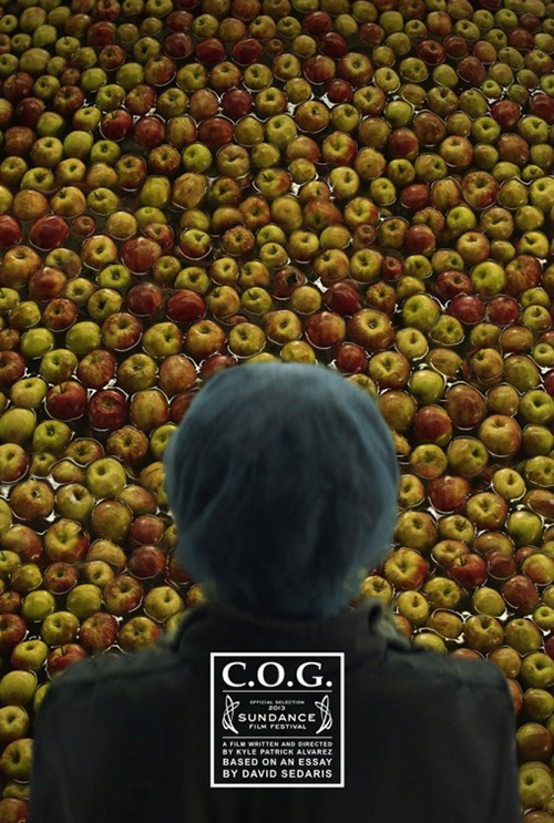
First up comes C.O.G. (limited September 20) and its sea of apples bobbing in water as a blurred figure’s back stands between them and us. It’s simultaneously whimsical and foreboding because we aren’t aware of the fruit’s utility in the context of the film or with the mysterious figure. All we have to go on is the carefully quarantined box of pertinent information at bottom center focused on its name, Sundance selection, and source material’s author David Sedaris. Poor writer/director Kyle Patrick Alvarez—he obviously drew the short straw.
Where it has mystery, P+A‘s more current entry flips our vantage point to see the confused boy that was once a blob of hair. Standing dumbfounded like William Tell with an apple atop his head, this poster utilizes more generic tropes while still remaining somewhat attractive in its soft colors and shallow depth of focus. And Alvarez graduates to a bold typeface so kudos to him.
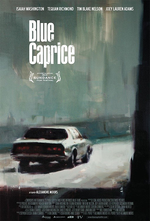 |
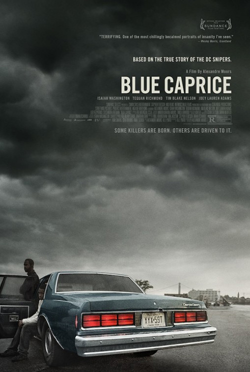
Gravillis, Inc.‘s Blue Caprice (limited September 13) garnered a ton of Twitter chatter upon its release due to the rather odd tagline “Some killers are born. Others are driven to it.” Yeah, someone dropped the ball on that one. Way to make a tragic thriller about the DC snipers sound like a coming of age tale of youths becoming men because fate thrust them towards greatness. Solid idea …
Despite that misstep, however, the aesthetics at play are rather stunning with heavy emphasis on the dramatic atmosphere. The titular car juts out at us in the foreground—taillights lit—as two of its passengers wait for what’s to come. The gray sky moves towards black as the white text pops out of its tumultuousness to even out the frame’s weight. It’s a beautifully rendered update of the original’s paint-streaked canvas that definitely ups the ante.
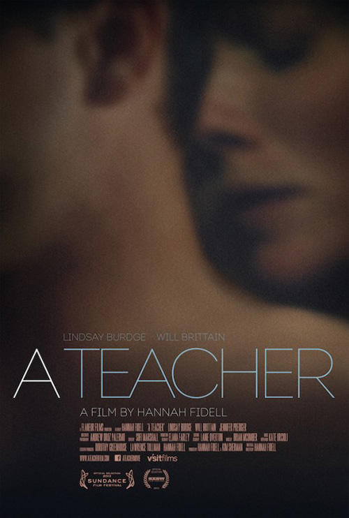
Continuing the trend of dark, rumbling shadows, Andrew Bannister‘s design for A Teacher (limited September 6) utilizes the human form in a way that both abstracts and highlights its subjects in a passionate embrace. The heavy grain and warm filter emits the illicit romance on display by also drawing us in to look closer through the hazy lustful heat.
There is a palpable sexuality to allude to the film’s plot as well as a carefully manipulated palette of softly smudged organic shapes offseting the thin, exacting font cutting through its axis. And with the bulk of the text a muted yellow absorbing into the background, the bright white of the title can’t help but look sharp and dangerous.
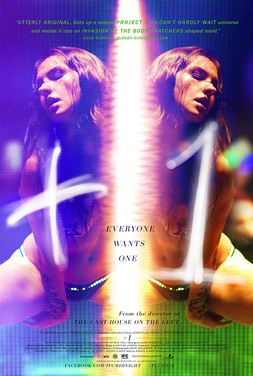
Who wants subtle sex appeal, though, when you can go all out with pasties and pornographic posturing? That’s what The Boland Group and Wheelhouse Creative are saying with their marketing campaign for the interestingly stylized +1 (limited September 20). Gone is the nuance of emotion as double vision gyrations taking its place with unbridled physicality basking in the neon glow of blue, yellow, and green to help set its strip club stage.
There is a horror/sci-fi feeling that comes from the page’s emanating light bisecting the image into a reflective mirror of splitting cells into identical replications too. A pulsating movement of bass is conjured by the woman’s kinetic movements as the barely there title in pin-pointed light threatens to be gone if we turn away. It may not be kid appropriate to hang next to Monsters University at the cinema, but it will definitely turn heads, young and old.
What is your favorite September release poster? What could have used a rework?

