“Don’t Judge a Book by Its Cover” is a proverb whose simple existence proves the fact impressionable souls will do so without fail. This monthly column focuses on the film industry’s willingness to capitalize on this truth, releasing one-sheets to serve as not representations of what audiences are to expect, but as propaganda to fill seats. Oftentimes they fail miserably.
—
December is here and the posters are many. With studio releases being pumped through NY and LA during the holidays for award consideration, the number of films coming out this month looks to match the output of a complete year during the 80s. So it’s a surprise how many are worth noting because of their quality and not lack thereof—see BLT & Associates’ attempt to equal Pulp Fiction’s flair with Young Adult and simply look tired and lazy in the process.
It was a struggle to pick out my favorites and some may surprise. Not included are the umpteenth Shepard Fairey-chic rendition for The Lady, Gravillis Inc.’s strikingly similar one-sheet to The Transporter for Outrage, and BLT & Associates’s inventive advert for The Sitter that would have been so much better if it actually was a tear sheet flier.
Oh—kudos go to New Year’s Eve, the worst poster of the month (and possibly year). A wonderful example of how not to Photoshop, I seriously want to know what’s up with Ashton Kutcher’s face.
Comedy, drama, suspense(?), and all of the above
 |
 |
 |
 |
Because I enjoy this quartet’s ambitions, I didn’t quite lie earlier when I send I picked my favorites. A couple of these are good for what they are while the others intrigue without astonishing. Either way, mention is deserved.
 |
 |
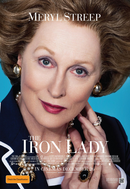 |
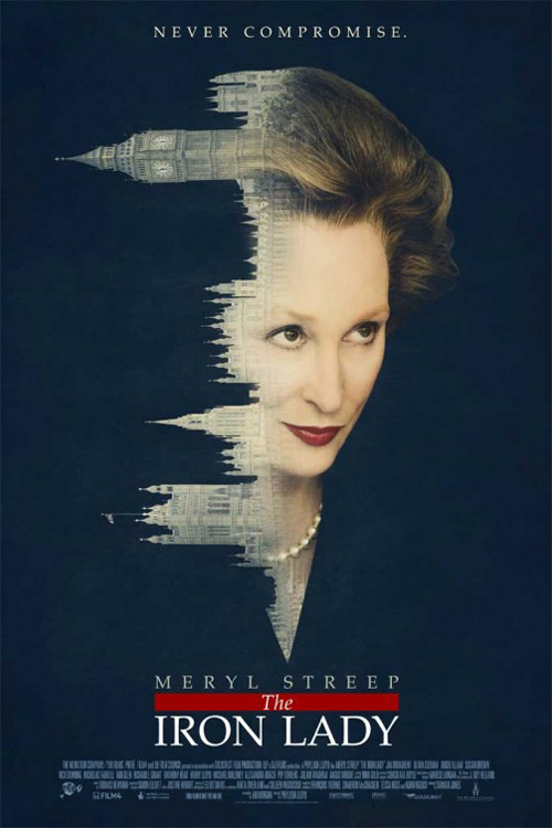
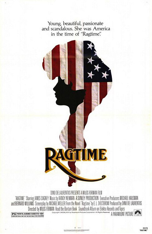
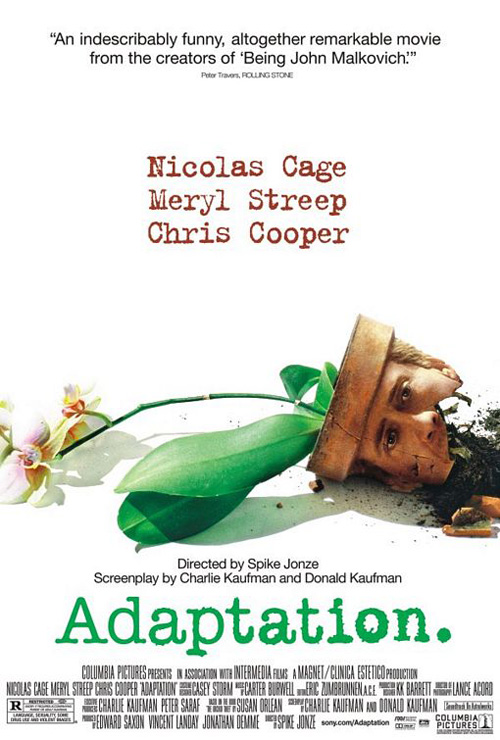
Blood & Chocolate and AV Squad Print’s work for The Iron Lady (NY & LA December 30) perplexes me the most this month. I feel I should love it, but can’t get past its awkwardness. The concept is great and really aligns it with the wonderfully minimal posters for Ragtime and Bemis Balkind’s Adaptation. Those combine a human figure with an inanimate object to perfection. Perhaps London needs to come from Meryl Streep’s head or contour her visage’s bottom. As is, it’s simply too malicious and off-putting. Maybe “tough as nails” is appropriate, though?
It’s still better than the newest advertisement. I feel Streep is channeling a satirical Catherine Tate or Tracey Ullman characterization of Margaret Thatcher than the woman herself.
 |
 |
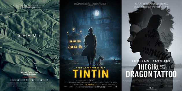
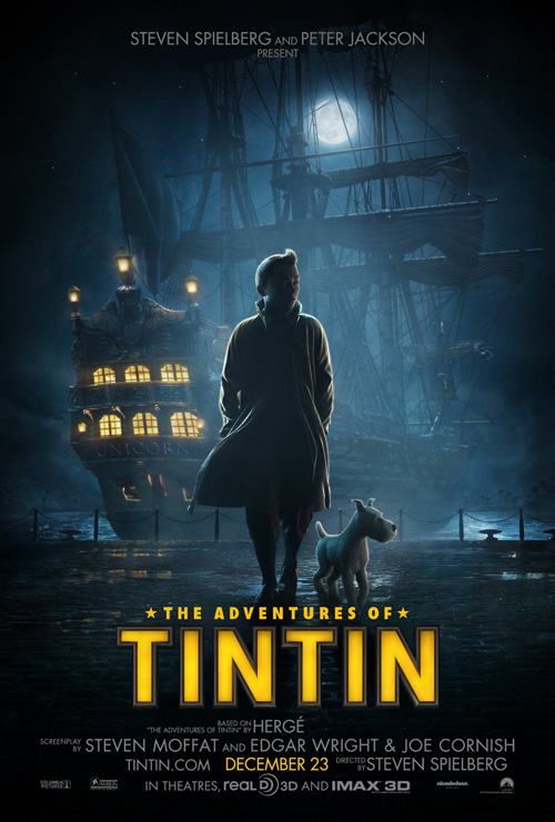
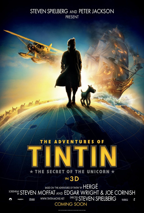
Where BLT & Associates’ plethora of The Adventures of Tintin (open December 21) posters goes wrong is their attempts to better a fantastic piece to disastrous results. The first is brilliantly atmospheric, creating a sense of dread while also giving it three-dimensionality. I almost forgot it was a computer generated image because the haze is so authentic.
But then the firm removes all nuances by giving us pretty much the same imagery but with harsh edges. It gives off a Carmen Sandiego vibe, seeming more computer game box than blockbuster movie poster. The third reclaims its movie theatre scope, yet tragically falls prey to the floating head syndrome so many utilize. All mystery is removed and the adventurous tone it wants never quite replaces it.
 |
 |
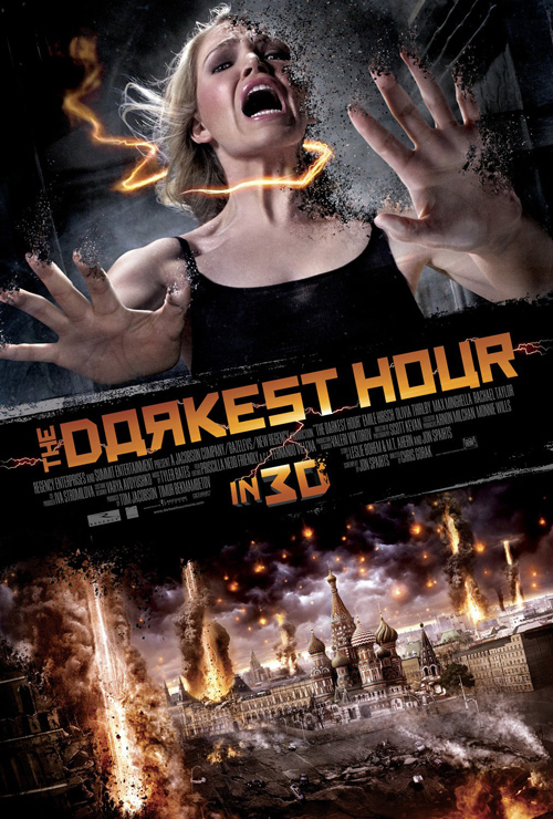
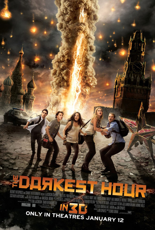
Opposite that, however, is a generic piece I somehow enjoy despite its cliché. Midnight Oil Creative’s work for The Darkest Hour (open December 25) is generally horrid as Moscow falls on top of the film’s actors. I hate the faux Soviet font and the movie it advertises looks devoid of any value besides an excuse to eat popcorn in a darkened room.
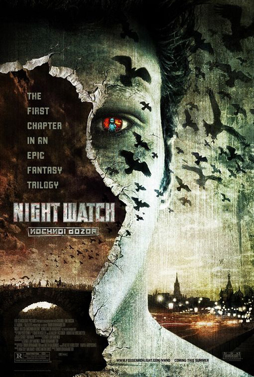
But something about the one I singled out above works against all odds. I can’t help but bring cold open’s Night Watch to mind when looking at it and that comparison almost wants me to roll the dice and see it. Almost …
 |
 |
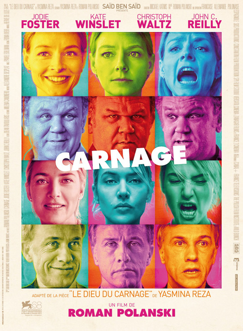
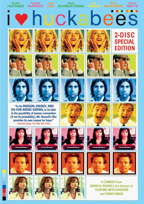
One I do want to see is Carnage (limited December 16), mostly due to the fact Roman Polanski directed it, I also really like the cast involved and it appears monsieur x studio did too since they decided to use a quartet of differing emotional states for each actor involved. Very reminiscent of the I Heart Huckabees DVD cover and to a lesser extent BLT & Associates’ poster, it draws the viewer in. I may be expecting to see over-the-top performances as a result, but that isn’t necessarily a bad thing.
The gradual dissection of celebrity
 |
 |
 |
 |
I know Mission Impossible: Ghost Protocol (open December 21) should not be on this list. It’s a blockbuster actioner coming out in the midst of Oscar bait and it has a horrible one-sheet with Tom Cruise’s face shrouded by numbers as though BLT & Associates couldn’t quite understand how to do what Ego Communications did for another film shown below.
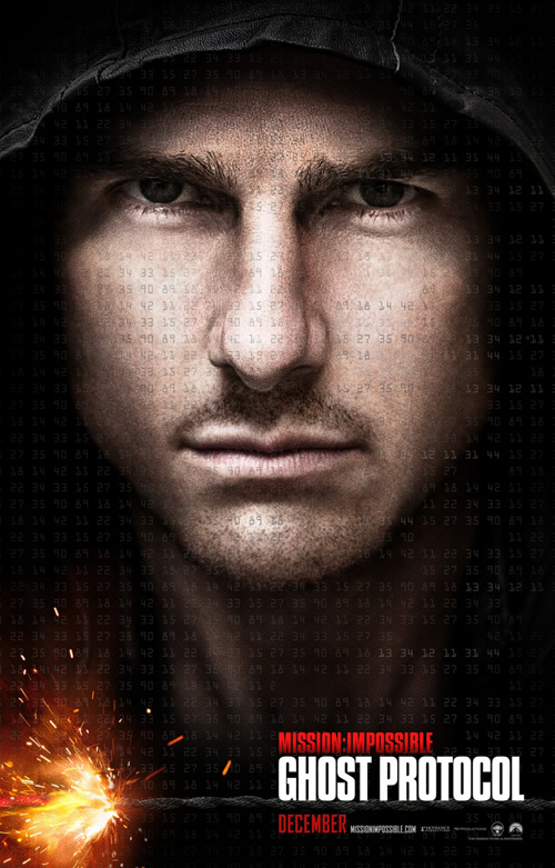 |
 |
There is something about their other poster that captivates me, however. I love the bird’s eye view along the side of the Burj Khalifa in Dubai as Cruise hangs precariously from a window. The text is slanted to form a three dimensional perpendicular plane to the building and totally adds to the vertigo-inducing height of the vantage point. If nothing else, it blows the Japanese ‘is it or isn’t it Anime’ entry out of the water.
But as the title to the section reads, the posters here begin to move farther and farther away from the common ‘celebrity sells’ mindset of the industry. With MI you not only get one of the world’s most recognizable faces, but also his in full-on aggressive, action-packed alpha male persona.
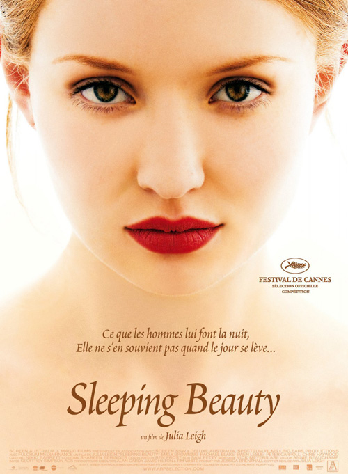
So, the next step becomes removing the celebrity from his/her performance by relying solely on their face. The French sheet for Sleeping Beauty (limited December 2) does this beautifully. Using the gorgeous Emily Browning to portray the film’s titular beauty, you become seduced. Her skin fades into the halo of white at her back to place your entire focus on her dark, sultry eyes and invitingly red lips. One couldn’t ask for a more effective way to market a film about desires.
 |
 |
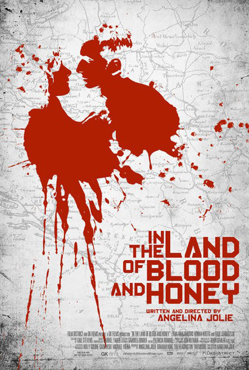
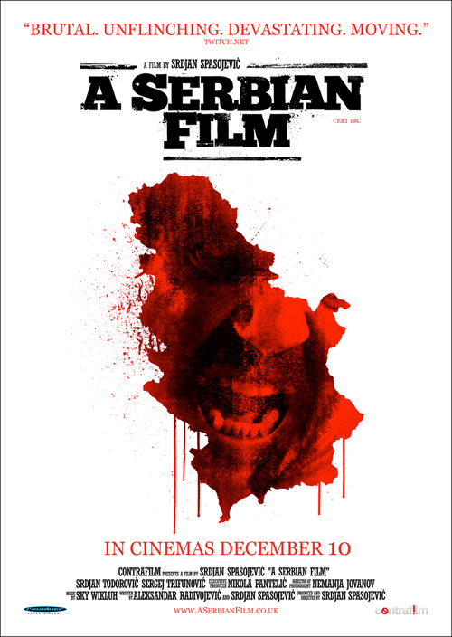
From there we arrive at Robert Russell’s graphically minimal design for Angelina Jolie’s Bosnian film In the Land of Blood and Honey (limited December 23). Replacing all photographic representation of the actors by silhouetting them in a splatter of the title’s first viscous liquid, we see how effective shape and texture are. Calling to mind the red scream of A Serbian Film’s American advert, the substance itself brings with it connotations that are allowed to shine through without being muddled by star power.
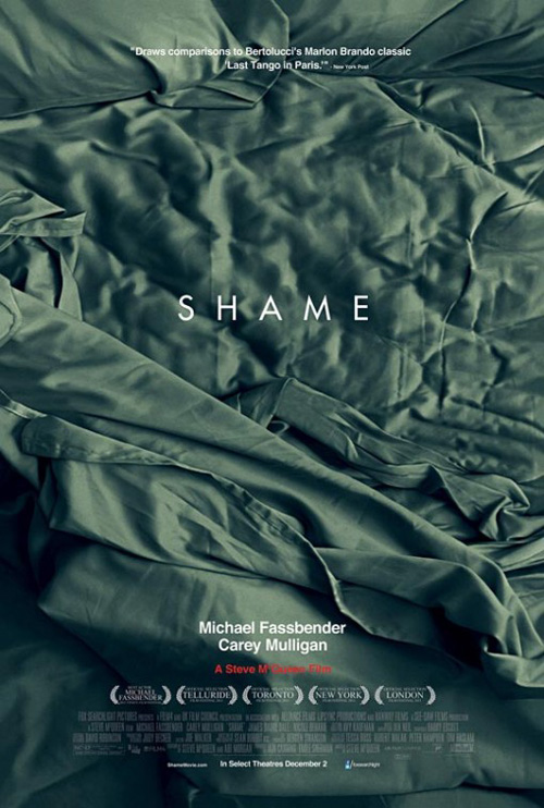
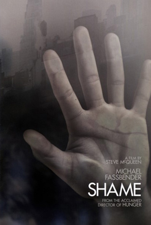
While it may be one thing to remove actors you wouldn’t recognize anyway—Blood and Honey is not in English—it’s a completely different beast to blatantly disregard A-list celebrities like Michael Fassbender and Carey Mulligan. Mark Carroll shows his moxie by doing just that with a strikingly bare one-sheet for Shame (limited December 2).
I prefer the earlier—apparently removed from the internet—teaser of a solitary hand pressed against glass, but that may only be because I’ve seen the film and remember the scene it depicts. If I take away that knowledge, the rumpled sheets of an empty bed prove an accurate dissection of Steve McQueen’s pulse-pounding character study. Bold like the film it depicts, it’s bravado advertising that will stick in viewers’ minds as they wonder what it’s all about. The NC-17 rating should help connect the dots.
Artistic splendor
 |
 |
 |
 |
 |
 |
You don’t have to say much in terms of why Mojo’s sheet for Pariah (limited December 28) is so exquisite. Letting its image speak volumes, the drastic crop of Adepero Oduye’s face wonderfully gives a visual definition to the title while the dictionary’s attempt is placed at center. She is an outcast unworthy of even the poster selling her story—the second-hand reflection in glass the world’s only glimpse. The text block allows the photo to breathe rather than weigh it down at the bottom while its block justification mirrors the page shape it’s within. Containing a powerful visceral reaction, the words become secondary to the face of longing looking back at us.
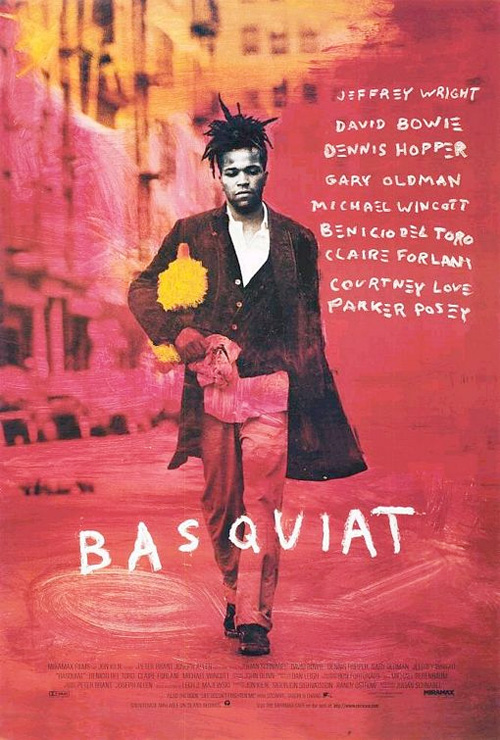
Its Basquiat-looking second poster takes an individualistic route with bright paints and broad strokes but only ends up looking like a Scholastic book cover. I don’t know why anyone would think a new design was needed; Mojo hit it out of the park the first time around.
 |
 |
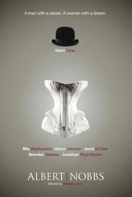
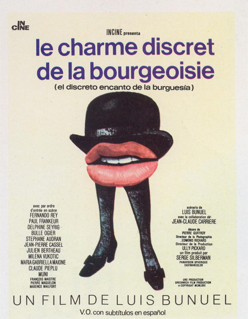
I could say the same for Creative Partnership’s Albert Nobbs (limited December 21). Fresh, original—if you forgive the similarity to Discrete Charm—and eye-catching, the negative space works magic around the paper doll-esque articles of clothing. An empty void where Glenn Close’s gender-blurring role belongs, the message rings clear with an artistic flair.
But someone felt it needed more—and by more I mean superfluous information that will inevitably ruin genius. The Refinery gives us a much more by-the-numbers entry with the film’s actors front and center. I like the painterly feel its airbrush aesthetic gives, but it will forever pale in comparison to the more abstract, message-driven piece before it.
 |
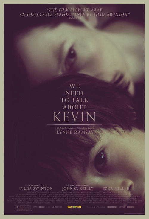
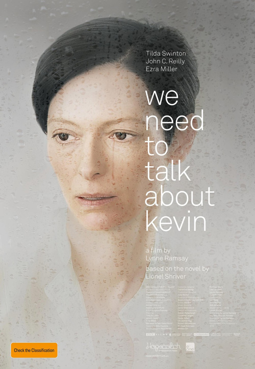
If only all films could receive brilliance at every turn like We Need to Talk About Kevin (limited December 9). A film I tried desperately to see during TIFF, the imagery used to market it has been nothing short of spectacular. Both examples here portray mood over plot, instilling a foreboding melancholy. Hearing from multiple sources about its rough emotional ride, these only increase my anticipation.
Seeing Tilda Swinton through a foggy, rain-covered glass gives a sense of detachment while the full disclosure of her expression breaks through. The white lettering becomes lost in the background and her emotion is left to grab hold and pull you in. Memorable for its brightness despite the subject, it’s contrasted nicely with Mojo’s darker, more sinister artwork. Recalling the iconic imagery of Rosemary’s Baby, the mystery printed on these two pages is palpable and I can’t wait to finally discover what lies beneath.
Transparency sells
 |
 |
 |
 |
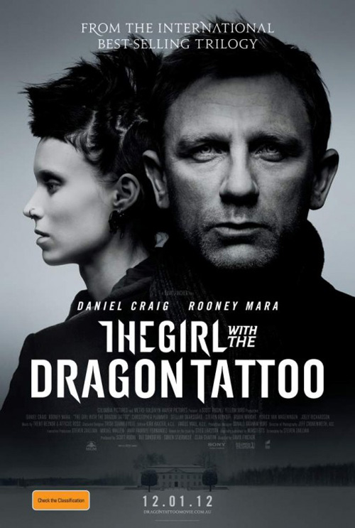
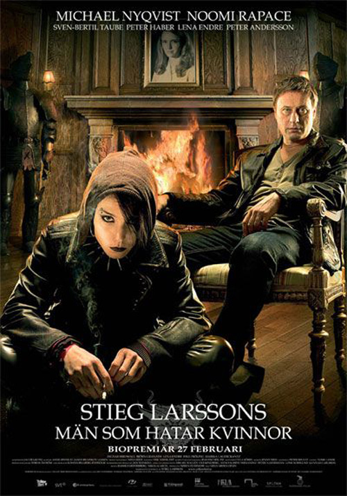
Like the shocking material contained within Stieg Larsson’s novel, Kellerhouse, Inc. goes the extra mile to encapsulate the same in their design. Starting with the NSFW teaser—the ‘clean’ version is included here—The Girl with the Dragon Tattoo (open December 21) sees a series of increasingly more abstract and minimal advertisements.
 |
 |
Nothing like the original Swedish poster simply showing its two stars posed for the camera, the teaser propels you into the action with a naked and pierced Rooney Mara covered by the protective arm of Daniel Craig. Needing only the date because we all know what movie it depicts, the titillating subject matter plays to lowest common denominator intent, but the finished product deserves much more credit than that.
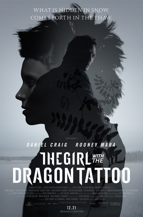
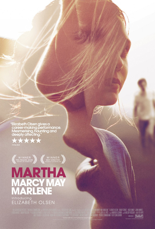
From there comes the two-headed monster we’ve seen countless times this year. Floating above the creepy landscape of the film’s setting that’s used so memorably in the year’s best teaser trailer, the poster does little to intrigue. So—much like A Dangerous Method—Kellerhouse plays with transparencies and creates his own version of what Empire Design did with Martha Marcy May Marlene. The outcome is much more intriguing with its layering of imagery, but still somehow lacks the impact of the tease.
Last comes more of an art print than actual finished poster; a negative space exercise with Mara’s profile bisecting Craig’s face. I love the color palette and its simplicity, but just can’t stop the nagging feeling in the back of my head telling me it is nothing more than half a photograph. That may be—it still captivates nonetheless.
Intelligent mosiac
 |
 |
 |
 |
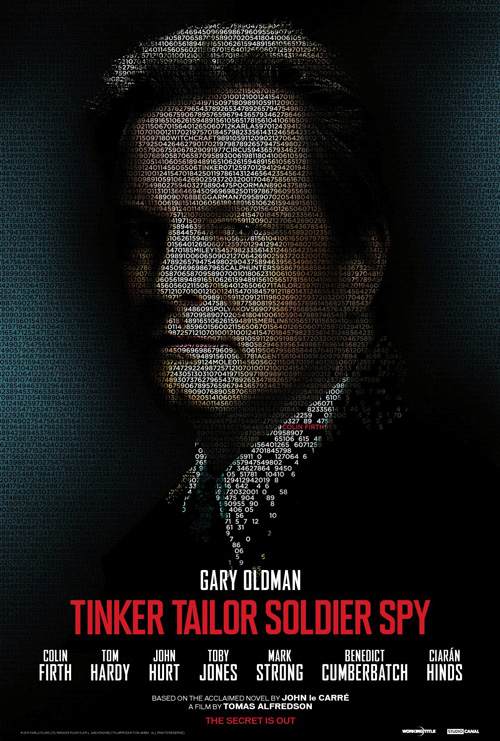
Anyone who can’t get enough of Ego Communication’s campaign for Tinker Tailor Soldier Spy (open December 9) needs to take a short trip through the inter-webs and discover Chuck Close. A photorealist painter who created giant portraits with a mosaic of abstract forms, the style he utilized has been claimed by many in the past few years—including myself for the design of the header to this column.
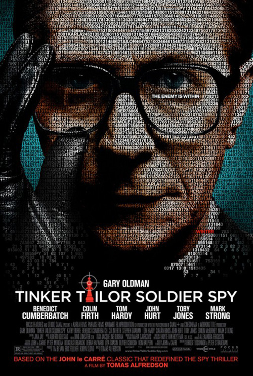 |
Made of numbers and letters as though a secret code—save the red names of each corresponding actor—the portraits are a spectacular feat of calculated design. One doesn’t need to look farther than Ignition Print’s attempt at the style with their Gary Oldman-centered work to understand the precision. Similar in so many ways, it’s also completely inferior. Lacking the dark shading and meticulously vibrant color scheme, a six-year old could pick out the one that doesn’t belong.
The runaway victor of this month’s work, these four posters give us the best of both worlds discussed in this article. Able to show the celebrities through a device that also explains the espionage and tonal suspense inherent in the spy thriller genre, Ego has created an unstoppable monster. I’m actually appalled the studio tried to commission a lackluster facsimile instead of porting these British gems over. Trust me, we can spot a fake when we see one.
What is your favorite December release poster? What could have used a rework?