“Don’t Judge a Book by Its Cover” is a proverb whose simple existence proves the fact impressionable souls will do so without fail. This monthly column focuses on the film industry’s willingness to capitalize on this truth, releasing one-sheets to serve as not representations of what audiences are to expect, but as propaganda to fill seats. Oftentimes they fail miserably.
October is here and Hollywood is kind of, sort of leaning into the Halloween spirit with sequels Maleficent: Mistress of Evil (October 18) and Zombieland: Double Tap (October 18). Are they horror? Not quite. But they have enough darker elements to get people in the mood to spend money on a new release rather than the countless repertory screenings of true genre classics happening throughout the country. Do they need attractive posters to do so? That’s also a no considering what’s been delivered for the latter. This Real D 3D sheet for the former, however, is quite stunning.
We therefore receive the usual ramp up to Oscar season rather than true big budget scares as fall festival selections opening in limited release flood the market with their “prestige”—horror or (mostly) otherwise.
PS: I talked about the poster for Wounds in March and now it’s finally opening in limited release on October 18.
A progression


I’m still shocked that LA’s campaign for Jexi (October 11) is what it is because these posters look like social media images thrown together with zero effort as disposable memes meant to be forgotten and recycled ad nauseam. They’re literally just poorly cropped stills of Adam Devine with slapped-on quotes stolen from other movies. And they’re hanging at your local theater.
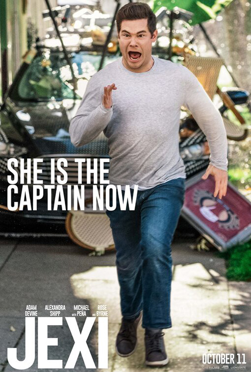
What’s worse is that I think it’s intentional. Because the film is about a guy who falls in love with his phone’s OS, this social media angle makes sense. The problem isn’t therefore that the idea created an ugly result, but that there was probably no way for anything good to ever result. They should have realized this and scrapped the series as a misguided experiment en route to something better. The fact they went ahead with it anyway screams laziness unless the studio reveals that Jexi (the phone’s OS) designed the posters itself/herself.
While a boring image and boring text doesn’t get the job done, however, neither does the decision to increase that boredom exponentially. Take Blood & Chocolate’s The Current War (limited October 25) for example. Can’t get anything good to work with the four lead actors’ faces? Why not take an interesting aspect of the film (the light bulb map of America) and superimpose those faces atop it like ghosts? The answer is of course because that looks even worse. It muddies the water and renders the “cool” thing inert.
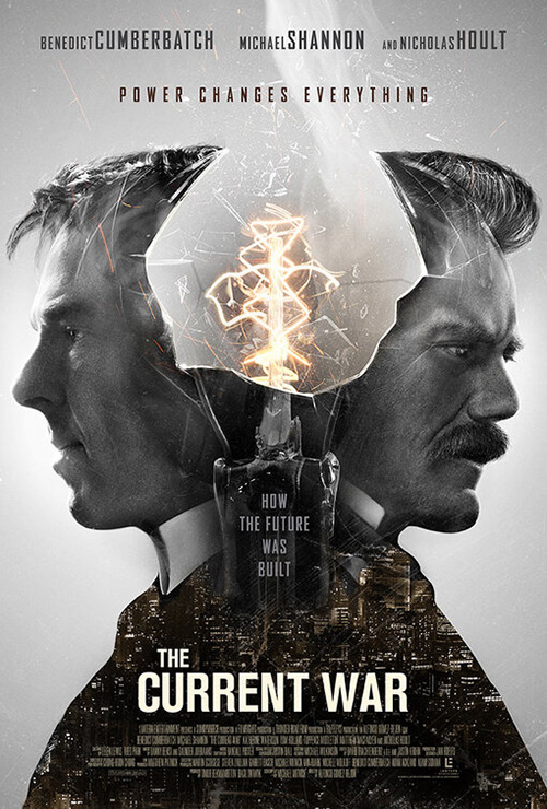
You could do so much with that map to craft a piece of art that pops and they chose to complicate its simplicity by covering it with floating heads devoid of intent. Why is Nicholas Hoult partially cropped off the page? Why is Tom Holland seemingly in possession of half the country by himself despite having a fraction of anyone else’s screen time? The composition wants me to think they’re positioned above their hometown or the location of their factories, but neither is the case. It’s random.
This older poster on right isn’t great on its own either, but it’s at least trying something different by making the two leads (Holland doesn’t get his name on here) into a light bulb. It goes too far by also making them the cities their electricity will power as smoke rises from of their frustrated brains, but I know what I’m looking at.
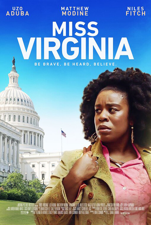
Chargefield, on the other hand, knows adding more works best via augmentation rather than excess and they utilize this knowledge on Miss Virginia (limited October 18). Like Champ & Pepper Inc.’s version at right, it’s just an image with text. But their execution is light years apart. The latter is more like Jexi with a visual flatness that projects a plastic surface of artifice on which we slide off. The former uses a shallow depth of field to conversely place us into its scene with weight—the sun overexposing aspects to create drama and emotion.
That Chargefield uses a more interesting font and palatable ratio of text size from one part to the next is merely icing on the cake. The title’s white is almost being embraced by the soft colors of the sky behind it, each element married to the next rather than popping out here or there. Both set forth with the same instructions (Uzo Aduba in front of the Capital building with title, tag, and actors) and yet deliver starkly different outcomes.
Burning Cane goes ten steps farther by turning the canvas, adjusting the contrast, and finding an idiosyncratic font with real personality. Rather than push an actor into our faces, this sheet manufactures a mood. There’s no staging on display, just a careful crop of light and dark perfectly carved for its superimpositions.
I do think it’s too perfect in this way since the text practically fills every inch of space around it, but I get the impulse to make everything as legibly big as possible. It would probably work better nevertheless by removing the critic quote at the bottom since doing so will free up some white space and prevent the weird juxtaposition of left and center justification kitty-corner to the one another. This image needs to breathe in order to reach its full potential. It’s almost there.
Peer overhead


The number of posters this month with bottom-heavy images is crazy. It’s not surprising, however, since the aesthetic is one that works by allowing a title to float above with little to distract it from its importance.
France’s selection for the 2020 Oscars, Les Misérables (limited October 18), is a perfect example of the design choice’s effectiveness. It’s nicely centered for symmetry with the Arc de Triomphe at the middle and a mass of people below as smoke is seen in the distance. The sky is then completely removed of anything that prevents it from being a strict field of color so the black title can pop. It’s a nice font choice too with deckled edges as though it’s made of ripped paper. A strong composition that might not do much, it does what it does right.
InSync Plus does a few things differently with their The Kill Team (limited October 25) and end up creating a more dynamic image by pushing things just off-center—actors bottom left with a heavy diagonal plume of smoke leading our eyes up to a title subtly covered by its cloud. That motion delivers added drama while also giving the designer more room to balance the text against that angle cutting through the middle. Its parts are simpler, but its orchestration more complex.

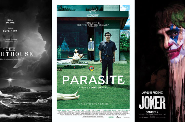
Heading back to straight symmetry is P+A’s teaser for The Lighthouse (limited October 18). Like Les Misérables, everything is placed on the center axis. The difference comes from letting the sky become as wild as the water below. Where the former let the chaos of people contrast the calm above, this one almost rejects calmness altogether. Only the lighthouse at the center with its beacon of light feels at rest—a trick of course considering what will happen during the course of the film on that island. The extreme horrors of sea and sky are converging to attack anyone that dares fight their whims.
The mermaid tail is thrown in for a bit of mystery, but also levity. It’s a nice decision because the film exists on that precipice between fear and laughter once its actors’ paranoia takes control of their actions. That flourish is missing in the firm’s final sheet. It relies solely on the drama born from two unhinged performances instead by focusing on cast more than atmosphere. Doing this will probably sell extra tickets, but I love the teaser’s choice to let the environment and place stand as the true star they are.
That brings us to LA’s Lucy in the Sky (limited October 4). It’s utilizes the bold choice of not only creating the white space like the other three, but also allowing it to exist on its own. This is about scale and placing the title in the white of the moon would ruin the impact of just how this celestial body dwarves humanity.
What’s interesting about the choice to keep Natalie Portman in focus rather than the moon is that it leaves a door open for her to conquer it—her David to its Goliath. It’s threatening to consume her as much as she’s rising up to show it that she’s in control. The duality of that is nice considering the film is about her losing her grip on reality upon returning to Earth. She’s no longer as small as the rest of us.
Portraiture


I’ve yet to see The King (limited October 11, Netflix November 1), so I’m not sure if the tense scowl on Timothée Chalamet’s face that B O N D highlights in the poster will be believable on-screen. It is here, though. This is the look of someone who just sentenced a person to die before diverting his eyes with determination when they begin to plea. The dark surface gives it a gritty aesthetic that aligns with its period setting and the armor while sitting shows this is a ruler who’s unafraid to get his hands dirty.
I’m torn on the font, though. While I like the risk of playing with its thinnest lines by removing them altogether, I’m not sure what the point is. To me it feels as though the text is either rising from Chalamet’s chest or drowning into it. I can imagine the opening credits where these letters manifest before fading away and this is them in mid-motion. This static result is therefore weirder than it is attractive.
Le Cercle Noir’s Frankie (limited October 25) seeks to match The King‘s severity with a look at Isabelle Huppert in contemplation. Rather than looking away from something, she appears to be thinking about what she’s just seen. There’s drama and mystery to it that works to pique interest without actually saying anything.
Beyond the actor herself, however, I’m a big fan of what the firm did via the layout. The title is centered first and Huppert placed second so that the thin opening of her coat perfectly aligns with the straight edge of the “K”. It’s subtle and yet purposeful, the whole existing from that crisscross for our eyes to travel left to right and up to down. The cast list is then presented in a thin sans serif of faded white to remain legible despite also disappearing at a distance so we can take in the image itself.
Kevin Smith films have never really had great posters (see Cop Out), so it’s nice that B O N D goes all-out on Jay & Silent Bob Reboot (one-night screenings October 15). There’s a comic/videogame element to this augmented image that serves its pop culture meta relevance by letting the characters exist in and of that world. They’re all grown up and ready for a fight—even if it’s only within the fantasy of their minds.


It’s a vast improvement over B O N D’s teaser (I hate when the stars can’t be corralled to take a photo against a wall since the Photoshop shadows never work) and their illustrated collage (which is too busy to parse). We know there will be cameos, so you don’t have to put them all on the page. Jay & Silent Bob are enough to either conjure excitement or sow distaste.
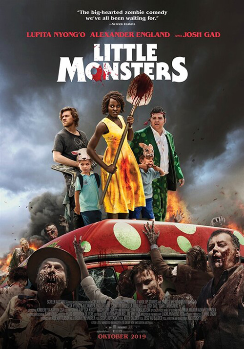
While Little Monsters (one-night screening October 8, Hulu October 11) doesn’t have the legacy of Smith’s iconic duo, Legion Creative Group’s excels by separating Lupita Nyong’o from the rest of the cast anyway. The need to put everyone together leads to a flat group shot against a dark sky and zombies where isolating her delivers an infectious amount of fun we can’t help but get enthusiastic about.
The way her body curves in the jump allows for a great slope that our eyes can travel from zombie hands to smiling face. We orbit around the title to land on it only after we’ve absorbed the surreal juxtaposition of happy and death. The fact that the ukulele hasn’t been used as a weapon yet is hilarious. What makes it so precious?
Undeniable


Ever since I first read the description of Greener Grass (limited October 18), I knew I had to keep a lookout for its release. So it was wonderful to see that Brandon Schaefer and Jump Cut’s poster kept the surreal train running. On first glance I couldn’t help but think about Soundgarden’s “Black Hole Sun” music video, so I watched its wacky suburban nightmare and got even giddier.
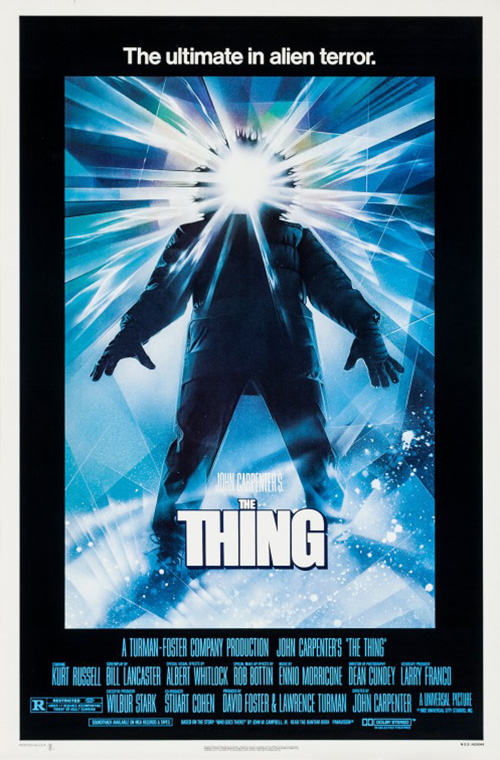
The sheet has an 80s comedy vibe filtered through a David Lynch dreamscape with white picket fence and grotesque mouth face illuminated by the light of Drew Struzan’s The Thing. And the frame within a frame within a frame choice helps us enter this zany landscape—one step into the pink and another into the garden of hallucinatory hell.
Speaking of nightmares: I love B O N D’s Joker (October 4) painting variant. It’s Jack Nicholson’s rendition with flesh-colored make-up covering the clown white meets Francis Bacon with dripping pigment smudged by a smack to the face. And it’s only made creepier by Joaquin Phoenix’s wide-eyed malice and comforting smile, an off-putting juxtaposition in and of itself that recalls the joke in “How I Met Your Mother” concerning Kyle MacLachlan’s The Captain and his dueling expressions. I only wish the title was more imaginatively handled … or removed completely.


The firm has actually done a great job on the entire Joker campaign from an extreme crop tease to a dancing lunatic in bright red against the oppressive cement and metal of urban living to a stately portrait of Phoenix practically tipping his hat in dance. The colors, compositions, and textures have been breathtaking to behold.
Better still is the playful graffiti of Jojo Rabbit‘s (October 18) teaser (which I’m told was designed by Mark W. Carroll). The street art wallpaper wrinkles are intact with non-cookie cutter paint stroke clarity in every letter. Drop the second “J” in the title lower and you get the shadow-puppet rabbit’s face to gleefully transport us into a childlike mood of excitement no movie starring Hitler should be able to provide.
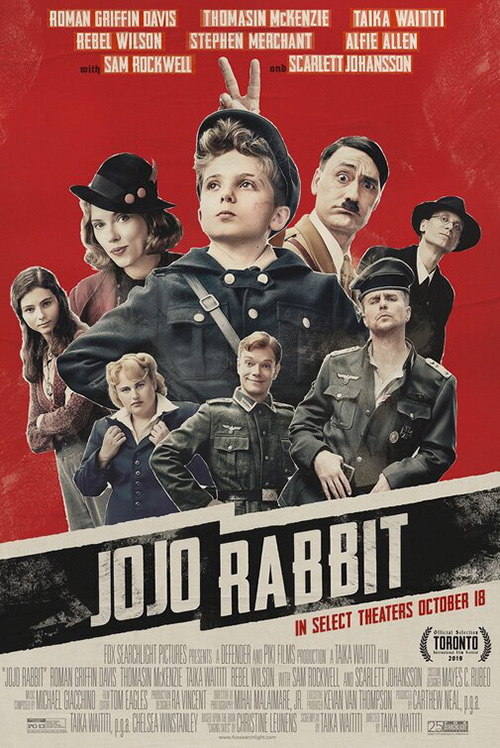
To see the main sheet and Taika Waititi’s “bunny ears” above Roman Griffin Davis’ head only gives the silhouette greater purpose than pure shadow play. It’s just a shame this poster can’t equal that one’s unparalleled uniqueness. Cutting out the actors and pasting them together doesn’t really do much to distract from the fact their collage orientation is just as familiar and boring as any other Photoshop monstrosity on the wall. And the cleaner, modern font loses all sense of joy the hand-drawn title gave us above.
The poster (and perhaps movie) to beat this month, however, is Parasite (limited October 11). What a captivating scene of characters starring our way, eyes censored, as though challenging us to ask about the presumed dead body connected to the legs at bottom left. Are we interrupting something? Can we slowly creep away backwards in case they start to pursue us? Why the beach ball? Why the teepee? There are so many questions that implore us to buy a ticket and learn the answers.
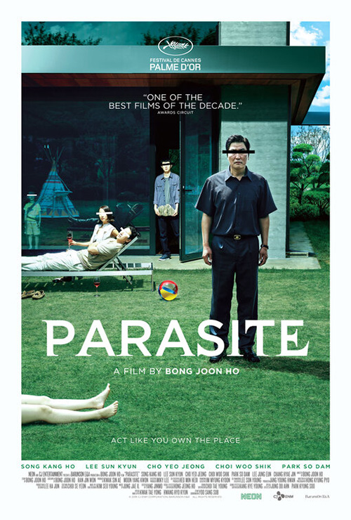
How good is the design? Good enough that the American poster didn’t dare to change a single detail. The feeling of dread that manifests by looking at this family is universal no matter what language you speak. Even so, though, the font is just the right amount of additional oddness for our brains to get tricked. It’s a serif/sans hybrid where the letters appear to oscillate back and forth until we’re struck by seasickness despite everything being stock still to the point of terror.
What is your favorite October release poster? What could have used a rework?