“Don’t Judge a Book by Its Cover” is a proverb whose simple existence proves the fact impressionable souls will do so without fail. This monthly column focuses on the film industry’s willingness to capitalize on this truth, releasing one-sheets to serve as not representations of what audiences are to expect, but as propaganda to fill seats. Oftentimes they fail miserably.
It’s a five Friday month so prepare yourself for a ton of new films to hit theaters. From Marvel to Disney (wait, those are the same) to Netflix drops and Sundance hits (already), there will be something for everyone—including those who’ve waited months to years for their highly anticipated festival darling to make it to town (Jafar Panahi’s 3 Faces hits in limited release on March 8).
The positive of this surplus of work is being able to talk solely about the posters I really like. All sixteen below are successes for different reasons, so hopefully what they’re advertising ends up proving just as good.
Title placement


It may not be the best sheet of the month (see the hard-edged cutouts of actors at the bottom), but Urgency Company’s festival poster for Giant Little Ones (limited March 1) does well to capture the film’s modern tone. The bright yellow and pink makes the whole an in-your-face experience while lending a fun poppy feel. We can almost hear the music coming from Josh Wiggins’ headphones as he cycles towards us.

For how confident the kids at the bottom look, however, it’s the crop of Wiggins’ face at top that really gets to the heart of the film’s handling of complex issues concerning adolescence and sexuality—he’s literally pushing himself outside of the box attempting to hold him in frame. Add the borderline thriller font and there arrives a duality moving beyond simple “fun” to the razor-sharp edge of social circles, gossip, and misinformation at the center of this authentic high school drama.
You simply don’t get the same vitality with the official one-sheet hitting theaters now. This one gets more at the main narrative conflict between the two best friends depicted, but it loses the spark and excitement that surrounds them.
By contrast, Palaceworks’ Combat Obscura (limited March 15) excels because of its quieter nature. This is about unfiltered war from the cameramen who are there to shoot footage as a means of recruitment. It’s a glimpse behind the curtain that maybe we were never supposed to be allowed to see. So a severity is necessary to project that truth. A bold black box with white text sufficiently supplies just such an aesthetic by ensuring we understand the weight of what we’re about to see.
Yet the designers aren’t afraid to add flourishes too. The little camera corners around the title subtly augment the craft. The digitized font lends a professionalism and authority that could only be more Orwellian if some was redacted under thick black lines. And while the pixelation of the soldier may give off a videogame vibe, it works because you can almost sense he’s about to disappear. He’s not a recruitment tool in this context, but a casualty glitching out to be forgotten when no longer of use.
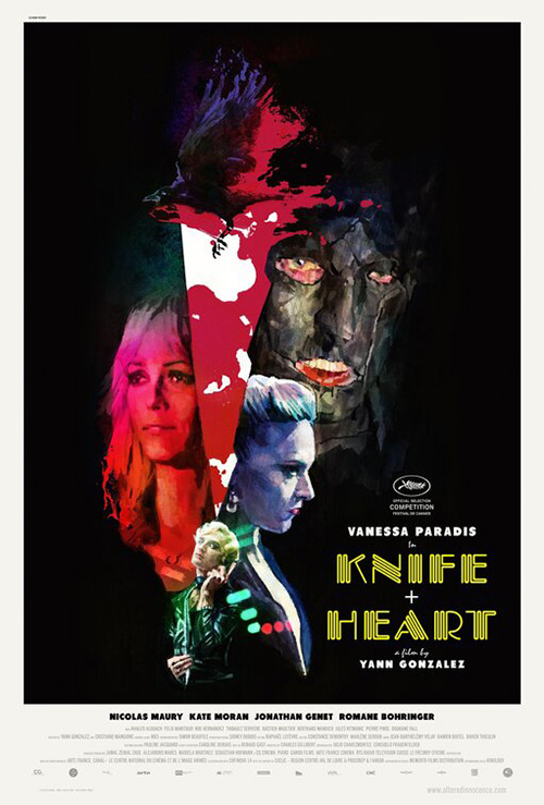
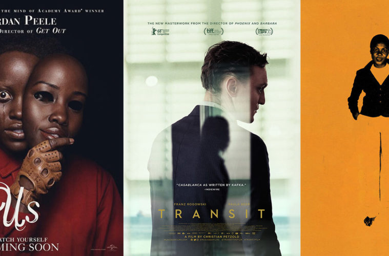
For Le Cercle Noir’s Knife+Heart (limited March 15), things get a little weirder. It’s wild what a matte painting of colorful stars can add thematically—you simultaneously get a sense of tone, genre, and atmosphere. Having Vanessa Paradis put under a similar hue with her head titled back to receive a kiss from a demonic looking bird only helps cement this notion. We’ve practically been given a painted Gothic Rock album cover that might be hampered by the neon glow of its title if the quirky name and use of a plus sign as ampersand didn’t increase the overall allure.
Alphaville’s old school throwback exudes a completely different sensibility. Gone is the otherworldly nature of the unknown in order to highlight a down and dirty low-fi horror vibe. If this movie is anything like director Yann Gonzalez’ previous work, however, the phosphorescent hum and glamour shot pose embodies that style to perfection. Maybe he’s gone in a different direction with this one and Alphaville is correct to shift the narrative. Is one wrongly banking on his past work to earn a glimpse? Or has the other completely missed the boat? We’ll have to watch to find out.
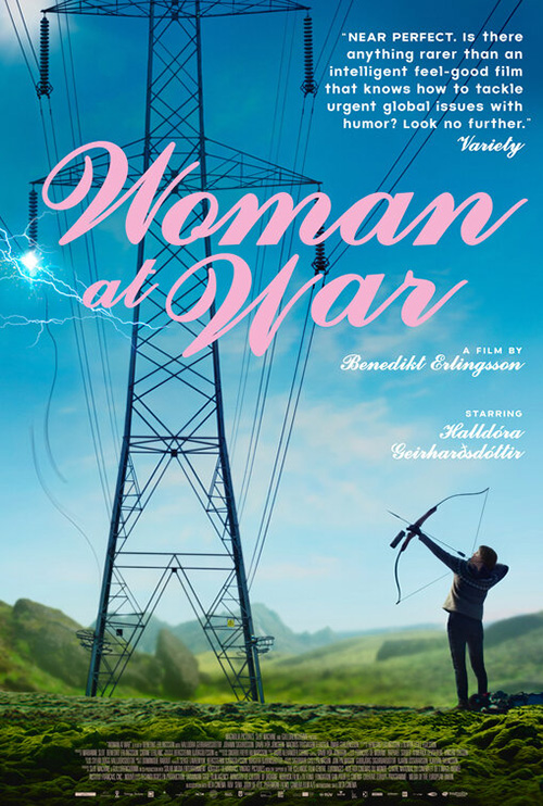
At the end of the day, though, it’s Woman at War (limited March 1) that takes the crown in this segment of eccentric font selections. You might not think it on its own, but putting that font next to an electricity tower gives it a jolt of juice to vibrate in place. It becomes the potential energy so the sparks to its left can show the kinetic. And it’s only after looking at this unleashed power that we follow the lines down to the bottom right corner to see the figure ready to shoot an arrow into the sky. Is she the culprit or perhaps a prospective hero?
To shift our focus to The Refinery’s variation on this same theme is to understand just how dynamic the first is. This poster has all the same elements from a different angle. The electric tower is straight on now so its lines can’t lead our eyes. The font is incongruous with a flowing serif that prevents it from integrating with the image beneath. And while the electricity itself is rendered more realistically, it loses its sense of danger. This is a science project whereas the other was an act of God. Drama has been replaced by boredom.
Austere portraiture


I couldn’t quite get a read on Captive State (March 15) from its trailer, but this poster from ARSONAL has me going all-in. It’s full of intrigue with Ashton Sanders standing still in a cloud of red dust because we don’t know what’s going on. Was that gas deployed by the army for cover? Is it poisonous? Alien? Pull back a bit and you start to see it take shape with tentacle arms—almost like a spider on its hind-legs readying to reach out and grab him with the rest.
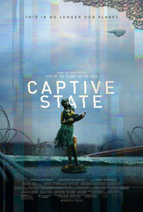
It’s a perfect tease with nothing but a cryptic phrase split between top and bottom as though a comment and reply. The title is nice and small to be seen against the red without overpowering the whole. And only those eagle-eyed folks finding themselves drawn in closer will see the more exciting stand-in for director Rupert Wyatt’s name: Rise of the Planet of the Apes, itself a bit misleading since people remember Matt Reeves’ Dawn and War best.
Somehow this tease says a heck of a lot more than the final sheet. Besides the addition of the credits box at bottom, we receive nothing new. The size dynamic between alien and human is removed and the beautiful smoke pattern is replaced by electronic glitching that makes no sense. This is a view from inside a car looking out the broken windshield, right? So are we robots with malfunctioning eyes? The execution just isn’t there.
If only we could get our hopes up that Netflix would continue hiring artists like Akiko Stehrenberger to illustrate its studio’s posters. After all, they’re the one’s we can assume have seemingly unlimited budgets to let their films be advertised with creativity rather than template analytics. At least we can bask in the glory that is Rhubarb’s The Boy Who Harnessed the Wind (Netflix March 1) in the meantime since it reveals what could be.
The sheet is memorable for more than its incomparable aesthetic, though. There’s also the brilliant composition with agriculture pushed back by the wind and Maxwell Simba pushing himself through it. There’s the delicate use of layers for depth as the title moves below the foreground to be slightly covered while the “Based on” line rises above everything. And don’t ignore the wonderful off-white palette that carries through to the frame around it with an equal amount of space above and below for the important names and studio logo.


It’s this type of handmade flavor that really excels amongst the glossy photography most theaters display. So while it might be a Dolby Cinema-specific advertisement, LA’s Captain Marvel (March 8) transcends its own main campaign. The fact that Michael Muller is credited with photography astounds because I would have bet money this was an illustration. The way LA saturates its colors and handles its iconography lends it a recruitment poster feel that really highlights the heroism and legend-like status of its subject.
The two team-up on the poster at right too with a comparable effectiveness if devoid of the enduring quality seen the above. This one is more cartoonish and photo-based, its colors more vibrant and modern so as to look more at-home in a theater than as an artifact in a history museum.
To go from one to the other is a noticeable shift, but the drop isn’t nearly as far as from the second to eclipse’s more traditional collage. Just because you put Brie Larson on the page twice doesn’t mean surrounding her with all those men won’t send a message this film should be working hard to dismantle.
But the poster that screams timeless in this quartet the most is definitely Sunset (limited March 22). The light on Juli Jakab’s face is that of a classic Hollywood picture, the elongated text seemingly from the same era. There’s drama despite no context and intrigue without action. We’re merely gazing upon a woman with a determined look caught in a crowd, desperate to know what she sees and what she’s going to do next. It feels as though there’s this epic sense of scale with nothing but a close-up. That’s true visual power.
Minimalist tease


The art of the tease creates some of the most captivating works of cinematic marketing because the designers aren’t beholden to as many rules. They don’t need to have so-and-so’s face front and center. They don’t have to find room to smack a slab of text somewhere that won’t interfere with the overall composition. And sometimes they don’t even have to worry about a title when the property is ubiquitous enough.

BOND’s Greta (March 1) is a perfect example of one such success. Will those two actors’ names sell tickets? Maybe. But just in case they don’t, we also get a wild juxtaposition of fishhook and purse as bait. The assumption is that Isabelle Huppert is putting out the handbag as a means to ensnare the younger Chloë Grace Moretz, the use of a hook to do so providing a sinister edge. As far as the weird wash of color in the background goes: I have no clue what’s happening there. Is it water? Grime? Poorly bleached blood? When coupled with the central imagery, it’s just foreboding enough to cringe in fear.
Look at P+A’s final sheet for comparison, though. We now have the actors filling the page as some sort of demented Matryoshka doll. Where its predecessor tempered its absurd comedy with uncertain terror, this one goes headfirst into cartoon. It may confirm itself to be truer to the film itself (I haven’t seen it yet), but it lacks the mystery that sold me in the first place.

An Elephant Sitting Still (limited March 8) doesn’t have to worry about toeing any tonal line as it embraces its drama with what could easily be a staged photograph. These four actors are practically posing for us, their beat-down fatigue speaking volumes against desolate rocks. The blurred mountain in the distance only helps to dwarf them and thus make them seem more tired hopeless than before. Add the sharply drawn, slanted strokes of the title in English and Mandarin to keep things off-balance and you begin to recognize their interwoven story won’t be cut and dry.
Thankfully the artists weren’t susceptible to being so on-the-nose that they’d want to add an actual elephant like the one at right. Rather than be scary like the darkened atmosphere craves, the result comes off as just plain goofy.
The same can’t be said of LA’s Us (March 22). Scissors are obviously a tool that can be weaponized, but who knew they could be depicted so creepily thanks to a cultish red robe and leather-clad hands clasped as though in prayer? The real payoff here is of course the way they have been molded to recall Caelin White’s original drawing of two heads back to back. Those finger loops are faces on bent necks forever moving in reverse identical motion from their joint fulcrum.


I therefore love the subtlety and intentional progression forward. To me it’s much scarier than the more blatant online image of Lupita Nyong’o’s tearfully wide-eyed self holding a mask of her skin. I think the former may represent the film better too (I haven’t seen this one yet either) as it keeps both entities (good and bad) together rather than assume one is pretending to be the other. An increase in shock value isn’t always an increase in success.
And while it’s less a tease than the product of a studio unencumbered by big budget strings, Midnight Marauder’s Black Mother (limited March 8) hits the scene as an ingeniously and unforgettably simple graphical depiction. It’s only fitting that a self-proclaimed “visual poem” would find itself marketed by the very subject of its name: a Black woman who will not be forgotten or erased.
This is because the Xerox copy aesthetic isn’t only a means to create a captivating image that does away with the separation between foreground and background so our eyes can process the whole as a quasi-optical illusion. It also creates a sense that you could copy the original over and over again with certain lines and details disappearing, but the woman herself will never lose her place. Her face and her soul will forever come through.
Captivating frame


If you look at the original festival sheet for Climax (limited March 1) at right you can see just how staid and fake things can be. I’m a big fan of the title as logotype with the “x” extending into an all-encompassing frame, but the way the characters are meticulously (and poorly shadowed) atop it on the fringes is uninspiring. There’s no dancing, nightmarish hallucination, or drug-fueled fun. Everyone is simply placed as though pieces on a game board—static and without purpose beyond holding their spot.
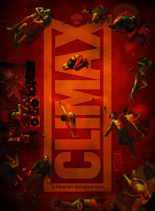
So the final French poster above proves invigorating by comparison. The title is now projected upon a curtain at back in the colors of the French flag. The characters are up and engaged in a set of movements that feels as though it could restart at any moment. And the angle of approach comes with an off-kilter trajectory, our vantage pushing in to swoop around their bodies and take in the whole scene rather than just hang overhead with nowhere to go. We’re a part of the action instead of stuck waiting for it to begin.
For a subject like Hotel Mumbai (March 22), it’s easy to play upon a sense of dramatic terror with guns. BOND does exactly that at right with its automatic rifle landscape threatening violence as a quintet of actors look scared in their tiny little boxes above. There’s no true emotion in it, though. It’s merely a collection of pieces adding up to nothing.
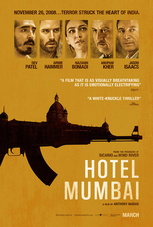
So why not look at what happened from another direction like the sheet at the start of this section? Why not remove all the obvious tropes and replace them with a singularly cohesive scene that can be understood on its own? That’s what this glimpse inside the hotel provides. Here we are hiding in the bathtub as bullets fly to bore holes into the wall. Here’s the harrowing experience from our vantage point rather than disembodied heads selling celebrity over true-life event. Using a Variety blurb that literally describes the poster with its “Visually Breathtaking” and “Emotionally Electrifying” prose maybe be a bit ham-fisted, but you can’t fault the designers for wanting to bring that glowing response to life.
There’s a similarly mysterious use of our positioning as the viewer with The Boland Design Company’s Transit (limited March 1). They use a ton of reflections to both separate us from the subject and them from each other. But who’s hiding from whom? Is the silhouette of Paula Beer spying upon Franz Rogowski or the other way around? For all we know the layers of glass and mirrors is creating a distance that doesn’t exist at all. Maybe they’re looking directly at each other while we’re revealed as the one who’s hiding. The possibilities are tiny mysteries that draw us in to discover the answer.
It’s very much like the German festival sheet albeit with a glossier, more attractive sheen. That one uses its crop to separate man and woman so we see her in life and him in reflection. So they are physically together and yet perhaps emotionally apart. This duality is therefore consistent, the visual fracturing thematically intentional. And whether augmented by filters or simply cut from life, I have to imagine the finished product is a gorgeous feat.
Moving from pretty to disturbing we finally set our gaze upon Wounds (limited March 29). I don’t know where to begin with this one since it definitely proves to be about more mood than content. This is some surreal Stanley Donwood type stuff from a Radiohead album with emotion and electronics merging to elicit an off-putting vibe that sears its visceral image onto your retina. And it does “glitching” so much better than that second Captive State sheet did above.
The horror of it is palpable, the cry of pain as easily a reaction to something be said over the phone or the phone itself proving a delivery device of auditory torture. His very being is shattered, his essence sucked away as though the spiral void of the title’s “o” is ripping him apart. I’m sold.
What is your favorite March release poster? What could have used a rework?