“Don’t Judge a Book by Its Cover” is a proverb whose simple existence proves the fact impressionable souls will do so without fail. This monthly column focuses on the film industry’s willingness to capitalize on this truth, releasing one-sheets to serve as not representations of what audiences are to expect, but as propaganda to fill seats. Oftentimes they fail miserably.
It’s October and there are two bona fide horror films on the slate. Two. Four if you stretch your criteria. That just goes to show you how many genre films come out each year and how successful they’ve become to get summer release dates without a holiday tie-in. With the way Don’t Breathe has been performing, theaters may keep it rolling all the way through Halloween.
In their place come some actioners, thrillers, and a couple comedies. Oh, and one family film in Middle School: The Worst Years of My Life (October 7). One? I guess studios are banking on kids still being in back-to-school mode with homework every night. Maybe I’m just realizing that October has become stay at home and rent a film month.
The age game


Two of those action films come in the form of Inferno (October 28)—or in layman’s terms, Da Vinci Code 2 or perhaps Angels and Demons 3 depending on your Dan Brown love—and Jack Reacher: Never Go Back (October 21). That puts 60-years young Tom Hanks and 54-years young Tom Cruise on the marquees like it’s 1994.
We know how old these guys are and yet the studios still want to try and deceive us. Cruise is never going to look “old” but at least BLT Communications, LLC isn’t smoothing his skin to make him look plastic. I only wish I could say the same for The Refinery and Hanks.


Rather than the weird middle part from Angels and Demons, The Refinery goes heavy on the shoe polish for a conservative Ken Doll aesthetic. Maybe the issue is casting someone so young in Felicity Jones because even Irrfan Khan is looking a bit waxy here.
Sadly I can’t say any of the Inferno sheets are better. From the blatantly computer generated teaser mimicking Darren Aronofsky’s The Fountain 180-degree pan to whatever LA was thinking on their bleeding red title against white. It’s a sad day when the boring triptych of glossy stills is our best option. At least the top Hanks looks real … ish.


Jack Reacher isn’t doing any better. Besides letting some wrinkles show on Cruise’s face, the formatting is quite boring across-the-board. We have Tom standing against American flag, Tom standing with back against IMAX letters, and Tom peering down forlornly with cheek gash as American flag waves translucently. At least the fourth has an explosion and what looks like it could maybe be Cobie Smulders. If not for her name being super tiny at the bottom, though, I never would have known. I guess Rosamund Pike took the subtitle’s hint.
October violence


They may not all be horrors, but these four definitely promise the violence you’d expect from the genre.
While Desierto (limited October 14) is the only one I’ve seen of this quartet, I wouldn’t be surprised to find it proves the “scariest” of them all. This tense thriller never lets go as a redneck “peacekeeper” goes border hunting for Mexican illegals with his bloodthirsty dog. Something about that premise feels more real than ghosts and goblins.

I think this foreign poster does a good job depicting that sense of dread with Jeffrey Dean Morgan at top and Gael García Bernal at bottom. This is a cat and mouse chase through the desert heat with very little cover from the former’s riflescope. The temperature is rising to haze out the title and a bit of the scale of the setting’s vast expanse is portrayed. It’s definitely been touched-up in Photoshop, but it has its merits.
If nothing else it’s more intriguing than the Spanish sheet with actors starring anywhere but at each other or us. This thing does nothing to express the emotion or suspense. The English language example is just as dry, the letters of the title looming as though actual aliens are coming from the sky to abduct the poor soul caught in the “R’s” tractor beam.
I may have no interest at all in Ouija: Origin of Evil (October 21), but I will say LA’s poster has its appeal. It’s not easy to make a ubiquitous board game creepy, so seeing them turn it into the walls of the darkened room a young girl must stare into the corner of is unique. I’d have taken out the shadow of the ghost, though—it’s not needed. A solitary girl staring at nothing is much worse than fake silhouettes that aren’t even in the same perspective as the object being shadowed.


The second poster proves how boring the board itself is. Do we need the letters and numbers behind the floating girl? She’s the focal point and the title in the identical font as the game is enough to make the connection. Everything else is distracting. Thankfully the teaser realized this truth and let the name and viewfinder satisfy Parker Brothers’ contract. It’s scarier to think about what might be in the darkness than show it waiting.
Gravillis Inc. was tasked with Rob Zombie’s latest freak-show entitled 31 (limited October 21) and they do an effective job showcasing the film’s inherent creepiness. Just look at the first tease of a van with clown head on top. You don’t need to do anything to this to make someone turn their head as soon as they catch a glimpse. Blood, vintage clowns, and Zombie’s name is enough to turn most people’s stomachs.


The final advert is almost too much in comparison. It gives everything away in its collage of horrors and lessens each figure’s impact at the same time. The character sheets are much better in highlighting one monster in high contrast black and white with blood red augmentation. There’s still mystery to them in their graffiti-stencil style. I also like the fun flourish on the “31” font. That sense of playfulness juxtaposes nicely against the genre and circus theme. The heavy sans serif never quite fit the others.
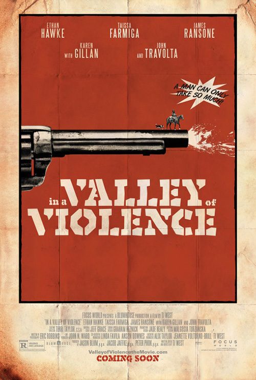
As for In the Valley of Violence (limited October 21), Ignition’s imperfect design is definitely the best concept of this group. The idea of using the corner of a building—one side with light shining and the other shrouded in shadow—to differentiate “white” and “black” hats is inspired. I wish they took the time to stage this in real life so Ethan Hawke and John Travolta didn’t look like they were cut out of another photograph and pasted on this one, but what can you do? The vertical corner strip should probably be darkened too since it’s on the Travolta side.
It creates a much better mood than the teaser’s graphic drawing of a gun blast. This one has a comic feel with the “A Man Can Only Take So Much!!” coming across in a hammy lilt with double exclamations and starburst. But maybe I’m wrong and this tone is more appropriate in the long run. It just goes to show how important a poster can be at preparing its audience. Is Ti West’s latest a comedy or thriller? Depending on which artwork your theater hangs, it could easily be both.
Memorable


There’s been a ton of great sideways posters throughout the years and although LA’s entry among them for American Pastoral (limited October 21) isn’t the best of the bunch, it’s still a stunning piece. This isn’t just about orientation; it’s about drama. And there’s no better moment to depict because although this isn’t the building that explodes to set everything in motion plot-wise, the meaning remains. That level of destruction stays intact as the venue is changed to a small home burning from the inside just like ‘Swede’s’ family.
I love the coloring of the sky, that giant tree at the bottom left, and the alignment of the flames with the title. It’s a bit too much text in close proximity at the top for my taste (and I have no clue why ‘American’ is slightly bigger than ‘Pastoral’), but obligations to all involved need to be fulfilled. It’s just weird how bold everything is compared to the tiny sentence case tagline floating in no man’s land. Just delete that thing completely.
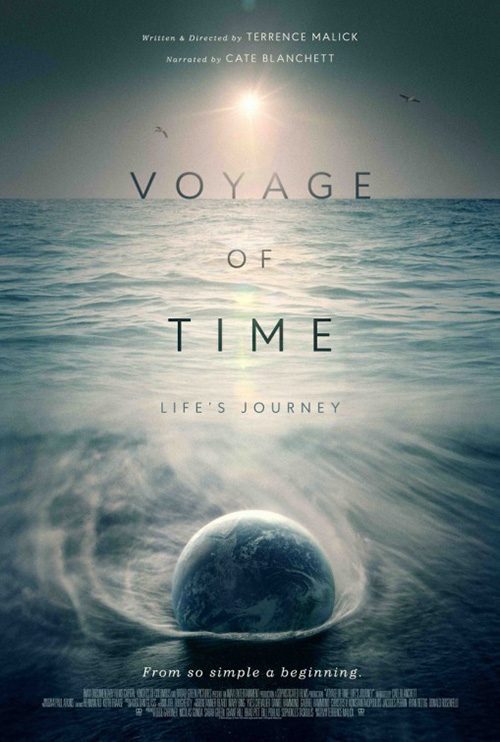
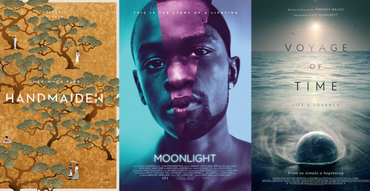
For Voyage of Time (IMAX only October 7) P+A goes head first into the universe’s unanswered questions like I’m sure Terrence Malick does with the film. This solar variation is for the IMAX cut narrated by Brad Pitt, a pared-down 40-minute ditty working from the Fibonacci spiral out to a trifecta of Earth, Moon, and Sun. It’s a powerful image with good contrast pop and recognizable bodies in symmetry. And it can’t be a contemporary Malick film without the title font going all caps serif to italics and back.
P+A’s version of the 90-minute feature (narrated this time by Cate Blanchett) is less captivating. The blues and greys become muddled, depicting Earth dropping into the ocean is strange, and the title on the horizon cascading down is clichéd. It pales in comparison to the previous entry and possesses no head-turning attribute to stand out from the pack.
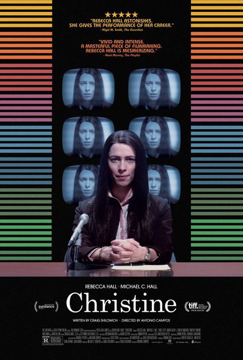
Christine‘s (limited October 14) festival poster on the other hand is perfect for catching a straying eye at the multiplex. There’s a great 70s feel to its imperfect collage of TV unit and woman’s body. It’s intentionally off like it was pasted together with scissors and glue, the Videodrome feel adding to the atmosphere presented—real life colliding with artificial, reality through a filter of artifice. There’s a certain charm to its aesthetic.
The official sheet loses a bit of this for color and stoic pose. I think it will surely stick out on the wall, but it’s not saying much. Is this a one-woman show? A monologue? To have a critic quote calling the film “vivid and intense” above such a static image loses some of the words’ punch. I don’t love the six TV screens all with the same freeze frame either. It doesn’t lend an Andy Warhol Pop Art vibe that one imagines from the motif and if anything only proves they were solely included as a way to pop Rebecca Hall’s dark hair and jacket off the black background.
The design I really enjoy in this section comes from P+A again with The Accountant (October 14). This is a studio-backed piece with Ben Affleck at the fore so there’s no need for artistic gravitas and yet that’s exactly what we get. Like American Pastoral, this halftone moiré pattern is nothing new. Neither is newspaper clipping (Safety Not Guaranteed) or covering eyes (Eternal Sunshine of the Spotless Mind). But these things are well worn for a reason: they work.


It’s fun to look deeper than just a photo of Affleck. You have the numbers faded beneath the actor names, a bloody fingerprint on the paper’s edge, and the sense of anonymity the main character possesses. All of these things are gone on the Russian (?) version. We don’t get to see any of those numbers, the fingerprint is covered, and all mystery towards Affleck’s titular character disappears in full view. Who knew the star was more important outside the US? Maybe we’re finally learning.
Unforgettable


There’s some good stuff above, but nothing matching the sheer beauty (or absurdity) of these next four movie posters. I don’t think there’s been a better foursome all year.
First up is that dose of absurdity with The Greasy Strangler (limited October 7). I literally know nothing about this film—an intentional maneuver. I heard the stories coming out of its festival run and the name itself is visceral enough to be a make-it or break-it point of contention. But this advertisement cements my unyielding desire to finally sit down and watch the insanity.
The title juxtaposed with that portrait would be enough to make this a great piece: those faces, the ornate frame, and its off-kilter hanging. But letting the words scrawl above everything in graffiti paint is beyond inspired. And this isn’t just a Photoshop filter wherein the text is placed on top. Each letter is physically present on wall, canvas, or frame with the three-dimensional depth of the object left intact. It’s sheer madness. Compelling, off-putting, and impossible to ignore like all good train wrecks are.
InSync Plus’ Moonlight (limited October 21) takes us much farther down the road of the style spectrum with its clean portraiture glowing under cool blues, reds, and purples. There’s absolutely no excess here: tag, image, title, and text block. No star, director, or producer name is present to take our attention away. All that matters is the somber mood and the brilliant visual approach to represent the Barry Jenkins’ triptych format.
This film is broken into three acts centering on one character at three different ages played by three different actors. They’re all on display here, expertly sliced and combined into a single face. If you’re far away from the wall buying popcorn you can easily mistake this amalgam for a single person. And then when you approach to read the title you start to question your eyes. It’s perfect.
Removed from their fantastically emotional performances onscreen, these three actors don’t necessarily look alike. You buy it contextually because they embody the role that came before them. But seeing them spliced together like they are here, this casting couldn’t have been handled better.
With The Girl on the Train (October 7), BOND has outdone itself. I’ll give credit where credit is due on the gorgeous title effect because that’s been utilized in conjunction with this property since the novel. I don’t own a copy so I can’t say the designer off-hand, but that is the book cover designer’s success: simple, clean, and wonderfully complex in its depiction of crisscrossing motion with eyes going one way and train the other.


But the minimalist image is all BOND’s. You can just barely see the hair in the darkness of the black, the white of the girl’s neck and back is blinding to earn our gaze, and the zipper as tracks with locomotive as toggle is genius. There’s no need for anything else. Plot and context are thrown out the window. You want to know what this is about based on the image alone. It sells tickets by itself.
Iconisus L&Y – Visual Communication Systems does their best to equal that success with their bisected sheet of text and Emily Blunt, but it’s not quite as exacting. Alternating font size within the title is a huge mistake as the doubling effect becomes unreadable. The tracks don’t have anything to do now and the “Based on” line spanning the entire width of the left side while everything else hugs the center is distractingly incongruous. As for Blunt, I get less mystery and more malice. Suddenly this thriller has become a slasher. Pretty, yes. Unforgettable, no.
The third sheet is actually better even though it’s so literal. Blunt’s gaze is softer, confused. Her peering from behind a “wall” is relevant now and the texture of the rain on window/metal is appealing. The text is less ornate, but still effective. And the reflection of the house gives us something to squint at and puzzle over until opening night.
But the cream of the crop is unquestionably Empire Design’s The Handmaiden (limited October 21). This thing combines the best aspects of Men, Women & Children and Catch Me Daddy. The animation is half woodcut and half painting, the layering with the text allows us to enter the page (trees falling out of frame into the white border a huge help in this), and the subject matter just left of its beauty with death, sex, and sadness keeps us on edge. And the font selection with its sharp sans serif couldn’t complement the soft background texture and curved foliage any better. You’d need to be blind not to stare.


It’s not like the photographic version doesn’t steal your attention too, though. The black and white contrast is jarring, the weird positioning of actors strangely alluring. How they touch to remain a chain of humanity with male hands on female heads isn’t something to quickly dismiss. And that gap between the men can’t help but hold something out of reach. Every time I look at it my mind fills in another nondescript face simply because I don’t want to be surprised when one inexplicably pops in. Now that’s what I call horror.
What is your favorite October release poster? What could have used a rework?