November brings Hollywood blockbusters, awards favorites, foreign Oscars hopefuls, and more with a ton of titles showing how this holiday season is going to look nothing like 2020 in terms of the theatrical release schedule. One could say the studios have all but erased the pandemic from their minds, deciding to stick to their plans without worrying about subpar ticket sales—a low risk move for many considering they have their own streaming services while a high risk move for theaters left wondering which films will make them the most money.
I have to imagine turnaround time for the big screen experience on many of these will be short—especially if Disney forces untenable screen quotas on theaters playing Eternals (opens November 5), lowering the real estate available for everything else. So marketing becomes a big factor for audiences to realize what’s coming and when. And those streamer logos? They might just end up telling potential customers which titles to de-prioritize, knowing they’ll be easier to catch at home than the rest.
What a tease


Good iconography stands the test of time and the cute little ghost in a prohibition circle signifying Ghostbusters is a perfect example. Why else has every film in the series (including the alt-universe reboot from 2016) used Michael C. Gross’ creation? It’s almost sad to see that the latest installment, Ghostbusters: Afterlife (opens November 19), bucked the trend.


BOND doesn’t remove it completely, but not letting it be front and center is a definite change of pace. The firm goes with the ECTO-1 instead, pushing the logo to the fringes on side door and trunk much like all the initial marketing material. There seemed to be a conscious effort to pretend as though this was a new world discovering the old rather than a direct blood relation—something they’ve stopped of late as we get closer to release.
The poster is striking if not wholly unique. Dutch angle with ample white space to house a very angry storm cloud of foreboding; blurred focus to create high-speed motion. It’s a teaser through and through. And it’s a lot more interesting than both Concept Arts’ cast sheet against a similar backdrop and BOND’s own variation via lightning stream collage.


Seeing the full name spelled out with Gross’ icon as the “O” honestly makes me a bit sad too because it shows a lack of trust that audiences know what the symbol means. It’s only been five years since the last one, guys.
Derek Gabryszak and Empire Design’s teaser for The Power of the Dog (limited, November 17; Netflix, December 1) uses some tried and true teaser sensibilities itself. The cropped profile cutting Benedict Cumberbatch’s face at the bridge of the nose, using the dark color of his clothes to create a field of contrast for knocked-out white text, and the choice to keep text simple and sparse by rejecting a credit block all mix to deliver a solid if familiar sheet that knows its subject’s draw.
I’m almost surprised Jane Campion’s name didn’t earn a more prominent position (contractual jockeying for equality on behalf of the cast surely played a role) because her name is enough to turn heads regardless of the quartet of actors above. Placing her at bottom all by herself does the trick regardless. Hers is the last name we read and the only one with an Oscar-winning pedigree.
It’s Time Tomorrow’s work (also with Empire Design) that takes teaser-tropes a few steps further with Spencer (limited, November 5). This poster is simply gorgeous with its ornate detail by highlighting Kristen Stewart’s dress, its delicate typography with ample kerning and almost illegible thinness, and its bold black/white contrast drawing our eyes to the division point of a woman in distress. It’s Princess Diana as ghost, victim, beauty, and icon all in one.


The full sheet with Stewart in black veil comes close to delivering a similar minimalist vibe despite the added information (critic’s blurb, credit block, etc.). It’s provocative if less poetic, dramatic yet matter of fact. I’m confused why the studio released the red one at all since it’s such a far cry from the others. The image is obviously masked onto its red (with little desire to make it seem like it’s not) and the text proves so distracting in its decision to use a consistent typeface between quotes and title that we can’t discern a focal point.
Put these three Spencer one-sheets in sequence and you have a perfect evolutionary chart taking you from art to commerce.
Text first


It’s the little things like a translucent red “R” overlapping text to make it appear to be written in marker as opposed to laid out electronically that show a level of craft well beyond the simplicity of an overall design. Add the precision kerning to ensure the “K” doesn’t overlap anything while also framing the text box below and I could look at the top half of GrandSon’s King Richard (opens November 19) for hours. That it’s also accompanying a sparse composition with the faux Williamses isolated at bottom—left justified text against right justified image creating a “Z” of balanced focus—only adds to its success.

Concept Arts looks to mimic the same in what I assume is a UK sheet due to the “Only in cinemas” designation and lack of HBO Max logo, but the brilliance of that red text is completely lost. Not only does it relinquish the translucency that made it so captivating, but the enlargement of its jagged edges makes it appear sloppy rather than handmade. I love that it extends over the image’s frame to fall off the page, but it’s a one step forward, two steps back scenario. Context is key.
The typography on Bad Luck Banging or Loony Porn (limited, November 19) is perhaps generic in aesthetic by comparison, but no less effective in utilization. Why? Because its sans serif font isn’t meant to draw our eye to it as much as the graphic imagery to which it is attached. Look at it as a complete unit and you just see an upside triangle or maybe a wine glass that’s two-thirds full with the text populating its negative space. Walk backwards, however, and you start to see something much different.

This one-sheet is itself a “daring and hilarious gamble,” words used to describe the film by Indiewire, because it provides exactly what it needs to get us looking closer to appreciate its introduction of its pornographic content (the plot concerns a town’s reaction once a teacher’s sex tape unintentionally goes viral online). And all it takes is a textured pink background alluding to skin and a geometric shape standing in as genitalia to do so. No amount of color or diagonal text (see its counterpart at right) can ever match that level of genius.
A similar sense of minimalism is at play for The Beta Test‘s (limited, November 5) festival teaser too—albeit more ornate in nature as opposed to exactingly angular. The studio has ostensibly given the world an invitation sparing no expense with its gold foil printing and wax-sealed rose. You cannot view this image without wishing you could reach out and rip its enveloped edges apart to see what’s beneath.
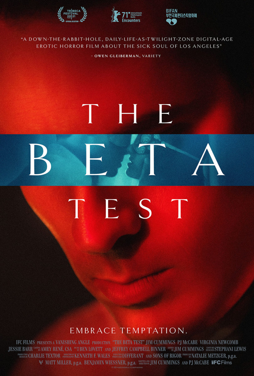
I highly doubt the finished poster is what we’d find, though. The style shift is simply too jarring. I’ve yet to see the movie, so I’m not sure which serves it best, but everything I’ve heard makes me think a combination of the two (satirical whimsy and harsh drama) would have been beneficial over such a sharp disparity from one to the next. Not to say I don’t like this follow-up. The way it masks eyes to create mystery and dread is very effective. It’s just so impersonal by comparison.
Layers
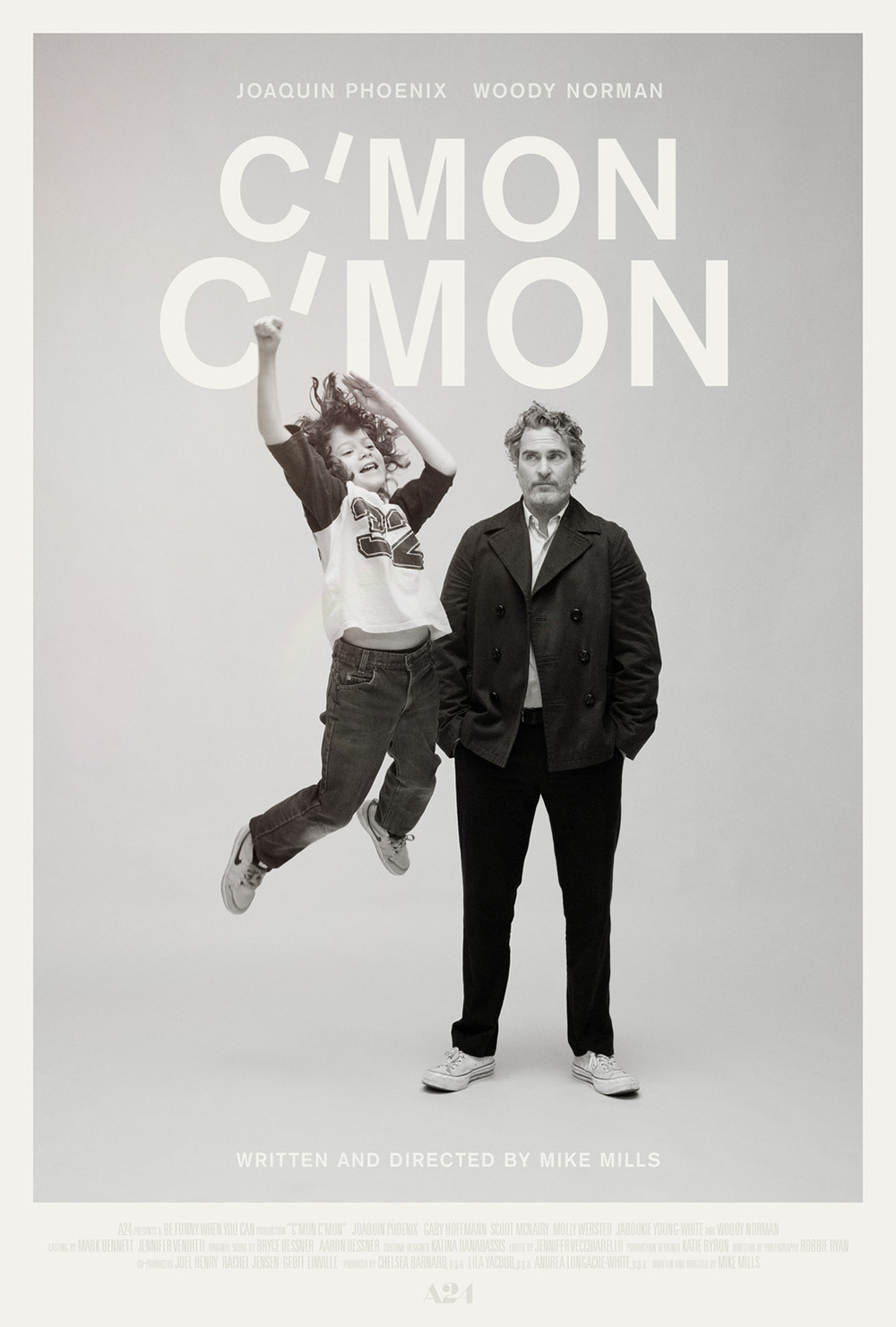


Minimalism abounds as we move to the wonderful series of poster done for C’mon C’mon (limited, November 12). The use of contrast pops Joaquin Phoenix and Woody Norman out as the rest fades together in a barely perceptible knock-out white on light gray. The font choice is ordinary, but the typography is not as it augments the title’s repetition through size shifts and that diagonal apostrophe. It’s as though the sheet is screaming the name at us, pulsing out a sound wave from small to large to actors rising above that adds depth to an otherwise flat whole.


I love the one with Norman jumping best, but the one with both actors on the ground smiling is great too. Letting them exist as full-bodied people in that empty frame just adds something that the torso crop misses. Seeing their shadows allows us to comprehend the space as a three-dimensional room. We can therefore imagine them moving within it rather than posing for a portrait—a snapshot of life being lived rather than life being paused. It’s a subtle yet profound distinction.
GRAVILLIS adds some color with The Harder They Fall (Netflix, November 3), but it’s the distressed scratches and extreme silhouettes that really set it apart. They know that Jeymes Samuel’s film is all about style and they’ve bottled it here with the same fervor used on-screen. It’s good versus evil, leaders and lieutenants, history meeting pulp fiction. This thing is pure mood filtered through the same sand blowing into the actors’ eyes.


And we get that vibe on the original teasers separating gangs too—a diptych that works best when paired together. The above is thus an abridged version in many respects that removes characters and compresses space while enhancing the same atmospheric golden hour battle brewing in the silence. Does it all look like a clothing store campaign in many respects? Sure. Is that necessarily a bad thing? No.
Nothing can compare to the exquisite work by Phantom City Creative on Night Raiders (limited, November 12), though. I’ve been holding onto this one for months, waiting for a release date so I could include it in a column. I’m a sucker for designers using the medium (printed paper) as an element of the design itself.
This is an Indigenous-led and created science fiction film tackling residential schools in Canada that portrays a future where all children must be indoctrinated by institutions to better serve the establishment in adulthood. The government uses drones to scour the land and find any rogue kids being harbored by parents desperate to keep them clear of such brainwashed assimilation—their spotlights becoming representative of defeat as exposure leads to capture.
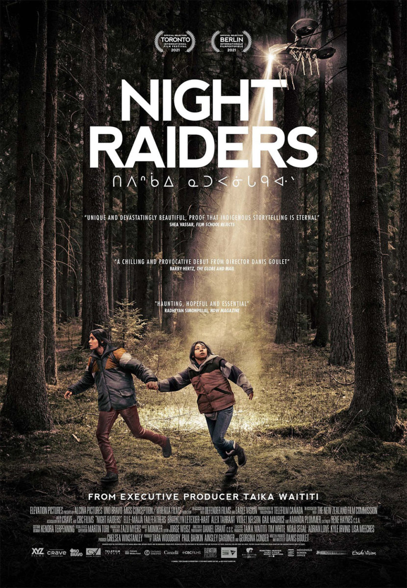
To therefore use that beam as a tear in the fabric of this mother and daughter’s world is a perfect metaphor for its impact in ripping families and cultures apart. To then move text onto that slant while stripping all color away beyond the black void of futility highlights the danger and stakes. Champ & Pepper Inc.’s latest simply can’t quite match that same drama despite showing the exact same scene as matter-of-fact photograph. Its emotion is excised. Its subjective poetry erased.