
After a packed-to-the-gills February, March is really dialing things down with releases. If my local theaters are any indication, it seems that studios are banking on Raya and the Last Dragon (in theaters and PVOD via Disney+, March 5) gobbling up a majority of screens. And with Oscar nominations just two weeks away, there’s always the assumption that theaters put titles they couldn’t show in 2020 on the rest to close things out.
That’s not to say there aren’t some “big name” contenders for streaming time, though, thanks to Amazon’s Coming 2 America (March 5) and HBO Max’s Snyder Cut redux of Justice League (March 18). So you’ll have to instead gaze upon virtual cinema selections and VOD to find the indie gems willing to go the extra mile by commissioning a compelling poster to set them apart from the Hollywood gloss.
Image first


In that vein comes Adrian Curry’s Wojnarowicz: F**k You F*ggot F**ker (virtual cinemas, March 19). Rather than find an archival photograph of David Wojnarowicz, Curry utilizes a captivating work from the artist’s catalog as his baseline imagery. It proves the perfect marriage of illustrative metaphor and portrait with map collages, flames, and the addition of paint splats as ash. This is a figure on fire much like his early stenciled houses.
Curry therefore tasks himself with finding a font that works to offset the brushstrokes and chaotic nature—choosing a bold sans serif to stand tall against both. The result is simple yet effective with the words’ legibility and security complementing the image’s unpredictability without distracting from its originality.
The poster for Lost Course (virtual cinemas, March 5) is similar as far as its use of a piece of art as the backdrop for its marketing push. The swirling blue abstractions on its canvas is enough to draw us into the numerous black voids at their centers, but the addition of a red boat really gets things moving with a sense of scale and context that transforms the whole into a tumultuous ocean. We strive to go in one direction only to follow the curves elsewhere, each attempt at progress drifting us farther away.
Its typography ends up feeling a bit like an afterthought—the drop shadows lending an amateurish vibe when the stark white letter on a dark blue field should have been enough. Look no further than the Chinese characters of the title’s translation having none for evidence. The other text (tagline and director name in both languages) being so thinly rendered is where issues crop up because it gets lost without that hazy black outline. I only wonder if a bolder choice could have solved everything instead.
Midnight Marauder’s Honeydew (limited, March 12) may not be using the same sort of artwork as its base, but you can tell that the photograph chosen was definitely where the final piece sprang from just like the above two. It’s dramatic worth as a sort of pieta holds visual power that allows it to be reduced down and pushed to the bottom of the frame so the blackness of the whole can threaten to consume it. You can almost hear a scream coming from the actor’s open mouth, rising up to the heavens.
The font choice is nice with a distressed serif lending an old print press aesthetic that supplies a sense of time and place along with what looks to be water damage on the bottom-left corner. What I really like, however, is the way in which it’s composed. By stretching the kerning of the title, it becomes the horizontal arm of a cross carried through the vertical axis from laurel to tag. Add it to the pieta homage and you get a sinister, atmospheric take that wields its religious overtones with dread.
Faces


In an interesting bit of synergy, all three posters in this section hinge their visual through-line on a diagonal going from the top right corner to bottom left—each with the slant of a face as the source.
Sophie Jones (limited & VOD, March 2) is the most straightforward of the bunch insofar as it simply crops a film still via extreme close-up so that star Jessica Barr becomes our guide down to the title. Add her eyes and the whole forms a “Z” through the middle of the piece into the neatly constructed text block. It’s all about motion—content informing comprehension.
AllCity’s Son (limited & VOD, March 5), on the other hand, is using dual head tilts to create drama instead. The piece itself retains its vertical balance on the y-axis by centering the faces above the title and text at bottom. We move from mother to son with ease, that diagonal black line between them creating a fracture that’s only exacerbated by the fear in his eyes and blood on his cheek. The high contrast chiaroscuro is setting a mood that lets us know this is a horror film where love won’t prove enough.
Rose Plays Julie (virtual cinemas & VOD, March 19) takes a different direction by manufacturing its slant with a double exposure of two separate, level images. The hair of the silhouette becomes the window by which Ann Skelly’s face is seen—the angle erasing half of it to both allude to this notion of one character struggling with two identities and to cultivate a sense of foreboding for what that version of her is willing to do.
It’s another “Z” like Sophie Jones as the title (albeit shifted to mimic the diagonal) pulls us over to slide down left and move back right into the critic quotes. But it’s also another dark look at character dynamics similar to Son (even if the figures at odds are the same person this time).
All three are therefore intuitively simplistic yet complexly defined. They lead our eyes through their formal design while also providing an emotional reaction inherent to the subject matter on a purely visceral level.
All about the type


The first thing I noticed when this festival poster for Come True (limited & VOD, March 12) debuted last year was the typography. The yellow text reminding me of Lost Highway was a plus, but the title design is next level. The “O” becoming the “R”, the “M” and “E” sprouting another “E”, and the way the “C” angles itself to be the cross of the “T” is beautifully rendered. That the image’s old school TV halftone lines almost get forgotten as an afterthought is wild because it’s pretty unforgettable in its own right.
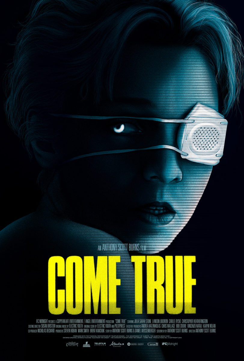
I won’t lie then and say I wasn’t disappointed to find the US version deemed its style too illegible to carry over. This thing is practically the same exact poster and yet it arrives from a completely different world. I get the appeal to make certain that viewers read the title at a glance, but I’d argue that being able to read the idea of “words” (if not the words themselves) is a better result because it demands viewers to look closer.
That’s what the sheet for The Fever (virtual cinemas, March 19) does. It takes the building block nature of the shipping containers at right and mirrors it via the text. In a unique case where having us read the vertical word letter by letter is actually the right move, our eyes are being taken in multiple directions all at once in a sort of controlled disorientation.
Maybe you read the English title. Maybe you read the director’s name. Maybe you read the Portuguese title. Maybe you read them all. Either way, those letters are pushing downwards towards the man at its center—a man lost in thought, sickness, or reverie as the world around him changes from the harsh reality of dock work to the serene leaves of nature.
If you really want to get people to know your name, however, why not just slap them in the face with it? That’s exactly what Mark McGillivray and Empire Design do with Amy Poehler’s latest directorial effort Moxie (Netflix, March 3). It’s screaming at us from the top of these girls’ lungs with stars, hearts, and graffiti imperfections to force us to take notice.
What’s so brilliant about the composition, though, is how those letters seem to serendipitously serve as reverse censor bars over the mouths of these kids. The “dot” of the “I” is stuck to one and the arms of the “E” are pulling double duty to cover two. It’s as if they’re literally shouting this word at us—the text manifesting out of them like a comic book panel to prove they’ve officially found their voice.
What is your favorite March release poster? What could have used a rework?