Between there only being four Fridays this month and most studios banking on July as a return to theaters, June doesn’t have as much going for it as the previous two thirty-day quarantine blocks. So catch-up on what you’ve missed, check out a few of the titles listed below, and prepare for the onslaught that’s coming. Fingers crossed this is the end and not merely a sign of the inevitable backslide risked by opening things up too soon.
Illustrated faces


If you’re going to market a film whose intent is to reconsider an infamous work such as Showgirls, you do all you can to give the whole a new paint job. It’s no surprise then that The CRP Group would go with an illustrative representation of that flop’s leading character for the documentary You Don’t Nomi (VOD, June 9). Remove any implicit stigma that showing a photo of Elizabeth Berkley in the role provides and add a bit of pizzazz instead. This is the real Nomi Malone.
There’s a major comic book sensibility to this poster too from the drawing style to the font choice. The bubble letters are drop shadowed and a bit distressed to make it seem as though the words are vibrating off the page. More humorous in tone than elegant (thanks to costuming and a glittering background), I think this choice goes a long way to expressing that an appreciation of Showgirls comes from the viewer’s ability to not take it so seriously.
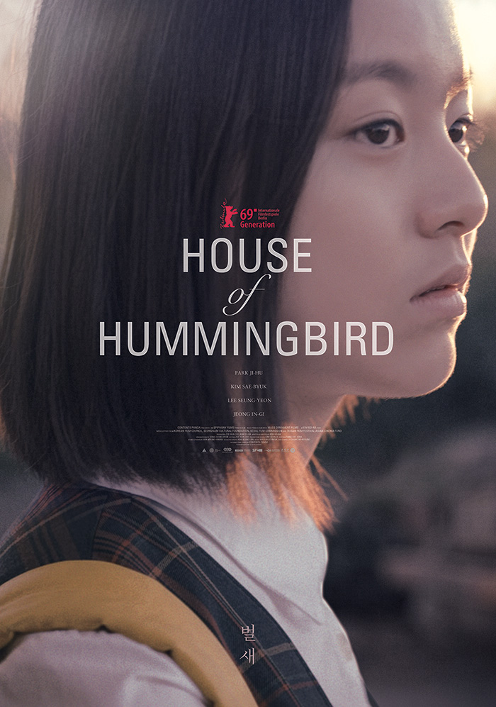
We move from pop art to painting with House of Hummingbird (Kino Marquee, June 26) and its intriguing multi-layered scene. There’s Ji-hu Park standing on what appears to be a residential street with trees in the background, but also a second location with a collapsed bridge on the water. The two alternate within the shapes created by a dashed pathway crisscrossing around the frame to create windows opening up onto the other.
The American sheet is vastly different with its simple photography beneath a center axis of text. The composition is more about making said words legible than creating excitement from the visual itself as Park is enlarged precisely to provide a very specific border between light and dark fields. It’s competent, but sorely lacks the imagination of its Korean counterpart.
Gravillis Inc. provides imagination and more with their poster for Da 5 Bloods (Netflix, June 12) by going full metaphor with a poignant look at a soldier crying five teardrops to signify the four main characters and the squad leader who died while they fought in Vietnam. Nowhere does it mention the treasure they also seek upon return. Nowhere does it mention the lives they’ve built in the aftermath of their service. This simple depiction of a man confronting the horrors of war for us all to see is more than enough.
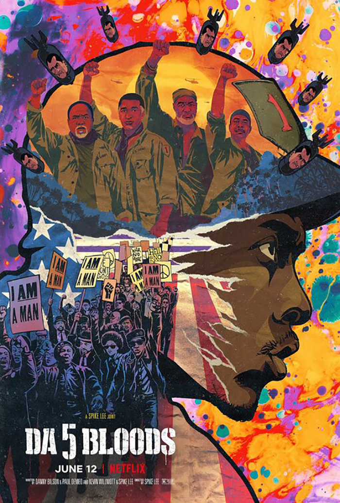
Nothing proves that fact more than the firm’s final one-sheet and its chaotic collage of tie-dyed paint and heavily inked drawings. It epitomizes the “more is less” conceit as our eyes are overloaded by the sheer amount of information screaming off the page thanks to past, present, abstraction, propaganda, and more colliding in an explosion of color. A 154-minute epic is admittedly a tough thing to condense onto a single page. They struck gold with the above minimalist teaser to crush our souls, but followed it with a beautiful disaster that assaults our senses.
Poised faces


There’s very little going on with the poster for Babyteeth (VOD, June 19) and yet it’s doing everything right. By using an image where Eliza Scanlen is looking up, we get a sense of hopefulness and a side of positivity from her smile. You’ve got the cotton candy coloring of blue-greens and orange-reds bisected by the white of the curb she’s sitting on to create a symmetrical y-axis as an intriguing rainbow shift in the cast names provides movement left to right above the title that barely registers against its backdrop.
It begs us to look closer, rewards us with information we might not see on first glance, and refuses to smack us in the face by subduing its bright hues for a more palatable introduction.
Miss Juneteenth (VOD, June 19) is very similar sans rainbow. It also has its star (Nicole Beharie) sitting on a curb, but this time she’s looking past us off-screen with a look of melancholic contemplation. The mood is in stark contrast to the otherwise playful title font and crown flourish—reality perhaps not quite living up to memory. Her dark skin and deep red dress pop against the wall just as the bright white title pops above it without any need for tacky shadows. Where Babyteeth used perspective to prevent itself from feeling flat, Miss Juneteenth uses the dynamic between background and foreground.
The sheet for Judy & Punch (VOD, June 5) conversely embraces its inherent flatness both in construction and illusion. This is a portrait: posed and deliberate with Mia Wasikowska and Damon Herriman situated behind a still life complete with goblets and animal carcass. It’s a painting that should be hung and yet it has been stripped of its color to prove itself a facsimile as advertisement for the duo’s show. Add the small print at the top and its use for marketing doubles as in-film prop and real world commercial.

Beyond the monotone, texture, and period specific letterpress font, however, my favorite detail of its quest to be an object above a scene is the blood splatter bleeding perfectly into their faces. It smudges, seeps, and lingers with specks above and below to make us wonder about impact. My first thought is that someone got their teeth knocked out and this is the crimson result—evidence that the pair is definitely not in Kansas anymore.
To compare it with The Robot Eye’s final domestic advert is to become deflated. The authenticity and mystery of the tease has been excised for over-saturated color photography that can’t help but spotlight its Photoshop work. The title moves from delicate historical artifact to comic book marker scrawl and ultimately throws everything off. Rather than depict two people from the past, we’re suddenly thrust inside a renaissance faire of tacky make-believe.
Confrontational faces


I know Martin Scorsese gets butts in seats, but giving him top-billing on the poster for Shirley (Hulu, June 5) is frustrating since any new Josephine Decker film should be an event all on its own. Maybe his attachment will get folks to finally realize as much. Watch this one and check out her back catalog later. But I digress.
This is an interesting sheet because it seemingly promotes a totally different movie than what you will ultimately receive. Not only is Elisabeth Moss’ Shirley Jackson more of a supporting role to Odessa Young’s Rose, she’s also never this serene (staring daggers or not) at any point during the whole. I look at this and think the venerable author is bothered yet willing to hold her tongue and invite me in to witness her writing process. What she actually does, however, is terrorize anyone who dares step into the room where her typewriter lives.
I’m not saying the designers should have depicted her screaming, but this merging of indoor and outdoor alluding to Jackson’s mind often taking over the film’s visuals presents more fantasy stroll through the park than the quasi gothic horror suspense we experience. It’s an effective poster. It’s just also somewhat misleading.
I wouldn’t know that if I hadn’t already seen the film, though, so it’s tough to really fault it. In contrast, I haven’t yet viewed Abel Ferrara’s Tommaso (Virtual Cinemas, June 5) and thus can’t speak on whether the mood it delivers is accurate to the finished product. Unlike with Shirley, what makes this one effective can therefore stand on its own in the abstract.
Just like with Moss’ Jackson, Willem Dafoe confronts us eye-to-eye. He too is not necessarily happy to see us, but also not ready to pounce. By adding two people in the background, however, we do get a sense of story beyond mere surroundings. His distance from them and attitude makes you wonder about their relationship and whether his look is less about our presence and more about theirs.
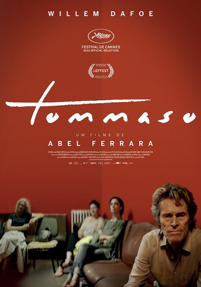
It’s a dynamic composition that uses depth of field to open the frame up as a window—that corner line does a lot of work despite being nothing more than the natural delineation between two shades of the same color. The title font mimics an artist’s signature and the ability to push the credits box to illegible status at bottom gives it room to breathe. I do feel sorry for the woman in the international sheet that got cut out in this American one, but her absence and tighter crop does improve the work immensely.
No matter how good its use of focus is to present its content, not even Tommaso comes close to the precision on display with The Surrogate (VOD, June 12). Here we have yet another actor in Jasmine Batchelor who holds our gaze, but this time she’s in obvious distress. She caught in the middle of two men who appear more confident about the scenario and presumably quick to diminish whatever worries she might have as people who believe they have final say regardless. And as the frame inches in to crop their faces, the walls quite literally begin to close around her.
She’s the surrogate and she’s being psychologically crushed by the weight of everything that position entails—her health, that of the baby, and the desires of the men who will ultimately raise him/her. It’s no coincidence then that the diagram behind her is skewed. Nothing about parenthood or childbirth is perfect. Nothing about it is without complexity beyond its objective science.
What is your favorite June release poster? What could have used a rework?