The theaters are officially back. How do I know? Because I had almost three times as many posters to go through for this month’s write-up than I had any month the past year-plus. We’ve got new releases, postponed releases, streaming releases, multi-platform releases—you name it, July 2021 has it.
I’ll be honest, though. I didn’t think I’d actually find more selections to talk about than the usual nine I’ve been doing of late. The increase is mostly Hollywood fare and studio interference generally means mediocre retreads and collages. The fact that I’m including twelve films below and putting the great “blur” campaign Searchlight assembled for Summer of Soul (limited/Hulu, July 2) here in the intro means the art thankfully hasn’t regressed to match an overflowing release calendar. We’re still getting eclectic stuff worthy of a head-turn; hopefully that will never go away.


Iconography


I’ll start things off with simple, clean teases utilizing a familiar (or hoping to become familiar) symbol.
For anyone who grew up in the 1980s watching cartoons, there are few symbols as iconic as G.I. Joe‘s Arashikage Clan. You see that mark and you can bet either Storm Shadow or Snake Eyes is coming next. WORKS ADV knows it and capitalized on it.
Because those rectangles won’t be as easily recognizable to those of us who didn’t watch the show, however, they aren’t so confident that they don’t also include the title: Snake Eyes: G.I. Joe Origins (wide, July 23). It’s small enough not to impede the general mood of the whole and ultimately becomes an afterthought of contractual obligation. They let the smoky haze and neon precision of the mark do its thing.
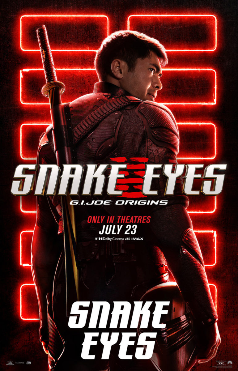
And to satisfy the studio’s needs—they have to spend their budget somewhere— BLT Communications, LLC comes in for character sheets that know a good thing when they see it too. Maybe the sword is replaced by its soldier and the title is made bigger (and duplicated when the decision to highlight the character name is made without thinking about how dumb it will look while advertising the titular character), but those rectangles remain gorgeous.
LA had a more difficult task with the same idea since, as far as I can remember, Black Widow (wide & Disney+, July 9) never had a symbol all her own in the movies before. Maybe the hourglass was in the comics and thus familiar to old school fans? Either way, she’s been branded with it now. Seeing it for over a year due to a COVID-19 postponement obviously helped.
It’s simple and cool—especially when given the graffiti grunge effect around its edges. Pair Marvel with Scarlett Johansson and our brains fill in the rest. We know she’s Black Widow—thus whatever is shown instead of those words becomes Black Widow. It’s a neat psychological trick.
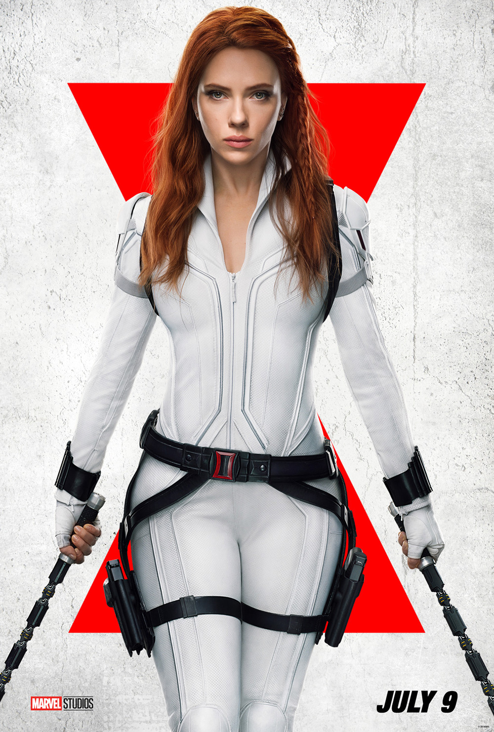

I personally prefer the black and red boldness of the 2020 sheet when compared to the current iteration of white and red by Art Machine and BLT. The way ScarJo’s pose mimics the symbol’s double triangles is a nice touch, though. And both are just infinitely more interesting in their minimalism than last November’s failed release attempt’s main sheet. Adding all those other actors and vehicles muddies the water to a point where that hourglass is lost completely.

If you want impressive, however, look no further than Mike Stillwell and Empire Design’s teaser for Pig (limited, July 16). This isn’t a beloved toy line or billion-dollar superhero franchise. No, this is an indie film starring Nicolas Cage with a simple title that’s just as easily illustrated by a silhouette as it is the three letters of its name.
Actor, pig, studio. Bing, bang, boom. Put it against the disorienting texture of the animal’s hairy, wrinkled skin and you get an image unlike anything else that’s on your theater’s walls. It’s almost too pure a concept to believe a studio gave the greenlight. I’m sure the decision was easier knowing the next piece would be Cage’s own hairy, wrinkled face. I only wish they kept the pig symbol in lieu of the word this time around too.
Redacted


I absolutely love the colors cold open used for their Space Jam: A New Legacy (wide & HBO Max, July 16) poster. The red-to-purple gradient is enhanced to a shimmer thanks to a similarly dark filter placed above LeBron James and the Looney Tunes characters that makes them pop with dramatic gravitas. Add the extreme crops (he has no head and they’ve lost their bodies) and this thing oozes intrigue and style. It’s just a shame the logotype is so awful.
I get it. Both words have an “A” in the middle and having them line up begs you to combine them somehow, but Warner Bros. should have nixed the choice. Is it a spaceship? Is it a cartoon elastic gag? A runway? An arrow? Will it bounce back and leave the title SPCE JAM when animated? For a design as gorgeous as this sheet is, all I can do is stare at the giant “A” taunting me.


You could at least say it’s a flourish to augment how high James is jumping—like it extended through his leap—with the above. You can’t say the same when it’s just hanging up in the top left corner while BOND continues utilizing the brilliant lighting effects to try to get us to look at Lebron and Bugs instead. It’s no wonder the firm gave up and decided to hide the “A” behind James on the final design. If he covers it up, our brains can trick themselves into thinking it’s two letters instead of one. Sadly, it’s too hard to forget.
Continuing with the cropping aesthetic, Scales (limited, July 9) arrives with a more monotone palette that’s just as beautiful. It’s the perfect image: a strong vertical stance to bisect the page, a bright yet delicately rendered title to ground things onto an x-axis, and a strong diagonal line to pull our eyes through.
The flow of her dress creates a triangle of focus with the spear that ultimately creates a zig-zag from stoic face down to scaly feet. We sense adventure and fantasy along with drama and epic scale. It’s the philosophy of “less is more” at work.
Enemies of the State (limited & VOD, July 30) is similarly spare with its center-justified symmetry focused upon a family portrait powerfully altered with black redaction lines. Everyone knows what that means: we’re not supposed to see what’s behind them. Just seeing these three figures almost becomes an illegal affair that makes us complicit in confidential information. That’s the draw, though, isn’t it? We want to know what our government is too afraid to tell us.
The alternating text coloring from white to gray helps our eyes move down the page from festival laurel to critics’ quotes to title all while the background is imperceptibly textured by more words and censor boxes, adding to our curiosity with “Wikileaks” and “Anonymous.” We need to know how this seemingly normal family became terrorists. We need to know what makes them so scary.
Images through text


Brian Hung has become Cinema Guild’s go-to poster designer for all things Hong Sangsoo (see Adrian Curry’s piece at MUBI) and The Woman Who Ran (limited, July 2) is right in line with a couple of his previous entries. Place it next to The Day After and Grass for a series of meandering (yet calculated) compositions weaving large titles around repetitive cast cutouts.


Day takes us from top to bottom via a connect the dots road from one word to the next. Grass adds an illustrative pathway through scenes from the film as both grass and cigarette smoke wafting into the air. And Woman supplies a journey that’s either very exacting or utterly confusing with Kim Minhee getting turned around left, right, and backwards.
We can either follow the lengthy title through its chaotic mix of horizontal and diagonal placements or try to travel the endless yellow line curving off the page and back on again. It’s impossible not to get dizzy as the repetitive nature of the actor keeps our eyes bouncing back and forth between image, graphic, and text with no seeming conclusion. It’s almost too much to bear… and unforgettable in the process.
Rather than a weave, Mark McGillivray and Concept Arts’ Die in a Gunfight (limited, July 16) mixes text and image with depth of field. I kind of wish they didn’t have to add the cast behind the gorgeous neon sign at all, since the photo takes too much emphasis off the title. Maybe silhouettes could have created a happy medium?
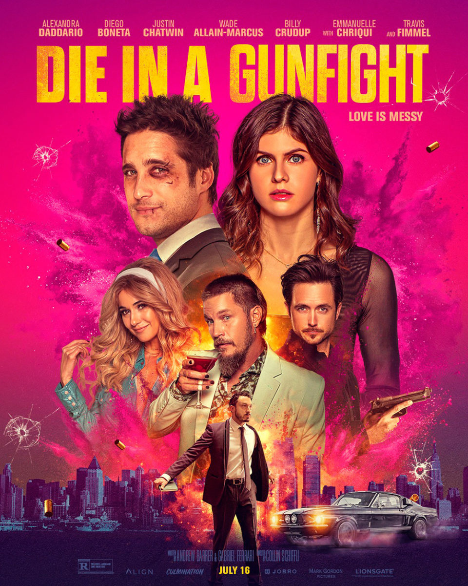
Take it as a text-only tease and its texture, authenticity, and atmosphere are unparalleled. I love the doubling effect of the light reflecting off the window beneath and the bullet holes providing just the right amount of dark clarity through their centers to prove the glass itself is fogged. It doesn’t just represent the movie—it is the movie.
And MOT’s full sheet only augments that success by giving us the usual cast collage with bright colors and explosions. It’s all gloss and zero mood: a slap to the face of the film’s world rather than a smooth zoom into the core of its drama.
Speaking of drama: how great is the sheet for Ailey (limited & VOD, July 23)? The image’s chiaroscuro lighting. The athletic pose frozen at its apex in anticipation of a downward thrust into motion. The bold sans serif adding a punch of color while also intersecting the figure as a floating wall between body and hand. We can’t help but throw our head down through its center from quote to credit box. Only the elbows give us a reprieve by pointing our way through each separate axis to breathe in the whole at a more leisurely pace.
Flat multitudes


Two church steeples. Two priests in crisis. Two fields of color. Everything in Sister Hyde’s poster for Scenes from an Empty Church (limited & VOD, July 2) is paired off for a compare and / or contrast with the sharp, elegant linework necessary to keep it all meticulously measured for added impact. And everything has its counterweight to maintain balance, whether the yellow text on black opposite the black text on yellow or the architecture of an invisible God beside the stark white collars of the men who live in His grace.
It’s somewhat of a departure from Sister Hyde’s usual work composed of heavy textures and intentional degradation of quality for a uniquely lo-fi aesthetic. She almost moves in direct opposition to that impulse here yet still creates something wholly of her style—a concept stripped down to a reckoning that pits hope and despair against each other much like the characters in this COVID-set conversational piece.
Pablo Iranzo Duque’s River (VOD, July 13) is just as spare despite the additional input of full-page photography, thanks to a muted haze rendering objects into shadows and the light cutting through its left side into our focal point. More than the figure caught in it and lifted off the ground amongst falling leaves, this beam from the heavens becomes our balance opposite the glaring orange title weighing things down to earth. It shoots through the poster only to tell our minds that it’s actually moving up—the optical illusion a sensory paradox that puts us in stasis by that woman’s side.
The soft coloring makes the whole otherworldly like a dream. The inconsistent glow of the title makes it feel as though it’s also in motion, spreading left from the gravitational pull of that light. It’s like we have been caught too and everything is about to disappear into the sky in a blink. So we hold tight, not daring to reach out and accidentally secure our fate.
In contrast to the first’s minimalist fields and the second’s diffusion, BOND’s poster for The Green Knight (wide, July 30) finds itself flattening from the rich colors of its high-contrast lighting. That which should provide three-dimensionality—see Ailey above—has been carefully manipulated to the point of cutout geometric shapes. This is a silhouette despite the clearly rendered chainmail and facial hair proving the opposite. It’s formed a heightened reality through deep saturation similar to the effect that made 300 into a living comic.
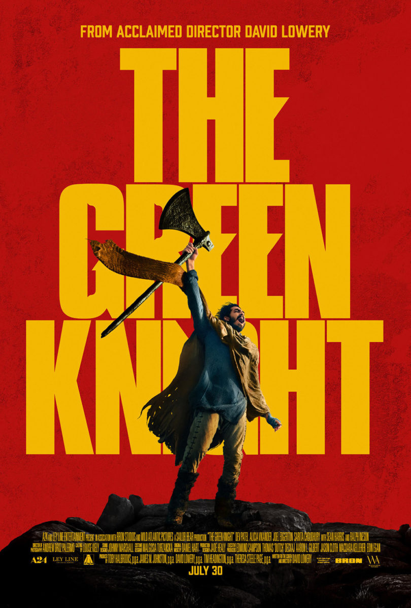
It’s undeniably attractive in its boldness and captivating in its mystery. The old English font of the tagline gives us a sense of place and era while the singular knife-edged title brings us into the fantasy of lore. The whole exists at the collision point of both styles: history and fairy tale merged as one to deliver an image trapped in our imagination.
The decision to leave the mature and adult nature of this initial sheet for a family-film tone on the latest is confusing to say the least. I see a child roaring in excitement rather than Dev Patel leading a charge. It’s an interesting contrast, too, since A24 commissioned a whole series of character posters in that first vein. To abandon it is strange unless they thought the oppressive drama was too… misleading, perhaps? I wonder which we’ll receive.
What is your favorite July release poster? What could have used a rework?