“Don’t Judge a Book by Its Cover” is a proverb whose simple existence proves the fact impressionable souls will do so without fail. This monthly column focuses on the film industry’s willingness to capitalize on this truth, releasing one-sheets to serve as not representations of what audiences are to expect, but as propaganda to fill seats. Oftentimes they fail miserably.
There’s no bigger holiday weekend for Hollywood than the Fourth of July and its propensity to get audience members thirsty for high body counts, action, and the occasional counter-programming to compete against such weaponized patriotism with a side of explosions in the sky. So it should surprise no one that this month brings the gift of seven sequels. Seven. If ever you worried about the dearth of studio creativity, this does nothing to assuage your fears.
They will be taking up so many screens that you will probably find it hard to see the handful of independents and foreign films arriving alongside them — especially for anyone outside of a big metropolitan market. That’s why I’m forced to talk about the posters for six of those seven properties in the opening two sections below: sorry for leaving you out, Unfriended: Dark Web (July 20).
Hopefully the ones I highlight in the final two sections will be seen hanging on the walls of your local theater sooner rather than later.
The blockbuster machine


This monstrous entity is nothing if not consistent in its marketing machinations and July 2018 is no exception with quick teases, animated characters without backgrounds, Photoshop challenges of attrition, and the daring decision to give us something worth looking at.
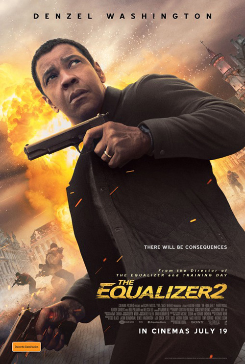
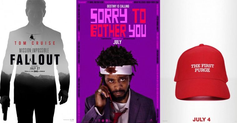
BOND delivers the first with its poster for The Equalizer 2 (July 20). If you’ve seen the original film, you know that star Denzel Washington is a dour, frustrated, and putout man forced to do what he knows he can but doesn’t want to do. So it makes sense to highlight that determined if vacate stare to challenge us. It says, “What? You don’t want to see me beat people up again? Maybe I’ll stay home too — your home.”
And while I like the Roman numeral “2” acting as a window onto Washington’s incitation, I have no idea what’s going on with the title. “EQ2”? I guess earning close to two hundred million dollars would prove me wrong, but did the first film really make that much of a brand impression to get away with such a weird abbreviation? We should just be happy we didn’t get the UK sheet trying to get us to forget how slow and methodical the last one was.
Proof is the firm putting its animated lead from Hotel Transylvania 3: Summer Vacation (July 13) on a spare background. These types of designs for cartoon fare are always so funny to me because you can literally do anything you want thanks to the medium. You could put this character against any background — whether or not it’s in the final film — as long as it proves exciting to an audience of children. Instead it just feels like the character design of beach-going Dracula was completed early and the studio wouldn’t allow any of its environments out to play. The punny tagline doesn’t make-up for it and the ability to lewdly outline its subject with graffiti is counter-intuitive to its target audience’s innocence.
The second sheet is much better even though it just has a gradient added. Our eyes aren’t stuck looking at Dracula and nothing else. We can travel through its “room”. The shadows and composition provide movement off-screen. And the contrast between positive and negative space isn’t oppressively stark. I can take a journey from the floral beachwear cape to the funny suitcase stickers of more puns and dangerous locales. This creates intrigue for young and old without haphazardly throwing every character’s head into the sand a la BLT Communications, LLC.
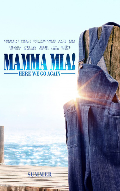
Speaking of haphazard, what was LA thinking with their poster for Mamma Mia! Here We Go Again (July 20)? This thing doesn’t even try to compose a scene or even fake realism where depth and space is concerned. (I think Christine Baranski is flying.)
Do we really need two versions (past and present) of everyone on this tiny little dock? Either bring the number down by half while supplying the remaining lucky souls some three-dimensionality or use the visible flatness to your advantage by turning the whole into a scrapbook of cutout photographs. I already want to go up and peel everyone off as though they’re stickers, so leaning into that aesthetic wouldn’t do any harm.
Thankfully BOND’s tease shows some necessary restraint with a pair of overalls on a dock post. I never saw the first film and yet this image alone would tell me what’s being advertising. I hate saying fortune cookie design mantras, but “less is more” is a concept for a reason.
I’m not sure who is responsible for this gorgeously simple Regal poster for The First Purge (July 4) — LA did the others — but it does what I wish more firms would. When a franchise has an aesthetic that’s able to sell itself, don’t get in the way. And while that would generally mean scary masks on tilted heads for this series, Universal understands the prescience their property has shown when compared to our current government regime. So they get their marketing people to map said aesthetic onto the visual language of our true present.


The result is powerful whether yellow police tape covering a nation about to turn (it’s a prequel) its entire geography into a crime scene or a red MAGA hat saying “Make America Purge Again” without putting those actual words in frame. Add the political mirroring of the civil rights movement with their black and white protest scene and you’re taking a firm if calculated stance about our country. There’s boldness to this that you don’t generally see from Hollywood. Give credit to Universal and to Blumhouse for pushing their distributor to the edge of that thin line separating capitalism from art.
The little people


There’s nothing like tiny silhouettes against a massive backdrop that shows their scale in the grand scheme of things to supply relevant drama. Even so, you don’t see it happen quite often enough to have four examples in a single month. And yet here we are.

First up is LA’s Mission: Impossible – Fallout (July 27) and itty bitty Tom Cruise hanging off a cord attached to a flying helicopter. I want to see this poster without the giant Cruise framing device because it can only do its job better with a full sky above and threatening black abyss below. Even so, the placement of everything is top-notch from the cord just clearing the letters along its path and tiny Cruise wishing those thick “Ls” were there to prop himself up and give his arms a rest.
Going from this to Concept Arts’ glossy collage is a huge step down. That fire and mountain isn’t adding drama, so why include their slivers of imagery at all? The goal here is obviously to showcase the franchise’s sprawling cast of A-listers, so fabricating danger only augments the fabrication. I could get behind this style in motion on the screen with each scene quickly playing while the fire engulfs their vignettes separately, but it does nothing for me on the page.
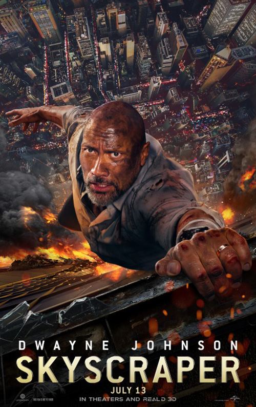
Ironically, it’s Concept Arts that got the hint for Skyscraper (July 13). They let us see just how tall the titular structure is when compared to the other buildings within the city below and show how crazy Dwayne Johnson is for jumping into burning glass regardless of the physics that may or may not make his trajectory impossible (as if that’s the most implausible part of this scene).
Like tiny Cruise, tiny Rock is but an ant trying to save the world one family member at a time. The sky is suitably dark and foreboding and the dangers below are ready to consume him whole. And rather than go boring collage with a follow-up, BLT comes in to do a close-up that retains the context of scale. They put Johnson against a far away ground, holding onto life with four fingers on a jagged window frame. Both might be static images, but both also present a potential energy desperate to release itself in an explosive force of speed.
Art Machine uses the same principles as those two films with Ant-Man and the Wasp (July 6), but they do so for comedy instead of drama. BLT may have done the exact same thing for the first, but that doesn’t make it any less effective when adding a second player to the game. And unlike Hotel Transylvania, this isolating white helps matters by creating the perfect contrast to draw our eyes into a squint for clarity.


BOND subverts scale for a Honey I Shrunk the Kids look via Paul Rudd and Evangeline Lilly walking amongst giant popcorn kernels. But while it is inventive, it isn’t quite as funny. As for the full-sheets: Art Machine’s generic montage has some flair with a diagonal orientation if not unique character and LA’s honeycomb is pretty much just a rehash of their design for Thor: Ragnarok. These are the perils of a cinematic universe being so successful that every single cast member demands equal billing.
Bringing things back to a heavier tone, the French poster for The Night Eats the World (limited July 13) takes a page from Ignition and LA’s Chronicle tease. Rather than show the power of flight, however, this design shows an inversion of falling. With land at top and sky at bottom, we’re watching a silhouette fall upward for a welcomingly disorienting feeling of weightlessness caught in suspended animation.


I don’t blame the film’s American distributor for wanting to give its audience horror context with a bright red makeover of a high contrast black skyline and reaching hands, but boy is it ugly. Maybe that was part of the goal. Maybe the original was too “pretty” to get audiences ready for zombie carnage, but how much of this mentality is predicated on the studio’s lack of faith in its consumer? I don’t know about you, but that’s not a great business model since it means dumbing down what could be great until those able to appreciate it are turned off and those who can’t are pissed they wasted their money.
Font fun


What BLT is doing with Eighth Grade (limited July 13) is more “typography fun” than “font fun,” but you get the idea. They’ve put the title in a heavy sans not only to raise the legibility level, but also serve as a second shield for its lead Elsie Fisher to hide behind. And yet the eye is left unencumbered, her gaze directly at us — witness or perpetrator to whatever she’s keen to avoid.
This is the power of type — that you can create a story from nothing more than its placement atop a single, carefully cropped image. The firm could have zoomed out, placed a smaller title top center, and left the bottom for a quote and credit box you can barely read. Instead they’ve led us from eye to title to critic blurb, layering everything with faux depth due to differing font sizes so that we move forward and backwards as though in a dance with the sheet.
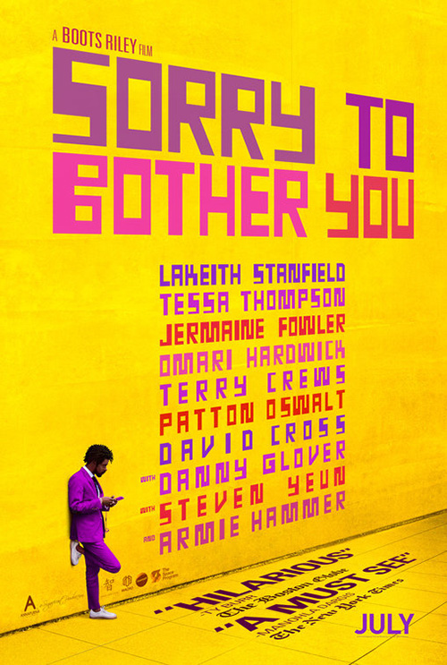
Gravillis Inc. does what I said BLT shouldn’t have and yet it works for their Sorry to Bother You (limited July 6, expanding July 27). They zoom out and place Lakeith Stanfield from chest up at the bottom so the title can be centered above him. The difference is that his character isn’t hiding in this scene. On the contrary, he wants us to see him. He’s looking at us with intent rather than embarrassment or fear. We’re supposed to take stock in his bandaged and bloodied head and wonder what is going on while the playful, Saul Bass-like font pops off the page with its bright hues above.
They turn the quotes into a frame, creating a focal point with which to travel the border and back in rather than anchoring us at the bottom. The coloring provides a striped rhythm to complement the irregularly shaped letters screaming its name.
BLT saw that more could be done if the type became the focus above the actor. So they throw in a huge cast list with alternating colors over a yellow wall with subtle perspective. Stanfield’s angle is different, but we can look past it because that font begs for an off-kilter vibe throughout
Scarred Hearts (limited July 27) allows its type to be memorable because of its decision to use illustration rather than photography. This choice means anything is possible whether a sharp font to juxtapose against imperfect imagery or a hand-drawn, calligraphic scrawl to enhance it. I’m glad they went with the latter because its ornate yet expertly measured thin-to-thick stroke gives the whole a feel of illuminated manuscript even if the drawing is much less polished.
That font is the highlight here since the composition is serviceably familiar — title, image, text — and the artwork itself weird out of context (the signature infers it was drawn by the author upon whose work the film is based). I’m not sure why the credits are compressed beyond clarity since there is so much room to expand them out, but the shape lends the whole a sailboat look as the consistent symmetry gives our eyes a rest from the usually chaotic onslaught of movie theater walls.
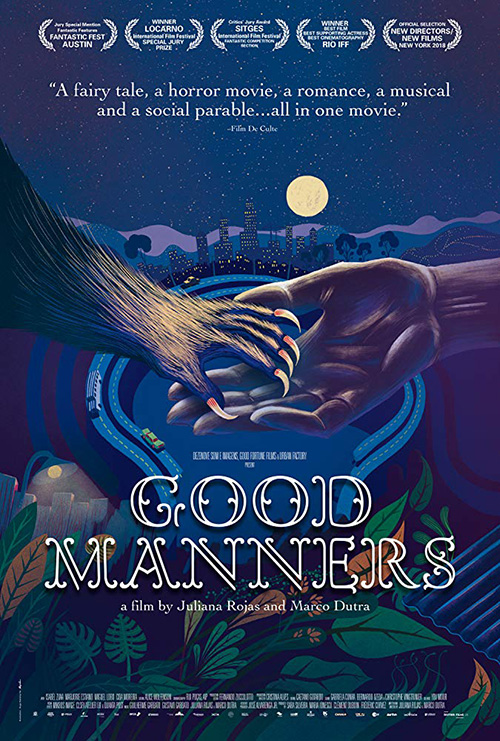
This leaves us with Good Manners (limited July 27) and its heavily-saturated, fairy tale scene of beast and human in the blue light of an evening moon. Both the French and English versions utilize the same painting with an eclectic font, but my favorite is the former because of its breezy swoops and curves lending an old-timey feel of a yarn told with an infectious smile.
What the English one adds is room to breathe. It gives the critic quote space to float rather than attack, its thin serif much “nicer” to us than the other’s all-caps, bold white. There’s a good chunk of white space between the title and credit box too that lets us take a pause on the film’s name without feeling pressured to move on to the next thing. But while the font they chose is overly elaborate like the atmosphere itself, the cursive just gives it more character and a lighter touch. Put that font on the English sheet and you have a superb piece of art.
Simple ideas/Complex orchestrations


The great thing about the Japanese poster for The Third Murder (limited July 20) is the way that it bucks the usual triptych trends of boxes or totem characters with one bigger than the rest. It takes its three leads and supplies them equal space to shine within a radial pattern around a center field. But rather than be circular, it takes the “Third” of the title and creates a triangle for their core. One side is given to each actor and the points of each extend out for reasons unknown. Maybe they bleed from killer to killed? Maybe they connect allies and separate enemies? Whatever the story, it’s just noticeable enough to ask those questions.


So how then did the English language sheet become so boring? This thing looks like a shoestring-budgeted college press textbook with a go-to template of film still and text — but the text got screwed up and enlarged to the point of overlapping the image. That aspect doesn’t look intentional except for the fact it butts up perfectly with the edges. Besides Kore-eda Hirokazu’s name at top and the actors’ faces, nothing here is selling more than stating.
The film does eventually get a better iteration with its third prong reintroduced for a trio under gradually increased blurring to denote importance, but it lacks the intrigue of that first international sheet. This one gives us a start and an end rather than a merry-go-round’s infinite loop.
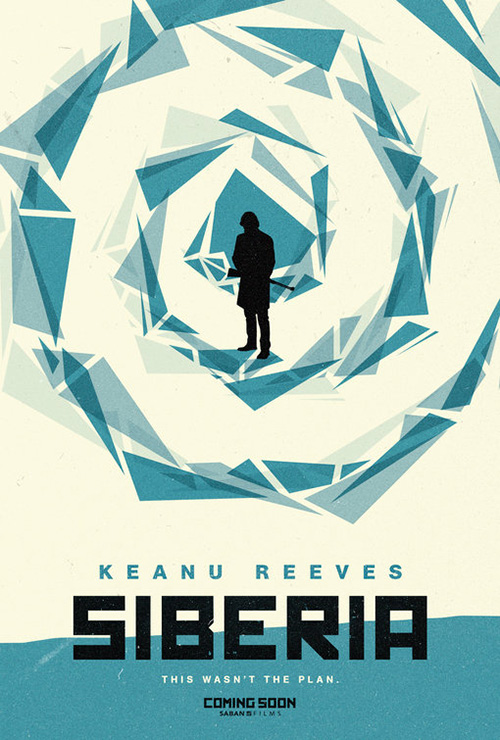
Along with that loop is an early tease for Siberia (limited July 13) that Gravillis Inc. created out of a geometric diamond being deconstructed as it moves further from the middle. It’s a graphically intriguing head-turner if for no reason other than its distinct lack of photography. The font fits in with the constructivist aesthetic of the region and you can discern the silhouette as the top-billed Keanu Reeves, but is this a winner? Not really.
Suffice it to say, I was surprised when the latest sheet (the one spotlighted above) came out. Gravillis abandoned the geometry, but didn’t destroy the minimalist bent. They push the actors to the top at an extreme angel about to kiss, the image fading to a snowy white cloud of zero visibility amongst a forest of trees with a tinier Reeves in the middle. Despite the desolate locale suffocating him with its expansive emptiness, he finds love.
The title keeps its boxy font and adds some more distressed grunge to ensure the “softer” texture of the grainy photography stays consistent. No part is therefore crisp enough to distract from another and the overall look feels weathered with time.
With a bit of a marketing push at its back currently — I just saw the trailer the past weekend at the theater — Blindspotting (limited July 20) hits the scene with two new art pieces devoid of superimposed text besides release month and hashtagged title. Instead they deliver colorful mood murals with actor likenesses, maps, earlier poster motifs (the tree), and found material. Crafted by Brandon Gastinell, the one above and the one at right looks to capture the zeitgeist of raw urban aesthetic on a consumerist level. And they succeed.


That’s not to say LA’s work with shifting, dueling profiles of its leads (Daveed Diggs and Rafael Casal) isn’t good with torn edges and do-it-yourself moxie. But where that supplies us the vessel, Gastinell shares the emotional turmoil beneath the veneer. Treat them as companions rather than competition: left-brain meets right; information meets intuition.
And that brings me to BOND’s throwback mixtape of a retro poster for Hot Summer Nights (limited July 20). I can imagine this smudgy ash-black artwork with soft neon glow looking back at me from the cardboard sleeve of a new wave or hair band’s vinyl release from the 70s. It oozes fantasy and danger with an artificial melodrama intent on showcasing its brooding teen heartthrob.
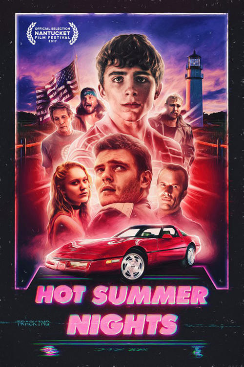
It invokes an era, taking us back to a bygone year whether or not the actual film takes place then or not. BOND is extorting nostalgia and sentimentality to put us into a daydream that turns their advertisement into a road towards a specific memory from our past. Suddenly the film and that personal feeling become intertwined if only for a second, selling us on the promise of what it might offer despite knowing nothing about it.
The earlier festival sheet tries to reach those same heights. Despite the tracking to make it seem like a VHS box, I get more of an Atari videogame vibe. By comparison it shows its hand more than the new design. It projects the notion that it’s desperate to trade on your memory of its aesthetic rather than boldly recreating it to appear like you just dug it out from the bottom of your closet. This one recalls a feeling via homage while the other builds a time machine to conjure it from thin air.
What is your favorite July release poster? What could have used a rework?