Hollywood is officially back to normal with a ton of limited release qualifying runs in New York and Los Angeles this month before expansions arrive in 2022. It’s easy to forget stuff like West Side Story (December 10) and The King’s Man (December 22) are coming too as a result since we’re all more interested in discovering whether the new A24 is bowing locally.
That means a lot of posters to choose from and yet I probably could have whittled the below to six and been okay with what got cut. So many are banking on name recognition getting them across the finish line alone and they probably aren’t wrong. For those still undecided, however, a memorable one-sheet could be just what the doctor ordered to subconsciously worm your title into the forefront of another mind.
Framed


I love the optical illusion at the center of BOND’s poster for Encounter (limited, December 3; Amazon Prime, December 10). A quick glimpse has you believing the circle is the focal point—a blue-green orb with orange halo. It’s not long after, however, that you realize it’s actually the white space with the edge manifesting itself into a horizon line with both ends connected. Suddenly it’s a hamster wheel with Riz Ahmed and the children running left and Octavia Spencer looking right. Will they eventually meet? Or will they always be on opposite ends?
The title treatment serves as a nice complement to the image as the last five letters get mirrored to mimic the circuitous nature of the whole. It has us moving forward only to then be pushed back. If I hadn’t already seen the film, I’d assume the subject matter had something to do with time travel as a result. That it doesn’t may disappoint some people, but the poster will have served its purpose getting them to watch either way.
The Scary of Sixty-First (LA, December 3; NYC, December 17) takes us from metaphorical framing device to a literal frame. It’s a captivating image with a painting of a woman wrapping a scarf around her neck. While the scene it represents has co-writer/director/star Dasha Nekrasova trying to see how hard it would be to hang oneself in the manner that Jeffrey Epstein did, this depiction conjures a more sensual and mysterious air.
That shift makes sense thematically since the film juggles conspiracy, sex, and psychological terror within its gorgeous, old school grainy aesthetic. To see this sheet is to imagine parallel worlds through a looking glass, the glowing haze of clouds around the ornate frame teasing a supernatural presence seeking to travel between them. Whether or not that vibe translates to the screen (I’d argue it’s a deceptive translation at best) has no bearing on the image’s success in selling the notion that it will.
Continuing our journey from the outside in takes us to Desi Moore’s Wolf (limited, December 3). It’s an attractive and spare glimpse at the film’s lead characters that can’t help but get our minds racing to figure out what’s going on. The window reduces the image to the look shared between George MacKay and Lily-Rose Depp. He’s on all fours. She has whiskers. The title as animal provides context that setting couldn’t as the composition places us inside their minds to acknowledge how their laser-focused connection moves beyond humanity into the realm of nature.


You lose that dramatic transformation in the character sheets due to their environment being allowed back into the frame. Our minds cannot pretend any longer that they are animals rather than simply pretending to be them. They’re crazy when alone and powerful when together. Viewing these three in tandem therefore increases their effect by expressing the weight of mutual acceptance.
Apple24


While Swan Song (limited/AppleTV+, December 17) is supposedly getting a limited theatrical release, the only poster image I can find is the stripped down AppleTV+ image with nothing but title and logo. So, while we don’t know how The Refinery might have handled the imagery with a full sheet of text, we do get the image. And it’s a great one.
The easy route would have been to have two Mahershala Alis facing off against each other considering the film is about a dying man grappling with the choice between telling his family he’s dying or letting a clone/robot/etc. replace him (a similar conceit to the Anthony Mackie episode of “Solos”). To instead go with one Mahershala via paint strokes and scribbles to denote his unraveling existence is an inspired alternative. He is being erased regardless of whether the people who love him know it.
GrandSon goes the illustrated route for A24’s Red Rocket (limited, December 3) too courtesy of Steven Chorney’s depiction of lead actor Simon Rex. The piece is generic on the surface with its limited color palette, y-axis presentation, and simple image with text components, but the choice to move beyond photography gives it enough character to standout anyway.


The goofiness of seeing Rex wearing a frosted and sprinkled donut helps because it’s a set-up that isn’t going to be easily forgotten. Pair it with the elongated script typeface (the same one P+A and InSync Plus used for Sean Baker’s previous films Tangerine and The Florida Project respectively) that feels like a contained mess similar to the darkly outlined airbrush effect of the painting and you get a nice sense of purposeful playfulness without the clutter of excessive stimuli.
Pare down the illustrative nature of the previous two actors to geometric abstraction and you get BLT Communications, LLC’s beautifully rendered woodcut-esque poster for The Tragedy of Macbeth (limited, December 25; AppleTV+, January 14). I love the texture of the paper, the imperfect coverage of black and red ink, and the vintage letterpress font fully justified and in need of a hyphen. It just feels right despite the otherwise clean/crisp text that doesn’t quite aesthetically belong.
Uneasy is the head that wears the crown—especially when there’s no body left to bear the weight. It’s a brilliant representation with multiple meanings as the gap between crown and head becomes both eye and blindfold. The bloodied sword doubles as a boat taking his soul to its afterlife. It’s murder, betrayal, deception, and reverie all at once.
Paired


Last and First Men (limited, December 10) can’t help but captivate us with its abstract imagery devoid of understanding. It’s a red circle. But then it’s also a black page with a half-circle cut into it. By lifting the latter from the former, you must question the relationship between these colors since the negative space of one might in fact be creating the positive space of the other. Which is therefore more important? The pieces or the whole? It’s an optical puzzle akin to chicken and eggs that conjures metaphorical notions for the title of “first” and “last” coexisting.
More than the image itself, however, is its soft-focus nature. The black is more of a dark, cool gray. The edges dissolve into the background as the white text appears to fade away. That ephemeral quality lends a profound tone considering the director himself has left us too soon. Light as well as life are visible yet elusive.
Despite there only being one figure in Intermission Film’s poster for Benedetta (limited, December 3), I’m calling it a pair because the crucifix is just as important of an object in context with the complete work. While also serving as a framing device (simultaneously keeping the text contained and highlighting Virginie Efira’s face as a cross of its own), this graphic becomes a layer upon which we judge the photograph. Both pieces are pious and provocative—often in direct opposition to the other.
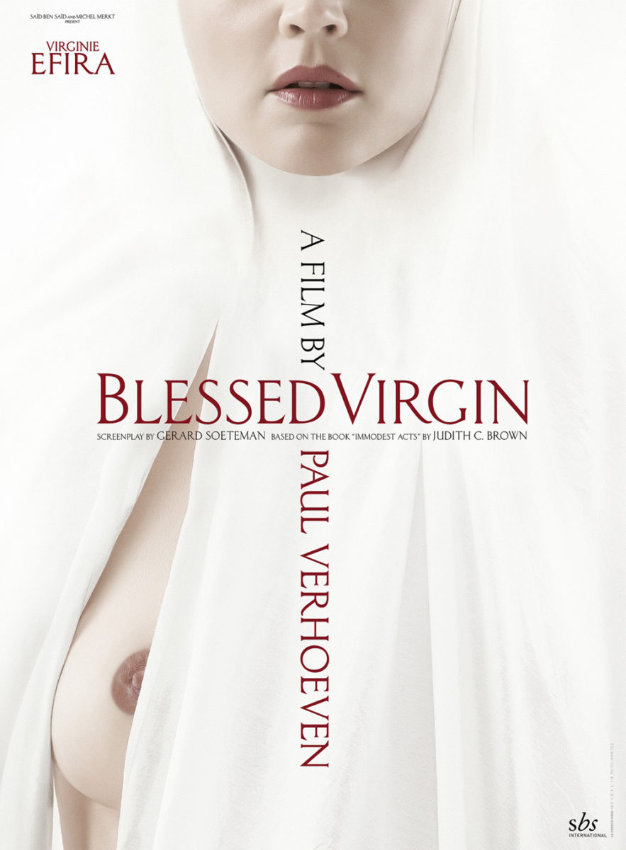
It’s an impressive compositional feat with expert typography and visual language. And it might even be more memorable than the more overt tease by Le Cercle Noir and photographer Anne Tilly as a result. That one goes for the jugular with its bare breast peeking out from the habit while this one leans on juxtaposition and design fundamentals to do the same in a more nuanced fashion to get under our skin rather than slap us in the face.
Similarly, I can’t help but place the eye-straining black and white lines of Javier Jaén’s second poster for Parallel Mothers (limited, December 24) ahead of his more infamous original. Don’t get me wrong: I love both. The nipple as eye with dripping milk is evocative to the point of widespread internet gossip, but I wonder if it loses something in the process. It’s about incitement—daring us to take notice rather than inviting us in to meet its film.

To have it as a precursor to the “hug” is thus more important than its existence alone. It got the conversation going and seared the title in our brains while the follow-up presents a different scene of maternal instinct with an equally artistic explosion of singular design. This one blinds us as the red (although the same) grows brighter from the stark contrast of black and white as opposed to muted grays. The text shimmers as our eyes go out of whack trying to decipher the pattern below that simultaneously separates and connects Penélope Cruz and Milena Smit with vertical and horizontal lines. Just as the nipple dares you to look, so too does this scream of light. Neither are for the faint of heart.