“Don’t Judge a Book by Its Cover” is a proverb whose simple existence proves the fact impressionable souls will do so without fail. This monthly column focuses on the film industry’s willingness to capitalize on this truth, releasing one-sheets to serve as not representations of what audiences are to expect, but as propaganda to fill seats. Oftentimes they fail miserably.
We all know that December isn’t actually the end of the 2016 movie year (at least not in cities with names other than New York or Los Angeles that must wait until February for some buzzed-titles), but it is the month where those coveted Oscar-bait movies get their qualifying run.
The Founder (limited 12/16, wide 1/20), The Comedian (limited 12/2, wide 1/13), I Am Not Your Negro (limited 12/9, wide 2/3), and Hidden Figures (limited 12/25, wide 1/6) are just a handful with more discussed below that fit this mold. This is what happens when you want to ensure your film is seen as close to award’s season as possible. It’s all sat on, released together for one week all at once, and than paced throughout winter to cash in on their trophies.
December might therefore be the most important month for advertising—more so even than the summer blockbuster deluge. There’s a lot coming at you and you only have so much time to devote. Maybe an art print abstract isn’t good enough when the McDonald’s arch and Michael Keaton can grab you with recognition. Marketing may create art, but it can’t help forcing many imaginative artists into its generic box too.
But some still break free.
The highest form of flattery


Hooray, imitation. I just hope flattery was the reason and not laziness because these four bear quite a bit of resemblance to past posters.


Assassin’s Creed (opens December 21) came out with this mirrored image a little while back after the main drive of their marketing campaign was in full swing. I like the idea because Michael Fassbender is playing two different characters separated by time wherein his future self is embodying his ancestor. He’s the same even if the environment he’s in isn’t. So why then is this poster just the past reflecting itself? Where is the sense of duality? Whether or not the similarities to The Last Witch Hunter design were lazy or not, this half-baked utilization of a fun concept is.
The Vin Diesel starrer isn’t quite the same, but it’s close enough to beg comparison. The crown of thorns behind him is based in repetition with the spire revolving more than once and the whole is mirrored over its vertical centerline. Add the pensive drama in Vin and Michael’s faces and you have virtually identical circular motifs on white.
It’s not like the rest of Assassin’s Creed campaign is bad either. Putting Fassbender at great heights to stand tall or fall works to get the action and stunts on display. I like the falling example because it plays with a sense of vertigo as we struggle to realize if the image is upside or right above us. This advert by BLT Communications, LLC makes me dizzy in a good way.
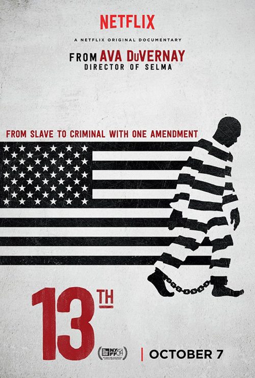
I’m not sure what to say about the comparison between Barry (limited December 21) and Ava DuVernay’s documentary from earlier in the year 13th because they are both Netflix productions. Maybe the internet studio is trying to retain a consistency in tone for their movies? I don’t know. It’s not as though the two share genres or subject matter—one fictionalizes Barack Obama’s years before becoming president and the other documents injustice in America.
I do get that both are “America”-centric and the flag lends itself to them, but they don’t have to be so similar. 13th is designed better as far as symmetry and clear focus goes, but Barry is more intriguing with its overlays and atypical style. The more I look at the latter, the more I think perhaps that it’s a fan-made piece considering its inconsistent kerning on the actor names and weird visual artifacts. Who knows? It’s not like Netflix needs posters.
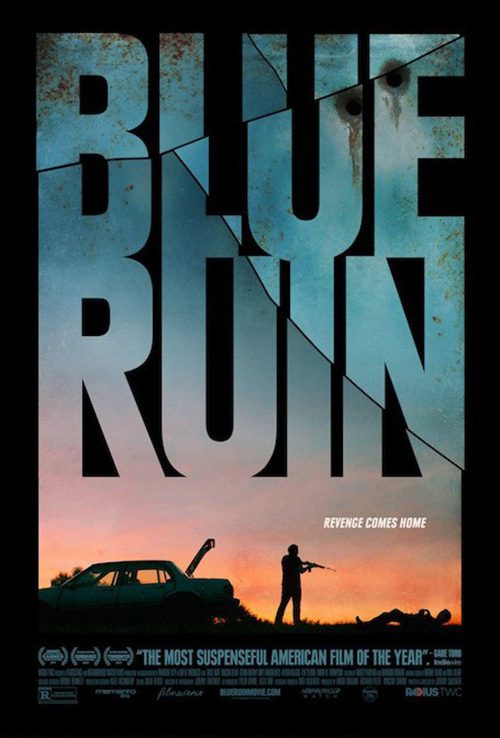
The most egregious example of copycat artwork this month has to be Burn Country (limited December 9). I really think whomever was tasked to design this literally opened a file of Blue Ruin‘s one-sheet and drew over it.
There’s the large text acting as part of the main image with silhouettes of people beneath. There’s the addition of destruction to it in the mode of the film (bullet holes for Blue Ruin, charred edges for Burn Country). And there’s a car in the exact same place because it would be too hard to stick the police cruiser on the opposite side. Even without those floating heads adding an amateurish flavor, however, this latest poster can only show us how great the other was in 2014. The plagiarism here is inexcusable.
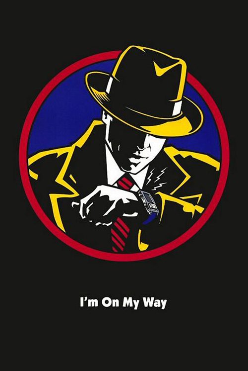
I’ve left Ignition’s Live By Night (limited December 25, wide January 13) for last because I do enjoy the piece. The coloring and shadows deliver a palpable drama and the font of the title is captivatingly unique. It’s not perfect considering all text besides that title is obviously compressed and distorted alongside a bad decision to stretch three of the five lines at top to mess up any hope of consistency, but it’s a head-turner nonetheless.
With that said, I cannot look at it without thinking Ben Affleck has been cast in a new Dick Tracy movie. What’s going on here? I watched the trailer and I don’t remember seeing anything resembling this foreboding aesthetic tone or its yellow hue. So what made Ignition and Warner Bros. go this route? I haven’t the faintest clue, but I’ll give them credit anyway. Whether this visual style ultimately serves the film or not, I desperately want to watch it and find out.
When is enough enough?


There were only three films with massive character sheet campaigns this month so my inclusion of Passengers (opens December 21) is tenuous at best. I mean the film pretty much only has two characters (minus android Michael Sheen and a quick trailer shot of a crew) so moving beyond them is impossible. It’s just a shame no one could put Jennifer Lawrence and Chris Pratt together in an interesting way.
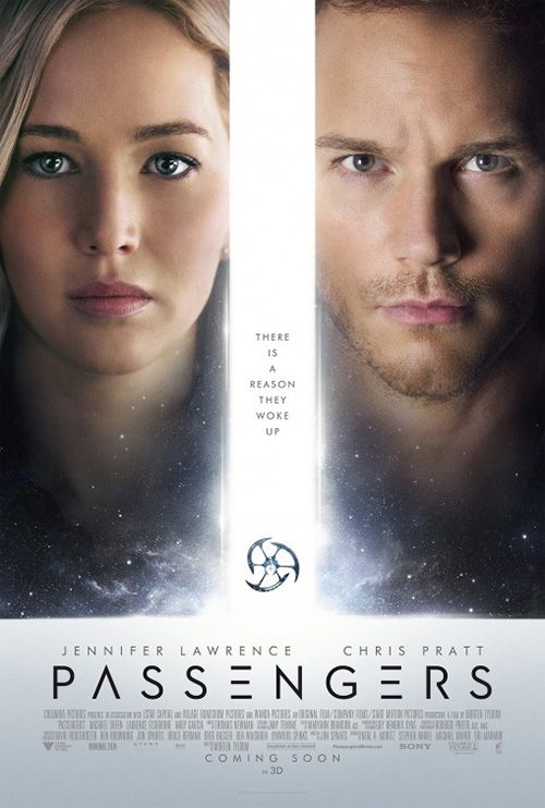
BOND’s sheet is creepy if nothing else because her eyes look dead and his sad. Can’t wait to discover she’s an android too … nah, that won’t happen. I don’t get this glamour shot concept, though, because nothing is happening. Are they looking at us or are they merely there? Why are lines missing from the title font? Why is Morse code being used as a design flourish and why is it five times thicker than the text?
Wonderland’s entry is a lot better and that’s saying something considering it is practically the same concept. Putting the actors on the same level so we can look at their eyes by shifting left to right rather than top to bottom is a plus. Putting them on a space background adds more relevance than stark white emptiness and the tiny spacecraft is a nice distraction for us to shift focus. I guess at the end of the day these two celebrity faces just mean more than their actions.
I think that’s why I often prefer ensemble pieces without a clear A-list name to usurp the whole a la Office Christmas Party (opens December 9). Jason Bateman and Jennifer Aniston aren’t necessarily huge enough to garner special treatment anymore and this fact allows firms like BOND to focus on themes rather than personas. Why not go the Project X route of showing the aftermath of chaos? We’re going to see this movie because of the insanity. A destroyed office, broken window, passed out randoms, and a urinating Santa deliver.


WORKS ADV can then come in and give that insanity a more personal touch to highlight the actors involved (literally as those featured in each sheet have their names colored at the top in case we didn’t know who they were). Make a bunch of these and put them on a giant cardboard structure with multiple panels. Play with depth of field to enhance the seizure inducing lights and the motion of partying without a safety net. We get a sense of the characters via their expressions and yet retain an air of mystery as to what they are getting themselves into.


It’s BLT’s graphic series that shines, though. It’s nothing special or necessarily attractive with way too many snowflakes, but it allows for the freedom of doing whatever craziness is wanted without needing to spend time setting up a photo shoot. The splash of red adds some spice to the monotone blue and the instruction manual aesthetic fits its office setting. They’re stupid fun, plain and simple.
To a point, LA’s series for Sing (opens December 21) utilizes this same ambition. Let’s separate the characters and showcase something that makes them standout from the others. Have fun with homages to Flashdance, punny fake band names, and showing-off the animated fur and quills to intrigue animal-loving youngsters. This is the stuff theater lobbies were made for and each little critter should get its time in the sun.


If ever a film needed this breadth of posters it’s Sing because the teaser is rather bland. Yeah there’s an animal poking out the window up high, but the whole is just a marquee. No kid is looking at that and begging Mom and Dad to go. There’s no hook. Show the stage with a singer in the spotlight, not a bunch of names kids could care less about.
It’s a different story with Rogue One (opens December 16) because the world is what many gravitate towards—especially when the cast is completely removed from the usual Skywalker clan. I don’t exactly love the awkward fighting on the bottom of LA’s tease but the juxtaposition of the Death Star in the sky above the horizon line is awe-inspiring. This is a galaxy far far away and we get to bask in its beauty before the violence officially begins.


And from there you can just run wild. It’s Star Wars so you don’t really need advertising to fill seats. Those tickets are being sold regardless. So go all-out like BOND with their Asian sheet focusing on light and composition. Superimpose blueprints on faces and pay homage to old painterly collage work. Besides that first upside-down triangle IMAX design bottling everyone up into a confined space, the other assumedly opening night giveaways are quite attractive.


BOND’s white version of said triangle with softer edges is my favorite, their illustration with a giant Felicity Jones looming my second. LA’s Darth Vader as backdrop concept is nice in an “appeal to fanboy anticipation” way, but it’s a tad too busy. All in all, though, Disney has the resources and confidence to go beyond straight photography and they embrace the idea of collector’s items to make it all worthwhile.
Advertising the “must-see”


Like with Rogue One above, must-see cinema is afforded a leeway others are not. You can add more style and abstraction, focusing on mood rather than star-power because your audience is already aware of the work. So what emotion are you going to convey? What aesthetic insight will you share to set your film above the rest? Because even though it probably will be seen, ensuring everyone goes opening weekend rather than wait is crucial to longevity.
Is 20th Century Women (limited December 25) a must-see? I’d argue yes considering Annette Bening has a real shot at an Oscar nomination and the A24 shingle is practically a stamp of cinephile approval. And with the rest of the cast equal to the task of supporting Bening, why not give them some of the glory too?
This poster evokes a feeling of joy and promise in its beach setting and lens flare—not to mention three and a half smiles to counter young Lucas Jade Zumann’s look of determination. It blinds us by putting those glare bubbles everywhere, covering the title too to make it shimmer. As for those boxes at the top consisting of seemingly random items, if you’re aware of Mike Mills’ work you’ll know they’re a comment on his style. Just like in Beginners, this latest piece uses static images of people and things to better contextualize his characters throughout.
It may not look like much on first glance, but this sheet embodies the film completely with just enough uniqueness to turn a few heads.
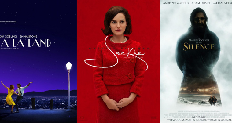
I believe BLT’s Silence (limited December 23) does too although the jury is still out for me. It’s an intriguing choice of artwork because so much is distorted from the darkness of Liam Neeson’s portrait to the tiny size of stars Andrew Garfield and Adam Driver at bottom. The haze makes the former look God-like, the latter pair his disciples (which I believe the trailer does render fact). Unfortunately, however, it also bears resemblance to Frodo and Samwise searching for Gandalf.
And while I enjoy the font selection for the title, using it for all other text may have been a mistake. The thinness of its serif forces it to be enlarged beyond subtlety until becoming distracting. Those names at the top keep stealing my attention away, the blackness popping them off the white smoke too much to simply look and forget.
The idea behind this one is worthwhile, but the execution leaves something to be desired. Again, though, it doesn’t really matter. Like Quentin Tarantino so brashly does, you could have just put the words “The New Film From Martin Scorsese” on a piece of paper and people would come.
Patriots Day (limited December 21, wide January 13) is one where the topic is enough: the Boston Marathon bombing. Mark Wahlberg in the lead is a box office plus just like the partnership of he and Peter Berg for a third time in two years, but they pale in comparison to the central tragedy. And that’s why LA’s decision to use Cullin Tobin’s photography of loose shoelaces as American Flag is a powerful one.
The design has its issues—namely the title awkwardly pushing “Day” huge as though it’s the important part of the holiday’s name—but you will be looking at it when you pass by. That red, white, and blue is bright against the black background and the optical illusion of believing it to be a flag will jar your attention to look more intently. It’s all about patriotism and sticking together to honor victims of tragedy. Those who died and/or were injured didn’t realize the finish line would become the frontline of war until it did.
LA’s La La Land (limited December 9, wide December 16) puts it all together. It knows Emma Stone and Ryan Gosling are attractions, but also that atmosphere is king. This is a callback to Hollywood musicals of old and as such the poster should mimic this feeling of excitement, promise, and fun. Seeing those two actors in dance as only arms up and legs kicked can describe is therefore the perfect pose with a light post (Singin’ in the Rain) adding more genre flavor.


I love the vast expanse of emptiness that isn’t empty too. Just because there’s no text block doesn’t mean the starry sky or lit city on the horizon don’t have substance. The coloring is dark but welcoming, the notion of “dream” perfectly embodied in its hue. Gosling’s white lifts him off the sky and Stone’s yellow pops her off the page. And that font used is wonderfully modern with Art Deco appeal to harken back to yesteryear.
If you are going to fill those empty spaces with text, though, credit LA for altering their layout from dancing to gazing. Suddenly Gosling and Stone are looking at the praise with us, basking in its platitudes and begging us to find out if those critics are right. The graphic piano key tease and old school album cover version are nice and different also, but neither delivers the air of importance that blue sky provides. Something about the first example above simply puts a smile on your face.
What’s in a name?


I have no idea what’s happening in the poster for Toni Erdmann (limited December 25) and it’s all the better as a result. Is the lead actor hugging a gorilla? Is that Sasquatch? It’s such a captivating image that I don’t even mind the abundant critic quotes littering the frame without rhyme or reason—although I wouldn’t mind seeing it without them too.
It can be overwhelming as a visual assault with so many words, but the coloring helps us traverse the chaos. We can filter out the quotes as highlights in the “monster’s” hair mimicking her blonde locks and the white almost disappears without us having to try. This leaves the blue title to draw our eyes in. This is the name we need to keep on our lips to ensure we remember to visit the theater once our city is lucky enough to have it grace the big screen.
Barfutura’s Spanish poster for Julieta (limited December 21) intrigues in its own mystery despite the faces of those involved being clearly visible. It’s an odd pose with one actor above the other, drying her hair but stock still as both stare daggers into our souls. These are fighting glares, both women provoking us with a sense of sensuality and danger.
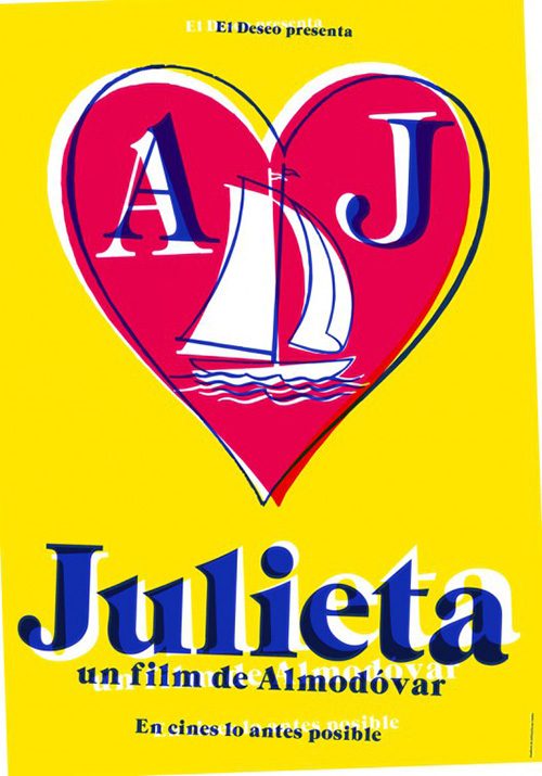
The image is great design-wise too because it bisects itself solely through its color. I have to believe the Spanish flag allusion is intentional considering it’s Pedro Almodóvar’s home country, but I’m not certain. All I know for sure is that the yellow and red give both women their own halves to exist separate from the other while remaining a cohesive whole. And I love the thick white letters of the title, its lowercase appearance a subtle choice that ensures we take note.
I enjoy the firm’s tease too mostly because of its use of color separation via the printing process. The red, yellow, and blue plates are all out of sync and it gives the design a virtual sense of animated movement. Our heads almost tilt to the right as though the graphic is rotating clockwise off the page. We engage the page and keep it with us via the interaction.
The decision to use three different fonts should irk me where The Refinery’s Paterson (limited December 28) sheet is concerned, but it doesn’t. I actually find myself mesmerized by the heavy sans serif quotes because they’re so bright compared to the rest of the poster. I want to look at the faux handwritten title but it seems almost gray in comparison. It’s okay, though, because while my eyes try to look at the bottom, that bright white drags me up through the image of the actors sleeping underneath a filter of poetry.
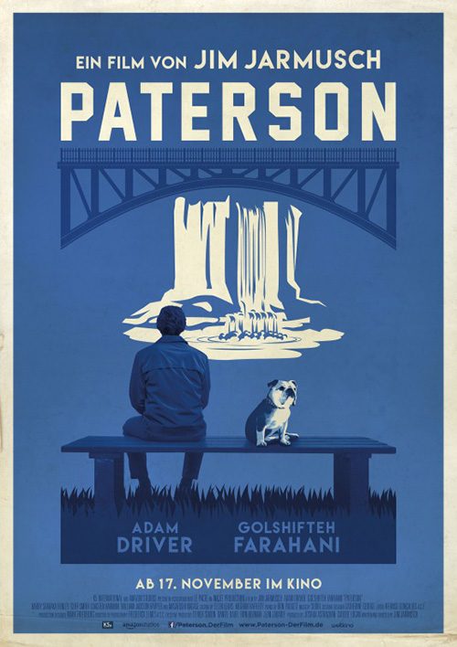
It’s that fancy serif at the top showcasing their names that provides the third font, but it’s different enough from the other two to not be distracting. The selection is so thin that it gets lost a bit, falling into the background with the poetry overlay so that the quotes appear to be assaulting us in 3D. The effect is great because it fabricates layers of depth for us to dive into past the words to that bed of loving embrace. This is soft romance enhanced by contemporary hard-edged typography.
The German graphic entry pales in comparison even though its aesthetic does lend it to old school destination advertisements. Maybe drop the “Film by Jim Jarmusch” and add a large “Visit” above Paterson to go fully into that homage. And maybe do something about the actors’ name placement considering this one makes it seem as though Golshifteh Farahani is a dog.
The obvious choice for poster of the month has to be Jackie (limited December 2), though. This thing is stunning in its simplicity, grace, and style. The red on red coloring is inspired with shadows outlining Natalie Portman just enough to separate her from the background. It’s the type of fashion choice meant to turn heads in the 60s and will still do so today amidst a wall of glossy photography.
But it’s the expert typography that reveals itself to be even better than the color. First comes the recreation of Jacqueline Kennedy Onassis signature to literally wrap itself around Portman as though in a heartfelt embrace. Next is the actor’s name just dark enough to pop above the red but not enough to overpower the white cursive. And finally there’s the tiny director line in white to differentiate it from the whole so its size doesn’t force it to be lost.
It’s as gorgeous as I’ve been told the final film proves in its own right.
What is your favorite December release poster? What could have used a rework?