Now that Tenet has officially been removed from August’s slate so it can be released in international theaters while our country continues to botch its COVID-19 response, you can settle in for another four weeks of VOD, Digital HD, and Drive-Ins (if you’re lucky enough to have one close by). Unhinged (discussed in last month’s feature) is holding out hope nonetheless in its quest to be the “first” indoor theatrical-only release despite our nation’s constantly moving restart, but that doesn’t guarantee its August 21 date succeeds where its others have failed.
Regardless of that outcome, the question remains whether or not you’ll walk through the doors of your local multiplex anyway. All these posters may be caught behind glass with no eyes to peer upon them before another week goes by without any recollection that they were even there. So bask in the work’s splendor via its digital form for one more month (or longer if you and/or your governor so chooses). It, unlike the films themselves, is no less effective in any form.
Familiar Portraiture


I get the desire to ensure that we all know your film’s name, but you shouldn’t cross the line separating bold and distracting to do so. That’s exactly what the poster for Spree (Limited/VOD, August 14) does by rendering its title treatment with what looks to be a knock-off sans serif font in bright red with a black outer glow. It’s barely legible and yet I cannot look away from its assault on my senses.
It’s a real shame too since the rest of the page works at mimicking a cellphone screen aesthetic with cracked glass, superimposed menu bar, and critic quotes as social media comments. Heck, I even like Joe Keery’s crazed and bloodied face begging for us to wonder what happened. But that title: woof.
Get Duked! (Prime, August 28) isn’t much better with its bright yellow paint strokes, but at least we can read it without any problems. Name change aside (it hit the festival circuit as Boyz in the Wood), I’m not sure what the designers were going for since it’s neither graffiti nor handwriting. It’s manufactured messy that isn’t messy at all.
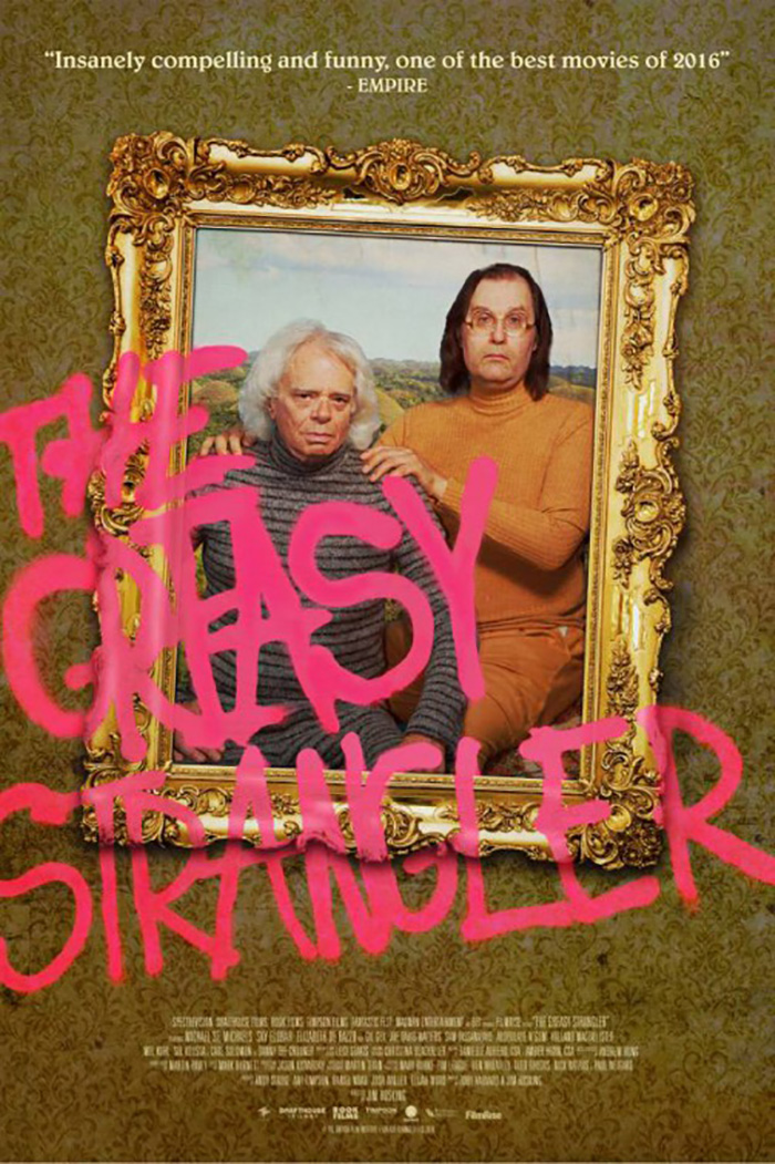
This would be so much better if they went full Greasy Strangler so the title becomes spray paint atop top the boys’ faces. Give the whole a bit more authenticity by interacting with its depth because it all feels as flat as the paper its printed on here thanks to the Photoshop sheen inherent to the choice of isolating multiple pieces within the same scene rather than integrating them.
The taxidermy concept is solid considering this quartet is being hunted though the Highlands like deer, but it’s all too plastic to truly embody the rustic nature of a trophy wall. Its execution deserved a few more drafts.
Less is ultimately more by stripping things down to realize the delicate balance between evoking a mood and forcing one upon your audience. BLT Communications, LLC finally gets us going in that direction with An American Pickle (HBO Max, August 6). They marry focus, aesthetic, and intrigue together to stop each from competing against one another in a war of attrition that leaves the viewer wanting nothing but an escape.
Seth Rogen is the sell and put front and center as a result, but there are no antics like the previous two posters. He isn’t being made to do any heavy lifting because time and place are able to pique interest instead. With a decorative frame and subtle fuzzing reminiscent of daguerreotypes, we become transported to the past in order to understand his story. Mystery exists in the unknown.
The same can be said about The August Virgin (Virtual Cinemas, August 21) and its gorgeous job at highlighting its lead Itsaso Arana without making it seem as though she doesn’t belong within the scene crafted behind her via filtered background and appropriated moon. Her portrait becomes more than mere photography as those abstracted color fields place atmosphere above location and metaphor above reality.
There’s also a wonderful texture to the piece that elicits a sense of tactility digital pixels shouldn’t be able to conjure. Who needs the printed page when you can fabricate its medium this well? (That’s a rhetorical question of course. Nothing beats it.)
Enhanced Portraiture


Creative Partnership’s poster for The Personal History of David Copperfield (limited, August 28) is less an augmentation of a regular portrait and more an additive variation on that very traditional idea. It’s still all about the titular character as played by Dev Patel and he’s still very much front and center giving us a wry smile that alludes to Armando Iannucci’s irreverent humor, but it also gives us something beyond the physical by providing an insight into this man’s creative mind through sketches floating about his head.
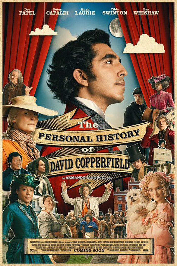
There’s a Disney princess quality to it with those pages swirling around him as though they are fairy godmother leaves of magic about to transform him from rags to riches like the tagline states. That we get a sense of the playfulness that drives this metamorphosis is the design’s success because without it the whole is rather generic.
That’s why I personally prefer Concept Arts’ version and its cutout collage that’s unafraid to leave rough white edges around each actor or lean into the layering effect with subtle shadowing. It feels like a Terry Gilliam-animated sequence from a Monty Python film with everyone coming into frame to assault our senses as a conniving Ben Whishaw sneaks in to skulk around the back.
Why have just one portrait, though, when you can hold eighty heads together with nails and place them upon your subject’s neck instead? Leave it to an Alejandro Jodorowsky film to answer the question with a “Why indeed?”
This is exactly what we get out of the illustrative sheet for Psychomagic: A Healing Art (Alamo On-Demand, August 7). A documentary about the auteur himself and how his theories on trauma therapy have impacted his outlook on life and the films he has made, a body covered chest high with water that holds numerous cartoon faces seems about the best way to advertise whatever wild journey he’s constructed for us.
It’s a captivating art piece regardless of what it’s selling, however, from the Bill Plympton-like body to the New Age font to the lack of typographic clutter. You see this image and you want to know what is going on. You see Jodorowsky’s name and realize it could literally be anything. And you either run away screaming or start knocking on the box office window for a ticket.
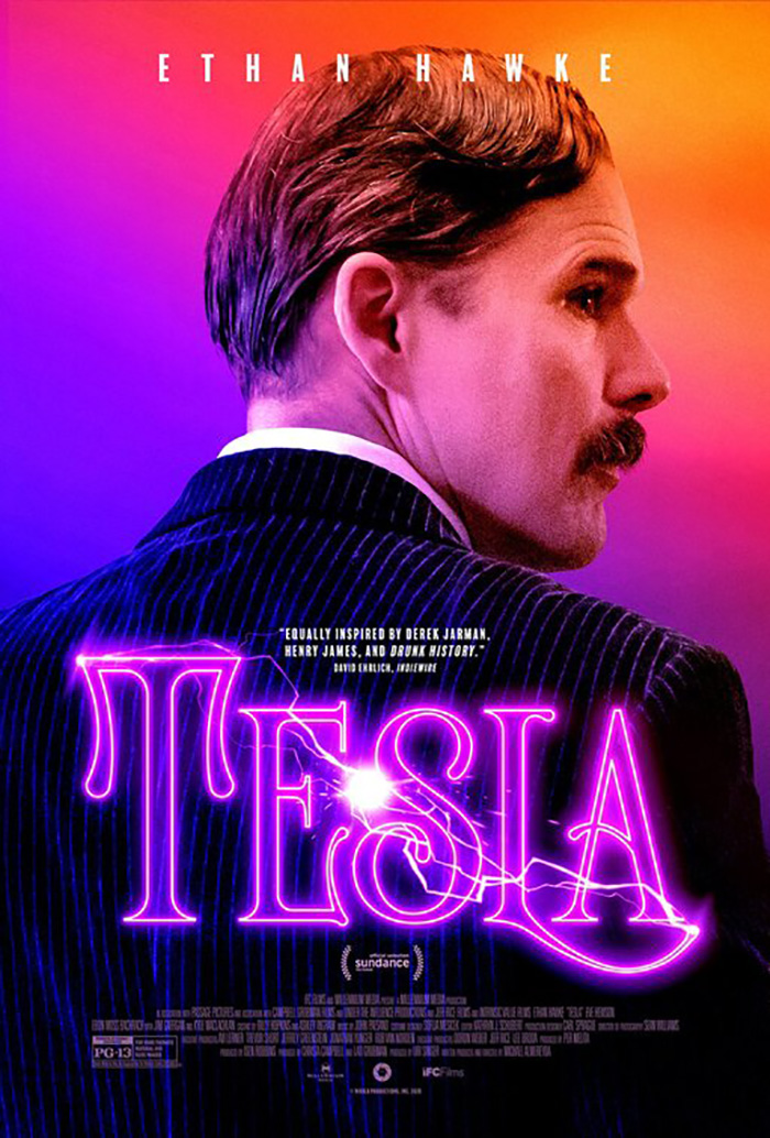
Tesla (VOD, August 21) doesn’t go quite so far to completely filter its subject through drawing, but it does infuse some brilliant coloring work that makes it so Ethan Hawke becomes a human police light alternating between blues and reds for an eerie yet attractive glow.
Brandon Schaefer’s stunning font choice taken straight off a checkout aisle paperback cover puts this one over the top, though. It has the perfect era-specific feel and the lavish curves to hold the electric light coursing through its outline to emit a pulse of drama rather than hokum. Who knows: maybe they cribbed the concept from the synth beat opening credits of Hawkes’ daughter’s show Stranger Things. (It was actually riffed from the 1983 World’s Fair.)

Whether or not the designers on that one forgot to call Legion Creative Group and say they had the color scheme first remains to be seen, but I do believe the latter used it just a little bit better with She Dies Tomorrow (currently playing drive-ins before hitting VOD on August 7). While I can’t speak to Tesla having not yet seen it, I can say that these colors play a very big role in Amy Seimetz’s sophomore masterpiece about contagious fear. Get the bug; see the lights. This is your first and last symptom.
Beyond just riffing on what is used on screen, however, this image also becomes a sort of black light tracing Kate Lyn Sheil’s invisible anxiety as it flies forth from her pores to the next unsuspecting victim. This is like a shake of the head in a mosh pit throwing her emotions out into the world until you can’t help but absorb them in yourself and involuntarily transmit them out.
Shrouded Portraiture


The ominous final sheet for Sputnik (limited, August 14) is a dual portrait of sorts (even if the alien ends up being revealed to have been inside the astronaut the whole time thanks to a kinship with Akiko Stehrenberger’s all-timer, Colossal). It’s man and shadow—predator and prey.


With ample atmosphere and decent lighting effects, there’s a lot to like about this one despite there being so little going on. I’ve seen many try and fail to create a similar mood simply because the artwork’s quality wasn’t up to snuff. The last thing you want is the shadow looking cartoonish or the fog proving too thin to hide the obvious Photoshop masking that went into putting everything together in frame. If you don’t believe me, just look at the alternate advertisement above. The film instantly goes from glossy Hollywood-caliber theatrical release to direct-to-bargain-bin knock-off. The first holds authentic mystery. The second screams unintentional comedy.
That’s not to say you can’t have an effective sheet without photo-real visuals. Case and point: Sunless Shadows (virtual cinemas, August 5). From the crude title font to the painted wallpaper-esque sheet to the silhouetted stool that creates an optical illusion to flatten the whole, this thing is undeniably great. It evokes a desire to reach out and see what’s beneath the fabric despite knowing the answer is nothing. We rip that human-shaped field off and merely reveal the wall beneath.
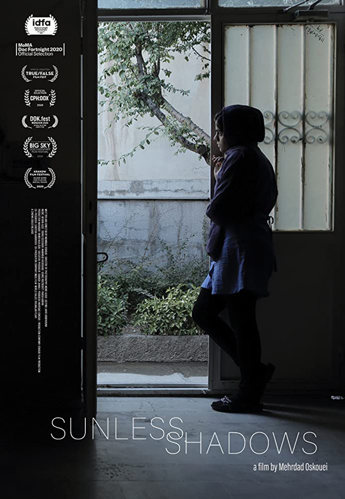
And then the optical illusion pushes in to go beyond flatness and into concavity. It’s as though an invisible figure is standing on that stool. We’re peering under the sheet to see a shape impossibly held by air and yet its existence demands something be there in its place. We are therefore captivated by the emptiness of form much like its photographic counterpart wherein the composition asks us to gaze at an empty doorway onto daylight before we notice the woman standing by its side in shadow.
AV Print takes “shrouded” literally with their poster for La Llorona (Shudder, August 6). Not a horror film in the vein of The Curse of La Llorona and its rendition of the Spanish legend, we still get a veiled woman under embroidered flowers that lends a much creepier flavor than any demonic bride could.
I love the mirroring of floral patterns from fabric to wallpaper and the simple yet austere use of Optima as a title font, but the coup de grace is that central figure and the fact we can still make out a face through the folds without actually seeing one. There’s a nose, half a mouth, and darkened circles masking eyes that are surely looking right back at ours. Is this dictator’s wife muttering incantations or simply taunting us with a cold stare?


A step up budget-wise from the festival sheet, the latter isn’t too bad itself thanks to an evocative image cropped and colored to leave the actress floating both in the water of the scene and on the page housing its facsimile.
And that leaves us with a poster that’s been around for months for a film that’s threatened to open for over a year. Reshoots, release delays, and a multi-billion dollar change of parent companies couldn’t stop Ignition from giving The New Mutants (limited, August 28) what will probably be one of my favorite adverts of the year.
Similar to the Batman v Superman teaser campaign, this one has a ripped look taking us beneath the surface to see what exists under these teens’ skin. It goes further, though, by utilizing the effect with its typography as an abstract window rather than a physical layer. The actors themselves are placed as flat cutouts in a rough totem design, but the text eats into them to create negative space that’s then filled with the drawings of skulls. No matter their powers or their strength, they’re all still human. They can all still be psychologically tortured from the inside out.


It’s a very cool, graphic evolution from the firm’s original 2019 sheet with photography by Frank Ockenfels. Here we see faces trying to break through instead of external forces trying to break in. If we ever do get to finally see the finished film, maybe we’ll finally get to know which is a more accurate depiction for what Alice Braga’s Dr. Reyes has in store.
What is your favorite August release poster? What could have used a rework?