July was optimistically listed as the month when theaters were going to re-open this year despite every shred of scientific evidence proving that doing so would be a dangerous proposition. First came word that certain establishments weren’t going to mandate face masks. Then came the quick backtracking on such declaration due to an instantaneous backlash. And finally Warner Bros. and Disney pushed Tenet and Mulan further back after it became obvious multiple governors would keep theaters shuttered indefinitely.
Two studios are currently still hoping to release their titles this month anyway (more on them below), but don’t be surprised if that also doesn’t happen. Maybe they’ll drop at drive-ins and on VOD anyway or perhaps they’ll get rescheduled yet again. Only time will tell.
Either way, many intriguing titles remain on the docket thanks to streamers, VOD, and virtual cinemas nationwide. We’ve already talked about some (The Truth finally arrives today, July 3), but here are a few more.
Portraits


Is Greyhound (Applt TV+, July 10) using de-aging technology? Because this poster looks more like a Polar Express character than Tom Hanks. What’s worse is that this is an improvement over the Photoshop work utilized on the original one-sheet before Sony sold the property to Apple after COVID-19 struck. At least this one has some texture to go with the smooth plastic surface.
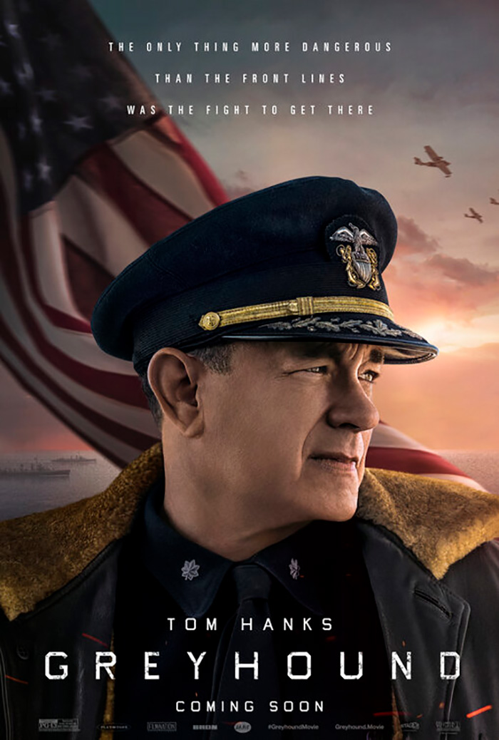
What’s even more glaring, however, is the distinct lack of credit to anyone involved besides Hanks. I get he’s the draw as star and screenwriter over director Aaron Schneider and co-star Elisabeth Shue, but a little bit of recognition would go a long way towards stopping me from thinking this is a literal one man show. I feel like I’m going to sit down and discover the entire project is Hanks giving us a monologue from his Captain’s chair.
LA’s poster for Unhinged (still holding out hope to be the first major theatrical release post-quarantine with a newly scheduled July 31 date) almost does the same by literally highlighting Russell Crowe as the movie. Crowe isn’t in Unhinged. Crowe is Unhinged.
The whole thing is pretty funny if only because it’s trying so hard to be tense. The black and white coloring wants to add some extra grit, but it’s tough to accept it at face value when they go and reverse the first “N” in the title as though that makes things crazier and not more childlike a la Toys R Us.


Thankfully BOND seems to get the joke with their trio of teases. Whether a pair of concentric circle groupings surrounding Saul Bass-like eyeballs or a gas can ready to be blown up by a lit match, this tongue-in-cheek aesthetic has character. Also: the hammer for an “I” proves a much better graphic depiction of the title than the aforementioned backwards “N”. Its design is a bit too clean to be a full-on threat, but it still works.
Character is also what Gravillis Inc.’s advert for John Lewis: Good Trouble (limited, July 3) has in spades thanks to Akiko Stehrenberger’s illustration. I love the juxtaposition of mug shot and knowing smirk as though he knew all along where his life would take him.
What more do you need than that? The numbers say it all: thousands of protests, forty-five arrests, and thirty-three years in Congress. Here’s a hero who owns every single action he’s ever taken and who had the backing of his constituents to continue letting him take that action. Rather than prove an albatross around his neck like his many detractors probably hoped, that jail placard became a badge of honor.
The final poster in this section is the other “maybe” July release. A24 sent a press release two weeks ago saying that Saint Maud was coming out July 17, but so much has changed in those fourteen-plus days to make it seem impossible except as a drive-in title similar to what IFC Films has been doing. I’m including it here just in case.
It’s a good one too—stark yet bold, pious yet blasphemous. AV Print stood strong despite what I can imagine were multiple voices trying to add a “splash” of color. But that would defeat the ingenious use of iconography. If the title were a bright red to draw our gaze, we would completely miss the distinct way in which it fits with the critic quotes to create an upside down cross.
So is she our savior? Or is she hiding evil beneath her robe? Which crucifix will prevail: the one around her neck or the one positioned as her pulpit?
Group shots


You have to like the wildly chaotic nature of the poster for We Are Little Zombies (limited, July 10) because it exists despite the composition itself proving extremely controlled. It’s both a generically mirrored axis (wherein the quartet of children are shown as students and rockers simultaneously) and a messy assault on our senses with bright colors and hidden gems (take a look at what’s creating the two dialogue bubbles housing festival laurels at top left and top right).
What’s really great, though, is the decision by Oscilloscope to make the whole bilingual. Three bits of critics praise are not in English at all while the title comes at us in both English and Japanese. Aesthetics were probably a bigger factor in highlighting the work’s native language than a drive to be inclusive, but it means something just the same.
Legion Creative Group’s sheet for Palm Springs (Hulu, July 10) is subdued by comparison—something you might not have expected considering it’s a Lonely Island production starring Andy Samberg that looks like a dirt-bag Groundhog Day (I say as if Bill Murray didn’t do his best dirt bag for a majority of Groundhog Day itself). Looks can be deceiving, though.
A quick glance will have your brain processing the scene as Samberg and Cristin Milioti day drinking in a pool, but that’s not actually what’s happening. I honestly don’t even know what’s happening. Beyond the surreal setting of having the water they’re floating in be where a desert road should are tiny details that will surely have more meaning upon watching the finished film. From the plane to the dog(?) crossing sign to the 80s-riffic title font, we’re catching glimpses of content through a lens of tone. What better process is there to sell a product without giving everything away?
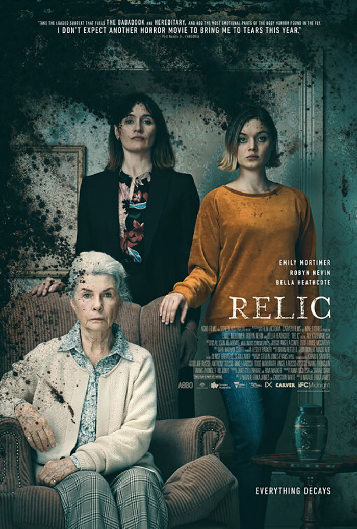
Relic (drive-ins, July 3; VOD, July 10) is similarly all about mood. Rather than show us the main cast with a film still, the designers have positioned them as a family portrait. Whereas MOCEAN allows their version to exist as that object alone, the above goes further to play with what you should expect to experience during the film.
More than just the degradation of time, place, and reality via black mold, there’s also a physical transformation of the place in which they reside. So while these women may be standing in one room for the photograph, who’s to say we aren’t viewing it through a series of doorways that are randomly opening and closing in front of us? Everything will ultimately become off-kilter until we cannot trust our own eyes. The evil permeating the frame isn’t thus erasing what was there. It’s changing it.
It’s a different family affair that drew my gaze even more this month, however. It’s impossible not to turn your head back towards Metamorphosis (Shudder, July 2) if you initially dismissed it because the people in it have all turned their attention back to you. If you ever wondered how to make a pedestrian scene of people in their living room eerie, we have our answer.
All it takes to create such palpable uneasiness is the simple double exposure blur of faces in motion. Some are subtle (the man at right) and some extreme either from distance (the boy at the table) or distortion (the girl at left), but every one of them is unmistakable when compared to the priest at center. Not only is free from blur, he’s also staring daggers at us as though we’ve infiltrated their gathering. I have no idea what the movie is about and yet the inherent creepiness of this image has me wanting to drop everything in order to find out.
And all the rest


The Beach House (Shudder, July 9) is an atmospheric horror/thriller wherein something from the depths of the ocean has come ashore to gradually and systematically wreak havoc. So it makes sense for Mister.S to provide their poster for the film with a sinister feel by cropping the image in a way that hides what’s coming towards us.
Liana Liberto’s partially blocked face becomes like a shark’s dorsal fin—a harbinger of destruction. And there’s a welcome sense of uncertainty in not knowing what the rest of her holds. Is she still the aspiring biologist we met at the start? Or has she become something else?
It’s a bit disingenuous considering her character is the sympathetic lead and thus the one person we align ourselves with as the last vestige of humanity once the “unknown” consumes everything around her, but I get that it’s sometimes tough to sell a mood and your star without taking some liberties. Does the poster make her out to be the villain? Yes. Does it also highlight her presence within the whole? Yes. Maybe fearing what she could be is worth the subterfuge to get us to purchase a ticket despite quickly discovering that she’s actually the one who’s doing the fearing.
The Boland Design Company didn’t care about star power for their The Painted Bird (limited, July 17) poster as they went full atmosphere with diffused lighting and black and white curiosity. Stellan Skarsgård and Harvey Keitel (surely cameos) are but names placed at the top to pique the interest of American audiences who might not usually choose to see a foreign film while young Petr Kotlár gets the spotlight.
I like the scene itself because it shows a state of mind. This is a story about a Jewish boy seeking refuge during World War II and the image portrays him as a figure leaving the light of a home that’s no longer safe to enter a dark forest of unknown horrors. He has no choice but to walk into danger.
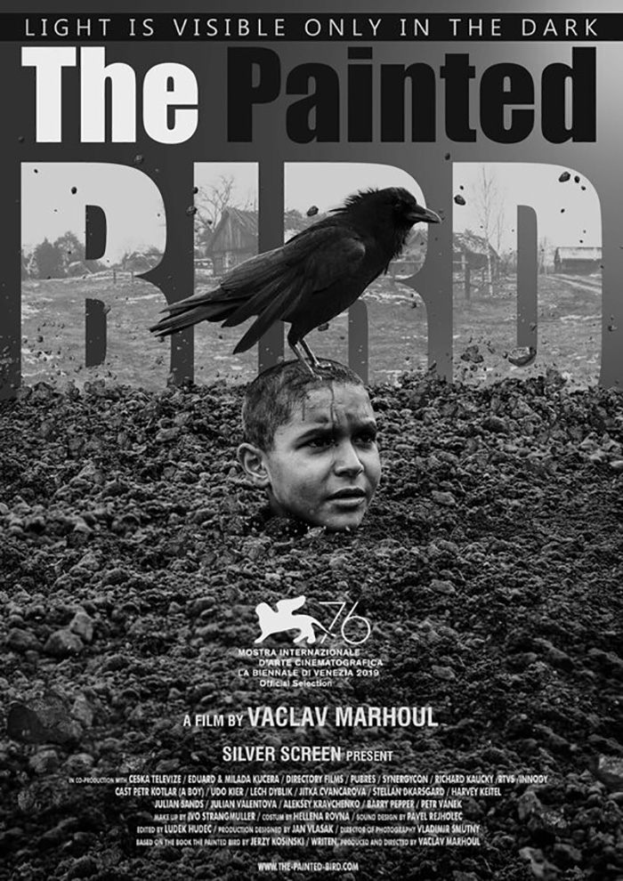
The design is otherwise simple besides the odd kerning and leading used to space out the title. Legibility remains intact while the weirdness of it helps pique interest to at least read what it says. It’s a huge departure from Handy Kara’s festival one-sheet with Kotlár neck deep in dirt while the title’s letters rise as a giant window onto a farmhouse. The name is only three words long and yet it uses three different fills (white, black, image) to muddle perception and risk a quick glance seeing nothing but “The Bird”. Sometimes eccentric and uniform is better than generic and varied.
Rather than use metaphor like the previous two films, the poster for Boys State (limited, July 31; Apple TV+, August 14) provides a literal graphic representation of its topic. There’s the Texas State Capitol Building in Austin, a boy raising his hands for victory atop it (Did he win the teen governorship?), and the title connecting their combined totem into a giant “T” for Texas.
It’s a clean design (helped by it being a documentary and thus able to skip over any cast lists) with only one idiosyncrasy: the critic buzzwords are all lowercase. This choice works to contrast the all caps nature of the title (along with a lower opacity that lets the blue of the background bleed through) while fading away so the “T” remains front and center. The final design may not be exciting, but it is effectively cohesive and coherent.
And that brings us to Art Machine’s gorgeous work for The Rental (limited/VOD, July 24). I’m not sure you could call it metaphorical or coherent without knowledge of the film itself, so its surreal scene becomes the perfect tease dealing in anticipation rather than expectation.
It’s darkly dramatic, hazily mysterious, and meticulously symmetrical to work both right side up and upside down. The latter was definitely the way to go, though, as its inversion of gravity supplies so many unanswered questions whereas a body falling from the sky only possesses one: where did he come from? Now we have connotations of Hell and nightmare. We have the potential for alternate dimensions or impossible physics. And as the title shimmers with its motion blur, we have to wonder if things aren’t about to shift again. For all we know a snap of the fingers will flip the page and find this silhouette falling into bed even if oblivion appears to be the more likely destination.
What is your favorite July release poster? What could have used a rework?