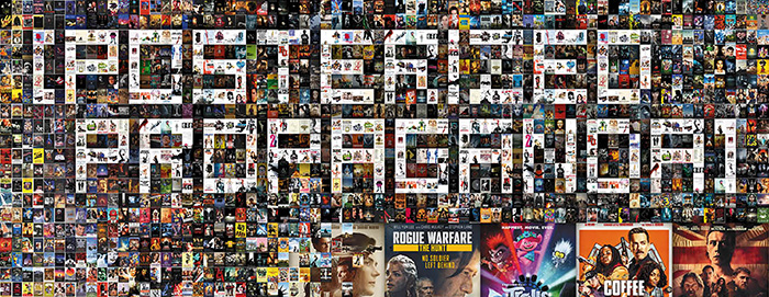
“Don’t Judge a Book by Its Cover” is a proverb whose simple existence proves the fact impressionable souls will do so without fail. This monthly column focuses on the film industry’s willingness to capitalize on this truth, releasing one-sheets to serve as not representations of what audiences are to expect, but as propaganda to fill seats. Oftentimes they fail miserably.
Well that was unprecedented. First came the studios pushing titles back a few months. Then it became a full year. And then, overnight, is was deemed unsafe to release anything in theaters as the establishments meant to provide artistic escape in times of strife went dark to aid our long fight against the COVID-19 pandemic.
So not only did a lot of films I talked about last month not end up coming out (My Spy was moved to April 17 and now might get moved again), but pretty much every big (and biggish) April release was postponed too. You can’t blame the distributors for wanting to wait for an actual box office despite millions spent in advertising because that weeklong engagement also means Oscar eligibility (which will hopefully be overhauled in light of those that were forced to go VOD unplanned).
All that to say this month’s column will be brief. Besides Universal Studios’ decision to drop Trolls World Tour (April 10) on digital (along with those few theaters around the country that remain open) and the streamers (Netflix, Amazon, etc.), the pickings were slim. Maybe these posters will turn your head enough to check them out from the comfort of your home.
And don’t forget to support your local theater via gift cards and virtual cinema offerings they may be providing in the meantime!
Collage party


The easiest way to advertise a film is to put the cast into frame and call it a day. I know that’s a reductive way of looking at this common formula when you have to consider cast contracts demanding billing on all aspects of a project, but it’s tough to think about the reasons when the unfortunate results are all you can see.
We Summon the Darkness (VOD/Digital HD April 10) is a perfect example of just how piecemeal these types of advertisements can become. It’s as though the studio gave their designers ready-made pieces to do with as they might: cutouts of the main cast, a grungy pentagram, and a generic silhouette of concertgoers. What they got back were two sheets that epitomize the tagline, “Be careful what you pray for.”
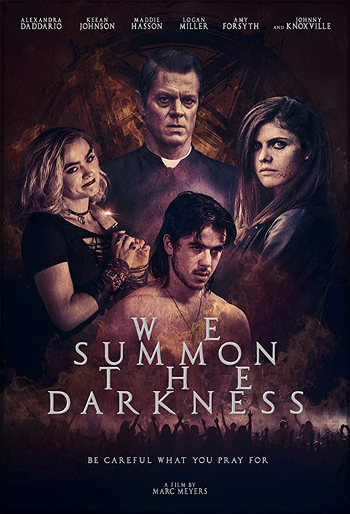
I have to give credit to the red one above because it includes Amy Forsyth (even if her name is missing from the top). In many ways she’s the lead of this film because she’s our entry point into the craziness that ensues. Add the playful title treatment that gets at the tone of the whole and you could do worse.
That’s not to say the other is worse. If anything I’d say they’re on par. I like the dark coloring because it hides the obvious mask lines against the red background and something about the title works even if I’m not sure why. Is that kerning forming a skull or something? Why such big gaps in “We” and “The”? Who knows?
The Refinery Creative appears to have wanted to avoid their own artificial mask lines by blurring all edges within True History of the Kelly Gang (theaters and VOD April 24). It works in concept by using the hair as a more natural delineation between actors, but it cannot save the whole in execution. Why? Because the scale shifting between characters is glaring and the amount of “scenes” included is way too high.
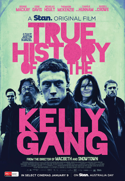
I get making George Mackay huge as a focal point for your lead, but then you have Russell Crowe and Charlie Hunnam smaller, Nicholas Hoult smaller, and Essie Davis even smaller. Throw in two stills you can barely make out and a couple people point guns off-screen despite everyone else looking forward and it’s hard to know where to look long enough to keep your eyes from closing.
The Australian poster is much improved in this regard as its quintet could feasibly be standing together in a triangle formation. I’m not sure about the title treatment making it seem as though this is an edgy cable drama for tweens, but you have to do something with an unwieldy name comprised of six words.
In order to avoid the idea of naturalism altogether, Concept Arts went with a contextually relevant framing device to lean into the fact that their poster is a collage. By giving Coffee & Kareem (Netflix April 3) a police badge to house them, everything can radiate out from the center title. We get stars at top, secondary players a bit smaller at the middle, and one scene at the bottom depicting a few more cast members for good measure. It’s giving us a lot, but in a way that doesn’t overwhelm. And it’s having fun in the process.
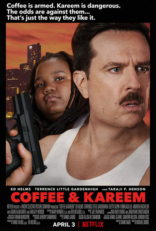


That humor is then amplified with a trio of alternate takes riffing on ubiquitous action films from the 80s. There’s Die Hard, 48 Hours, and Beverly Hills Cop. We’ve seen this type of parodying many times before, but I give Netflix credit because they didn’t have to go that extra mile. It’s a streaming movie that might not have gotten a theatrical release anyway. But they gave it a chance to be seen by tapping into the nostalgia machine.
While the above Coffee & Kareem collage is the most effective of this bunch, however, I’ve put The Quarry (theaters and VOD April 17) last because it utilizes a different technique than the rest. Rather than merely slap everything together, the designers have turned one actor (Catalina Sandino Moreno) into the frame that Shea Whigham and Michael Shannon inhabit.
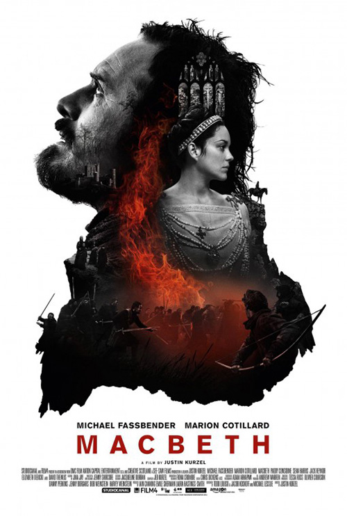
This is never a perfect solution since it generally forces the whole to float within the white space of the larger composition (see MacBeth for a more egregious example), but the coloring and distressed aesthetic of paint help to ground things here. And the fact that they could also include two scenes at top and bottom without distracting us (the spacing between faces lets us breath easy) reveals just how busy We Summon the Darkness and Kelly Gang truly are.
Straight and to the point


I don’t know what’s happening in this teaser for Bad Education (HBO April 25). If I remember the scene correctly, Hugh Jackman is talking to an assembly of people about how he’s vaulted the school district to number four in the country. Because we can see an audience at bottom, those white specs cannot be flashbulbs. Because it was indoors, they can’t be snow drifting above the blue word either. Film stills prove that most of them are actually ceiling lights, but what about the rest? Is it an affectation to suppose a dream? For anyone who knows the story, nightmare is more apt.
For all I know this isn’t even an official HBO release (can’t find it on their website), so talking any further on motivation is probably a moot point.
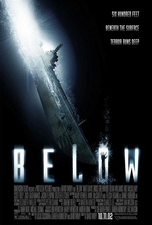
This poster for Sea Fever (VOD and Digital HD April 10), however, is definitely legit. And it may surprise you how much work it’s doing to embody the feel of the film despite seemingly looking like a generic horror tease. Because while Hermoine Corfield’s silhouette against light adds a commonly used aesthetic sense of suspense and dread (see BLT Communications, LLC’s poster for Below), her isolation is a physical (literal at times) and psychological (figurative throughout) truth in the film. And the almost imperceptible pattern of blue beyond the white isn’t arbitrarily drawn either.
I do wonder about the title treatment, though. While cool to make the “A” of “Sea” into the upside down “V” from “Fever” where sci-fi flourishes are concerned, it doesn’t quite work in execution. Had the words been left justified so “A” and “V” mirrored each other along a vertical axis (with “S” and “E” perfectly centered above the “F” and “E”), things would be different. That would lend purposeful symmetry and synergy above mere gimmick.
Rather than use a still of protestors, Slay the Dragon (limited and VOD April 3) very succinctly provides us with a visual representation of gerrymandering. How has the Republican Party turned those tiny shapes of red at top into giant state-sized shapes of red at bottom? How are they working to expand their practices until they end up turning the entire nation red with a roll of paint too?
It doesn’t get much straighter to the point than that—especially since the designers were able to execute this metaphor while maintaining tried and true poster language tactics like keeping the title bold and center, colors clear and bright (and patriotic with red, white, and blue), and all other text sectioned off to be read or ignored at your leisure.
They’re the exact same tactics Gravillis Inc. utilizes on Selah and the Spades (Amazon April 17): centered focal point (actor and title), pertinent textual details isolated at top and bottom, and a simple three-color palette.
Because the white of Lovie Simone’s uniform is the brightest spot of the whole, however, you do find that the title gets lost a bit in the background. It’s a similar color to the accents of the ornately augmented chair she sits on, its distressed nature and inconsistent sizes and shapes helping align to those swirls and highlights. It is still legible, though, and its unique font does ultimately set it apart. I just think it was a slight miscalculation of contrast.
Standing apart


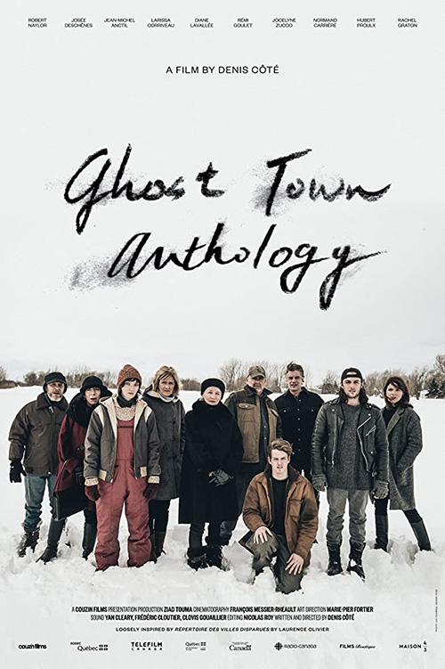
While I don’t often enjoy posters composed of multiple windows on a grid showing disparate scenes from a movie, Ghost Town Anthology (MUBI April 21) proves an exception because of its unorthodox aesthetic. Instead of sticking photos together, this designer has stripped each image into grainy, almost indecipherable exercise on positive and negative space. Shadows become bright fields of color and silhouettes rule the day via a computer-effected stand-in for post-impressionist pointillism.
It’s attractive precisely because it’s ugly—something its English-language counterpart eschews for a more traditional sense of symmetrical beauty composed upon a vertical axis. This one wants to add some smudgy personality too through its hand-drawn title, but it comes off as more of a dissolution effect than an in-your-face stroke of boldness.
BLT’s Tigertail (Netflix April 10) won’t be called bold either, but its simplicity renders it effective nonetheless. You could dismiss it as just being an image and title, but it’s doing so much more visually in the background. It’s extracting the “T” from the alliteration of “Tiger” and “Tail” and basing the entire composition on its shape. The title is the top horizontal with the intentionally full-justified director box and Chinese characters beginning the descent of its column straight down to the running boy. Our eyes fill in the rest as they read along.
For midnight marauder’s To the Stars (VOD and Digital HD April 24), the blank space is the point. That there are no stars to be seen in this gray sky keeps things grounded to reveal space was never on the agenda. Our eyes therefore sink fast through the cast names to the vintage, dollar bill-like font that brings us back to the 1960s setting of the film and over to the women at left thanks to its words’ diagonal steps bisecting the page along with the slope of their heads.
The black and white coloring allows the title to pop without needing a bright hue to do so and the overall texture provides a tactile quality we want to reach out and touch. Rather than depict a grainy image, the pattern becomes the fibers of the paper—a soft cotton blend offsetting the tense drama unfolding within the scene.
No matter how good that one proves, however, The Refinery Creative’s sheet for The Other Lamb (limited, VOD, and Digital HD 4/3) is on another level. From the deep saturation of the colors making Raffey Cassidy’s blue eye our obvious focal point to the barrier wall of string providing depth that close-ups rarely contain, we can’t help but feel uneasy as we confront her presence devoid of context.
Are we protected from her by that barrier? Or she from us? The blood upon her forehead and mouth merge two different moments from within the film (dream and reality) to force us to question whether she’s victim or foe.
And like a page of sheet music, the letters of the title become notes to read, study, and absorb. Maybe the “other” of the title deems her a pariah. Or maybe it marks her strength as a new contender for power. Because her gaze is determined and absent of fear, you’re safe to assume the latter.
What is your favorite April release poster? What could have used a rework?