“Don’t Judge a Book by Its Cover” is a proverb whose simple existence proves the fact impressionable souls will do so without fail. This monthly column focuses on the film industry’s willingness to capitalize on this truth, releasing one-sheets to serve as not representations of what audiences are to expect, but as propaganda to fill seats. Oftentimes they fail miserably.
October is here with a fantastic collection of poster designs from big studio pictures to small independents looking to standout against them. It makes sense since awards season is now upon us with the “prestige” festival season having recently completed. There’s a lot coming each week this month and many will be lucky to get a second week depending on the size of your market. So hook ’em early and hopefully reap the rewards.
Compare and contrast


It’s interesting to look at ARSONAL’s (with photography by Sheryl Nields) The Hate U Give (limited October 5; expanding October 19) and riddertoft’s Border (limited October 26) together because you’d generally assume the Hollywood production would want to fill the frame while the foreign import would remain stark. While the opposite is true here, the effect is no less successful with either. One is focusing on the message its title brilliantly represents as the other strives to capture your attention with the surreal.
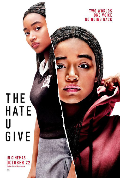
The former’s title might be more obvious to discern in motion at the end of the trailer, but justifying the words to the left so the first letter of each lines up does the trick in print with a subtlety no blatant in-your-face maneuver can possess. That “U” is intentional so we read “THUG” as we move from top to bottom—a label many have weaponized as a means to dehumanize an oppressed population desperate to survive. And it’s potent enough to understand the meaning, its placement on a sign held by a young black woman in a hoodie providing the context we need. The bright white ensures we can’t look away.
Much like the trailer highlighting this duality, the UK sheet falls prey to a knee-jerk desire to make certain the audience gets the message. Putting these “two” different versions of Star together may even subvert the idea of confronting us. This could be intentional (I haven’t seen the film yet), but this one pits her two halves against the other rather than specifically engage our humanity (or bigotry depending on how racist you are). I’m sure this is intentional—that compartmentalization to exist in two vastly different worlds those with privilege are quick to say don’t exist—but to me the domestic sheet calling us out is much more effective. It could simply be a result of America and Britain’s differing relationship with the issue.
That level of starkness from the first couldn’t work with something like Border. It’s not entrenched in this political and social tipping point happening in our nation and thus must lean into what it does possess: the weird. This poster is gorgeous with its face either sinking into the ground or that greenery rising to consume it. You can’t help but want to take a closer look to try and comprehend what’s happening and why. The firm lets the imagery speak for itself, doing little with text other than highlighting the actress, title, and director. What more do you truly need?

The US poster loses that sense of the otherworldly. It’s not bad per se, just much less powerful as far as providing something no other design on the wall has. Now we have a critic quote, a comparison point (“We know you don’t know the author’s name, so we’ll mention that cool movie you saw that you also didn’t know he wrote”), and a tagline. The latter is good: “Sense Something Beautiful.” But what does that mean in context with this image of two people screaming at the sky? I also hate that there’s so much white space above the laurel and yet the tagline is squeezed in above the distant mountain. My eye can’t stop moving directly to that near overlap because it didn’t have to be that way.
With Life and Nothing More (limited October 24) and P+A’s Wildlife (limited October 19) we see a number of similarities. There are the actors in semi-profile looking at each other or off-screen and the titles floating at the top in very specific fonts providing a sense of personality and authority respectively. What’s different is how the mood and drama is created by minimalism and metaphor. One is dark and mysterious, the other a depiction of its artificial façade risking to come crashing down.
It’s great to compare them from a distance because P+A has done a wonderful job letting their text-heavy sheet fade into the background. Looking at them above as small thumbnails really shows them to be striking in their simplicity despite up-close appearances that would assume otherwise. Where Life and Nothing More gives you raw emotion, Wildlife finds a way to somehow equal it while still fulfilling its studio-driven obligations for credit and buzz.
Studio pizazz


So is it Mid90s or mid90s (limited October 19)? I prefer the latter—how BLT Communications, LLC formats the title on their teaser—but it seems the former is official (on A24’s website, IMDB, et al). Does it matter? Not really. I just find the lowercase more pleasing to the eye as the capital “M” ruins its informal flow. Sadly what looks good doesn’t always dictate what people want for professional reasons. They’ll simply dismiss this discrepancy as a result of the poster wanting to use lowercase for everything, but I’ll be here thinking about the missed possibility.
I believe that aesthetic should have been embraced because of the film’s subject matter too. This is a young teen trying to cement an identity he can live with against those others would enforce upon him. This is the struggle every boy in the movie combats with differing success so the lowercase is a nice way to portray how new to this world and unprepared they are. Squeezing everything together without a space already brings us to a juvenile incongruity of English “norms,” so why not go all the way with it?


While that great use of typography was retroactively replaced, Warner Bros. went all-in on Concept Arts’ treatment for A Star Is Born (October 5). It’s an interesting layout with the staggered alignment of words seemingly arbitrary at best. There were many opportunities to align serifs or letters and the firm took pains to ensure none were used. The leading between lines one and two is tighter than that between two and three and the placement of actor names is off-centered and almost an afterthought. It’s kind of a mess and yet it somehow works.
I wonder if the perfect use of gradient that lends the whole a brushed metallic finish lets us forgive the rest. Making that gold look gold on a regular printer without any special foils or inks isn’t easy and yet it appears effortless here. That effect also mixes well with the muted coloring and hazy background, popping for some subtle flair against an otherwise simplistic visual.
And the image or color scheme doesn’t matter as evidenced at right. Give Gaga and Cooper a smile, have them touch heads affectionately, and voila. Much like the film itself these posters provide a clichéd, oft-remade property the homerun hit you simply wouldn’t believe until seeing it for yourself.
Typography aside (it’s a gorgeous font), InSync Plus’ poster for Beautiful Boy (limited October 12) is both attractive and fitting. If you’ve seen the film you’ll know a lot of it takes place as memories of happier times on behalf of Steve Carell’s character, so this faded photograph hits upon that nostalgia with authentic emotion. Even if the concept didn’t work for the art itself, though, the care in rendering those folds and its muted Xerox monochrome is stunning. You could say it doubles as a “missing poster” too. This is the son he has lost. Maybe Timothée Chalamet’s character will see one posted around town and not recognize who he’s looking at.
As a composition it’s objectively nothing special and yet it stands out because of the choices within that frame. Cast list, image, title, and credits: so many posters follow this template. Few filter it in intent. Few choose a unique font that embodies its tone. And fewer still stop one piece from overshadowing the rest. The focal point is revealed to be those smiling faces—a miniscule piece of the whole. We’re shown what once was so the film can devastate through that harsh reality that it may never be this way again.


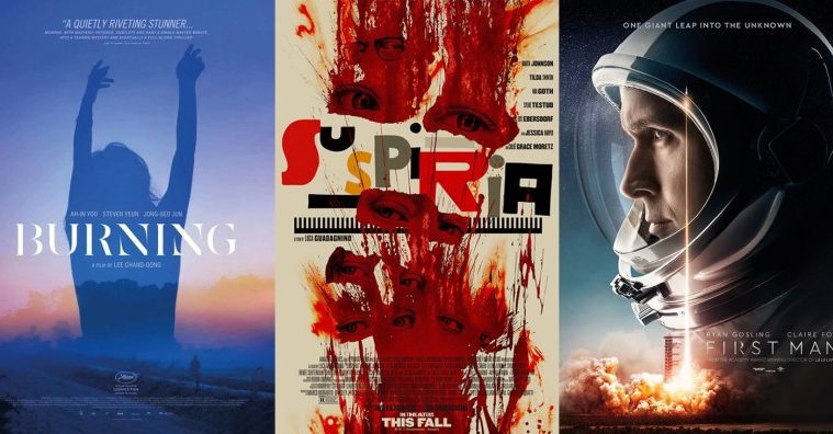
From washed-out and heartfelt arrive dark, brooding, and dramatic thanks to BOND’s (with photography by Dan Winters) First Man (October 12). This image of the smoke trail as Apollo 11 rises through the clouds to continue towards the moon portrays the terror and excitement the event simultaneously possessed. Juxtapose that with the rather nondescript title and we know exactly what this movie is about without any additional context. That’s how ubiquitous this historical moment was and how powerful everything surrounding a cinematic depiction of it needs to be to resonate.
This is a distinct departure from a campaign spanning multiple firms. They each focus on Ryan Gosling’s Neil Armstrong specifically—something that makes sense considering the film is about him rather than the mission alone. We get BOND’s introspective head bow with moon as spacesuit helmet shield. There’s ICONARTS CREATIVE’s J.J. Abrams zoom of fire with numbers that remind us of a flux capacitor. And finally we have Creative Partnership’s more generic (but no less intriguing) mix of character and event. They all have their positives (and negative thanks to the very bad title treatment with sliver moon “R”), but none match the awe of that first.
No photos allowed


It may just be a festival art print, but Bill Sienkiewicz’s illustration on LA’s Halloween (October 9) is memorable in its attitude, vantage, and craft. The way the moonlight creates a halo around this monster’s head is great, the highlight a contrast to the dark, lifeless eyes below. Our position beneath him intrigues because we don’t seem to be his current target—but are we a viewer or casualty gazing up without sight? And the stylistic title treatment complete with double “E” represented by horizontal lines alone is the icing on the cake.


The journey our hype takes from this to the studio-friendly sheets is akin to jumping off a cliff only to discover the ground a foot below you. That tease is bland: is Michael Myers looking down at us or is this just a mask hanging on the wall? The second with focus on Jamie Lee Curtis is uninspired: faces that don’t notice each other. Letting a property this famous be squandered by ubiquitous, static motifs is unforgiveable.
A similar thing happens with Venom (October 5) as LA delivers a wild illustrative effort only to make way towards Hollywood convention. Just look at that tease above. The character is hunched a la The Maxx vol. 1 with eyes crazy and tongue out. This is the menacing face of insanity we crave—the R-rated embodiment of anti-superheroics that’s apparently been taken away from us with a PG-13. There’s danger, violence, and a connection to the property’s comic beginnings. It’s perfect.


And then you see the others. The half-Venom/half-Hardy image is understandable if poorly rendered, but the final sheet is laughably silly with a giant Venom that looks like it still needs at least five more passes through the rendering process. Does he have wings? Is that a spaceship? If not for the pedigree of the visible cast, you wouldn’t be blamed for thinking this the half-baked artwork for a direct to DVD rip-off desperate to ride the coattails of a more robustly budgeted counterpart. Realizing it’s the Hollywood iteration is therefore depressing.
Thankfully films that are outside the studio system can keep their animated posters intact without a need for by-the-numbers marketing-by-money entries to overtake them in the end. This means the quirky style of Shirkers (limited October 26) can grace our presence with its bright colors and chaotic content that’s able to surprise anyone who didn’t realize it was a documentary. It’s bold and loud, the checkered border housing an unlikely journey decades in the making as the title grabs attention with its three-dimensionality, translucency, and partial outlines.

Contrast this with the more staid Private Life (Netflix October 5) to see how versatile illustration really is. Chris Ware (who also created the artwork for Tamara Jenkins’ The Savages) comes in to build a scene with surprising emotion thanks to the faceless masses being broken by two leads at odds and yet still together with the touch of their hands. I love how the title bleeds into the white frame and how the bottom of “Private” kisses the top of the iron fence—a flawless bit of placement only beaten by the perfection of wedging the “I” right between two tall buildings in the background.
P+A is credited with the design, but I have to imagine Ware was responsible for the title because of this magnificent placement. That’s not to say the firm doesn’t do a great job complementing his color scheme with the critics’ blurbs or by keeping verbiage to the right of the tallest building for a welcome bit of visual stability. Meticulous synergy between image and text like this doesn’t come along too often.
Evocative typography


The effect that Palaceworks utilizes on their poster for Burning (limited October 26) embodies the title with its disappearing lines. You could say the letters are evaporating from the heat or at the very least a product of impaired sight thanks to the hazy shimmer of rising temperatures. They’re being consumed, the yellowish tint overtaken by the cooler blues and greens much like the orange horizon below them.
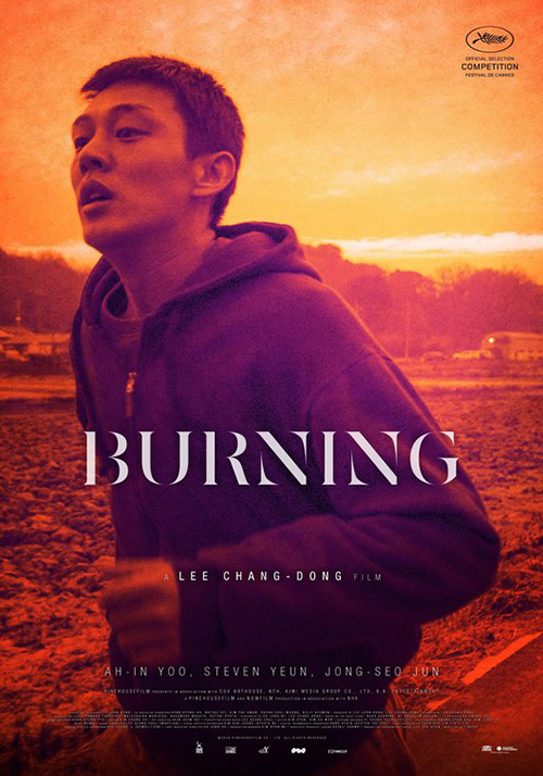
As for the silhouette, it’s enlarged just enough to house the actor list so the lighter background can become that text’s color. The arms point up to the critic quote, our eyes moving up and down the middle of the page from text to tiny runner. Our attention is held, our sight led, and our interest piqued. It’s not a perfect sheet, but it does its job.
I personally prefer an older iteration where the title is a bright pink against the warm fiery hue the image beneath is filtered through. There’s more drama here too—more mystery. The first could be a rave attendee drunk and riding a wave of air outside a car’s sunroof. This one has motive. Where’s he running? Who (if anyone) is he running from? There’s a story here rather than merely pretty colors.
The designer on Studio 54 (limited October 5) really leans into the glitz of the old nightclub with glitter everywhere. The texture and reflectiveness of this substance lends a cool effect to what’s otherwise a flat sheet of paper (much like A Star Is Born‘s gold) as well as a common aesthetic from image to title. Where the face is rendered with stunning clarity, however, the title loses something by trying to say too much in a style that doesn’t quite bolster its importance.
“54” is large and in charge, but the rest is too thin to stand up to the deep black ink beneath. “The Documentary” is lost completely with “Studio” following closely behind. This doesn’t necessarily ruin the whole since that “54” conjures so much by itself from a distance, but having the other words buckle under their own weight in something as visually audacious as this can’t simply be ignored.
Considering Can You Ever Forgive Me? (limited October 19) is out this month and we only have a teaser poster to show for it (by MIDNIGHT OIL), I’m hoping the studio realizes they shouldn’t ruin a slam dunk by trying something different. This one has it all: unique typography that plays with boldness, capitals, color, and format; a skewed view of something integral to the piece (the typewriter as surface); and its star Melissa McCarthy. You don’t need to know more than what’s shown to want to know what the film will deliver.
The way it moves is great too, that curve of the key well brings us around from left to right as though on a roller coaster up to a somber McCarthy ready to surprise in a serious (but still funny) role. Besides her being a depth-less cardboard cutout by comparison with the rest, I can’t really say anything bad about it.
And there’s absolutely nothing disparaging to be said about Gravillis Inc.’s What They Had (limited October 19). The way the title intertwines with the flowers is both pretty and terrifying—the leaves wrapping around it to bring it down into the grave of the deceased we can assume is being represented. The figuratively wry smile of the designer who responds to a need to ensure the cast is visible by facing their backs to us is delightful while the result a powerful representation that some things are more important than showing their faces for our enjoyment.
Put it all under a lo-fi, vintage-like grain and you get a throwback concerning itself more with the efficacy of the poster as art than as advertisement. The beauty of this sentiment is that its success as art is enough to serve the other purpose simply by making us linger and thus remember. This is a conversation starter of an image—one few will be able to disregard like so many others they see.
S is for …


I’d be remiss not to talk about the extensive campaign for Luca Guadagnino’s remake of Suspiria (limited October 26; expanding November 2). It started with LA’s simple “S” as a teaser, something many people online mocked considering the graphic accounts of footage shown around the same time. The explanation was that the fat font was also a tease of the opening titles—an aesthetic the production seemed very excited about despite the layperson wanting to see more than its use in a sad attempt at graffiti on concrete.
Next came a more realistically bloodied “S” with a darker hue and splatters, the finished title font with Saul Bass janky-ness and xylophone colors in full view. The whole thing almost comes with a comedic lilt, the severe horror we’ve been led to believe this film would have all but absent. So it was with great excitement that LA delivered the third variation with bloody eyeballs, smeared fluids, and barely legible text. Finally we received a visual assault of craziness devoid of context beyond tone.


What came next was a series of character sheets ranging from boring to forgettable and a slew of set photos carefully cropped for maximum sterility—everything adorned with a red “S.” The latter is actually a unique artistic decision. Why just sell actors when you can sell the place too: the architecture, era, and oppression visible before what we assume will be a gory blood bath? It’s quite intriguing for a film being released by a streaming service such as Amazon that ultimately doesn’t need to spend so much money on marketing.
None of these solidified Suspiria‘s mystique, though. That came courtesy of Sara Deck and Mondo with a beautiful illustration of a woman sitting in flowing silk dress with hair covering her face. Is it Dakota Johnson? Tilda Swinton? With the controversy of whether or not Lutz Ebersdorf is actually Swinton swirling, this sense of anonymity drives home a theme centering upon identity to add yet another level to the whole. It’s a striking image harboring infinite possibilities that we’ll soon be able to discover for ourselves.
What is your favorite October release poster? What could have used a rework?