“Don’t Judge a Book by Its Cover” is a proverb whose simple existence proves the fact impressionable souls will do so without fail. This monthly column focuses on the film industry’s willingness to capitalize on this truth, releasing one-sheets to serve as not representations of what audiences are to expect, but as propaganda to fill seats. Oftentimes they fail miserably.
This month is the epitome of summer blockbuster season with a couple kids films, a couple attempts at old school epics, some comedies, some actioners, and a sparse few adult-oriented indies to provide a well-needed counter to the explosions and slapstick. We’re still inundated with sequels (four on this post alone) and reboots (two), but as long as we buy tickets they’ll continue coming — louder, brighter, and vapid.
So let’s try and give some love to the smaller films. Take the kids to a matinee this holiday weekend and then check out the art-house for your own sanity. It’s fun to watch big studio fare fail because we can laugh and laugh and laugh. But each one doesn’t seem to slow Hollywood down because there’s always potential to hit the mark. Give less money to the franchises and more to the mid-range auteurs. Someday “property” will become meaningless in comparison to creativity, right? Fingers crossed.
Summer: for kids and adults alike


One thing family-friendly sequels are good for is a paycheck on behalf of the marketing firms because most times the campaign has already been established ten years prior. I can’t believe the Ice Age series still has legs let alone the strength to endure fourteen years. Fourteen years! Think about that. Maybe the newest subtitle Collision Course (July 22) is finally predicting the end has arrived.


What more is there to do with this property as far as posters are concerned? Nothing. It seems lazy to just slap the characters in frame to stare at us with the title in the middle, but Fox and Blue Sky is probably so resigned to the fact that the film will sell itself that they can’t be bothered. All our favorites are back and Scrat is once again in peril. Now give me your money.
The Refinery can’t be faulted either because they know a fifth installment needs little panache. Smush the animals together for funny faces, put Scrat in an astronaut suit, and be glad you have a client as easy as this. They don’t come along often.
By contrast, The Secret Life of Pets (July 8) provides LA the opportunity to have fun. The premise concerning what our pets do while we’re gone is ripe with comedic possibilities and the obvious one — their sitting and staring silently at the door in wait for our return — is perhaps the best. Look how simple and brilliant this tease is. This is the picture of faithful servant regardless of whether being such is contingent on our being that little guy’s only source for food.


I like the second one-sheet too even though its showing the back of other animals doesn’t quite work with the same theme (and neither does having them on a roof’s ledge). The great part is the cat in the foreground slyly looking back at us — bored of this futile exercise the others have embraced and cunning enough to see through the artifice of the poster itself. It’s a tiny detail, but it’s hugely effective.
What about the character sheets, you ask? Well, they’re cute. Pun humor reigns and minimalism sustains. I don’t love the horizontal logotype (the vertical one is much better as the red box serves as a billboard above the “Pets” skyscrapers), but it’s a tiny gripe. The goal here is to advertise the eventual toy lines to come. Get those kids loving each pet before the lights even go down.
The Legend of Tarzan (July 1) does the exact opposite of Pets by having its subjects stare straight through our souls. I won’t lie: BOND’s sheet with the titular hero and an army of gorillas is a bit unsettling. Are we supposed to assume he is as much a brutal beast that cannot be tamed like his jungle brothers? He’s looking at us with menace, after all. What did we ever do to him? We better buy a ticket so he doesn’t leap forward and rip out our jugulars.


Their profile version is so much better as a result because we are no longer being threatened. He and the gorillas are fiercely moving towards their true enemy and we can look upon the rage with excitement rather than fear. The film is targeting a moderate family friendly atmosphere — it’s going to need one to be successful — so dial down on the animosity please. You know, stop having them run towards us as though they’ll be the last things we ever see.
At least the sheet with Margot Robbie’s Jane gives their steely eyes a cause. They are protecting her (which is ironic when you see the film considering she’s the biggest bad ass of them all). They growl and snarl for us to move on. Okay. You win.
This same aesthetic does, however, work for Wonderland’s The Purge: Election Year (July 1). These creepy demonic humans in masks are actually out to get us. We’re supposed to fear them because there are no heroes to be seen. We need to turn around right now and run because they are not fooling around.


This entry and its French counterpart (boy do I absolutely love the title “American Nightmare 3: Elections” as though the film is a documentary on Clinton vs. Trump) are the best because they put us in the world of insurmountable odds. If you cannot afford to stay safe behind closed doors, this is what you see: murderers and maniacs approaching slow because you have nowhere to go.
That’s not to say the tease from LA isn’t nice too, it’s just not as creepy without the foggy atmosphere of an ongoing assault. I will give the credit for the “I Purged” sticker advert, though. That’s pretty funny.
Do I know you?


Yes, I do know you. You look a little different, but the gist is pretty much the same. This is what happens when 20+ films are released each week, every week for decades. That doesn’t make it any less fascinating when it happens.
ARSONAL’s sheet with photography by Sam Jones for Mike and Dave Need Wedding Dates (July 8) isn’t exactly a rip-off of Project X per se, but it definitely is using the same concepts. Passed out and drunk in the grass after a wild night out, where the latter leaves the victim alone to wallow in his own vomit the former includes a couple predators. This juxtaposition of the girls being the troublemakers while the boys think they’re the wild ones is key to the film’s appeal; the delivery is simply tired.


And is it just me or do the lipstick drawings on Adam Devine and Zac Efron look Photoshopped? I want to believe that this is a scene from the film and the boys did actually have these pictures scrawled in lipstick on their chests, but I’m finding it harder to do so the more I look.
Regardless, this poster is by far better than the Spanish version. Interaction always is when compared to obvious photo-manipulation. I’m honestly not sure what is real in this wedding shot because nothing but the faces appears to be untouched. Those glasses in the girls’ hands look vastly out of proportion, Devine’s eyes and mouth look plastered on a mannequin’s head, and Efron is either destroying his back with that posture or had his head titled without regard to the shoulders.
Our Kind of Traitor (July 1) is all kinds of redundant. I like the idea of the “gun text” layout, but can’t help seeing The Departed every time I gaze upon it. I hate the little hammer flourish on the bottom of the “T” and find the placement of trigger frame completely awkward. It tries too hard to be something unique without realizing it’s anything but.


As for the others, Leroy and Rose’s white slanted collage mimics too many designs from the past to even begin to mention any. And the landscapes growing out of the photo boxes are distractingly irrelevant. Maybe Big Ben above Damian Lewis and the Kremlin below Stellan Skarsgård are okay because those two countries seem to be of major concern to the story, but stop there. Adding the other two loses the impact of what those locations mean.
Empire Design’s work is the best of the bunch if only because it hopes to spin the monotony of photo strips into something new. It’s not much, but having the text cut across the diagonal photos horizontally gives our eyes resting points. Overlapping adds intrigue because we’re deciphering visual and textual language separate from the other at the same time. We aren’t just reading left to right blandly.
The next two are less “copycats” and more saddled by stylistic tropes because you cannot tell me you don’t think Wes Anderson upon seeing BLT Communications, LLC’s poster for Captain Fantastic (limited July 8) and expect me to believe it. I won’t. It’s all I can see and I’ve seen many people stating the same online: quirky family portrait, quirky text (I adore the stamped, retro typography in different fonts, though), and quirky vehicle.


On a purely simplistic level it is pretty much Anderson’s The Royal Tenenbaums meets Little Miss Sunshine — both posters that BLT also designed. There’s nothing wrong with this, it’s just an unavoidable aesthetic comparison. It will help ticket sales for those who like the aforementioned films and hurt for those who don’t. People look at posters and say, “Oh look, a Wes Anderson-type film.” Those words are just as praise-worthy as they are damning.
As for Concept Arts’ Jason Bourne (July 29), this trope has been well-documented and the source of hilarity everywhere. Let’s slap some text on Matt Damon’s face — it’s practically a meme. It’s too bad too because the effect works here due to the lighting photographer Frank Ockenfels utilizes. The shadows reveal the actor’s secretive nature and the text warps and glitches above him to speak directly to us. It works even better on the full body shot. The diagonal ray of light here beautifully takes our eye on a journey from top to bottom.


And really, is a meme so bad when the alternative is such a god-awful back-to-back rom-com pose with gun drawn? Alicia Vikander’s stern face is laughable and the duo floating above a non-descript skyline with burning police cars comedic. This is the poster you make for a Bruce Willis straight-to-DVD flick. Not the long-awaited fourth installment of a prestige franchise.


Who you gonna call?


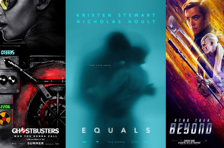
Ockenfels isn’t done this month with the black and white, high contrast images. With BLT providing the designs, the photographer delivers a stunning quartet of Ghostbusters (July 15). These things are cropped perfectly, sprinkled with just a pinch of color splash (save Kristen Wiig getting the entire logo and no yellow like the others), and enhanced by humorously over-the-top dramatics. It’s all so familiar and yet brand new.


Full disclosure: I’m all for this reboot. If you want to hate and say Ghostbusters doesn’t deserve to be “ruined,” that’s on you. Be childish, sexist, and/or selective in what constitutes the label classic when greater movies more revered than this have gone through the same treatment. The idea of a remake is to give audiences something fresh, not necessarily to improve, mimic, or defame. Paul Feig and company are doing exactly that by giving a new generation of comedy/horror fans something the original never tried to do: female heroes. Beyond remake, this is reinvention. That at least deserves the benefit of the doubt.
Even so, I’m glad BLT stayed true to the classic by giving us a logo tease straight out of time. It’s been reformed and beveled to lend a 3D look, but it’s ostensibly the same.
I’m not as psyched by the need to put Chris Hemsworth on the full-sheets in the US, UK, and China, but here we are. He’s a big name superstar that will help sell the film to the male demographic too simple-minded to accept female Ghostbusters. This is true. But do you have to consistently make him more important than Kate McKinnon? Even the trailers have relegated her to the background with hardly any screen time and the least amount of dialogue possible. Here’s hoping it’s all a ploy before discovering she’s the best part.
Cream of the crop


You aren’t the only one to be surprised to see the teaser for Star Trek Beyond (July 22) under this headline. I am too and I put it there. But it’s difficult not to love what BLT has done. The coloring is wonderful (this thing pops), the speed and motion swoops our gaze skyward, and the abbreviated title intrigues despite its 3D rendering. You want to tilt this thing 25-degress to straighten it before realizing the appeal is in the slant. We’re going on an adventure.


I don’t even mind the other posters utilizing Jaimie Trueblood’s photography amidst speed trails and Klingon ships creating layers in space. They are extremely busy and it’s weird the members of Starfleet don’t get their pattern made of different ships, but they work. The bright colors against black earn our attention and the painterly quality lends them a vintage feel. I do hate Idris Elba’s character infiltrating the top right corner of the full sheet, though. Not only is it distracting, the angle and size are in direct opposition to the aesthetic.
LA’s poster for Nerve (July 27) may be construed as another surprise in this section too. You see a truth or dare film starring Emma Roberts and Dave Franco and think very little of it until you see these gorgeous sheets of neon color and fearless dedication to concept.
This version depicts Roberts looking at a computer screen between her and us. Because she’s pressing a button on said screen, it must be reversed from our vantage point. Whereas most studios would probably force the designers to turn everything else around so we can read it, Lionsgate allows them to double-down and leave the entire thing flipped. Yes, even their tiny logo at bottom right is. They know that the sparse wording can be comprehended backwards or forwards and that we’ll look closer at this orientation in response. Switch it around and there’s no reason to linger.


Case and point is the full sheet. What’s happening here? There’s no sense of the mechanics to the movie or the plot. It looks like Roberts and Franco are being beamed up to the Enterprise. We’ve been transported back to 80s sci-fi. Thankfully Cullin Tobin’s photos give LA the room to have fun with their world-building series. These are funny, jarring, and chic. The eyeball logo is horrid, but not enough to disregard the whole.
These next three are the big winners of the month, though, as I’m not sure how anyone could look at them and not think masterpiece.

First up is actor Brady Corbet’s directorial debut Childhood of a Leader (limited July 22). The high contrast black on red is jarring, the subtle twinkle of a yellow star in the silhouetted eye an unavoidably powerful attention grabber. It has a similar creepy foreboding as Goodnight Mommy did with a similar color scheme.
I’d love to see it without all the text or perhaps just a smaller title block, though. Doing a full justify with a serif is tough and that “A” looks to be floating as a result of the “R’s” right leg below it. “Leader” becomes so bold that you almost lose the rest of the name completely. A little work on this aspect and the sheet is perfect.
Second is Into the Forest (limited July 29) by Gravillis Inc. The image itself is spectacular with the worry in Evan Rachel Wood’s quivering lip and sorrow in Ellen Page’s tearful embrace. The mood is palpable, the dread heavy enough to cut through if you had the strength to get up and move towards it. It’s monochrome and yet your eye can’t help seeing a bright red in Wood’s mouth to steal our attention. We can’t help but feel their pain.
The other visual flourishes make it that much better from the reflection of trees as though they’re on the other side of a glass window to the scrawled but measured title. We aren’t sure what’s going on, but the hash marks portray anything but good vibes. They’ve been stuck in this forest for days upon days — a prospect that would cause this type of emotional distress and yet we know more is at play.
I’ve already seen the film and yet somehow this poster has me anticipating its release as though I never have.
I haven’t seen Equals (limited July 15), but I’m just as enamored by what InSync Plus has done of its poster. What an image. It’s like Remember meets Allegiant and all the more powerful from the combination. The actors are trapped behind foggy glass, their kiss presumed forbidden within the world they reside. The names are blurred, the title even more so. But that tag — despite it’s diminutive size — is crystal clear.


It’s far from perfect: the names at top are way too big and the tag being off-center from the rest seems like a mistake rather than a calculated decision. Strip all the text away, however, and you get what’s perhaps the most provocative, mysterious, and captivating image of the month.
What is your favorite July release poster? What could have used a rework?