Cinematographer Ed Lachman doesn’t often work with new directors, but for someone he considers “the most important filmmaker in South America,” he’ll make an exception. El Conde marks the first collaboration between Lachman and Chilean filmmaker Pablo Larraín, but Lachman had followed his career dating back to his Pinochet trilogy: Tony Manero (2008), Post Mortem (2010) and No (2012). Lachman clocked similarities to Larraín and a frequent collaborator of his: “Pablo always finds the subtext in the story through the language of how he tells the story through images. That’s something I’ve done with Todd Haynes. Those are the directors I’m drawn to, directors looking to create a language that’s unique to that story.”
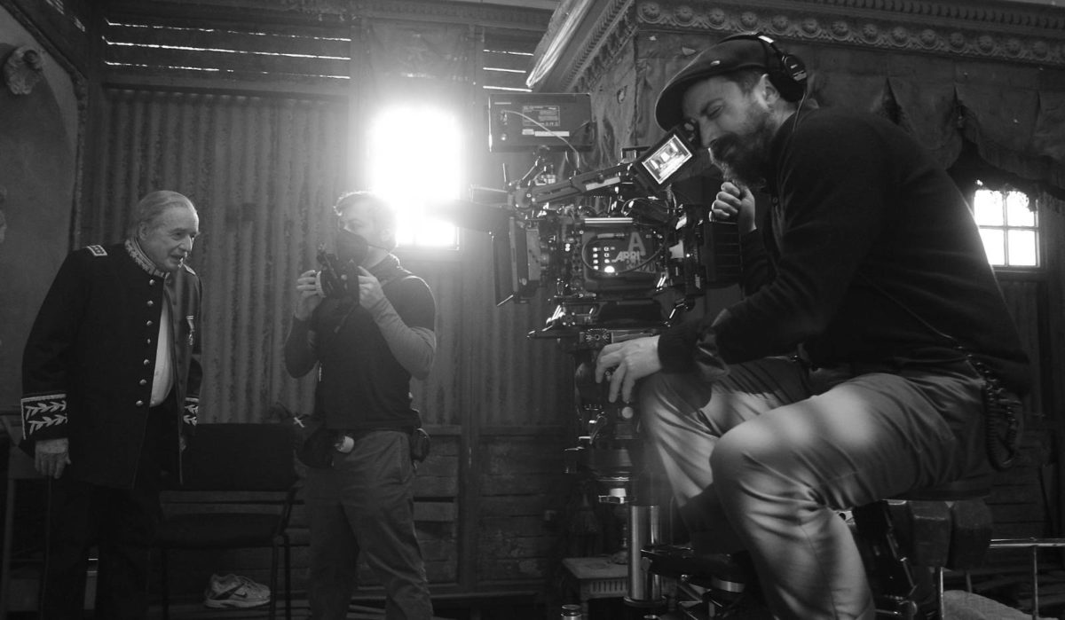
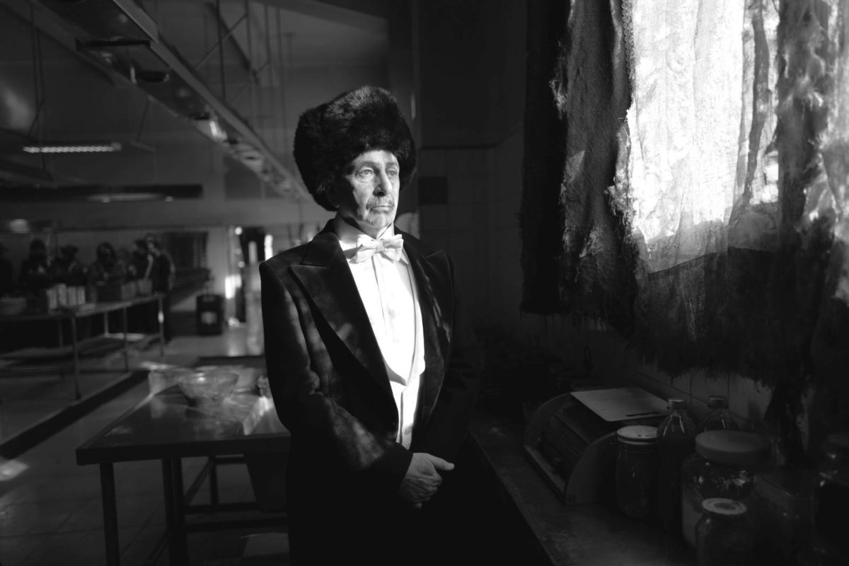
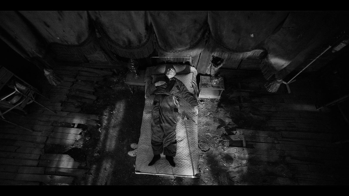
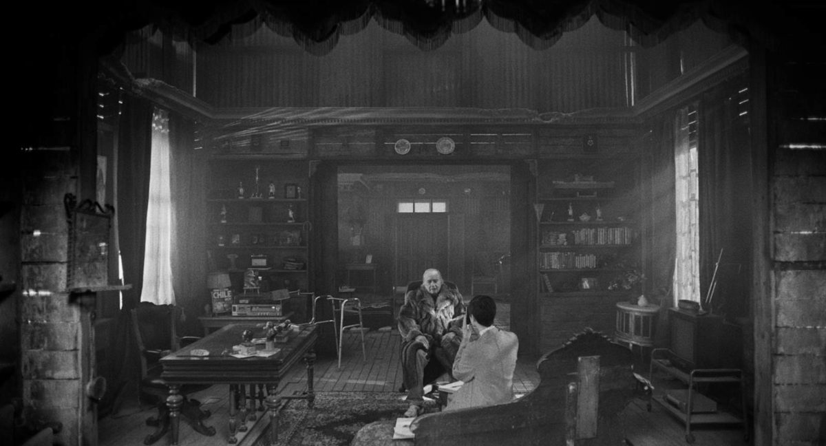
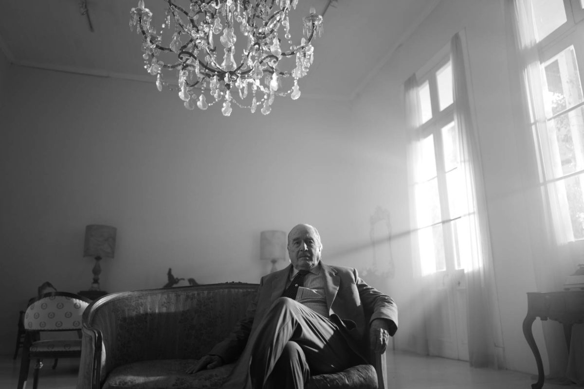
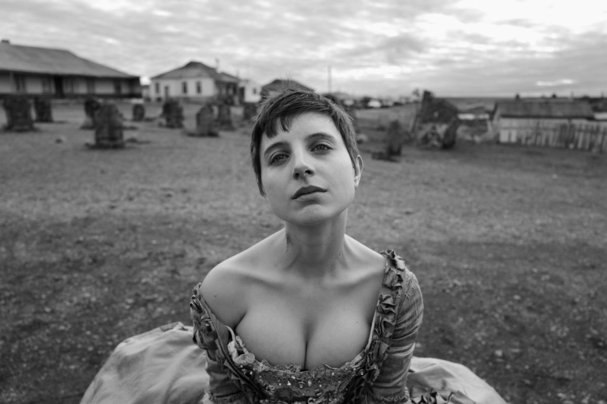
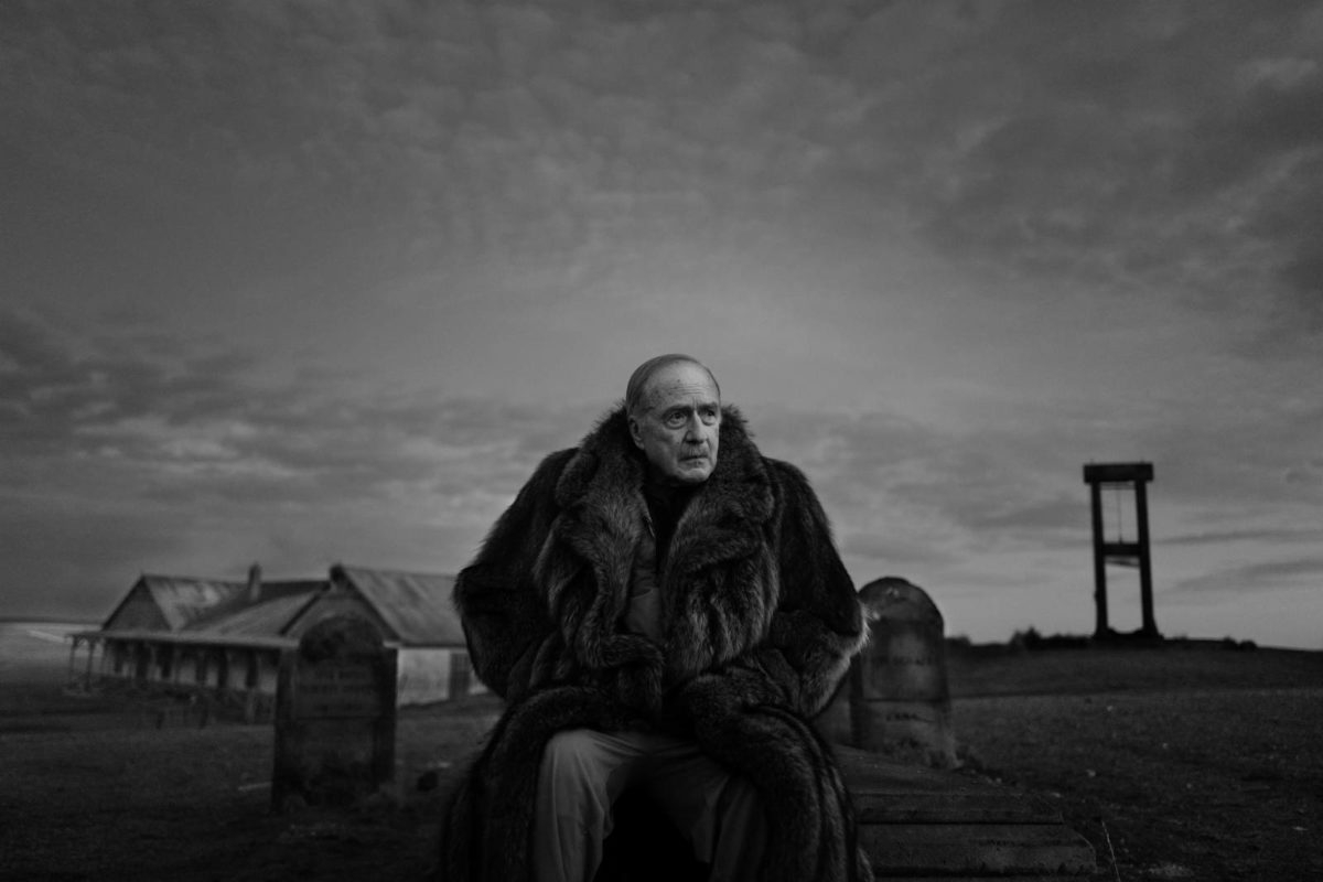
This trilogy introduced Lachman to Augusto Pinochet, the Chilean dictator who ruled Chile from 1973 to 1990. While those films dealt with his reign indirectly, El Conde, is Larraín’s first to tackle Pinochet head on. But Larraín’s “metaphorical ways of telling stories” is ever present, seen within the film’s framework as a satirical horror picture in which Pinochet (87-year-old actor Jaime Vadell) is an aging vampire seeking to end his life after 250 years. This attracts his family to a small cabin on the edge of the Patagonia mountains, who each harbor hopes of getting their hands on his hidden fortune. They contract the services of an accountant nun (a wide-eyed Paula Luchsinger) to track down all of this dark money. But she harbors her own secret motivations.
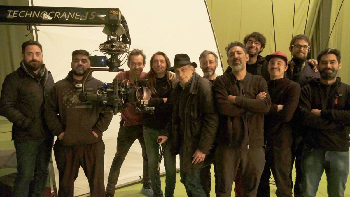
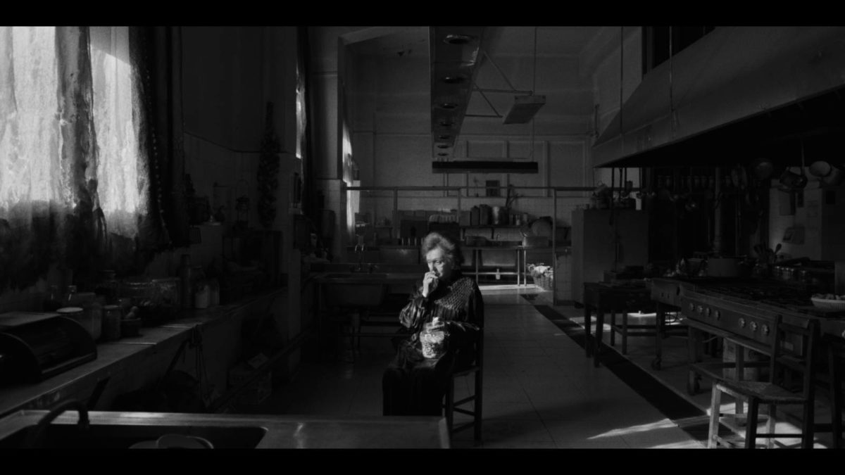
Lachman lenses El Conde in a distinct black and white palette which involved a number of unique elements: a brand new ARRI camera made for the production, vintage lenses from the 1930s, black and white filters typically used on 35mm black and white, and a special mapping system inspired by Ansel Adams. The film sets were built so that a sweeping 15-foot technocrane could move freely, granting Lachman and Larraín the ability to find the frame during the shoot. The result is one of the most bold-looking digitally-shot black and white movies.
I spoke with Lachman twice: first at the Telluride film festival in which he was kind enough to take a break from a busy film-watching schedule to chat, and then again this past Friday in which he phoned in from a Paris airport, en route to Athens with Larraín. The pair are teaming up again and were location scouting for their upcoming biopic Maria, slated to star Angelina Jolie as opera singer Maria Callas. What follows is an edited version of those two talks.
The Film Stage: When you’re discussing taking on a new project with someone you haven’t worked with, what are you looking for in a partner?
Ed Lachman: I want to know if I’m going to be able to contribute something. When I read a script, it’s the vision of the director. I come with a lot of visual ideas, and it might not be the idea of the director per se, but at least they see I have an idea. It’s the basis to start a conversation. I’ve been very fortunate to work with many visual directors––like Pablo Larraín, Todd Haynes, or Ulrich Seidl. I then try to plug into their world and see what I can do to implement that world. In this case, Pablo told me upfront that he had convinced Netflix to shoot in black-and-white.
So I reached out to ARRI about a monochromatic sensor for the LF camera. They were thinking about it but hadn’t done it yet. They had one for an older camera, the ARRI XT. With a monochromatic camera, the contrast ratio is different, the exposure latitude is different. You can design the set and the wardrobe against the values of black-and-white, and not have the fallback that the film might end up in color for certain territories. ARRI didn’t know they could do it in the time frame because they were coming out with their new camera, the ALEXA 35. I thought: no way are they going to stop the progress with their new camera to come off on a one-off camera for me. But lo and behold they did, which is remarkable for ARRI to move that fast.
When we got the camera to Chile we had to do all the beta tests with it. What I discovered was that all the pixels that would go to color could now go to luminosity for the black-and-white. So the speed of the camera, the ASA, was faster. But 800 became 1280, 1280 became 2000. So I could work in lower light and get the contrast and the saturation where normally I would’ve had to use more light.
Low-light capabilities aren’t a trademark of an ARRI camera, though the ALEXA 35 made strides in that realm.
Well, they do well in low light but this was just another added plus to it. The advantage is that I can use black-and-white filters the way I used to work in black-and-white film. I could go back to using black-and-white Harrison & Harrison filters that I’ve had for 50 years, and could deal with creating black-and-white images the way we did 50 years ago.
There were three elements that created these images––the first being this new monochromatic camera. The second was that I had rehoused a set of Baltar lenses, the Bausch and Lomb glass. Not the Super Baltars––those came out in the ’60s. This glass was made in 1938, and shot most of the ’40s black-and-white films: films like The Magnificent Ambersons, Touch of Evil, even parts of Citizen Kane were shot with this glass. What was different about this glass? It was a very simple design. It’s polished differently. They had falloff, a lot like Cooke Speed Panchros.
The early studio cameras in Hollywood were non-reflex or rackover cameras. The whole movement would go out and into the camera. You would take it out, see the image, and then you would bring it back. So this glass had been forgotten because we can’t use it on reflex cameras, because the lens goes back too far and would hit the spinning mirror.
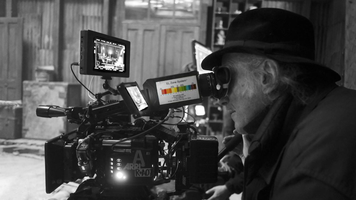
Alex North has a rehousing glass company called Zero Optik. He told me about this glass and said you could use it on digital cameras because the film plane is shorter so it wouldn’t hit a spinning mirror. So now I could use old glass that was created for black-and-white photography. I had a black-and-white sensor, the lenses, and the third element is technology I had been working on called the EL Zone System. It stands for exposure latitude system, not the “Ed Lachman System.”
The EL Zone System is a way of tracking your exposure that’s like a heat map. You look at an image and it tells you exactly what the evaluation of your exposure from 18% gray. It’s the way Ansel Adams decided where he would place his exposure to read the clouds and to have shadow detail. I adapted Adams’ idea to the digital world. El Conde was the first film that I could create the exposure latitude knowingly in the camera from how I placed the stops on the lens. When we were in post, they were astounded that it was so close to what the final grade was, because I could evaluate the exposure. That’s why in the film, there’s so much detail in the shadow areas. Generally if you overexpose something, you’re trying to bring the exposure down in the highlight; you lose the shadow detail. In this film there’s a beautiful midrange between the highlights and the shadows. That was partly due to the EL Zone system.
Was there ever a thought to use the RED Monochrome camera?
Pablo wanted it not to feel digital: the texture, the sharpness. We always felt that ARRI has better roll-off. It doesn’t feel as digital. We weren’t looking to go 6K, 8K. I’m somebody who likes the low-resolution look––it’s more filmic.
How did you figure out the blood for black-and-white?
That was something that Pablo was very sensitive about. Not only did we do testing for the wardrobe and the sets, because you notice everything in the sets fall off against the character, but the blood was obviously very important. I’ve always used red because there isn’t any better black than red. But he had the idea of trying different colors, and we found blue had more of a texture, a luminosity to it.
What was the pre-production process like with Pablo and the team?
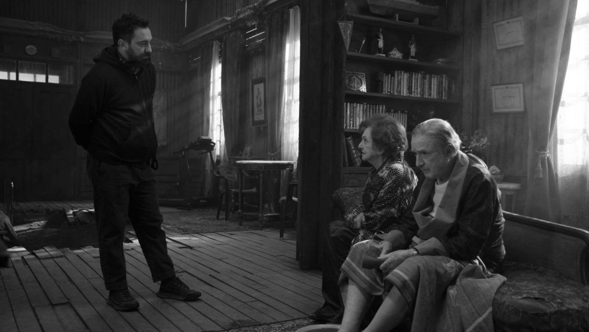
Pablo’s lived in Chile his whole life. I was walking into their world: they had prepped this, they had lived with this world very closely. So for me, even not speaking Spanish well, I felt like I was someone from outer space coming into their world and observing. I almost like when I shoot in a language that I don’t speak, because it intensifies my own vision of what I’m seeing.
What was it like recreating moments in history like Marie Antoinette’s beheading? Did you reference paintings, descriptions or did you just imagine it?
Actually in the treasure room in the film there are images of that time period. I tried to just be true to a classical look. I looked at Vampyr by Dreyer, Murnau’s Sunrise, and Nosferatu. Later I wanted to see what they were doing with the black-and-white, like Josef von Sternberg with Shanghai Express. It was so interesting how advanced they were with how much they did in-camera. A lot of the effects that we would do in post, they were doing in camera. I was looking at, stylistically, how they were lighting.
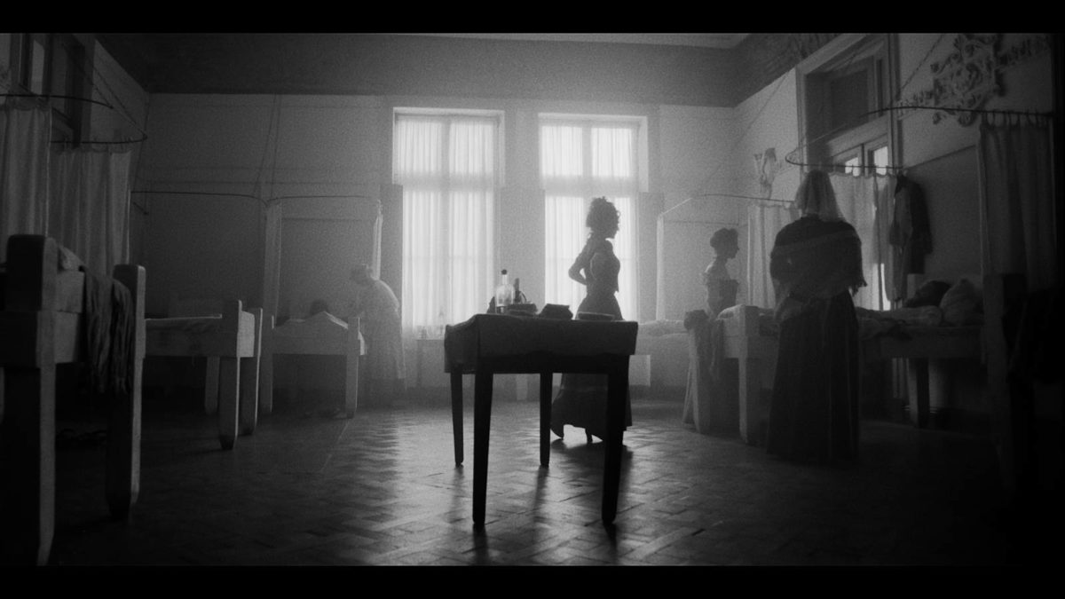
But I realized in those studio films, they were lighting the people in the set, against the set. I call it portrait lighting. Because we move the camera so much on this 15-foot technocrane, I lit the space more than I tried to light the individual, and let the characters fall in the space. They always say “the eyes are the window to the soul,” or whatever, but I felt people were hiding from themselves and from each other. So we weren’t afraid if their eyes would go into the shadows.
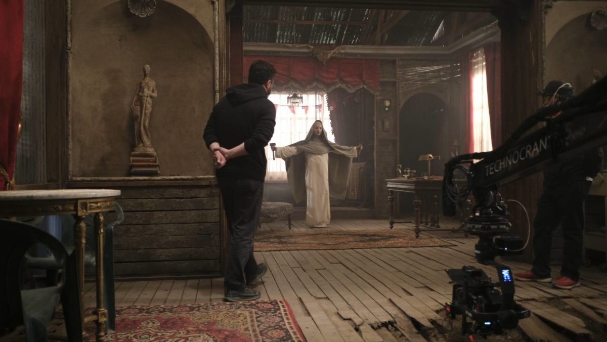
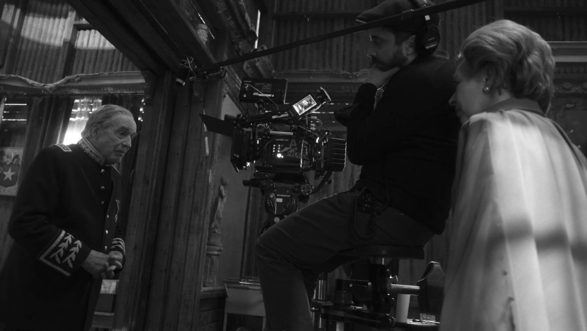
Speaking of portraiture, what about the head-on shots where the nun is interviewing all of Pinochet’s family members.
For that, Pablo did something I’ve never done before: he put two cameras next to each other from the same focal length, so he would get the reaction and dialogue at the same time. It was an efficient way to shoot, and so I used a China ball to light it.
Watching Pablo Larraín’s films you get this sense that certain images have been in his head for a long time. In Jackie I think of the secret service agent riding on the back of the convertible. Here, I think about the nun learning to fly for the first time. Can you talk about when Pablo talked to you about that shot?
Why the imagery has a relevance is––as much as we planned for the apparatus to be with us––we really try to be in the moment for what the performances were. I don’t think we ever went in with a storyboard. We found it on the set. That’s what was beautiful about being on this technocrane: because we could move it right, left, down, up, and find the frame when we were in the space. To me, Pablo’s images all have a sense of discovery. That’s what is important about the imagery people respond to––you feel as if you were there, that this is something you could’ve seen.
Connie Hall used to talk about this: “Why is everybody always in the perfect light? We’re not.” Sometimes you have to make the light imperfect to show what you’re looking at. When the nun talks to the priest and the other nun, I had the light come in and hit the floor. Then the residue of the light from the floor is what lights them. That’s more the way it would naturalistically be. I approach an expressionistic world of that cinema in a naturalistic way.
What lighting were you using?
I was basically using tungsten light. I was trying to use the lights that were the least expensive, because it was still a limited budget. Those were major sets––we were on two big stages for his bedroom area and then the hallway and the living room was on another set. And then all of that was married to being on the location.
That’s interesting because I have a pet theory about LEDs when paired with digital cameras and the look that creates, compared to traditional lighting like tungsten.
I totally agree with you. I use LED with a combination of tungsten for digital cameras but I don’t like to do that on film cameras––or maybe I would keep it in the background, but not for flesh tones. I would prefer to use tungsten.
Also, Mank––which looks a lot different from this––is also digital black-and-white and they used tungsten lights from what I remember. I could be wrong.
Yeah, maybe. But also they shot in color and made it black-and-white, which I hope people see the difference.
Do you still do the black-and-white polaroids for test photography?
I used to. I have the cameras but it’s hard now to find the polaroids. So I use a digital camera.
What camera?
I use a Fuji XT-3.
Do you ever use an iPhone for quick framing references?
Well, actually Todd Haynes loves to find the frame with his iPhone, with the Artemis Pro app. That was the beautiful thing about being on the crane again: we could find the frame through the camera on wheels on a remote head.
You gave me a sheet which, among other things, lists artistic influences, and there are a number of black-and-white photographers which make sense. But then you have a few assemblage and collage artists like Joseph Cornell, who’s a personal favorite of mine. How did those artists factor into the artistic approach? It’s not such an obvious connection.
I know, I know. When you look at these black-and-white films, I think about the textures in these sets and how they portrayed the world through the graphicness. The thing about black-and-white is that it’s not representational of the way we see our world, unless you’re color blind. It’s an abstraction of how you see your world. I feel the same way about how you create a set. In black-and-white, it made me think of Joseph Cornell because he would construct the images with these different tensions of these boxes, these mini museums. Maybe that’s far-fetched for you. It was actually more of a reference for Wonderstruck.
Spanish painter, Antonio Taule, is probably a better reference because he was very cinematic, visually, with contrast. Fan Ho was a still photographer but he was a filmmaker also, in Hong Kong. If you look at his street photography, he basically set up the shots with shadow and light. Sergio Larraín––no relation to Pablo––was a Chilean photographer in the ’50s. His street photography has a certain abstraction.
Were any of these artists discoveries?
I never knew about Alexey Titarenko, the Russian. He would create black and white images with slow shutter speeds so that it would create motion in the frame. I guess all the artists I’m looking at: painters, photographers, it’s about how they use the found object, a so-called naturalism in an expressionistic way, in a way that has a certain kind of poetry but it’s constructed. It’s not representational.
When reading the script and talking to Pablo about the thematic elements, how do you translate that in a visual way? How do you connect the art and the technical in your job as a cinematographer?
It’s how it comes together in any thing. Why does one painter paint the same subject in a different way? I never thought of cinematography purely as a utilitarian practice. For me it was a tool to interpret the world that I’m constructing. My background is painting. I always thought of painters and periods of time that painting came out of, and why it was created that way. Why did German Expressionism have the unnatural colors and representation of the figure that’s different from Romanticism or the Impressionists?
I’m always trying to look for how you create the psychology of the image of what you’re telling about the story. What will bring the viewer closer to the language of the characters you are depicting? I was inspired by how artists or creative people create images out of ideas. The director brings the world to me and I show him options on how to interpret that world. That’s why I don’t work with that many directors: not all directors are visual. I’ve been very lucky to work with directors that are visual.
What’s the experience like when you’re working with a director that’s not visual? Do you have more latitude?
No, no. You have the most latitude when you’re working with someone that’s working with you. It works best when everybody is on the same page. People say a director’s relationship with a cinematographer is a marriage. I say it’s more a dance partner. Do you hear the same music to make the steps? Do you complement each other with your steps?
Explore an exclusive gallery of behind the scenes photos below.


Camera Kit:
Camera: ARRI ALEXA LF Mini with monochrome sensor
Lenses: Bausch and Lomb Baltars, designed in 1938 and used in 1940s and ’50s black and white films
Lighting: Tungsten Nine-lights and 5Ks
Color: Joe Gawler at Harbor Picture
El Conde is now available to stream on Netflix.