
“Don’t Judge a Book by Its Cover” is a proverb whose simple existence proves the fact impressionable souls will do so without fail. This monthly column focuses on the film industry’s willingness to capitalize on this truth, releasing one-sheets to serve as not representations of what audiences are to expect, but as propaganda to fill seats. Oftentimes they fail miserably.
Looks like December is officially too important to riddle with holiday fare despite Christmas remaining a huge opening day at the movies. Besides a couple family friendly trilogy cappers and two musicals including Disney’s adaptation of Into the Woods (December 25), everything else is wrestling for their Oscar race bow complete with heavy drama and “brave” performances.
Then again, I guess Hollywood has been releasing their Christmas-esque flicks in November the past few years with Arthur Christmas in 2011 and Rise of the Guardians in 2012. It’s a smart move to hope for a big opening weekend and the potential for some legs to keep going past New Year’s. The thing about 2014, however, is that we didn’t even get one of those.
Character craze
 |
 |
 |
 |
 |
 |
 |
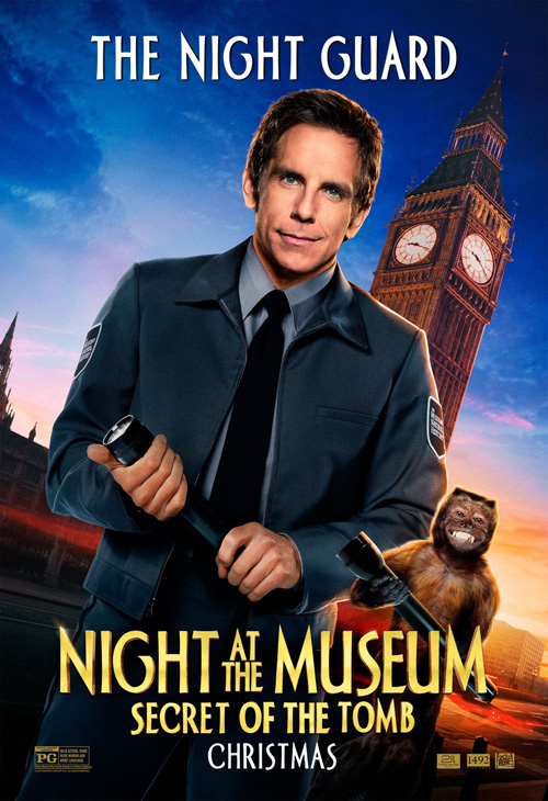 |
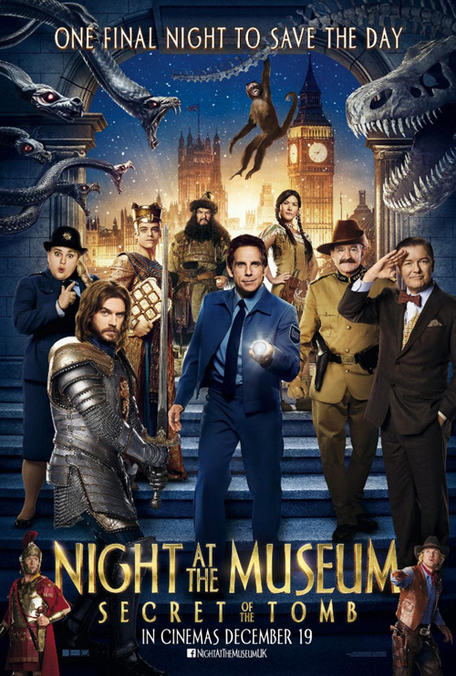
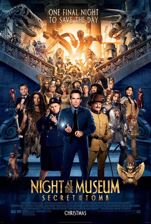
Blockbusters enjoy sprawling casts and oftentimes possess more than a couple A-list stars demanding some poster love. The trick becomes how a design firm solves the problem of fitting everyone in. With the case of Night at the Museum: Secret of the Tomb (December 19), The Refinery can’t help but go busy with actors against a generic backdrop. Give them credit at least for paring things down to only eight humans unlike BLT Communications, LLC‘s zoo of what look like cardboard cutouts devoid of even the slightest bit of depth.
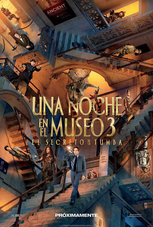
It’s by no means a great sheet; it simply allows us to not become too overwhelmed. And by “we” I mean Americans because it’s also The Refinery who get creative with the Spanish language iteration utilizing an MC Escher style to fantastic effect. Not only do I count twelve human characters in this one, they are spread out in a way that facilitates our ability to breathe light years better than the firm’s other example. There’s motion, environment, and some shadows that help remove the horrible aura surrounding everyone in BLT’s. This is how you win a rigged game.
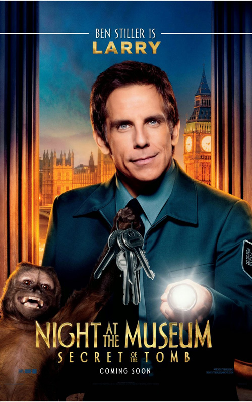
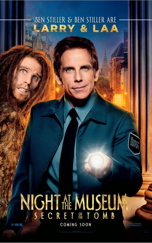
The only other way to dismantle a large cast is giving everyone—or every pair—his/her own display. This isn’t a horrible choice for a children’s film since kids will love seeing all their favorite characters together in one giant marketing wall, but at least throw some variety and effort into the mix. It’s pretty bad when three separate adverts spanning two different designers use the same pose for Ben Stiller with different head tilts. You must to do better than that.
 |
|
 |
 |
 |
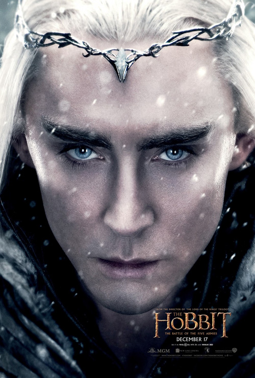 |
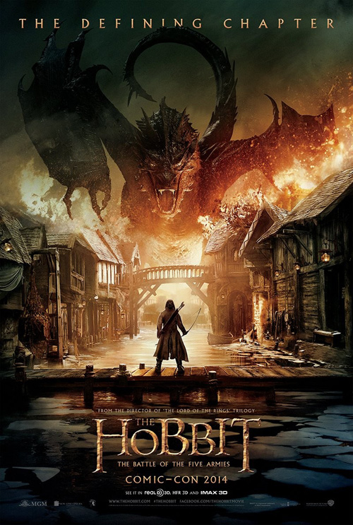
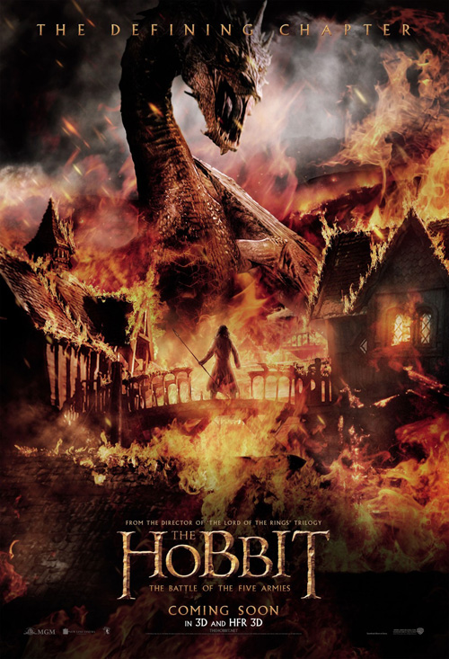
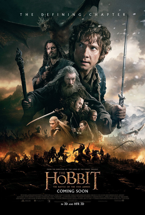
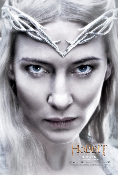
What The Hobbit: The Battle of the Five Armies (December 17) has that Night doesn’t is the PG-13 rating. It may not seem like much, but that number after the dash allows firms to go darker and more risqué as far as what they can use to advertise their product. Neither Art Machine, A Trailer Park Company nor Statement Advertising needs to plaster faces on their teasers because each sells the world. Their respective “before” (Comic-Con) and “after” depictions of Smaug’s clash with Dale gives uncensored fire and brimstone where the destruction is real, scary, and able to be displayed without excess.
Once you move past teasers you unavoidably must hit the usual totem collage Ignition has excelled at delivering. Even it is better than Night‘s class portrait, though, simply because there’s drama in the faces along with some subtle action. The absence of a legitimate scene for them to populate remains a harmful sacrifice either way.
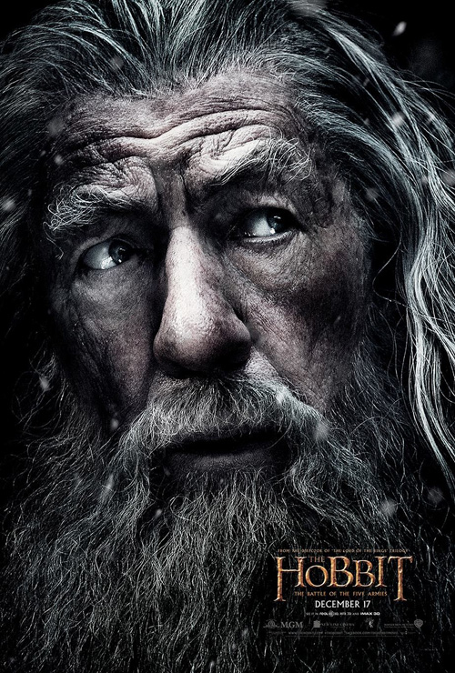
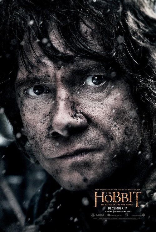
Where Ignition does succeed with The Hobbit is in their high-resolution close-up character sheets. You don’t have to paste people onto a consistent background when you’re cropping so tight and the emotional turmoil shown unedited on both Ian McKellen and Martin Freeman‘s faces is powerful. Every crease etched on their faces due to their long journey is accentuated thanks to most of the color being removed so the purity of the posters’ formal composition is front and center. The bright white of the elves is less effective—yet perhaps scarier—but it’s still a huge step forward from awkward poses.
Ensemble assembled
 |
 |
 |
 |
 |
 |
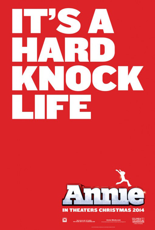 |
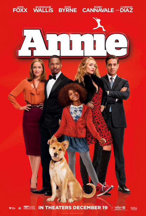
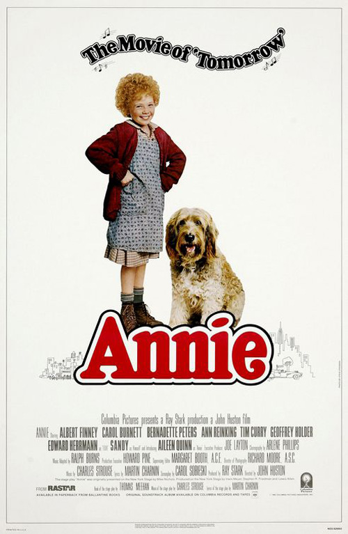
There is something iconic about the red of the Annie (December 19) logo from 1982. It’s necessary to assist the remake’s campaign for nothing else but nostalgia on the part of thirty-somethings wanting to show their children a contemporized version of what they saw decades ago. So even though BLT used photographer Sheryl Nields‘ work on a solid background, it succeeds.
Compare it to their second version set against a blatantly manufactured skyline (badly mimicking the 1982 line drawing) and tell me which looks faker. At least the red isn’t trying to look real. It merely wants us to focus on the actors who are selling this film to everyone that could care less about the musical itself. Less is definitely more in this case.
Just don’t go too much less, though, since the text-based teaser is a failure. Yes the song lyric is as ubiquitous as the logo, but this thing is boring. It actually looks like the designers set it up as a background and forgot to put the actors above it. Add Quvenzhané Wallis similar to Aileen Quinn before her and it might work.
 |
|
 |
 |
 |
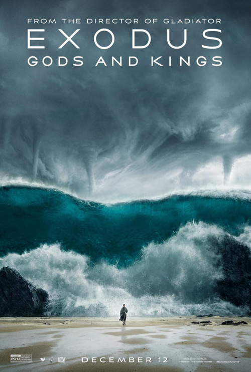 |
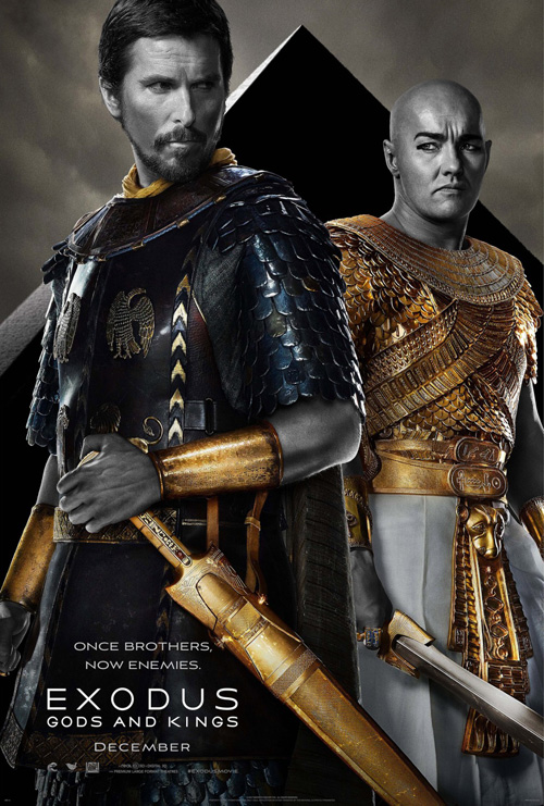
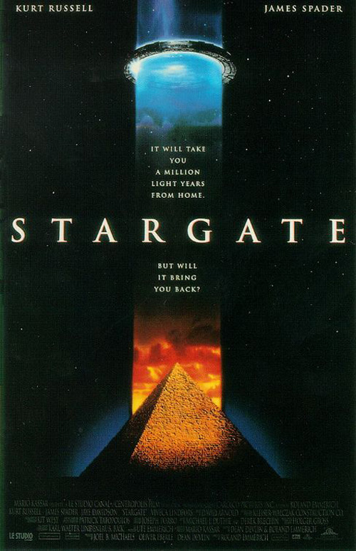
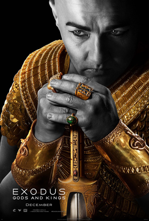
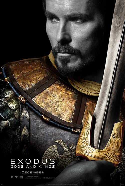
A lot of people gave eclipse‘s designs for Exodus: Gods and Kings (December 12) major flack when they arrived. But I kind of like them. Using photography by Michael Muller, the stark black and white desaturation look juxtaposed with the bright gold metal is eye-catching. I’m not sure about the Stargate pyramid behind the two leads, but I didn’t say the poster was perfect. (I can even forgive Christian Bale‘s head looking way too tiny for his body.)
The character sheets are cool too. There’s a rough texture to the gold that helps render it authentic while the monochromatic faces of the actors lends some humor to the whole “white-washing” of the cast. If anything it hides the bronzing toner used to make these dudes look faux Middle Eastern. But hey, Ridley Scott received his financing. He just didn’t get enough support to make the whole film black and white, I guess.
eclipse tried something different and whether it works in your eyes or not, you cannot tell me Art Machine’s or BLT’s are better. The former’s dust storm with Joel Edgerton and Bale placing a sword at each other’s throats is unintentionally comical. Why not put a lightning bolt between them and speak to the fractured brotherly love? As for the latter, BLT has to stop with the tornadoes. God is pissed—we get it. Tornadoes on top of tidal waves, though? Overkill.
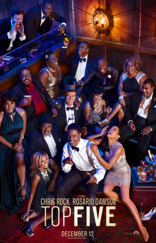
Maybe BLT was as bored as I was with that last one because they stuck as many people as they could in the sheet for Chris Rock‘s Top Five (December 12). They couldn’t even find room for Kevin Hart—bold move.
I don’t like Rock as an actor. To me his brilliant stand-up shtick hurts his delivery in everything I’ve seen on the big screen while simultaneously ensuring the artifice of his choices sticks out like a sore thumb. With that said, his latest foray behind the camera seems to depict this exact dynamic. I’m hoping he brings the same enthusiasm he does in the poster to the finished product because his lack of polish could be a huge positive here.
Back to the design: even though it’s a staged composition that probably wasn’t shot live, it is set-up flawlessly. Shaped like a pyramid, our eyes dart directly to Rock’s white shirt before exploding up towards each successive layer until we hit the yellow light at the top of the “tree.” My only criticism is the use of two thicknesses on the title font. It’s distracting and the “Top” gets lost. Make the whole thing bold.
 |
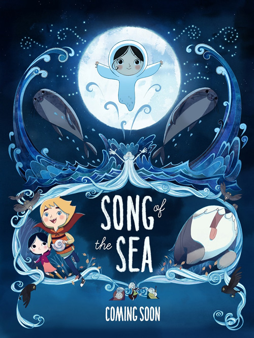 |
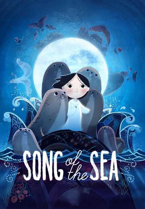
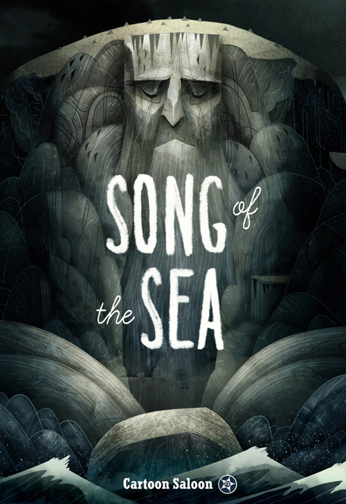
For Song of the Sea (limited December 19), calling the group at the middle an ensemble may be misleading since they are animated. The newest film from Tomm Moore, his distinctive style alone forces people to notice whatever ad material comes their way. It’s combination of solid 2D art and textured gradients is a welcome sight opposite Hollywood studios trying to render perfectly smooth figures as close to real life as possible.
The design is sort of like a totem collage a la The Hobbit above, but it has more consistency of depth and coherence because everything is fabricated with an extremely low field of depth. We know humans can’t fit together without space to hold them, but cartoons have the freedom to do whatever they want. So all these seals can share their rock island with the girl between them while the moon illuminates from behind. Cloudy, dream-like details can rotate around them and add detail while the gorgeous mix of rough, elongated bubble sans serifs and pristinely curved cursive can pop the title to surface.
This aesthetic is matched by the iteration with its sleeping man mountain (?) to create drama and appeal. The “Coming Soon” sheet, however, loses some character by becoming too crisp. Rather than seem fleeting and atmospheric, the harsh lines and shadows have this last one looking like paper art. A neat visual flourish itself, it lacks the intrigue of the other two.
Based on a true story
 |
 |
 |
 |
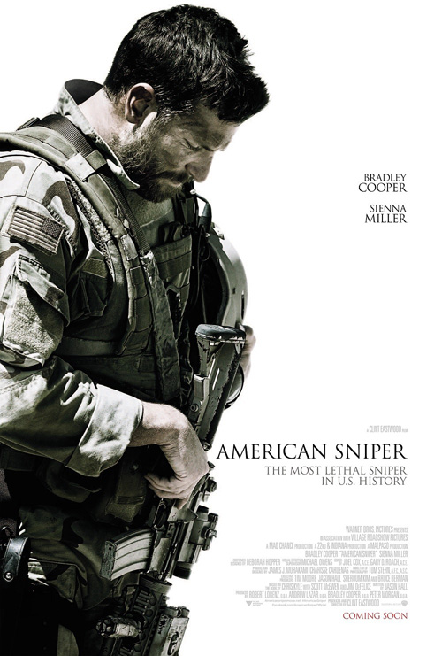 |
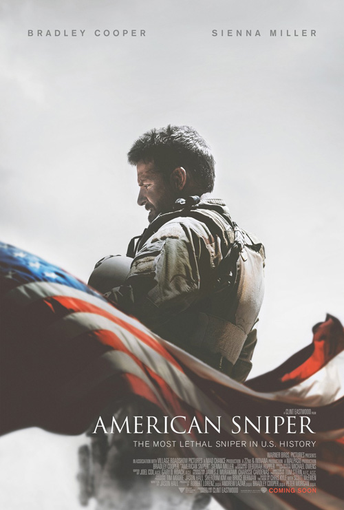
I really like what The Refinery did on American Sniper (limited December 25). Displayed as though through a haze, the text at bottom seems so bright despite much of the layout being just as light. There’s an otherworldly quality as though what we’re seeing is a dream—a hero lost and indelibly marked by what he has done for his country. And the way the flowing flag bisects the frame to ruin any sense of symmetry Bradley Cooper‘s positioning provides is a great off-kilter move.
Their other design is good too, but it loses a lot of the first’s uniqueness. This one is just dark and light. No color, the text is plain black, and the scale is imposing in a bad way. Cooper is simply too big for the page and it therefore appears that his body is forcing the words to shrink ever so slowly away.
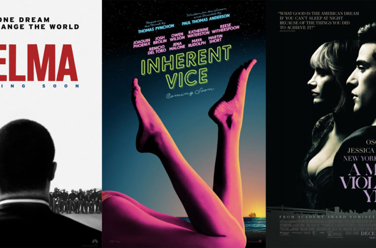
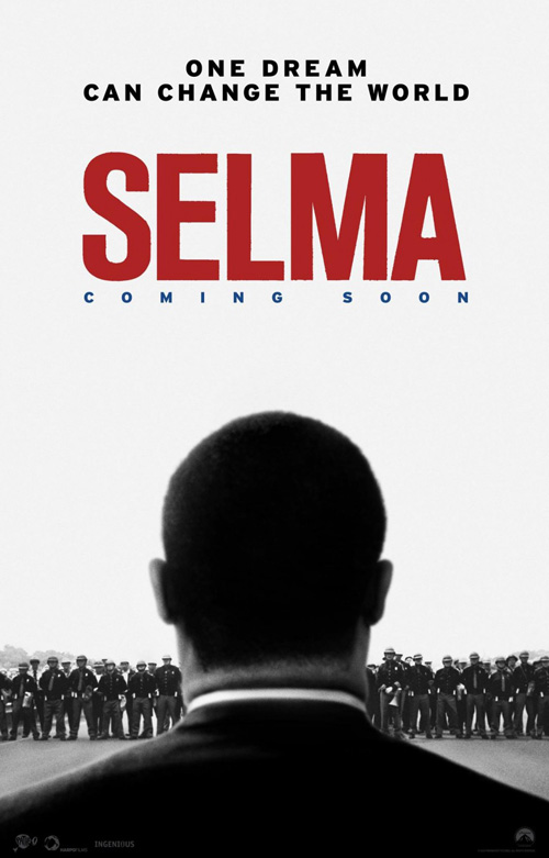
Heading in a similar direction with its lead subject against a stark white background, BLT’s Selma (limited December 25) adds a more singular power. It’s not as visually arresting as Sniper, but it is just as engaging thanks to certain truths our brains hold onto above our knowledge of its ruse.
This isn’t Martin Luther King Jr. and yet we believe it is since all we see is the back of his head. Selma has a very specific resonance with him and BLT’s placing him in front of us invites us into the fight. We’re staring at that hostile crowd right alongside him.
The black and white bits add an old-timey newspaper feel while the red of the title demands attention. And even though it screams from its perch at the top, it’s hard to take our eyes off King so we will be ready to move when the time comes.
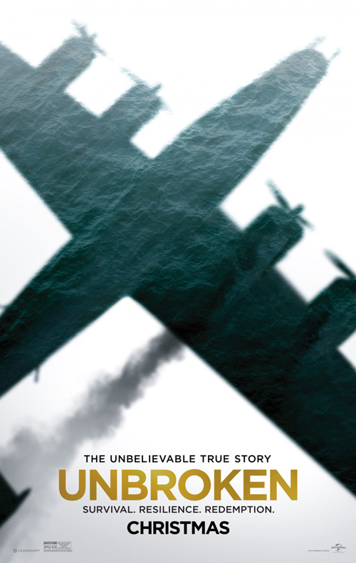 |
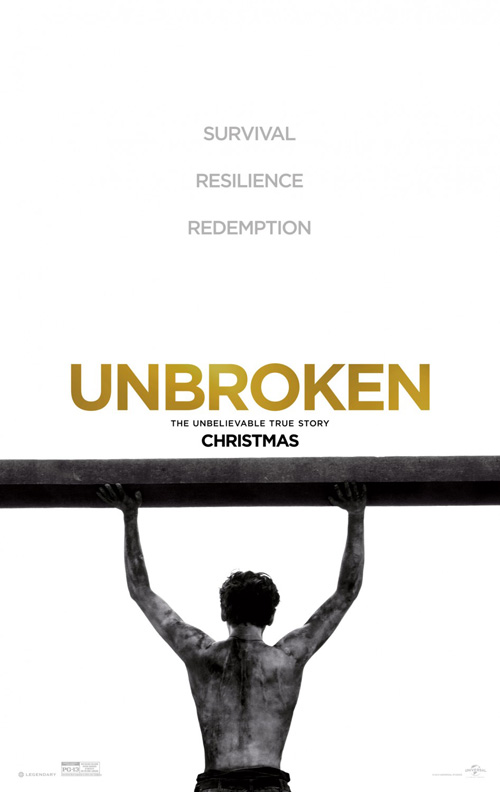
Ignition’s Unbroken (December 25) takes this distillation even further as it removes everything but its subject. We don’t know what Jack O’Connell is looking at or where he is. All we know is the determination and courage he’s expending to remain just as the title says.
The grayscale helps the gold letters stand as an equal to the actor with the words above getting lost in the white. Stripping away everything but the bare essentials shows us what it is like to be a prison of war and to understand we are only what we allow ourselves to become. This is an act of defiance—one the title emboldens.
BLT threw their hat in this fight too with a shade less success. It’s definitely the more dramatic composition, but not having O’Connell loses our ability to relate. Regardless of that disconnect, however, the way it shows us the water inside the shadow of the plane rather than outside is a great optical illusion reversal that will surely draw you in.
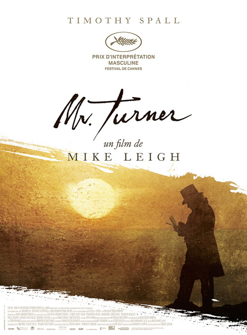 |
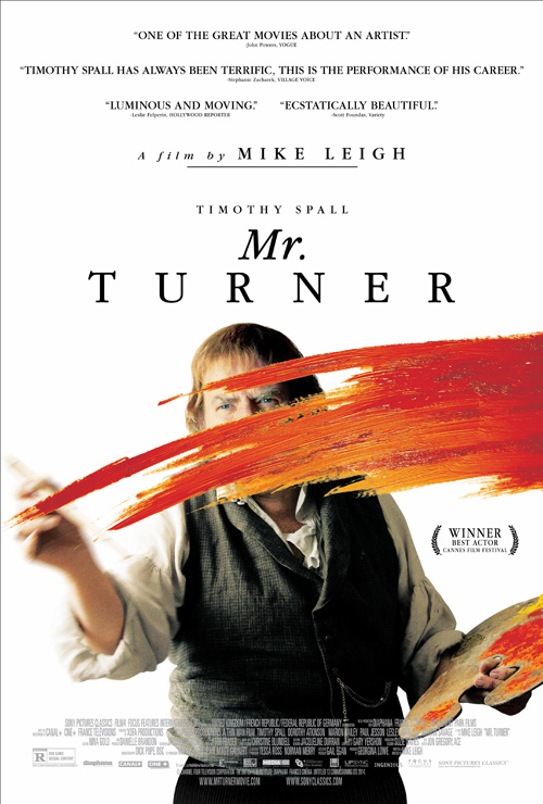
If there’s one figure over white that excels above the rest this month, Mr. Turner (limited December 19) proves the victor. A domestic version of the UK two-sheet from AllCity, its uncanny sense of depth is unparalleled. The easy thing to do would be having Timothy Spall‘s back to us as he paints a canvas in the distance. Having him face out and put his brush on an invisible field existing between us, however, is a stroke of genius.
I don’t love the two-font title or its size in comparison to everything else (this ratio is handled much better on the two-sheet). Take that and the copious quotes at top away, though, and the image itself is one of this year’s best. The detail and texture of the smear of paint is a memorable effect and its cropping of Spall’s face everywhere but his eyes exacting.
Le Cercle Noir‘s French entry lacks the drama with its silhouette, but I do love its handwritten font. Put it above Spall in AllCity’s artwork and you’ll really push it over the edge.
It’s all about the font
 |
 |
 |
 |
 |
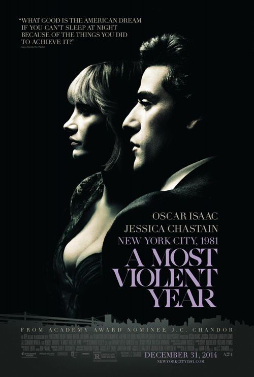 |
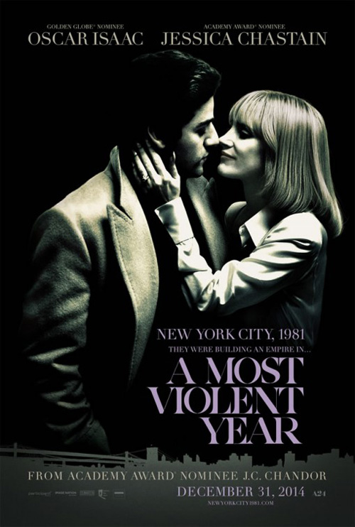
BLT does a nice job making their sheet for A Most Violent Year (limited December 31) gritty, but it’s the razor thin bevel of the font (similar to distributors A24’s logo bottom right) that sets it apart. While the pairing of Oscar Isaac and Jessica Chastain is shown with a nicely desaturated filter and coarse texture harkening back to its setting, the visual beauty of their bleeding into the black background only goes so far. Stick a block font or common Century Gothic and you lose a lot of the impact. Throw in the one they have and the whole comes together perfectly.
It enhances the imagery because it mimics it in its chiaroscuro. Despite being an optical illusion, the way the diagonal lines are overcome by the abyss behind portrays a powerful sense of consumption as though the letters are fading away or breaking through. I wish very much that the font sizes didn’t change on the two lines above, though, since the leading between lines is inconsistent and second line is overpowered by everything above and below. It’s a small quibble, I know.
The white version isn’t nearly as good due to its washed out look and surplus of text whether the huge tagline or growing number of actor names. With the silly skyline gone, however, the title may perhaps be bolder and sharper than the first.
As for the second black design, while the text size is handled better by keeping things consistent depending on proximity, the leading is still peculiar with the space between Isaac and Chastain being bigger than between Chastain and New York City just as the gap between New York City and the title is smaller still. Maybe they thought the gratuitous cleavage at left would distract us from noticing.
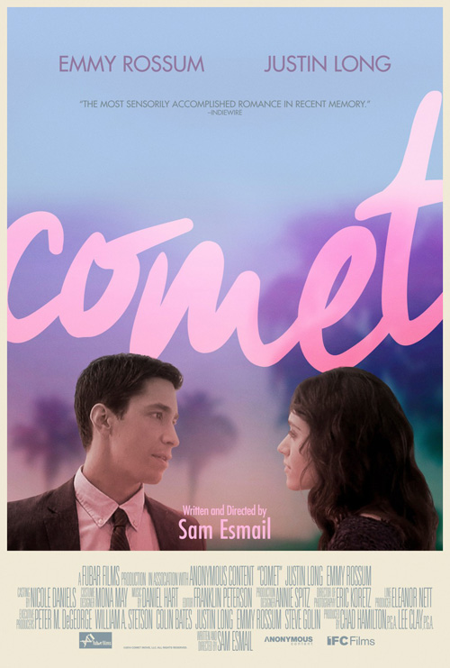
For Comet (limited December 5), I probably shouldn’t like it as much as I do. P+A utilize some romantic clichés with the color scheme and the longing look of the actors, but they take a risk by playing with depth to layer in the title between foreground and background in a way that ensures all sense of it being a “real” photograph disappears. It works, though, creating a fantastical air to the whole. It’s a storybook fairy tale of sorts that hits on a level of aesthetic rather than ubiquity—”sensorily accomplished” indeed.
Whether I appreciate the whole or not, it was still a big mistake changing the font for the writer/director’s name. This is one example where the Century Gothic at top enhances due to its sharp contrast with the lower case script of the giant title beneath. There’s no reason then to also add Futura underneath in sentence case despite nothing else matching it. No offense to Sam Esmail, but his name is probably the least important part of this poster.
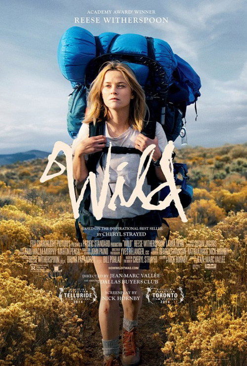 |
Similar with its largely scrawled title at center, I absolutely adore this poster for Wild (limited December 3). What isn’t there to like when your focus is crisply rendered above a shallowly focused photo looking like an Impressionistic painting for two-thirds of its coverage? Pan up to the highly detailed foliage with Reese Witherspoon‘s tired character walking towards us and you’ll find a brilliant sense of scale and motion.
Everything is sized perfectly and placed with exacting measure. The text is small and unobtrusive yet big enough for us to read; the title is unique enough to possibly be the subject’s actual handwriting; and the expanse of nature is enlarged despite most being shown in close-up. The blur therefore gives us more of a sense of the unknown and the cathartic journey being taken into it.
Compare this to version two and you’ll see how specifics confuse effect. Reese is now front and center, the text is squished together in a block and for whatever reason lifted into the air to leave a ton of dead space at the bottom, and the title is lost against a background as crisp as it. We’re seeing less and yet we aren’t able to see any of it as clearly.
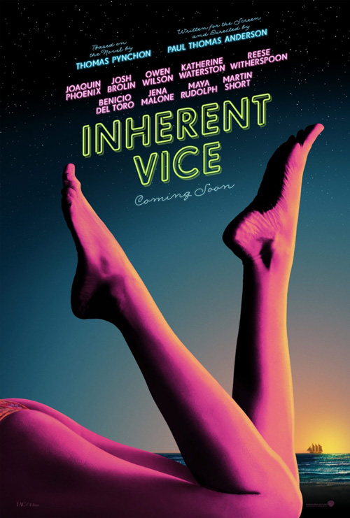
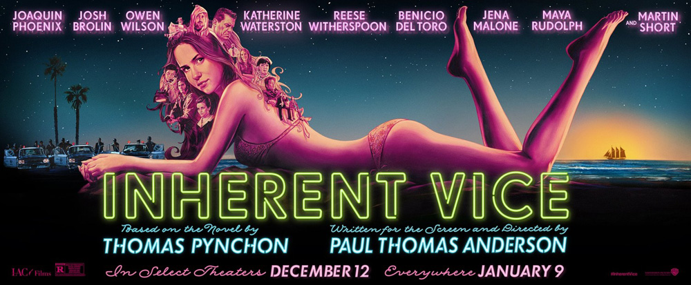
This is why Dustin Stanton‘s sheet for Inherent Vice (limited December 12) may be the best of the month. It is pure aesthetic, deliberately composed to lead our eyes to exactly what he wants us to see. There’s no need to jam in actors or place a spotlight on them—this thing is pure, manufactured tease. And I’m a total sucker for authentic looking neon typefaces.
The colors are vibrant and pulpy, the neon bright and engaging, and the cursive a welcome retreat from the rounded sans despite being consistent in its flickering sign trickery. Stanton places the legs so they can bookend the slanted text with ease and never sacrifices any of their own purpose for titillation.
 |
 |
And then BLT ruins the look with an extra-long billboard-sized poster that needs to force spacing so those same feet can join with the cast list yet not overlap. They’re made to look like they’ve been stunted in growth as a result—at the very least they’re disproportionate to the girl to which they are attached. The drop shadow on the names is distracting, the pencil drawn collage awkward with faces escaping her hair, and the text at bottom way too large. It’s kind of horrible.
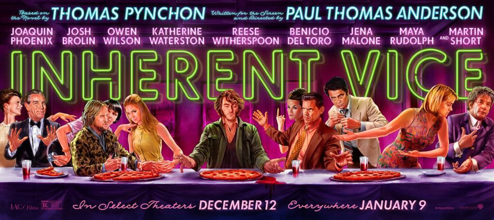
Thankfully the second wide sheet is better. The text is still weird with its drop shadow—although this flourish makes more sense on the title—and Thomas Pynchon and Paul Thomas Anderson‘s names are still too big, but everything else is much less sickening. Adding color to the drawn characters helps them really pop in their Last Supper homage and allowing there to be overlap between them and the title is more natural than force one or the other’s placement. It’s also a lot more humorous in tone than BLT’s girl. That one’s more akin to Boogie Nights than the director’s latest.
What is your favorite December release poster? What could have used a rework?