There are a lot of generic looking poster this month. I guess that’s what happens when the big names are all existing IP whether it be Robert McCall, Hercule Poirot, the Expendables, or the Nun. You don’t need to overspend on marketing when your target audience is already chomping at the bit.
So timing is perfect for the indies to swoop in with a stunner. Steal some eyes from Branagh’s mustache and Stallone’s airbrushed posse. I think many of the below do just that.
Eye contact


There’s a lot of text on P+A’s Fair Play (limited, September 29; Netflix, October 13)––an interesting truth considering it’s a Netflix film and they often don’t worry about such things. It’s probably a case of contractual obligations wherein names must be sized according to a specific ratio when compared to the rest. It’s a shame either way since the image is a captivating one without it all.
Thankfully they found a way to squeeze most of it to the bottom so Ehrenreich and Dynevor’s faces can be (somewhat) unobstructed. It’s tough to give them all the space they deserve when the title is so huge, but the font is thin enough and the kerning wide enough to help our eyes push through the letters.
The pose is familiar as far as romantic pairings go. Him looking at her with intent. Both titled at an angle for added intrigue. What I really like, though, is that she is looking at us. It adds a discomforting feeling. Like we’re in on a game she’s about to play on him. This is a seduction with ulterior motives of which we must buy a ticket to discover.
Ignition’s My Animal (limited, September 8) moves away from photography and towards illustration for its red-tinged collage of werewolf motifs. The silhouette at bottom being in-line with Menuez’s neck makes us assume they are the “animal” with the full moon and Stenberg becoming catalysts to the transformation.
The latter is also looking directly at us like Dynevor was. Here it’s less about bringing us into the scene then making certain we’re paying attention. She’s catching our eyes to provide an entry point from which we can circle around the moon and see the more dramatic scene below with Menuez. From there it’s just a matter of finally reading the title in its jagged, handwritten scrawl. Is it blood? Or simply part of a red palette that alludes to the supernatural horrors awaiting?
The poster for All Fun and Games (limited, September 1) takes a bit of both from the above. It’s photo-based but also rendered as collage. What’s interesting is that the two actors aren’t looking at each other as a result––they’re looking off-screen in opposite directions. It’s a maneuver that clouds our preconceptions; we can’t know for sure that Dyer’s fear is a result of Butterfield’s malice or that his crazed look is even targeting her at all. Are they both victims then? Both perpetrators?
And what of the face in the center? Is that a third actor? Perhaps Benjamin Evan Ainsworth with a grin and purposeful gaze into our eyes to guarantee we know they are the real villain here? It’s interesting, though, that they become the one we cannot look away from. Not the top billed actors with much more prominent portraits. There’s something sinister in that––a mysterious figure hiding in the shadows.
My favorite part of the whole, though, is the title. I love a playful bit of typography that goes beyond just a font to create a story of its own. The uneven and unique letter work gives a dual sense of playfulness and danger just like the words themselves conjure when you think of the phrase always ending with an “until …” Add the noose to really drive home the fact that these games won’t finish without bloodshed, and you must wonder how wild things will get.
Faces


While the poster for Flora and Son (limited, September 22; AppleTV+, September 29) is fun in its ability to put the title characters in frame without the usual Photoshop collage, it does feel a bit pointed in its synergy considering Apple’s whole aesthetic during the Aughts was silhouettes and bright colors. You must wonder if that played a role in this being the design chosen as nostalgia bridges the iTunes of old with today’s feature film offerings.
It works as a concept regardless, though. Flora is trying to connect with her son as his shift into teenage hormones causes him to be a pain in the butt and music (as in all John Carney films) becomes the road traveled to do so. As the trailer shows, the only time they aren’t at each other’s throats is when they are creating songs––so manifesting him as headphones for her to listen to with a smile proves an elegant metaphor.
I personally prefer a bit more overall individuality, though. Like with Mami Wata (limited, September 29). Rather than the manufactured, almost sanitized style of Flora, this sheet leans into the image chosen and adds to it in a way that complements what’s already there.
The contrast is bumped up to augment the shadows and highlights, turning a black and white photograph into a stark chiaroscuro that lets the bright face paint and pucca shells pop off the page. As a result, the bright white of the title and festival laurel don’t compete with the overall content. They become an extension of it––more highlights shining through the darkness.
And the title design is gorgeous. Geometric shapes enhanced by lines to turn triangles into letters. It feels like an extension of that paint––a projection of existing text that provides meaning to the whole instead of an artificial overlay revealing the poster’s fabrication. The title isn’t therefore floating above them on a plane all its own. It lives in concert with the women below, balancing the composition to perfection. One fails without the other.
Duke Aber’s Perpetrator (Shudder, September 1) similarly uses its imagery to balance itself by repeating Kiah McKirnan and Alicia Silverstone’s faces in a quasi-tessellation pattern. The result is mesmerizing in its calm horror as the whites of McKirnan’s teeth and eyes of both jump off the red and black backdrop to steal our gaze and force it onto an infinitely moving diagonal throughout the page.
And by giving them equal real estate, we can’t know who the title singles out. Is McKirnan the perpetrator baring her teeth and readying an attack? Or is it Silverstone and her knowing, satisfied stare. You get so caught up in trying to figure out their dynamic with each other that you forget both are looking at you. Both relish the fact they have you cornered. Dare to blink and you won’t stand a chance.
Feel the heat


Regardless of whether you get an idea of the plot from a poster like Robe of Gems (limited, September 15), the ability to have its abstract imagery evoke a sense of the tone and emotional essence of the work proves invaluable. This is a person on fire. Not just on fire: burning. It could therefore be self-inflicted. Literal or figurative. It might be telling us about a main character or a catalyst for the main characters. Maybe watching this person burn is what shapes their actions to come.
You can’t always receive those types of heady questions with a glossy picture of actors’ faces. You need things to be more open-ended and esoteric to trigger something within that forces you to consider what it is the artwork is saying rather than simply process what it shows and move on. The textures and typography demand that we look longer, move closer, and take a breath to soak it in. There’s power in that. Power that the familiar mugging of an A-list celebrity can never truly match.
You can even go further in your representation of the characters and achieve the same result. Because Ignasi Monreal’s painting for the poster for Rotting in the Sun (limited, September 8; MUBI, September 15) is still murky in its meaning despite seeming concrete. It is a dead man (at attention) lying under a sheet while a vulture eats him, but we don’t know this man. We don’t know the scene or whether he really is dead or caught in a scenario where he feels like he is. Maybe the vulture is real. Maybe it’s a manifestation of fear.
What’s great too is that it’s also very funny despite the grotesque nature of the subject matter. Paired with the press still making the rounds of a man looking at a censored penis, having this corpse depicted with an erection brings a level of absurdity that you wouldn’t necessarily expect. The studio wants you to know it too considering the quotes chosen are “searing satire” and “riotous blast”. You’re supposed to be shocked and amused.
That the typography is so stunning too becomes icing on the cake. The tight kerning and leading makes the letters bleed into each other to create a feeling of sunstroke––like you’re looking through hazy air on a day with a blaring sun to barely discern the yellow forms in front of you are spelling something. It’s as though they’ll disappear as quickly as they’re arrived, a hallucination sparked by dehydration and unbearable heat. And yet not even the sense you might be dying can stop you from laughing at its dick joke.
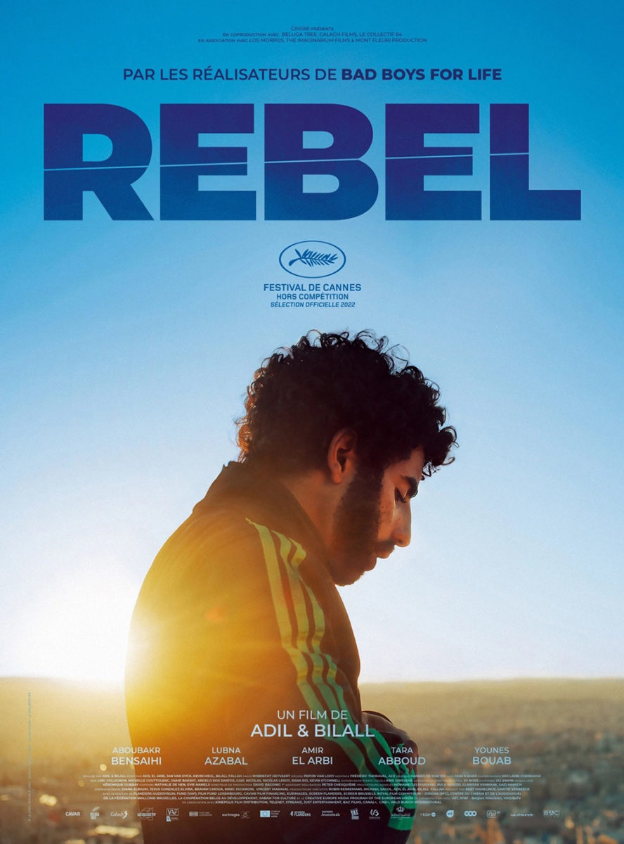
And then there’s Aleksander Walijewski’s latest for Rebel (limited, September 15). Once again, he finds a way to give us a photographic representation that’s able to devolve into nightmarish surrealism so we can bask in the glory of both worlds. Rather than just a photo like the French sheet––itself an effective if somber look––we get a scene full of manipulation, force, and confusion as disembodied hands tighten around Aboubakr Bensaihi’s face like a vise, detaching his eyes to expose a fire within.
The way Walijewski is bringing the Polish school of dreamlike, non-literal painting into mainstream Hollywood today cannot be understated. He’s giving studios enough of what they want where celebrity recognition is concerned without compromising his unique vision to create something wholly original out of it––to tell a story through imaginatively interpreted symbolism. The result proves as boldly in-your-face as the heavy font selection, screaming about its lead character’s turmoil as loudly as it screams the title. The question is whether Bensaihi will push back.