“Don’t Judge a Book by Its Cover” is a proverb whose simple existence proves the fact impressionable souls will do so without fail. This monthly column focuses on the film industry’s willingness to capitalize on this truth, releasing one-sheets to serve as not representations of what audiences are to expect, but as propaganda to fill seats. Oftentimes they fail miserably.
This June’s box office is pretty much all about four sequels: Toy Story 4, Dark Phoenix, The Secret Life of Pets 2, and Men in Black: International (June 14th). I’d do everything I could to avoid that quartet if I was a Hollywood competitor too. So besides a couple other studio selections sprinkled in as hopeful counter programming, the list of releases is lower than usual to compensate for how many screens will be locked up. (Next month is looking even sparer.)
That means upping your indie release’s game to turn heads in the theater because people will be showing up in droves to see the above. It’s your job now to keep them coming back if not cajoling them into a double-header they didn’t even know they wanted until seeing your poster. Kudos to a few of the titles listed below as they’ve definitely capitalized on that opportunity.
A childhood enriched and hijacked


MGM has no qualms about playing with Disney/Pixar’s intellectual property as their design firm for Child’s Play (June 21) has taken what Legion Creative Group did on Toy Story 4 (June 21) and used it to their advantage. It’s a smart play considering both films open on the same day. While the latter targets children, the former seeks to coax a slighter older crowd embracing the desire to leave “baby stuff” by the wayside. Parents can therefore take their toddlers to rejoin Woody and the gang while their tweens excitedly sit one theater over to watch Chucky wreak havoc upon sentimentality.
Since Toy Story‘s campaign dropped first, we do have to look at their character sheets against high school photo backdrops alone. They hit the right note where nostalgia and aging go with a nice mix of subjects spanning old favorites and new. The animation quality is enough to know the latter are part of the former’s world so information beyond a generic “June 2019” is inconsequential.
If anything, the Child’s Play riffs help bolster this family film’s exposure simply because people want to move back and forth between the two and bask in the juxtaposition. They remind us of one to introduce another and the connection is nothing but a viral scheme to everyone’s benefit—viewers too.


There’s enough to like about these films’ respective posters removed from each other too.
The Toy Story 4 teaser from Proof uses heavily saturated colors to lend it an intriguing mood steeped in more dramatic weight than we’re perhaps used to with this band of toys. And the illustrated IMAX sheet from Disney/Marvel staple Tom Whalen follows suit with determined faces instead of joyous ones. With such an iconic logo and cast of characters, there’s little you can do to reinvent the wheel than add atmosphere.


Child’s Play, on-the-other-hand, possesses the room to be different if only because it’s a remake of a film whose original franchise is still running. They need to standout as both something to see above the other selections at the theater and as a totally new vision of terror removed from its predecessor (this doll is ruled by artificial intelligence and thus firmly entrenched in science-fiction rather than the more supernatural notion of a killer’s spirit taking control). That doesn’t mean Blood & Chocolate is willing to use the latest Chuckie’s face in its teaser, though. They rely on mood too, shrouding the box in shadow so fans can’t complain about the doll itself.
The final sheet keeps their monstrous toy out of frame too, letting the knife as weapon speak for itself when placed above the bed of a sleeping child. I like the texture and old school vibe of the aesthetic as well as the menacingly sharp corners of the title. The whole is hardly unique, but it does its job.
On white


When your film is shot in black and white, it’s only fitting that your poster would be too. I would have liked something a bit more stylish when it comes to Leto (limited June 7), though, since the movie itself can be quite bold visually. Instead we get a simple cast shot masked from its background so it may sit atop white while its title screams out in thin lines on black. I always find it interesting when foreign films don’t translate their titles for American audiences. Does “Leto” have more allure than “Summer”? Maybe.
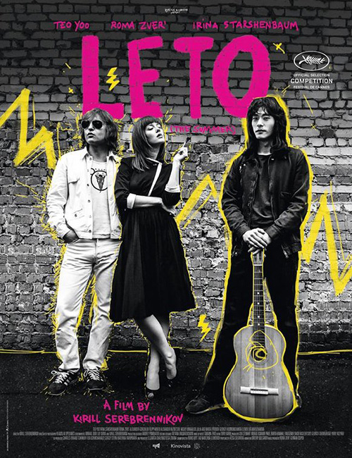
I don’t necessarily love Le Cercle Noir’s rendition either, but it’s definitely more exciting and true to the source. The film has brief splashes of color (albeit never this neon bright) and a ton of rotoscoped line work throughout to augment the action during some glorious musical numbers. Despite being black and white, Leto is far from stagnant or dour. So the energy this poster owns helps to portray the perhaps surprising sense of fun and optimism it does exude.
Anna (June 21) also has a stark black and white sheet with silhouettes merging into shadows to create awkward anatomy. (Is Sasha Luss looking over her shoulder? Is she facing us? Is her gun hand seen through her legs or in front of it? This bad optical illusion is messing with my brain.)
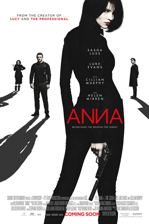
Rather than go too in-depth with that one, I’d rather look at the French sheet from the same design firm of mattverny / vanilla core. It’s nothing special on the surface being that we get a film still and text, but the way it’s cropped provides mystery nonetheless. Because her fur coat and hat are brighter than the background, they create a windowed “V” with which to showcase Luss’ powerful stare. It also lets the dark crevice of a cut pop off her cheek and complement the red title above some Matryoshka dolls bottom right. It’s cool, cold, and simple.
By contrast, Wild Rose (limited June 21) lets the white of Jessie Buckley’s jacket bleed into the background. She becomes the focal point not through contrast, but color. The poster itself becomes the window and the yellow of her skin and hair provides the pop with its saturated shadows holding the vacuous emptiness around her in check.
I’m not on-board with the italicized “Rose”, though, since it inherently separates the titles’ two words further than kerning should allow. I get why they did it—the right side angle now matches that of the left side “W”—but it’s more distracting than appealing.
The best use of white this month is The Chambermaid (limited June 26). It’s off-white like Anna so we see every fold and crease of the fabric piled behind the woman sitting below. By refusing to let us see context with a wider look at the room, the poster creates its own sort of optical illusion by simultaneously seeming as though she is inside a cave and outside a wall. We want to enter the frame and figure out which is true, risking a reality wherein the mounds will fall down upon us.
Credit its use of typography too as the sans serif font is more playful with its curves than stoic with rigidity. The “Hs” line-up perfectly so the whole remains on a faux grid and therefore proves easier on our eyes even if the “A” is pushed farther right than the “E” above it should allow. There’s as much care towards its legibility as its attractiveness.
Center stage


Sometimes a good photo is all you need to sell your product. That’s the philosophy Late Night (June 7) took with P+A’s use of Mark Seliger’s photography. It’s very to the point with Emma Thompson looking uncomfortable about someone encroaching on her space as Mindy Kaling moves right in with warmth and love. It’s old versus new, white versus brown, and experience versus enthusiasm. Those are the contrasts the film is showcasing and thus what more do you truly need to express them?
I like that the camera is pushed in to really put their faces front and center, but doing so has left the text in a literal tight spot. The title gets its fun late-night TV flourish on the “I” while the black/red mix works to highlight last names alongside a thickness disparity despite doing nothing for the title. There’s so little buffer space around it all due to those words needing to be as big as possible that the tagline is shoehorned in at an almost illegible point size. I honestly think the whole would be better off with no tag since it being there makes us squint and manufactures frustration.


Empire Design’s Yesterday (June 28) goes all-in on its photo too, but they’re keen on running some filters to better explain its intentions. Think The Beatles’ Beatles for Sale album cover mixed with Yellow Submarine so the yellowish hues can be spun with contemporary manipulation techniques in order to lend a psychedelic swirl of washed out blues and greens. The finished product is almost metallic in nature with our eyes wondering if different parts will become clearer upon changing our perspective.
It’s a nice improvement on ICONARTS CREATIVE’s literal play on Abbey Road with boringly large text atop a poor gradient transition. That yellow title is actually lost against the trees whereas its white counterpart blinds us against the colorful clothing of the above. Sometimes a shift in surface appeal is all you need to flip the script. Like the film’s world is slightly different than ours (The Beatles not existing), one tiny aesthetic change can make the ordinary anything but.


If it’s color you seek, however, look no further than InSync Plus and BLT Communications, LLC’s stunning Dark Phoenix (June 7). This thing gorgeously does what First Man tried to do with light glare to manifest a giant ethereal “X” at the back of a drama silhouette which itself is placed against the rainbow celestial sheen of space. Who cares that they changed the font to a delicate serif when it so perfectly complements the poster’s look above franchise recognition? This thing is a work of art.
And that’s why the others are so underwhelming by comparison. Whether the familiar division between good and evil (light and dark) with Jean Grey separated in the middle or the darkly sinister glow of an eye that does nothing to excite, the posters eventually caught-up to the poor word of mouth the thrice-delayed project has been receiving on the cusp of its release. A pretty illustration from the Pacific is a wonderful change of pace, but it’s so-removed from the film itself that I’m not sure how effective it is as marketing.
While it’s not better than the above Dark Phoenix teaser, The Refinery’s Ophelia (limited June 28) definitely seeks to garner attention through minimalism. Its focused light source helps this by covering almost half the page in black so Daisy Ridley’s face and neck can scream for attention via its escape from that darkness. By letting the gold of the regal type exist on the same visual level as her hair and the curved motif of the title match that of the wallpaper beneath, everything marries together with symphonic clarity. It draws us in to take note of the particulars even if it never steals our attention for longer than that particular process demands.
Arts & crafts


With a subtitle like the one Toni Morrison: The Pieces I Am (limited June 21) possesses, I can’t think of a better avenue to travel for a poster than what Magnolia got from their agency. It’s a scrapbook page of sorts with cutout fabrics, patterns, and a photograph made up of partial B&W and color swatches. There’s a sense of personality and intimacy in its construction as though Morrison is telling us about her life through those indelible markers of her memory. You therefore assume this goes much deeper than just her novels.


LA takes that concept further with one of their many The Secret Life of Pets 2 (June 7) series by literally recreating the subject itself out of disparate materials. This is less a scrapbook or collage than mixed media mosaic. And none is better than the simplicity of the Gidget homage formed by a precisely shaped doily outlined with a gold glitter background. It’s a perfect depiction of the character’s persona.
The others wielding this aesthetic are fun if busier and less creative. While Snowball leans heavily on his newfound superhero identity with Pop Art moiré pattern sensibilities and comic strip flair, Chloe awkwardly uses three-dimensional objects in a two-dimensional way as though it’s composed of magazine images of yarn rather than yarn itself.
The latter’s issues are compounded with the more vintage wallpaper chic designs wherein concept appears to always trump execution. The Chloe one deconstructs her body with a fantastically stylish hand and yet places her on a boringly ugly backdrop devoid of imagination. By contrast, the Snowball one has a wonderful 70s fashion vibe with ho-hum portraiture stamped on top.


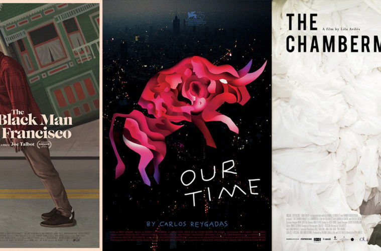
A24 decides against montage and instead lets Akiko Stehrenberger simply paint another of her brilliant works for The Last Black Man in San Francisco (limited June 7). I’m partial to the one above with Jimmie Fails standing on a hill wherein he and the buildings look crooked when the frame straightens the road out instead. There’s an existential beauty to it as though he’s walking into a wall of wind and struggling to remain upright. The typography is a bit awkward with the tiny “The” jammed in and the “in” left out, but how could it not with a title that long?
Stehrenberger’s second sheet is nicely rendered too, but it trades intrigue for content—the unfortunate reality when working for studios that want as many familiar faces as possible (“We need to see Jonathan Majors and Danny Glover!”). They can’t all be a pretty sunrise like P+A’s teaser. But even then the worst typography of all ruins things anyway. Why is the “The” not in line with the “Last”, “in”, and “San”? It makes my heart weep.
The best poster of June, however, is without question Our Time (limited June 14) by Sam Smith (Sam’s Myth). You know it’s good when the festival sheet plastered around Toronto last September remained the final key art for its US release. That kind of consistency is rare.
There’s just so much to take in from the hazy night-scene of urban skyscrapers at its back to the hand-scrawled all-caps of the title and director’s name. Add the bull looking as though it was made of paper spiraling around itself like some ornately complex single-sheet paper doll experiment and you would be satisfied without the inclusion of faces and naked bodies caught inside the contours. You can look at this thing for hours and still discover hidden treats weeks later.
What is your favorite June release poster? What could have used a rework?