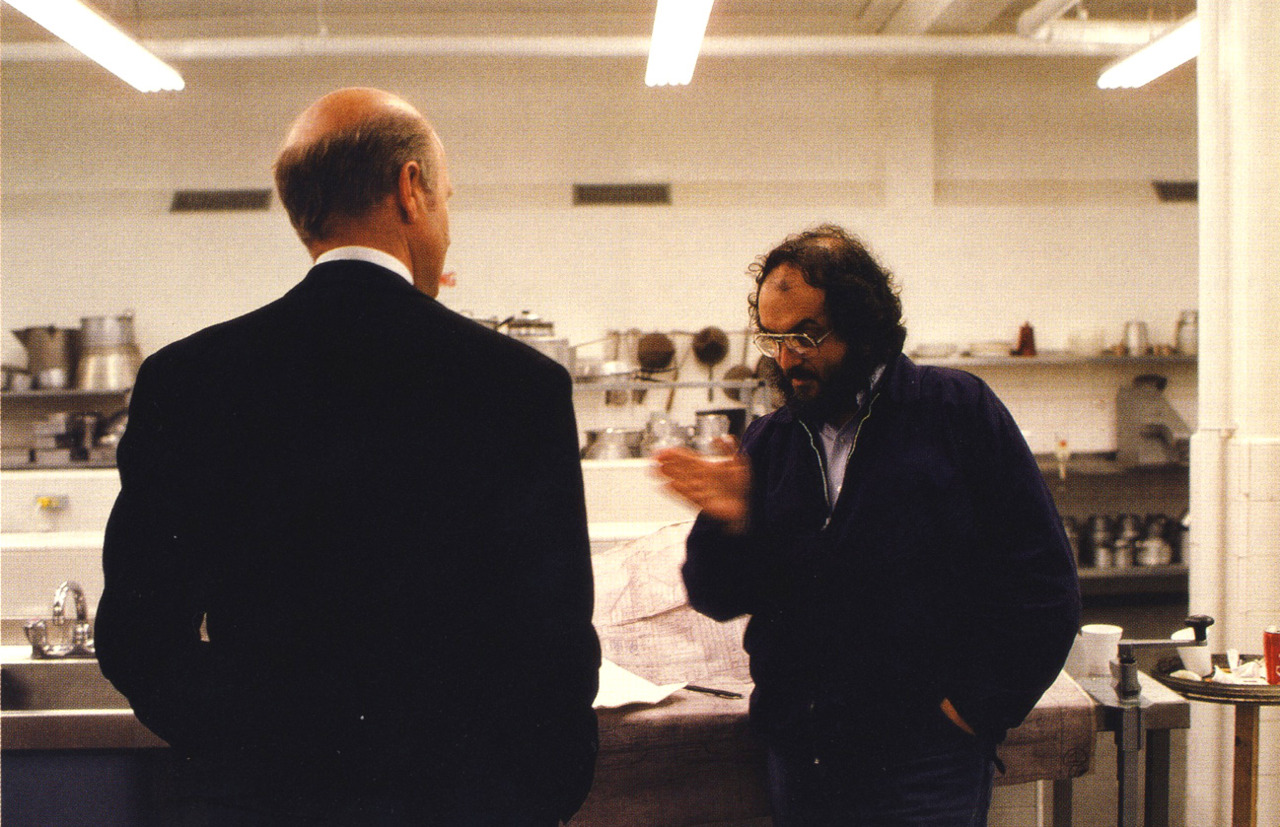
Either left with no option by the studio, or simply a lack of expertise in the field, most directors aren’t heavily involved in the marketing of their films. Stanley Kubrick, as one might expect, didn’t fall into that category. Once he was able to (fairly quickly) cement his status as an unparalleled auteur, he had a hand in every aspect of his films, from development to exhibition (going as far as selecting a list of theaters he’d want his films to play in).
This was certainly the case with his 1980 psychological horror feature The Shining, and now we’ve got a peek behind the process thanks to the currently touring Stanley Kubrick exhibition. After working with Saul Bass on storyboards for Spartacus, Kubrick got in touch with the designer some 20 years later to design the poster for his Stephen King adaptation.
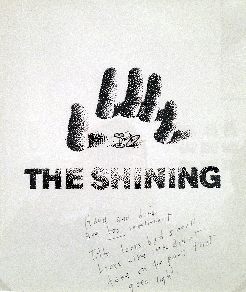
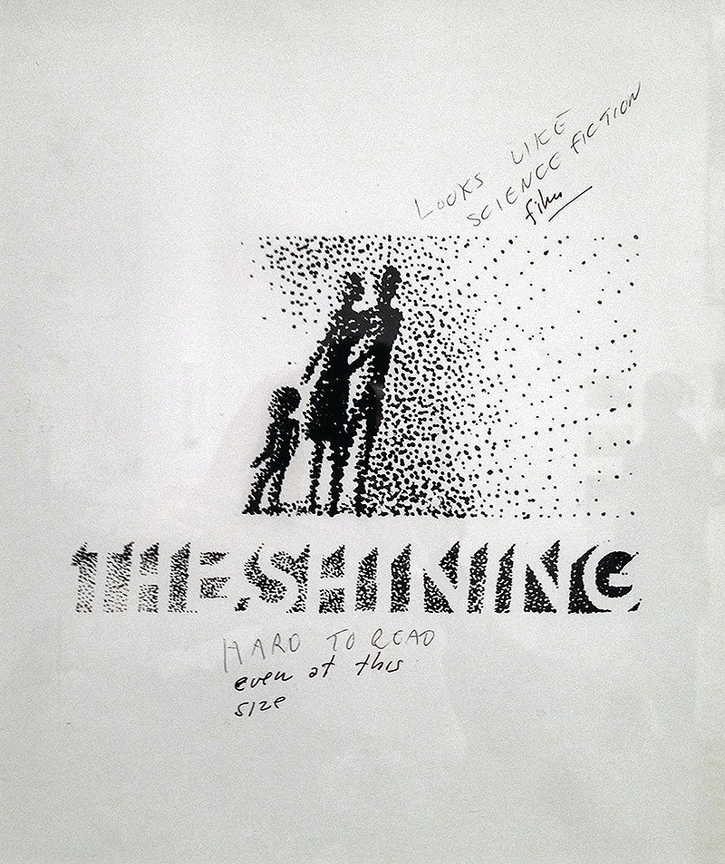
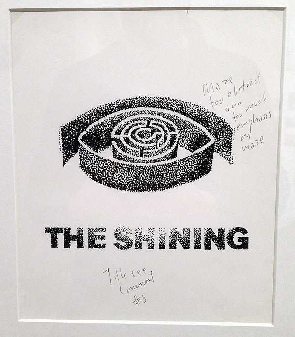
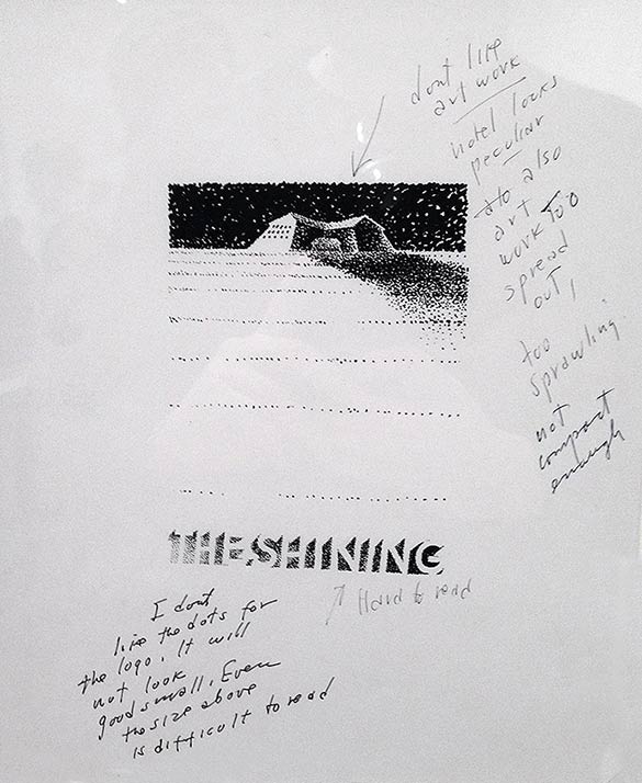
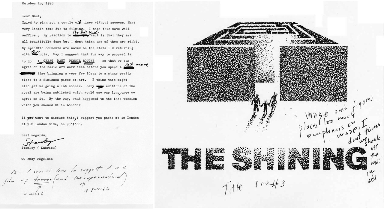
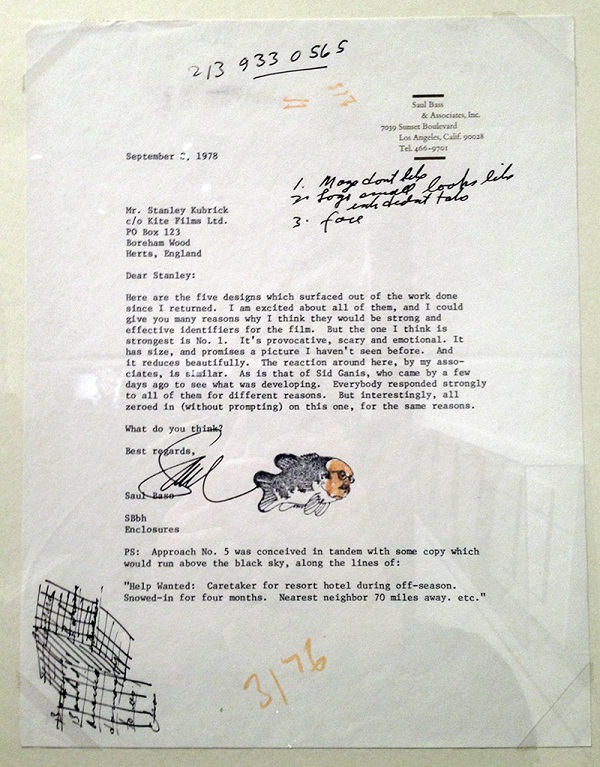
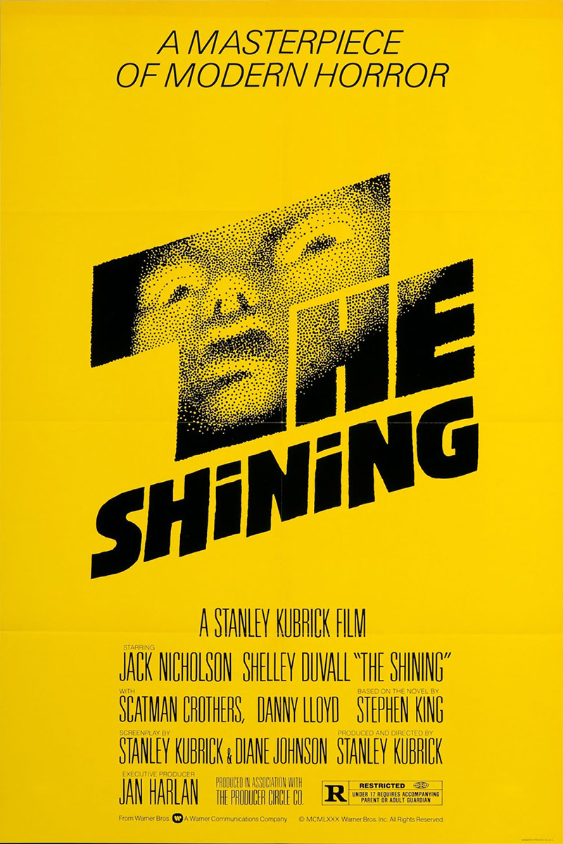
While the final result is the iconic, yellow one-sheet, there were a number of iterations, and we can now see the rejected ones. Drawing from different aspects of the film, including the maze, the hotel, and the family unit, there’s some striking imagery, but we can see why Kubrick went with the one he did.
Featuring handwritten notes by the director, check out the rejected poster designs below from Design Buddy and TOH (via Open Culture), along with a cover letter from Bass explaining what he sent, as well as Kubrick’s response. For more on the film, check out a recent video analysis and Vivian Kubrick’s behind-the-scenes documentary.
Do you like any of the rejected designs?