

“Don’t Judge a Book by Its Cover” is a proverb whose simple existence proves the fact impressionable souls will do so without fail. This monthly column focuses on the film industry’s willingness to capitalize on this truth, releasing one-sheets to serve as not representations of what audiences are to expect, but as propaganda to fill seats. Oftentimes they fail miserably.
For a month consisting of only four weeks, March 2015 has a lot of films coming out. So many that I couldn’t find the desire to talk about a few biggies like Get Hard (March 27th), The Second Best Exotic Marigold Hotel (March 6th), or Run All Night (March 13th). Here’s a summary: none of the trio has any poster to write home about.
I could spend a paragraph joking about Taylor Lautner growing facial hair to confuse us on whether Abduction and Tracers (limited March 20th) are the same film, but I’d rather focus on what I’ve selected below. They are mostly quite good. If not for the expansive catalog I’m ignoring, I’d say it’s one of the best-designed months in a while. Or, at the very least, one of the most intriguing.
Hope something sticks
 |
 |
 |
 |
 |
 |
 |
 |
 |
 |
Were Vince Vaughn, Tom Wilkinson, and Dave Franco not enough to sell Unfinished Business (March 6th)? Why else would the design firm go out of its way to squeeze Nick Frost and Sienna Miller into the bottom? It wasn’t for aesthetics, that’s for sure. Making a triptych of the three leads is overkill as is, adding two more does no favors. If ever I wished for a Photoshopped faux combination it’s now.
ARSONAL‘s ideas to combat the overkill may not be much better, but they are more cohesive. Franco’s goofy smile would be funny by itself and something about Wilkinson posing with a gimp is highly amusing. They could have filtered the spray paint font better, though. It is so bright and so sharp along the edges that it seems like an afterthought rather than a calculated decision. And that drop shadow was ill-conceived—paint adheres directly to a surface, it doesn’t hover.
Those headless bodies, though. Thank You for Smoking did it with much better effect years ago. These things just don’t look real. Vaughn’s suit is the most believable of the bunch with Franco’s backpack-toting shoulders appearing to be squished against the wall at his back. Maybe the condom in front of his face caused him to run into something and dislocate his arm?
So many choices and none get the job done. But does a film like this need a bang-up marketing campaign? It’ll still probably win the box office opening weekend regardless.
 |
 |
 |
 |
The Cobbler (limited March 13th), on the other hand, needs all the help it can get. Not only did it get dragged through the mud at TIFF (I enjoyed its fairy tale tone more than most), having Adam Sandler as your lead is almost akin to a kiss of death. Thankfully, the story makes it so his titular shoemaker inhabits the bodies of his customers. So Sandler isn’t onscreen as much as you’d expect. Indika Entertainment Advertising giving the tease a blank slate with its shoes as a focal point is therefore perfect.
Alas, while some avoid Sandler like the plague, others will buy tickets to whatever he does. In comes The Refinery providing the final sheet with the former SNL actor front and center at his schlubby best. With the weird neon sign logotype and his stained apron, it looks like he works as the line cook at a diner. If that’s not odd enough, gazing upon the skyscrapers in the background has me wondering if the building behind him was dropped from above in the middle of the street a la Dorothy’s house from The Wizard of Oz.
Somehow this isn’t even the worst that could happen. Internationally the film’s marketing has embrace Sandler’s shtick completely. First we have him posing above us at an impossible angle with a high heel. Then we get him in a pile of shoes smiling with his arms in “ta-da” placement. Throw that one against NYC and it looks like he’s a homeless guy in a pool of footwear ready to be immortalized on a Garbage Pail Kids trading card.
 |
 |
 |
 |
For Home (March 27th), like all children’s fare, it doesn’t matter what concept rises above the rest. Simply having a cute cartoon character is enough to mesmerize kids passing by. Give it some atmosphere like the above sheet from Concept Arts or merely throw the alien in as many Earthly places as possible like Proof‘s entries at right, you’re winning either way.
Putting the former into one of the latter, however, is something I haven’t seen. What’s going on with this? Tip Tucci and Oh sitting on a park bench reading a magazine from the Boov’s planet that has a back cover ad of the Earth movie they’re in? That’s some Inception-level parallel dimension stuff. My brain wants to pretend it never happened.
 |
 |
 |
 |
 |
 |
 |
 |
Thankfully Insurgent (March 20th) arrives to save the day as far as multiple styles for one film goes. I’m a sucker for designs that work right side up and upside down—remember Coherence? The angle of this first design is cool, watching Tris and Four propel out of windows above us yet also in front of us at the same time. The close-up version is a bit too Non-Stop with less success, but this long shot amidst glass façades is neat.
Both are better than Ignition‘s floating concrete fire from the trailer—a scene I cannot for the life of me place as existing in the book. It doesn’t make sense without context besides teasing airborne action. I thought it was a head-scratching decision to use in motion and find it more so in print.
On to the character posters, Ignition really embraced the whole glass motif. Or is it water? Are Tris and Four breaking into shards or splashing into droplets? Does anyone care or is it just something cool the designer played with that caught Lionsgate’s attention? The other examples with faces gazing up (or down) at exploding buildings give us some bearing at least. They’re still pretty obtuse and definitely style over substance, but someone’s trying to do something different.
Expressions to kill
 |
 |
 |
 |
 |
 |
 |
One of the most appealing aspects of Chappie (March 6th) is that it seems we’re to watch the titular robot mature. It isn’t just some killing machine or mechanical being speaking in 0s and 1s; it’s a creature who takes on a family to learn what it is to live. Vox and Associates going the route of building blocks to put this feeling on the page is an inspired choice. The execution isn’t the greatest with the gun and blocks at the bottom of the page anything but realistic renderings, but I appreciate the concept.
The same goes for the firm’s Spanish language sheet of Chappie drawing on the wall. While the gun again looks slapped on, I love the scrawled family at top left. The faded figures throughout are cool too, lending the whole a weathered texture akin to the future as depicted in the film’s trailer.
These get at the heart of the tale whereas the BLT Communications, LLC‘s and The Refinery‘s simply play on the idea of a robot savior. That view is reductive and while it may help get action fans in theaters, it cheapens what I believe the film will ultimately prove to be. I’m hoping it’s more District 9 than Elysium and the thought of giving this character an artificial soul helps me in that assumption.
 |
I really like what Empire Design did on The Riot Club (limited March 27th). It gets the tone of the film down pat and gives us a memorable design too. We see the fierce danger in Sam Claflin‘s eyes, the vapid entitlement in Douglas Booth‘s engagement with the camera, and the sense of something more Max Irons yearns to hold onto as he looks into the distance. It may just seem they are walking, but after seeing the film you’ll notice their composition and expressions are very much intentional.
The desaturation of color also provides it with a moody atmosphere the French brightness cannot match. Whereas that one looks cartoonish, Empire’s stays grounded in the horrors ready to be unleashed in the movie’s fantastic dinner scene. I also like the tagline’s single word per line centered in the white space at the top. Very well done.
 |
For Kumiko, The Treasure Hunter (March 18th NY; March 20th LA), Sam Smith has crafted an appealingly minimalist piece different than anything else displaying beside it in theaters. There’s a videogame box aesthetic to it that makes me think of Nintendo’s old game Earthbound for whatever reason. I like the collage of cityscape, country, VHS tape, and bunny forming a mountain out of Kumiko’s body and I think the font used is beautiful. The way the “Ks” hug the “U” and “O” after them keeps the block of text a solid white light popping out. Even the comma looks as though it belongs rather than an unappealing add-on like in most designs.
It’s cool that the studio stuck with the general shape and concept in their photo-real version too. Rinko Kikuchi is put in with her bunny as the skeletal x-rays of barren trees reach up out of the background to consume her. Accentuating the red of her hood with the title keeps everything in balance, gives us something to direct our eyes towards, and cultivates a rather foreboding feeling of suspense.
 |
I have no idea what’s going on in cold open‘s Faults (limited March 15th), but it works nonetheless. Perhaps it could have worked better if the fractured photo strips weren’t carefully framed in a rectangle, instead left to spill over the edges, but I’m sure the designer at least tried it. They or the studio felt this was better.
It reminds me of the great Argo teaser poster back in 2012—the reformed image of shredded pieces. Not sure if the stylistic choice takes a relevant plot point from the film here like it did with Ben Affleck‘s, but it definitely makes it unique.
The moodier the better
 |
 |
 |
 |
 |
 |
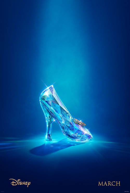 |
Disney surprised me with their campaign for Cinderella (March 13th) by BLT. Using photography by Annie Leibovitz is a great idea, but I didn’t think the atmosphere would be so dark. Just look at those clouds behind Lily James. The shadows do wonders for making the blue pop, but they definitely don’t provide the cheeriness you think of when Disney’s Cinderella is conjured. Maybe Into the Woods has them taking a more Grimm Brothers’ approach?
Even the sheet with Helena Bonham Carter is a bit too nightmarish—almost as though we’re getting a sequel to Hocus Pocus. The one with “Ella and the Prince” is the most tonally familiar, but it has a more realistic lighting to take it away from the pure fairy tale sheen I’d expect. These things aren’t bad, just different. Their incongruity if nothing else makes them memorable. Especially after the tease skewed so far in the other direction of magical romance. (That slipper was photographed by Nels Israelson? How is it not computer generated?)
 |
 |
The mood for Back Country (limited March 20th) is more appropriate. The title design is silly and looks like a free font you can download online, but I really like the image angle and tumultuous clouds. We become what Missy Peregrym fears, her height in the tree protecting her from whatever it is we’re standing in for. The word “Survive” cements the package as one of surprising intrigue.
The concept of silliness returns for Art Machine, A Trailer Park Company‘s entries, however. Where the first works as a tease for a festival screening, IFC must have thought it was too vague for general consumption. So rather than make the viewer into the bear, we now receive his growling roar in full focus. I don’t mind the wide shot where we can witness the scope of Peregrym hanging on for dear life, but the close-up loses all impact. If you’re billing it as “Jaws for the woods”, embrace the comparison with subtlety not horror tropes.
 |
 |
 |
 |
Leave the horror tropes for It Follows (limited March 13th) and Palaceworks. This first sheet is so good. The scale is brilliant, leaving the car and victims small—once again allowing viewer to stand-in for the monster skulking in the night. The glow of the text and the dispersing light out from the middle of the image has me feeling as though I’m entering the photo and moving closer to the car. As I hypothesize what might happen to the lovers embracing in the backseat, I simultaneously must wonder what I’m about to do to them.
Troïka‘s selections are equally moody if not as effective in their over-use of text. The lighting is still great and the imagery still provocative, but neither quite reaches the power of Palaceworks’. Things get more generic with AllCity‘s quad sheet (Maika Monroe does not look like she was there when the photo was taken) and Andrew Bannister‘s one-sheet (which is kind of cool, but confusing in its segmenting of top and bottom). Like with most horror, less is more.
 |
You don’t have to look much further than Spring (limited March 20th) to see this sentiment in action. This thing is surreal, devoid of setting, and all about tone. There’s a bit of romance with its actors at top longing for a kiss; a ton of horror with the tentacles, claws, and wings exiting its shadowy mist; and sexual intrigue with its female silhouette emerging alongside them. And the coloring is just muted enough to keep it from being oppressive—it’s yellows and reds manifesting a sense of discomforting dread with its brimstone.
Evan Yarbrough‘s version loses this visceral impact with its whimsical aesthetic. The font selection for the critic blurbs is totally ill-fitting and lends a ParaNorman comedy/horror vibe for kids rather than the brutal love-tinged nightmare it should possess. You also lose the connection between the girl and the evil of the first. Rather than have her rising from the same haze of creature limbs, she’s running from them. Or is it skipping? The tone is so skewed that it looks like skipping.
The grainier the better
 |
 |
 |
 |
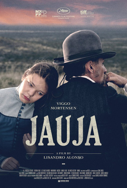
Let’s be honest, it wouldn’t matter what image was used on this poster for Jauja (limited March 20th). The photo is great—contemplative, gritty, and perfectly cropped. But it’s the title font that sets this thing apart. The word itself helps to give it a consistent horizon of slanted peaks moving down to its curves below, but the elegance of the lettering would be memorable regardless.
The scale of the remaining text being dwarfed ensures we know exactly what movie is being sold, the pale color of the logos at top fade back to not take focus away from the image, and the slant of the actors’ heads mimics the font’s serifs exactly. There is a stunning simplicity here that isn’t easily rendered.
The same can be said for X/Y (limited March 6th), although not to the same extent. I have issues with using three fonts on one work and the yellow tagline is too overpowering considering it’s one of the least important aspects of the whole, but I enjoy the intent. Move the actors line and Ryan Piers Williams line to the bottom with the tag so “X/Y” remains isolated above the photo without distraction and this thing would be so much better.
As is, though, the grainy texture gives the lustful expression a voyeuristic filter. We watch this intimate moment through the dark, its magenta hue shining down to enhance the merging of sex and romance. I just wish I could appreciate it without the text in the middle. The “X/Y” should be lowered just a tad, centering the slash on America Ferrera‘s mouth so the “X” isn’t picking her nose.
 |
While She’s Lost Control (March 20th NY; March 27th LA) contains even more text above its chiaroscuro imagery, the designers take care not to ruin the form its shadows create. They are very meticulous in putting the heavy title words exactly where they need to be for our eyes to comfortably following the sliver of light down from top to bottom. We’re drawn to her eye with “She’s”, move to the wide curve of her shoulders, and on to its end at her clothed torso.
The director and actor names do distract slightly, but they also anchor the large gaps between words. Without them I’d probably be wondering why there was so much unused space rather than see why the title is leaded the way it is. We’re not meant to hold on her stare like Sleeping Beauty. Instead we’re to wonder what she’s looking at. Emily Browning‘s confidence is missing and replaced by Brooke Bloom‘s trepidation for a completely different feel.
 |
Gravillis Inc.‘s poster for White God (limited March 27th) uses the rough, tactile grain of the previous three but positions it in a symmetry they all avoid. I know a lot of people find symmetry boring—I find comfort and beauty.
It’s the perfect device for this imagery as the blue hooded character at center draws us in before we fan out towards the group of dogs sitting at attention. We don’t know where they are or what’s happening, but there’s a power to its stillness as though we’re all waiting for the young girl to make a move. I love too that the dog at her side is peering up, inviting us into the circle.
The international poster is great for different reasons. A direct contrast, this one has a sense of kinetic danger with the dogs running toward her in pursuit rather than static in silent revelry. It’d be tough to ignore the allure of wanting to discover what it is the film’s about.
What is your favorite March release poster? What could have used a rework?